About to give the green light
J Smith
8 years ago
last modified: 6 years ago
Featured Answer
Comments (7)

jmm1837
8 years ago
Tribbletrouble44152k7 Trek
8 years agoRelated Discussions
The influence of light both natural and artificial light..how to use
Comments (8)Hello Lisa..thanks for your comments - so kind of you. The pictures are not good (sorry) and to be honest whilst I'm renovating I don't have the courage the post much at all ..well at least until it's finished but here are a few enclosed. My real idea is to get a discussion going that we might all enjoy. and yes how light strikes (as in angle?) can impact on even the paint colour etc. I see so many questions from readers about wallpaper paint colour etc and yet experts and skilled people such as yourself will know that it's the cohesion that has to work and light can play such a huge part. A wallpaper can be purchased and then prove disappointing if used in different a light as can paint - which is why we use your good services where possible! I've a pile of boards each with different colours (I use linen style artists boards as I can shift them around - I leave a white border on them to allow a suitable contrast) The small bedroom picture with the striped curtains was more to show that curtain colour - it's now blended with duck egg blue paint (sorry it's a New Zealand company called Resene's so it won't be known of there but called Robin's Egg Blue), ivory carpets which I had edged in a green/blue wool. Before these drapes (Laura Ashley) were in a different room and just didn't work. The bedroom hasn't been finished (See? I'm still a tad embarrassed) but I mentioned these as with incandescent lights this curtain colour did not work at all. Taking my courage in both hands and uploading a picture of the main living area which is to be painted next to do away with the strong saturated green..very dark and gloomy as the natural light is very limited. Hoping you can't see the paint splotches on the wall. Another lesson I learned is to paint a surface white and THEN paint the choices. If we don't do this the original surface colour 'bleeds'. So I really hope to have others including myself recognise that we have to have one eye to the climate and outdoor colours all the time as well as the same paint colour possibly being different from room to room. Regards...and thank you once again for taking the time to reply....See MoreLiteGreen obtains exclusive rights to Habitech
Comments (1)It's great to see professionals consider sustainable options...See MoreSeeking suggestions for a new colour scheme.
Comments (10)An old post , so sort of sorry to revive it ! The lighter shade looks a lot better , but something doesn't gel with me -- it looks like a beautiful Million Dollar house , let down by someone trying to save $10k . IF it was my place , the 2 things I would do is change ( or hide ) the round pillars , and the relatively cheap looking brickwork . I'd go for quality stonework in place of the brickwork , and carry the theme through to the pillars -- probably 'squaring' the pillars . In fact , I personally don't like the slightly strange 'extra' pillars -- I'd try to 'cut back' to 4 pillars , in a quality natural stone . Once I had done those 2 'improvements' , I'd sand back and restain a darker brown the entrance doors and surrounds -- that golden look screams 1980's IMO . I realise they tie in with the existing colours , but I'd want to get away from that look . Maybe I'm strange . . . . . . ....See MoreKitchen Makeover - Before and After
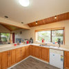
Comments (0)Miramar Kitchen Makeover Getting from a Then to a Now takes commitment and we could not be happier for our delightful clients. They tell us they pinch themselves every morning and what an utter privilege it has been to contribute to a space filled with joy. Before: After: As with any meaningful transformation, this one started with thoughtful consideration of space planning. This previously busy space now feels relaxing and spacious whilst also adding a laundry, having more kitchen storage AND accommodating uncluttered display features. It's a great example of the power of a good layout and bringing in the light :-) Before: After: One 21sqm room contains three zones that are cohesive but also occupy a distinct space practical for their function. The new kitchen layout is a galley (meaning no corners), the dining table that was against a wall is now centralised giving access from all sides, and a laundry occupies a corner formally filled with unused fireplace. Before: After: The new layout is a galley style kitchen with the main benchtop extending the full length of the outer wall. It comfortably accommodates space for a long working bench, storage cabinetry, main kitchen appliances, as well as the contained laundry unit. No corner goes wasted with this particular layout. Tall elements such and fridge freezer and pantry are located on the opposite wall so they don’t block light or views. Adjusting the existing windows allowed for maximum bench space and a clear wall for cabinetry, hob and extractor as well as a succinct shape for a feature tile. Before: After: The former kitchen and dining room didn’t utilise the space as efficiently as it could. We removed the fireplace, reconfigured the room layout, added a laundry, tweaked existing windows to allow for a more open and accessible kitchen design and brought more natural light into the space through skylights. Before: After: NEW LAUNDRY The ‘Laundry in a Cupboard’ is in an accessible area with plenty of room around it when in use but able to be shut away and appear as one with the kitchen. SPECIFIC FEATURES • Enclosed cupboard space to fit washing machine and ventless dryer. • Space to accommodate a dirty laundry basket and a laundry basket for clean washing. • Tall and narrow cupboard for ironing board, floor mop and Dyson vacuum cleaner. • Higher additional shelving for infrequently used storage e.g. Christmas decorations. Before: After: SKYLIGHTS The wall was able to be used by deleting an ineffectual window and raising the height of another so a bench to run underneath. The natural light was generously supplemented with the inclusion of three fabulous skylights that bathe the whole space in light. Before: After: For this kitchen, the transformation was quite remarkable. The room went from a worn, dim and makeshift set up to a well functioning, modern and attractive space. Before: After: DISPLAY SHELVES The display shelves on the cabinetry corners facing the table create a comfortable feeling for dining, enhanced by the low feature pendant over the inviting round table. Before: After: AESTHETICS The overall palette aimed to be refreshing and a balance of pretty and smart. Some of the key features: ‘Contemporary character’ achieved through matte surfaces and clean lines. Precise, elegant and simple cabinetry. Colours and materials that balance fresh light walls bathed in natural light with cool and warm in balance. Cool tones from the subtle sage green/grey coloured cabinetry and detail in the marble splashback tiles Light, warm timber tones used on floor, furniture and joinery details. Before: After: PENDANT having low over dining table helps to create an intimate gathering space in an open plan area Before: After: OPEN STORAGE The custom timber joinery designed for the tall open shelving unit and above the sink visually create a sense of the space appearing larger. Purposefully placed on the corner of a block of cabinetry, the tall open shelving doesn’t completely block off the view from the dining area. At the same time the open shelving is useful for placing items and small appliances that are frequently used, adding to the range of storage possibilities within the space....See More
J Smith
8 years agoJ Smith
8 years agoTribbletrouble44152k7 Trek
8 years ago PRO
PROLove My Kitchen Benchtop
7 years ago


apple_pie_order