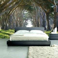
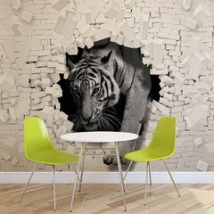
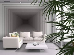
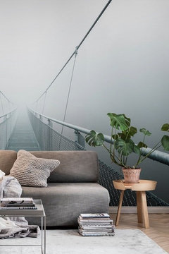
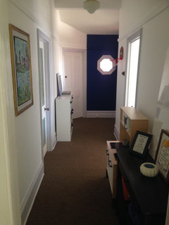
Entrance to house faces a solid wall
diwarwick
5 years ago
last modified: 5 years ago

mirrors
paintings
mural
Featured Answer
Comments (25)

siriuskey
5 years ago PRO
PROMB Design & Drafting
5 years agoRelated Discussions
Help needed please with front entrance.
Comments (39)Thanks Orangecamera. It's still a work in progress and mud everywhere Sorry we did look at having the steps' off set' but it didn't seem to go with only three steps and a small area. And about the zen well the cats are doing that for us much to our disappointment (it's still like a litter box to them). We went to the garden supply place still not knowing what kind of stones we were getting. We stood in front of all the bins (there where many). We even looked at mixing some. The grey stones had a bin more the size we wanted but we ended up getting the golden fleck. It was a little smaller, which was a shame, the bigger ones were so mixed in their grading it looked too messy. So this is what we finished up with. It was seagardens that got me thinking away from grey and nwduck mentioning the drainage. So this has really helped. Also everyone seem to think the wooden steps needed to go a lot lower. Next it's figuring out where the large river stones should go...See MoreNeeding ideas for blank wall
Comments (6)Hi nikki. This post has my creative juices flowing. The vertical space you have in abundance is seldom seen in regular interiors, and I will impart some ideas that I have implemented in commercial spaces. The bookcase is an amazing idea, it will not only solve a storage problem, but will add instant personality and style to your space. Bookcases don't dictate a style, so they are timeless and seldom date. They can be interpreted and styled in many ways so they have flexibility most other pieces do not. The flatpack bookcases come in many sizes, height and widths, so using this to advantage, I would measure the wall to the right of the door, and then mark that distance on the left side also. This is the area I would shelve! Only I suggest full height for maximum effect, and designer conviction! Floor to ceiling, in smaller widths is often featured in your trendy mags, Milans furniture fair loves to set up bookcases that emphasize space and light, the higher the more dramatic and the more customized they appear. Flat pack shelves mean you could afford to do this, and cleverly sort out your best fit scenario. I would even punctuate some of your bookshelf backs wi your accent colours with smaples of wallpapers that feature your accent colours. Places like masters offer free samples of them, or you could even colour photocopy prints offline. Simply temporarily set them into. Backs and display your face objects in these ones. The remaining wall left without shelving, upon entering the room, I would either paint a colour, or line it with horizontal timber planks. ( engineered flooring planks) are cheapest and most effective as their surfaces can be cleaned easily. This will add major wow factor and lengthen the wall visually, it will also clear the entrance sufficiently and allow the bookshelves even more effect. I myself would mirror this section of wall, which would be expensive, but would open the space dramatically, and look super clean. Just remember to leave a shelved area open for your tv, and forward think for another objects like lamps of entertainment units that may need housing. Lastly, depending on your style, I would track down an old painters ladder with cross bracing on eBay etc, and paint it black or turquoise. Lean it (fix it) against your shelving or even blank wall to tie in your amazing new library. Good luck!...See MoreSmartening up an ugly house!
Comments (10)Personally I cannot see what the problem is - I don't mind the presentation. It is not in your face wonderful. but it is never going to be. Its neat and tidy which is really important when it comes to home presentation. I don't like your idea re the bitsy garden at all. It will completely ruin the existing facade. Why not consider a line of pots - big pots running parallel to the wooden fence. The pots need to be all the same - maybe 5 in number. Tall and narrow in shape. Use quality potting mix and consider a native grass in all of the pots like Lomandra Nyalla. This plant will last for years in a big pot and they are tough. But take care of them because if you do this and dont take care of them,. then crappy pot plants are worse than not doing anything at all. Why not remove the lawn that you don't like and use a fine aggregate like Lillydale Toppings with a good base underneath. The effect that I have suggested is neat and tidy but also will give the area a professional, more modern look. If in doubt, leave as is! Alison...See MoreEclectic Elegance Villa Renovation
Comments (0)Brief: The client had purchased a 4 bedroom villa with large proportions. With white walls throughout, and very little existing furniture that the client wanted to keep, it was a blank canvas for design work in all areas of the house. A new kitchen was required to allow the client to enjoy cooking and house contemporary storage solutions. The client wanted to retain the integrity of some of the villa features, yet create a contemporary elegance which was different from a traditional take on design, and incorporated a quirky eclectic feel that could include reference to other eras. They wanted a sense of luxury and surprise incorporated into the design but didn’t want the traditional busy-ness of the Victorian era in which the villa was built but a more uncluttered simplicity. Newly purchased villa Solutions: With the entire house being white, and the existing black painted floorboards and grey carpet, a black and white base to the colour scheme was layered with accents of red and aqua, mixed with metallic silvers and charcoals. The starting point for this colour scheme was a painting the client had for the living area, which had a touch a soft aqua in it. (as pictured below) and we wanted to connect it into the room. A variety of depth of aqua tones were brought into the colour scheme to give it more depth but keep it restful. Existing art work The existing kitchen was dark and heavy and required a complete redesign, but had to fit with the existing large scullery area in behind it and incorporate all the modern storage within. The new design bought together pattern, texture and light. The cabinets above the hobs were printed with graphics on glass which incorporated a large scale traditional pattern and a touch of the soft aqua blue. This pattern on the glass uses a traditional emblem element and plays with scale to contemporise it. The main bench-top and cabinetry were kept light and white, to connect with the rest of the house, and an asymmetrical feature bench-top in Petra Grigio marble was added to balance the asymmetry of thehigh wall cabinetry on the back wall. The feature marble added interest and depth to the island. The high wall cabinetry was kept open on the right, to visually connect with the scullery rather than close it off. The splash back tiles on the back wall and tiles on the back of the island were heavily textured and played with the light to create a sense of interest and movement. The kitchen is situated in a south facing part of the house so it was important to consider reflectance, sheen, and the use of materials that added to the perception of light. The kitchen and scullery floor was also replaced with quirky tiles that played with light. To complete the area, high gloss black glass lights were hung over the island.These light fittings had a large base plate so the framing of the fretwork on the ceiling had to be enlarged to install them. The previous kitchen was flued through the roof on the kitchen side, we took it through the back wall and up through the scullery shelving in order to take it out of sight. The design off the kitchen allows connection to other areas so that while the kitchen is being used by the client, he can entertain at the same time. Before After The dining family area was open plan to the kitchen. A large American ash dining table with a charcoal stain was added with fully upholstered dining chairs, sitting on a custom designed rug. Contemporary cabinets in Resene Black-white sat on either side of the fireplace which had the hearth replaced in a black Basalt and a new gas fire retro-fitted into it. Contemporary chairs and small black leather and chrome side tables gathered around the fireplace sitting on a custom designed rug to provide a comfortable conversation space with out cluttering it with heavy furniture. All the fabrics and rugs pulled together the aqua, black and white colour scheme. Each chair around the fireplace was upholstered in a different luxurious velvet fabric, pulling together the traditional and retro elegance. Before After The formal lounge connected to the kitchen area and the back patio area of the house. The furniture was custom built for comfort and luxury. The fabrics incorporated velvets and texture, and the custom made rug added a high silky sheen to the room. Red was introduced into this area along with the aquas and the black -white base to bring warmth into a south facing room. A black basalt hearth was overlaid on the existing hearth, and the clients existing entertainment cabinet was recoloured to work with the scheme. A large traditional decorative silver framed mirror reflects back to the kitchen connecting the areas. This area provided the client with a spatial sanctuary, but also allowed for entertainment with the connection through to the kitchen and living areas. Before After The entrance hallway had large proportions. New hall lights were added that were made from a contemporary medium of black acrylic, yet were a modern take on a traditional chandelier. The pattern of these lights was reflected in the design of a custom designed hall runner. The scale of pattern oversized to enhance the proportions of the hallway and emphasis the contemporary feel. A touch of red was added in to bring interest into the colour scheme, you can see the formal lounge at the end of the hallway and the red leads you in. There is a real sense of an eclectic mix of scale and over the top luxury in this space. The rug allowed the client to have a warmth and softness on the flooring. To furnish the hall, we had to custom size a hall table so that the proportions worked. Before After The final result is a seemless transition from Victorian through to contemporary, connecting through a variety of design elements and creating the eclectic elegance the client was after. Check out entire project here!...See More
Luke Buckle
5 years ago
Rhonda Whybrow
5 years agoNivannii Rose
5 years agomenonvale
5 years agoellerm
5 years agoscognetti
5 years ago
Fiona
5 years agolegendaryflame
5 years agoNarelle Tooke
5 years agokizza123
5 years agoJasmine Johnson
5 years agoJulie-anne M
5 years agosuancol
5 years ago
KK1000
5 years agoSheryl Wilersdorf
5 years ago PRO
PROCutting Edge Countertops, Inc.
5 years agodiwarwick
5 years ago PRO
PROHelenscolour
5 years agoMonika Kryger
4 years ago- PRO
Helenscolour
4 years ago 
Charissa Stuart
4 years ago PRO
PROFoshan Yubang Cabinets
4 years ago


julie herbert