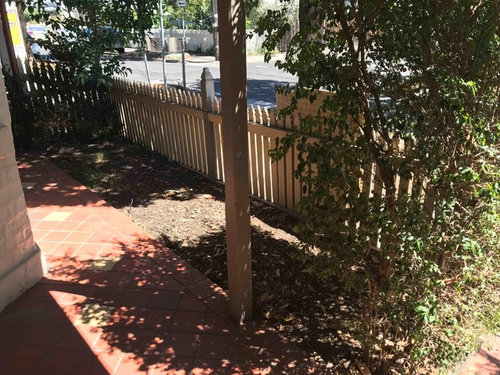
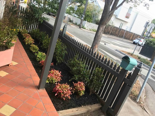
Before and After: A Victorian Terrace
User
5 years ago
last modified: 5 years ago


Featured Answer
Comments (7)
 PRO
PROJamie
5 years agoRelated Discussions
Help to make front porch more welcoming
Comments (47)Thank you so much for your comment after all this time. The colour you have suggested brightens the front door area beautifully and if the two red pots were painted in a tone to match, we think it would look great. Not sure if you can get Crestview doors in New Zealand but there must be something similar. We like the idea of going away from another cedar door - mainly because it would stand out too much while it was weathering. I don't know whether we would have been that brave but the tangerine works so well with the jade green of the joinery. I have re-laid all the stones and put a new wider front step in. The timber colour will soften down in time. I put a big pot in the garden to draw visitors to the front door and have added some colourful bromeliads to the garden alongside the house to make the area a bit more cheerful. We can't make a decision about what to do with a larger 'overhang' to protect the front porch yet - it is a project in progress. Thanks again for your post....See MoreHelp needed please with front entrance.
Comments (39)Thanks Orangecamera. It's still a work in progress and mud everywhere Sorry we did look at having the steps' off set' but it didn't seem to go with only three steps and a small area. And about the zen well the cats are doing that for us much to our disappointment (it's still like a litter box to them). We went to the garden supply place still not knowing what kind of stones we were getting. We stood in front of all the bins (there where many). We even looked at mixing some. The grey stones had a bin more the size we wanted but we ended up getting the golden fleck. It was a little smaller, which was a shame, the bigger ones were so mixed in their grading it looked too messy. So this is what we finished up with. It was seagardens that got me thinking away from grey and nwduck mentioning the drainage. So this has really helped. Also everyone seem to think the wooden steps needed to go a lot lower. Next it's figuring out where the large river stones should go...See MoreDesigning my own
Comments (19)Hello, I don't what to say, I'm really surprised by your generosity and how much time you have put in this for me you. Thank you so much. The kids bathroom design is still up in air too. Their rooms will have windows of course ( silly me ). I love what you have done with the family room. I'm not so sure about the master ensuite. We copied it from the Hyatt hotel where we stayed a couple of months ago( they had 2 sinks though), we loved the fact that the whole family kids adults and pets can take a shower bath together. That's why we liked the tub bath combo enclosure. Your comments about the steam and aroma are very valid that's why I think we will need to have 3 extract fans in there. We are currently living in china but we will be done here within a year. Thanks again for your help....See MoreCurb appeal indecision... advice please!
Comments (91)Sorry I am so late coming to your site - you are an inspiration to all, homeowners and advisers alike. For your planting advice, I suggest you call Merrifield Garden Center to see if they will come out your way. They currently have wonderful garden centers in Merrifield and Fairfax (both in Fairfax County) and a new one in Gainesville, but they may come further south to wherever you reside. (www.MerrifieldGardenCenter.com) Even if they don't send designers to your area, they are worth a trip to see their huge selection for a day of pleasure and inspiration, or to pick up some plants. Most of my clients are in the Fairfax and greater Washington area, but I am currently living out west below Front Royal, VA on the Shenandoah mountainside - wonderful views. cascio.offsite@gmail.com...See More
Allie Broadland
5 years ago
Celina
5 years ago PRO
PROEmily Mboya Interiors
5 years ago- PRO
User
5 years ago 
annb1997
5 years ago


Annabel Sullivan