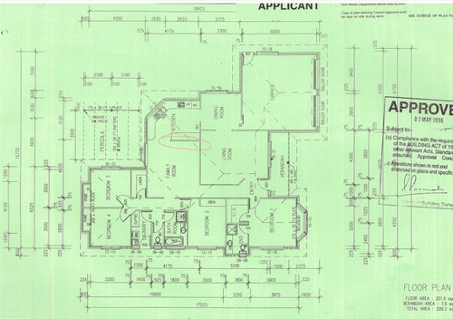
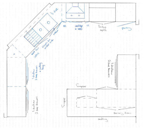
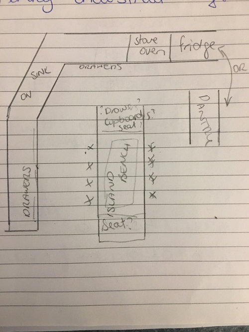
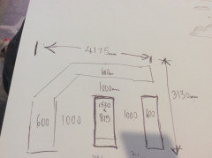
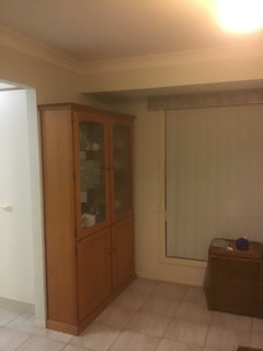
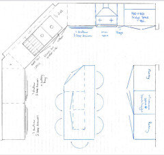
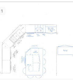
Never reno’d and I’m struggling. I appreciate any advice, thank you.
Tracey Duggan
3 years ago
Featured Answer
Sort by:Oldest
Comments (20)

User
3 years agodreamer
3 years agoRelated Discussions
Help needed please, how should I design a garden around this.
Comments (10)Wow!!! thank you so much for responding and for the ideas. Cyn222 I love your drawing of the area I think I might try that one in another spot , I wanted to have an area for a memorial seat, your drawing looks lovely and I think it’ll suit a spot just up the path. It’ll look down over the pond. I'm going to have to work out plan as I learnt that lesson once before. lol. I did wonder about a swing, the large tree sits on the top of a bank, it then goes down about 8 meters. It’s reeeeeally steep. I do like the idea of secret gardens and seats along the tracks. I was tossing up about a waterfall over in the far corner. Since the water flows down a stream and then though the overgrown swamp at the bottom. Gez I wish money grew on trees, lol. Actually I call them ponds but they are really dams on a natural water way. Decoenthusiaste, Thank you, you made a very good point about starting with the ponds and working out. I think you are right. It’ll probably take me awhile to tidy up the area. I’ll also have to check what kind of wild flowers are around as I'm sure there must be some. It would look nice with a bit of colour, I never thought of that. The ground down at the bottom is swampy like wet lands. I also wondered about board walks through it. We are building soon on the land, so this will be the back yard. There is also lot of native bush. Here’s a photo from the side of the pond. I’ll have to get it cleaned up somehow and figure out the best way to improve the water quality. If I start with that 1st, and then do the memorial garden I can then work from there. Lol I’m keen on getting the ashes out of the cupboard. Thanks, you both have given me direction, I appreciate it....See MoreWhat colours do I use?
Comments (57)Hi anne, that's what I was originally thinking, my issue is what colour I use for the 'pop' :) I keep coming back to a teal/turquoise colour (it's one of my favourite colours!!), I love blues, purples, teal/turquoise - many on here have suggested yellow but I'm really not sure about it. Here in New Zealand we're in Autumn, nearing Winter so uncertain about the yellow. I found these cushions that I've fallen in love it, and wondering how I could make these work.. do I try teal and mustard together, as an interior designer suggested?...See MoreANY SUGGESTIONS PLEASE WITH MY LONG DARK HALLWAY
Comments (5)Hi eclipse 66 I'm sorry to hear about your break in. This is quite tricky to picture as I wasn't certain which walls related to which, but I will give this a go. I wonder if your ceilings are around the 2.4mtr mark, as your doors suggest. Although you have many windows that are probably floor to ceiling, each room is sectioned off by this central corridor, so no real natural light gets down there, is that right? The little natural light that might filter through would be absorbed by the walls, and the colour you have on these walls would not be easily seen. Without. Sounding too mainstream here, I would absolutely paint an offwhite wall the entire corridor and each adjoining living area off that, with exception to your kitchen. All ceilings purest ceiling white along with the window frames and all internal doors. The walls in a satin finish to help the light reflect a little, and move around the wall without being too shiny. You haven't mentioned your floor? Try to keep it consistent in all the living areas including your hallway, and only carpet the bedrooms as these doors would be closed often. With the door filled hallway being a white gloss finish, and a white ceiling in a flat white, the walls will feel a little warmer in comparison, although still a white, perhaps something like a hog bristle 1/4 strength by dulux. In your main living room, and kitchen, paint the hog bristle in full strength, so it feels warmer, as these spaces flow onto each other, feeling larger as a whole. With your doors being so tall, (or the ceiling being comparably low), hang your window rods if any right at ceiling level, use a sheer curtain that even when partly closed let's light filter through, they dress the window but won't block light, for that install roller blinds that will roll right up exposing as much daylight as possible, and if privacy is a factor, the sheer will provide a buffer and still seem light filled. Even if these are never used, framing the window will place an emphasis on the window frame, and more importantly the light they provide, swell as an illusion of vertical space even without it. Aother suggestion for that hall is to use this principle to heighten the ceiling, visually, is to use lining boards vertically, or a wallpaper with a strip or vertical print. Drawing you eye upward toward the end, with a wallpaper, I'm thinking of one I've seen many times over, it's a white or cream background, with an image of birch trunks, the base or top of the trees arent revealed in the picture so it doesn't make the space feel from a low or high perspective. This would provide a creative distraction to the corridor, evoke a feeling as you have walking through a beautiful place, and is graphic but still very neutral. You can even paper you doors so when they're closed, the hallway won't feel so busy. I would remove carpet in the hall if you have any, because a warm closed in space without proper airflow, or light feels stuffy, and carpet absorbs sound and lint, where floorboards or hard surface atleasts has a sound walking down it, which amplifies noise and feels bigger again by comparison. Against this neutral, cohesive space, your furniture andpersonality pieces can really stand out, particularly the red. I would also use this in the kitchen somewhere, maybe a gingham check fabric on the kitchen window or just your accessories. The less is more theory also extends to colour, particularly in smaller busy spaces, minimize these elements, like the repeat of doors and architraves on your walls, by tying them in with single colour, and keep your decorations either in a theme or single colour hue. Scatter your colour around so visually you have somewhere your eye is drawn to around the space. If you get pictures I will know if I'm way off track, but if any of them resonate with you, then great. Good luck. Ml design...See MoreHelp! I think i made a mistake with my splash back colour!
Comments (46)The blue is awesome (grey is too trendy)! The reason it stands out to you is perhaps because it's the only real colour there. Bring in the blue in a window treatment, a small appliance that sits on the counter, a pretty tray or area rug. Also, it is more appealing often if there are more than 2 colours - so right now you have a white and blue colour scheme - bring in red or orange or fushia - something from the other side of the spectrum (like you did with the yellow flowers but in a more permanent way)!...See Moredreamer
3 years agooklouise
3 years agoTracey Duggan
3 years agoTracey Duggan
3 years agoTracey Duggan
3 years agooklouise
3 years agooklouise
3 years ago
Kate
3 years ago PRO
PROCompass Kitchens
3 years ago
siriuskey
3 years agome me
3 years agoTracey Duggan
3 years agodreamer
3 years agoKate
3 years agoTracey Duggan
3 years agodreamer
3 years agosiriuskey
3 years ago


Tracey DugganOriginal Author