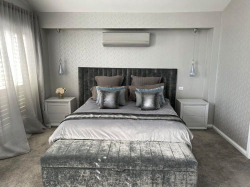
Before & After: An elegant bedroom
Lets See Design
2 years ago
last modified: 2 years ago


Featured Answer
Comments (17)
Related Discussions
Neglected bungalow given a new lease of life - before & after
Comments (2)Wow! what a stunning transformation...See MoreLook at this Before & After of a Master Bedroom in New Zealand
Comments (0)For this before and after, these clients were interested in maintaining the integrity and character of the home but incorporating modern and traditional finishes. The house featured pressed ceilings in the bedroom, which gave the room a grand appeal. This feature was retained as it was beautiful and kept the character but paired it with a more contemporary bed to modernise the space, and changed the spatial layout. We layered the bed with different colours, textures and patterns to create more interest. The light fitting was replaced with a modern twist on a chandelier. Before After Let me know what you think!...See MoreThe Bathroom Project of our Dreams - Before & After
Comments (2)Your client putting trust in you was the right decision! amazing transformations! Love the natural light in particular as thats a great spot for a post gym pump flex for a good selfie!...See MoreKitchen Makeover - Before and After
Comments (0)Miramar Kitchen Makeover Getting from a Then to a Now takes commitment and we could not be happier for our delightful clients. They tell us they pinch themselves every morning and what an utter privilege it has been to contribute to a space filled with joy. Before: After: As with any meaningful transformation, this one started with thoughtful consideration of space planning. This previously busy space now feels relaxing and spacious whilst also adding a laundry, having more kitchen storage AND accommodating uncluttered display features. It's a great example of the power of a good layout and bringing in the light :-) Before: After: One 21sqm room contains three zones that are cohesive but also occupy a distinct space practical for their function. The new kitchen layout is a galley (meaning no corners), the dining table that was against a wall is now centralised giving access from all sides, and a laundry occupies a corner formally filled with unused fireplace. Before: After: The new layout is a galley style kitchen with the main benchtop extending the full length of the outer wall. It comfortably accommodates space for a long working bench, storage cabinetry, main kitchen appliances, as well as the contained laundry unit. No corner goes wasted with this particular layout. Tall elements such and fridge freezer and pantry are located on the opposite wall so they don’t block light or views. Adjusting the existing windows allowed for maximum bench space and a clear wall for cabinetry, hob and extractor as well as a succinct shape for a feature tile. Before: After: The former kitchen and dining room didn’t utilise the space as efficiently as it could. We removed the fireplace, reconfigured the room layout, added a laundry, tweaked existing windows to allow for a more open and accessible kitchen design and brought more natural light into the space through skylights. Before: After: NEW LAUNDRY The ‘Laundry in a Cupboard’ is in an accessible area with plenty of room around it when in use but able to be shut away and appear as one with the kitchen. SPECIFIC FEATURES • Enclosed cupboard space to fit washing machine and ventless dryer. • Space to accommodate a dirty laundry basket and a laundry basket for clean washing. • Tall and narrow cupboard for ironing board, floor mop and Dyson vacuum cleaner. • Higher additional shelving for infrequently used storage e.g. Christmas decorations. Before: After: SKYLIGHTS The wall was able to be used by deleting an ineffectual window and raising the height of another so a bench to run underneath. The natural light was generously supplemented with the inclusion of three fabulous skylights that bathe the whole space in light. Before: After: For this kitchen, the transformation was quite remarkable. The room went from a worn, dim and makeshift set up to a well functioning, modern and attractive space. Before: After: DISPLAY SHELVES The display shelves on the cabinetry corners facing the table create a comfortable feeling for dining, enhanced by the low feature pendant over the inviting round table. Before: After: AESTHETICS The overall palette aimed to be refreshing and a balance of pretty and smart. Some of the key features: ‘Contemporary character’ achieved through matte surfaces and clean lines. Precise, elegant and simple cabinetry. Colours and materials that balance fresh light walls bathed in natural light with cool and warm in balance. Cool tones from the subtle sage green/grey coloured cabinetry and detail in the marble splashback tiles Light, warm timber tones used on floor, furniture and joinery details. Before: After: PENDANT having low over dining table helps to create an intimate gathering space in an open plan area Before: After: OPEN STORAGE The custom timber joinery designed for the tall open shelving unit and above the sink visually create a sense of the space appearing larger. Purposefully placed on the corner of a block of cabinetry, the tall open shelving doesn’t completely block off the view from the dining area. At the same time the open shelving is useful for placing items and small appliances that are frequently used, adding to the range of storage possibilities within the space....See More PRO
PROLets See Design
2 years agolast modified: 2 years ago
C P
2 years ago
Kate
2 years ago
K s
2 years agorobandlyn
2 years agoC P
2 years ago- PRO
Lets See Design
2 years ago C P
2 years agopottsy99
2 years ago
Mark Dennis
2 years ago


pottsy99