Transformation of a Dark & Dingy 1960s Apartment
hatch interiors and design
2 years ago
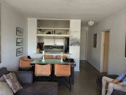
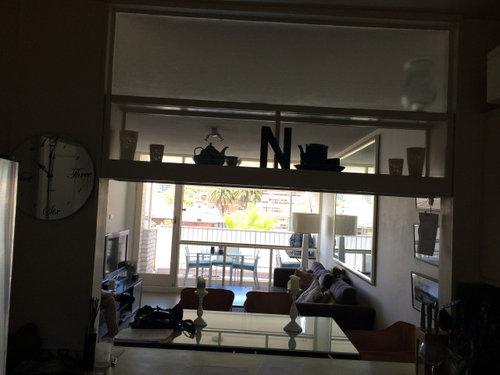
Our clients came to us wanting to renovate their small 1962 apartment which had all the features typical of the era such as a red brick exterior and a very closed-in floor plan.
The brief was to modernise whilst keeping to the classic nature of the building itself. Opening up the kitchen, hallway, and doorways to create a super light space with exceptional storage for a small (65sqm) apartment.
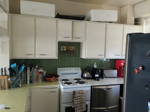
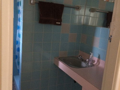
Before:
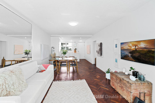
After:
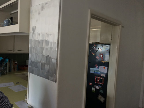
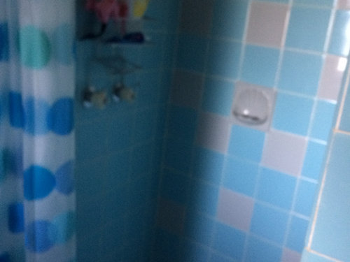
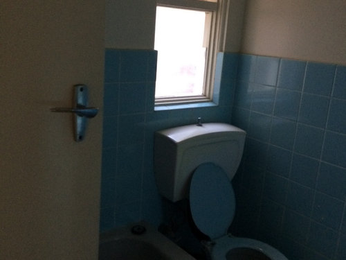
Before:
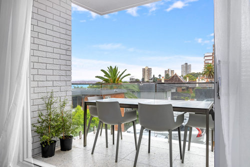
After:
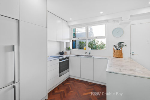
Walls were removed and doorways made wider and taller, adding barn doors to maximise space and create great natural light flow throughout the apartment. Herringbone timber floors were laid throughout the living areas creating warmth. The look was clean and fresh with timber flooring, white walls, substantial cabinetry, and gorgeous marble bench tops. Terrazzo tiles, a large stacking slider, and a glass balustrade were also added to the balcony further opening the apartment up to the North East light and beautiful harbour views.
Before:
After:


Before:
After:


K s
Asif Ali
User
Aus Joinery Kitchens Pty Ltd