row_014

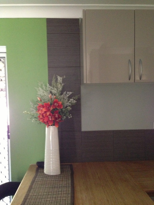
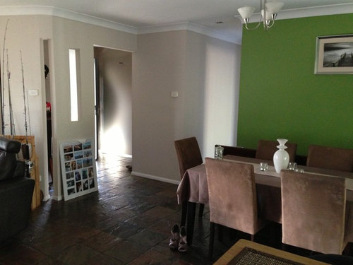
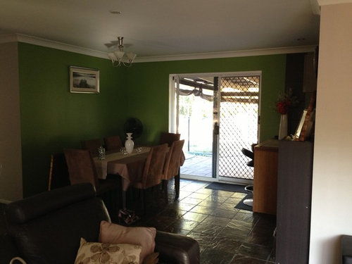
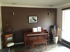
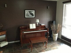
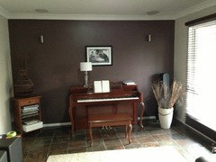
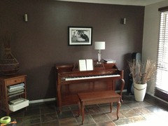
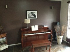
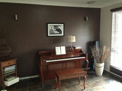
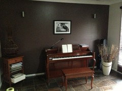
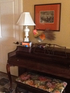
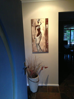
Should I paint my green wall?

row_014
10 years ago
I quite like our green wall but don't like it clashing with our table and chairs. What colour should I paint it? As you can see from the pics, the feature wall in the lounge room is purple (coffee house by taubmans). Other walls are Dulux river rock European stone. The kitchen is grey. My first thought was to paint it a similar colour to the kitchen cabinets (with a slight purple under tone) but I'm worried it will look boring and too much purple. What do you reckon?

Comments (229)

  • row_014
    Original Author
    10 years ago
    Hi all, sorry for neglecting this. I've been so busy! Will try lamps on the piano tonight. Also I was thinking three small pics in a vertical line for where I changed the mirror to? I really don't like it there, it doesn't reflect anything nice at all. Will lower our wedding photo tonight and also swap it with a sepia one we have to see what I like best

    Thanks for all your comments so far, it's been great! When I get 5 minutes I'll have a look around for a frame for the green wall pic. I was thinking dark brown to match the table and sectional?? I think black would be too stark? Also want to convince hubby about getting a fan with a light over the table. Do you think I should go minimalist with the fan or make it a standout feature?
  • row_014
    Original Author
    10 years ago
    I like something like this but can't find any with lights on them. Do you think it would go with the rest of the room?

    http://www.ozlighting.com.au/Hunter-Pacific-Majestic-Little-Bay-42-Celing-Fan-P2153.aspx
  • Related Discussions

    What colour should I paint the wall behind the table?

    Q

    Comments (6)
    I love your outside entertaining area. It does need a color that would complement but give the area a focal point. I like the darker red,orange colors you may find in natural. You could dress up the table with accessories and place cushions in a complimentary color on the benches. Colored potting containers would also bring it all together. I like the uplighting here in the photo you could place along the back fence to add drama. Your area reminds me of Modern mediterranean landscaping.
    ...See More

    What colour should I paint the small wall?

    Q

    Comments (7)
    May I suggest a cap of your pavers on the wall and the a slightly darker gray that relates to the privacy fence beyond? That way horizontal surfaces and vertical surfaces show similarities and blends/blurs the separations?
    ...See More

    What color should I paint the back small wall?

    Q

    Comments (9)
    As the appearance of the garden has a modernist style with the straight lines and concrete furniture how about a Mondrian influence and add a bold strip of blue? It is a pond and with the right shade it could look really relaxed and contemporary. My daughter's suggestion is a chalky lilac!
    ...See More

    How should I reduce echo in my tiled bathroom?

    Q

    Comments (2)
    Hi there, this is very touch. But you have discovered the base principle already, soft materials or materials with a lot of surface area absorb the sound. Just shooting out some quick ideas here for you: A soft and thick rag or bath Matt on the floor. Curtains are a good sound absorber, but not to much in a moist bathroom. Potential mold issue ;-) Another idea could be to hang bathrobes on hooks or a fabric laundry hamper onto the back of your door. If you find its still not enough.... since your walls are already tiled. you could do something on your ceiling... like a timber slat ceiling or a painted plywood paneling with holes in it. Make sure you use polycaprithane paint for moisture protection on the timber.... hope this helps. If there are questions or you need more help, feel free to send me a message. Cheers Gunnar
    ...See More
  • row_014
    Original Author
    10 years ago
    Ok. The pic dropped and also a sepia photo. I like the black and white better. Makes more of a statement
  • row_014
    Original Author
    10 years ago
    Would something like this work on my side wall? Both are hanging sideways lol! Or do I need three pics/art? Or go wider?
  • row_014
    Original Author
    10 years ago
    Or like this?
  • row_014
    Original Author
    10 years ago
    Can easy paint frames/ buy new ones. All black would look good?
  • classicinteriors
    10 years ago
    accent walls quickly become accident walls if the colors around them don't work. accent walls usually work best on a wall with windows. your wall I am sad to say is an accident wall. I love your floor. Work with some colors that work with the floor for all of the walls.
  • row_014
    Original Author
    10 years ago
    ndmoore5 - are you talking about my green wall or the purple one or both?
  • row_014
    Original Author
    10 years ago
    Some lamps... Not sure that any of them look that great
  • row_014
    Original Author
    10 years ago
    Another one, can't actually use this one coz its from our bedroom. Just giving you an idea of a taller lamp
  • row_014
    Original Author
    10 years ago
    A cream lamp - I don't like it
  • row_014
    Original Author
    10 years ago
    The only desk lamp I have. This gives the best light for the piano and I think it actually looks ok!
  • bellesum
    10 years ago
    Try it at night. I bet the desk lamp works the best for your purpose.
  • Catherine Giesige
    10 years ago
    The taller lamps look great, but you will need a functional lamp. Perhaps, use the desk lamp until you find something that looks a little better. I like the black and white photo better also. When I'm looking for frames I always check the op shops first and don't forget a can of spray paint can come in handy too.
  • bjohnson55
    10 years ago
    The picture on the wall caught my attention first. It seems too high on the wall.
  • leelee
    10 years ago
    There's a thing called a piano lamp for a reason. Also, in case nobody's mentioned it...your picture is too high.
  • row_014
    Original Author
    10 years ago
    Ok so is pic still too high?
  • row_014
    Original Author
    10 years ago
    Even after I lowered it? I thought pics should be at eye height (which means I should actually lift it from where it is now)
  • Catherine Giesige
    10 years ago
    I would leave the picture where it's at for now, if you are going to be doing a gallery there.
  • Rina
    10 years ago
    The placing of a picture depends on its context. Hung on its own, eye height is usually right. But when it's above a piece of furniture it should 'hug' it a bit to form a single (two-part) visual unit. Otherwise it looks as though it's floating. Size and shape, and the image in it, can also have an influence on what looks best.
  • row_014
    Original Author
    10 years ago
    It's hung on fishing line off the original hook so it's easy to move ;)
  • PRO
    Resource Art & Design
    10 years ago
    Ok, I guess you're not moving your organ... Now I see your windows and true size of sectional, the sofa probably wouldn't go against the window anyway. Frankly, I liked the sofa where you had it when you first moved in...left corner on purple/ cream walls, because I wouldn't consider the piano the focal point of the lounge. When you have company over, walking in and seeing people sitting on sofa across the room would be my priority. BUT...
    Never mind :-). Let's talk about your wedding picture over the piano. Several of the above suggestions are good but would cost you -photo ledge, buying lots of frames, etc. I would put the money into an even larger version of the "fishing place" art, do a gallery wrap since a frame and matting will cost you big-time. Maybe frame it later if you want.
    Sorry...got distracted;back to wedding picture...So put a lamp the size of your bedroom one on LEFT edge of piano top, about 8" in from edge. [did you happen to sit at the piano with the lamp turned on? You won't want a light bulb glaring in your eyes. Maybe have hubby hold lamp at varying heights so you can get a feel for the height. ]. Remember, this is your lounge...don't pick a lamp that looks too office-like. Hang the wedding picture slightly off center on the piano to the left and LOWER still than it is. How low? Seated at the piano, you should be able to see all of it, including frame over the music stand -just by a couple inches. You are dealing, as Rina is trying to get at, with a furniture grouping that includes the piano, lamp and wall art. It needs to metaphorically "hang together", without pieces (your picture) floating at some arbitrary eye-level place. If you're walking down an empty hall, then eye-level might be a consideration. But anytime you place art near something - a sofa, a table, even a window - the objects need to have a relationship. [I assume you are hanging the picture on fishing line til you decide on a final location?] Another comment re pix between your windows... Good composition with smaller pix top and bottom of larger, but...ideally, those little pictures should be bigger. Think IMPACT; the pictures are supposed to be Art, not just family pix you've stuck to the wall. As they are now, they might be better on a tabletop. But you've got a good concept so just think a bit more impact. Or live with them till you have a couple more fishing locations you'd like to print out...how bout cute pix of you and hubby...8x10" then frame those to 10x12".
    Glad you're overhead fan hunting. I would keep it simple so your art work and maybe a table runner will be the star of the space. Will see if I can dig up photos of arranging lamps with pictures over a table or flat surface.
  • PRO
    Resource Art & Design
    10 years ago
    Did a quick mock-up in my basement of grouping things so taken together, they create an entity.
  • row_014
    Original Author
    10 years ago
    Resource Art & Design, thanks for your very wise advice. And your pic helped explain it all!

    Now I've got a heap of good ideas from you all I need to go and spend some money. Will let you know how I go. I'm focusing on my CPA study for the next four weeks until my exam and then I'll get stuck into it! Thanks again everyone! And if any of you have some great brainwave for me, please post!
  • PRO
    Resource Art & Design
    10 years ago
    Best of luck on the exams...nose to the grindstone!!
  • row_014
    Original Author
    10 years ago
    Snapfish have got 60% off canvas prints ending today so I'm going to bite the bullet and get a 100cmx75cm canvas print gallery wrapped for the green wall :)
  • row_014
    Original Author
    10 years ago
    http://houzz.com/discussions/669954

    If you wanna chime in with ideas for my bedroom please do!
  • colournut
    10 years ago
    Your green is beautiful! Have u considered covering your chairs in a bold patterned fabric that marries your green and purple? Then yank off your tablecloth and show off the surface - could be fabulous!
  • row_014
    Original Author
    10 years ago
    Baby steps. I just got a new piece of art for the entry. I love her!!!
  • row_014
    Original Author
    10 years ago
    Canvas on the wall now... It's not standout awesome but it's a place we love and hubby is always looking at it (prob wishing he was there fishing and not at home!)
  • Rina
    10 years ago
    It's lovely, Row, the colours are perfect and it's unique and personal and makes hubby happy. Jackpot.
  • PRO
    Resource Art & Design
    10 years ago
    I really like it too!! Ties in nicely with brown chairs. Maybe it's the angle of the photo but it should be centered on the wall; can't tell if it's a TINY bit too high...2"?
    Hey! Aren't you supposed to be studying? :-}
  • row_014
    Original Author
    10 years ago
    I took 5 minutes off this morning coz the table was tidy :P and took a pic. The big day is tomorrow. Yikes!

    The art is centred on the wall but the table cant be. Prob what gives the illusion of pic not being centred. Here's a straight on pic. Does it need to go a tad lower?
  • Rina
    10 years ago
    Yes, a tad lower. Break a leg tomorrow.
  • PRO
    Resource Art & Design
    10 years ago
    Table is fine. Picture will be perfect once lowered a bit. And yes, good luck tomorrow. Stay calm...the info's all there in your head. You'll do great.
  • bellesum
    10 years ago
    Best of luck tomorrow!
  • row_014
    Original Author
    10 years ago
    I'm back again :) exam went better than expected. It's a relief that its all over!
  • row_014
    Original Author
    10 years ago
    Ok, this isn't my green wall but since we've talked about this in this post I'll add it here :)

    I dropped the wedding pic (and it looks better! surprise surprise!) and bought black frames very similar to it for the sides. What do you think of the layout? The height off the piano? Should I keep the pics in the width of the piano or is it ok to go outside like I've taped?
  • row_014
    Original Author
    10 years ago
    Keep it in the width of the piano but mix up sizes a bit more. Like this? http://houzz.com/photos/367785
  • Catherine Giesige
    10 years ago
    Hi Row. I really like the canvas in the dining room and think all the colours look great. I'm not a fan of the frames in a single row above the piano and think you need to arrange them in a block, similar to your inspiration photo. Oh, and your lady looks fab in the entry. Glad to hear your exam went well :-)
  • row_014
    Original Author
    10 years ago
    Thanks Cathieg! I started a discussion for the collage. I've rearranged, what do you think?

    http://houzz.com/discussions/700721
  • lazyks
    8 years ago

    so many comments I skipped a few (lots) so I could get to the end. I am wondering why , instead of art work on that green wall you don't put up a large timber framed mirror which would bring light in and throw it to the kitchen? Yes to table exposed with a bamboo or sisal runner.

  • PRO
    Helenscolour
    8 years ago
    I agree with Bellesum, the grouping of white matt pictures on the green wall look great! If you ever decide on a change from the trees, this should be the plan!
  • buffpoint
    8 years ago

    Nothing wrong with green, however perhaps something a little less intense. Sage is beautiful a bit more of grey undertones. I see you have slate on the floor, try to pick a colour out from that and use it on the wall. One other thing, lower the print on the wall it's far too high and possibly a little too small but lowering will help.

  • pascoeyvonne
    6 years ago

    My house, built in 2003, has purple feature walls in the dining room and 2 bedrooms and green feature walls in 1 bedroom and 2 living areas. That was the fashion then. Recently I decided it's time for an update as the feature walls seem to be absorbing all the light and making the house very dark. So far I've undercoated 2 of the feature walls and what a difference it makes! The rooms are much lighter and now I have to decide on whether to add a lighter colour as feature walls or paint them the same colour as the rest of the room.

  • Anne Love
    6 years ago

    You need to work out what aspect the dining room is facing. I get a feeling it's either South or East, so hence the colour is too dark for a space that doesn't get much light. Go for a lighter colour to reflect more light into the space. I like the green colour but feel it doesn't go with the brownish chairs or table. Work out what is your favourite colours and and go from there.

  • LesleyH
    6 years ago
    2013 post.
  • m_mdimond
    6 years ago

    I am sorry but by the look of your photo the green is too dark with the rest of the pic I think if you like green go for a softer avocado green to make the whole area lighter then take on the suggestions you like from previous contributors, just my opinion but I really think the green is too dark for the area and softer but still green will bring a more lighter look.

  • m_mdimond
    6 years ago

    Well it may be an old post but advice may help others form making the same problem if they read alternatives that may work better, we keep learning no matter the year or date.

  • carmacat1
    6 years ago

    I used Taubmans "Split" which is a earthy green & I loved it!