The influence of light both natural and artificial light..how to use
This may have been covered already; if not it may be a suitable topic for general comment although I'm not in a 'dilemma' - but I'd really like to see some discussion from anyone interested. I live in New Zealand although I was born and raised in England - these 2 countries have totally different climate colours as it's possible the East coast has from say the West coast in North America (?). I'm aware now of being careful when using certain interior colours about how they may not suit outdoor 'palettes'. For example I used a saturated burnt yellow colour wallpaper from the UK (Osborne & Little) mostly due a room not receiving much morning light. Now if i lived in the UK that colour was fine as the natural light is subdued and as such the colour could create a warm feeling especially at night. Most people when they heard it was yellow though it was an awful choice! I disagreed and maybe I'd call it distinctive. If I had a glass wall however, overlooking an almost completely green aspect (countryside etc) i know there is a risk of the green influencing the yellow (to my eye) and making it more of an acid colour. Using this same wallpaper in California sunshine would most likely be a sensory overload. One of the most tranquil elegant rooms I've seen recently is by www.greencouch.com or Houzz link here:
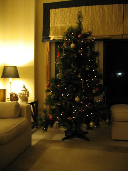
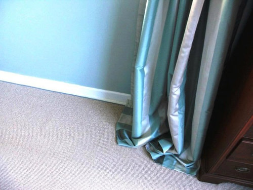
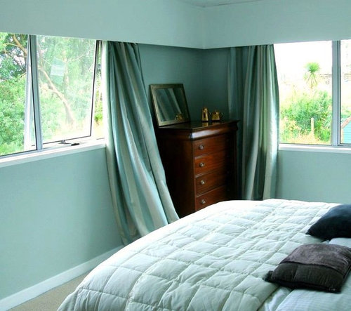
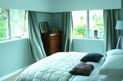
. I'd really like to know what the type of light is outside this dwelling; I'm sure though even in bright sunlight this room would look the similar. I've attached some pictures from my old townhouse to give an idea of how the yellow worked (sorry the only ones I have are from Christmas time lol). I've now moved and am renovating an older villa with wooden floors and am having to try so many different colours. The sample picture of these grey/blue/cream striped curtains were originally for a living room. This room has two Williamsburg candelabra with incandescent bulbs, so 16 bulbs in total. The curtains looked great in daylight. As soon as the lights went on at night they became a 'sludge colour' and really dull..so hence my questions. The pictures are a bit rough sorry Are there any set rules that can be applied here? As said I'd really like any or all comments
Comments (8)
 PRO
PROLisa Hoyt Design
10 years agoNot sure what you are asking.. The room is hard to see. So, I think I am hearing you ask, what color should I use in this room? And that you have learned that color changes with how much or how little the light is in that space both from outside and inside influences. You are correct on this point. I learned about color in school and it DOES change in the room it is in due to the light hitting the color on the walls. Yes! So, the way you work with this dilemma is that you try many colors on that particular wall and walls in that space until you get the color you like in that space. We as designers have to do exactly the same thing. Lots of times we will use a more muted color on the walls and let the flooring stand out or allowing the furnishings to take charge color wise. Or possibly all the accessorizing including rug, pillows, art or a chair or two take on brighter tones. There is a saying, "that is why God made the elephants large (grey or muted) and the canaries yellow (the color)." It is the same in a room. The large pieces and possibly the wall colors, need to be muted and the colors added in with the rugs, pillows, artwork, and accessories. It always turns of elegant and high end then... Hope this helped.... :) Best! LisaMichael Garrett thanked Lisa Hoyt Design PRO
PROCreative Lighting
10 years agoThe natural sunlight holds very blue, cool tones (color temperature is about 6500K). Often when we add incandescent light ( color temperature is 2700K) which is much more yellow, the colors in our homes shift, often in ways we don't like if we are using blues or cool colors. Try using LED or Fluorescent light in your home that holds a cooler color temperature....look for something in a 3500k. This will help get rid of the "sludge" feel.Michael Garrett thanked Creative Lighting
Michael Garrett
Original Author10 years agoHello Lisa..thanks for your comments - so kind of you. The pictures are not good (sorry) and to be honest whilst I'm renovating I don't have the courage the post much at all ..well at least until it's finished but here are a few enclosed. My real idea is to get a discussion going that we might all enjoy. and yes how light strikes (as in angle?) can impact on even the paint colour etc. I see so many questions from readers about wallpaper paint colour etc and yet experts and skilled people such as yourself will know that it's the cohesion that has to work and light can play such a huge part. A wallpaper can be purchased and then prove disappointing if used in different a light as can paint - which is why we use your good services where possible! I've a pile of boards each with different colours (I use linen style artists boards as I can shift them around - I leave a white border on them to allow a suitable contrast) The small bedroom picture with the striped curtains was more to show that curtain colour - it's now blended with duck egg blue paint (sorry it's a New Zealand company called Resene's so it won't be known of there but called Robin's Egg Blue), ivory carpets which I had edged in a green/blue wool. Before these drapes (Laura Ashley) were in a different room and just didn't work. The bedroom hasn't been finished (See? I'm still a tad embarrassed) but I mentioned these as with incandescent lights this curtain colour did not work at all. Taking my courage in both hands and uploading a picture of the main living area which is to be painted next to do away with the strong saturated green..very dark and gloomy as the natural light is very limited. Hoping you can't see the paint splotches on the wall. Another lesson I learned is to paint a surface white and THEN paint the choices. If we don't do this the original surface colour 'bleeds'. So I really hope to have others including myself recognise that we have to have one eye to the climate and outdoor colours all the time as well as the same paint colour possibly being different from room to room. Regards...and thank you once again for taking the time to reply.

Michael Garrett
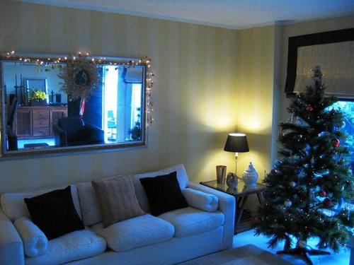
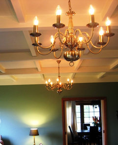
Original Author10 years agoHello 'mfwolfe'...good that you've got a similar awareness, which is what i am hoping for within any discussion that occurs..Lisa has given some guidelines as has 'Creative Lighting' all of which can help me. It's good to see some actual physics come into play e.g. the rating given by Creative and it's given me a key to so much that I can now work with; I could have researched sure but wouldn't have known where to start. The 2 (rough) pictures above will indicate the lighting colour- if you can forget the green - why the red/taupe/cream stripes work better. Warm colours. The walls will be a parchment or beige colour - hard to describe but I was looking for a natural stone look.Michael Garrett
Original Author10 years agoCreative Lighting..thanks so much. There is enough of a pointer in your reply to lead me on to more study. Very generous.- PRO
Lisa Hoyt Design
10 years agoYou are very gracious! Thank you for your response! You are right! The information you found about incandescent lighting was very very helpful! This is making a huge difference having this fact. But it will take all this trial and error and work to get the right colors for your color palate---- that you will enjoy in that space for a long time to come!! Looks lovely! Thank you for showing us all! Glad I could weigh in! Wishing you lots of good luck with this renovation! You are doing great! Thanks! LisaMichael Garrett thanked Lisa Hoyt Design - PROMichael Garrett thanked Creative Lighting


mfwolfe