
Architecture
4 Fabulous Backyard Home Offices of US Architects and Designers
Tour the personalised home studios and sheds that four Houzz pros designed and built themselves

Today more than ever, being able to work effectively from home is essential, as numerous offices remain closed, many schools continue with distance learning and multi-generational households become more common. For those with the space, a backyard home office could be the perfect solution.
Take a look at the following four freestanding backyard studios, all of which serve as the full-time office (and sometime guesthouse) for the USA-based designers and architects who designed them. From a converted blacksmith’s premises to a modernist shed, these designs show just how practical, stylish and creative an outbuilding can be.
Take a look at the following four freestanding backyard studios, all of which serve as the full-time office (and sometime guesthouse) for the USA-based designers and architects who designed them. From a converted blacksmith’s premises to a modernist shed, these designs show just how practical, stylish and creative an outbuilding can be.
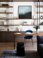
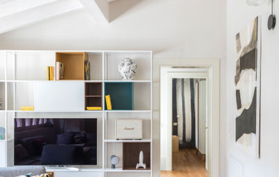
Mennes’ office sits off the entry vestibule and next to the work space of her husband. The office walls and ceiling are white panelled wood. Exposed reclaimed-oak beams provide some structural support, but they’re mostly decorative. Mennes looked to both America’s East Coast farmhouses and Scandinavian style for inspiration. “The office is simple and utilitarian,” she says.
Built-ins and organised storage contribute to the clean, functional look. A local builder designed and installed the 3.6-metre-long floating pine desk. Floating shelves are made from MDF painted to match the room.
Plain white binders and boxes store materials and office supplies for the firm. A pegboard wall holds architectural tools, and white filing cabinets offer additional storage. “The idea was to hide everything in the white storage wall,” says Mennes. A leaning ladder with wire trays holds the materials and paperwork for the firm’s current project.
The flooring is bleached oak and does not have radiant heating. “We do have a little Panasonic heat and AC unit in the main office. We tend not to need it,” says Mennes. The new shed’s tight envelope and the radiant heating in the other rooms keep the whole space comfortable.
Chair: Jens Risom; wall paint: Cloud White, Benjamin Moore

Need a pro for your architectural design project?
Let Houzz find the best pros for you
Let Houzz find the best pros for you
This space, adjacent to Mennes’ office, is where her husband sometimes works and where guests stay when they visit. Designed to be a warm and cosy space, it has wood-panelled walls and soft textiles that contrast with Mennes’ starker office. The wall panelling is a mixture of purchased reclaimed planks and wood pieces salvaged from the demolished barn. The vaulted ceiling uses the same reclaimed beams seen throughout the barn.
Other amenities, including a cushy fold-out sofa, a plush Moroccan rug and a wall-mounted TV, make the space an inviting place to work and for guests to relax. Five-centimetre-thick cuts of hemlock timber, left over from the barn, form the built-in floating wall shelf. Spacers a little more than 2.5 centimetres thick create small storage cubes for a record collection, a mini-fridge and other decor. Instead of a table, this built-in unit stays tight against the wall. “It’s a really efficient use of space,” says Mennes.
Keen to refresh or build your own granny flat? Find an architect near you on Houzz who can navigate council and design your dream studio
2. Converted Blacksmith’s Shed
Location: Hopkinton in New Hampshire, USA
Size: 16 square metres; the loft above is used for storage
Designer: Amy Mitchell of Home Glow Design
Soon after Amy Mitchell opened her own interior design firm, she realised her family’s kitchen wouldn’t provide enough space to run her business and host clients – or show off her design skills. Fortunately, Mitchell didn’t have to look far for her next office. A former 19th-century blacksmith’s shop sat on her family’s property, just on the other side of the driveway from the main house. “We had this space and we thought it would be perfect,” she says. “It was being underutilised as a storage shed.”
The redesign started with some minor construction and demolition. Working with a builder, Brian J Barrett, the team ripped up the floors, repaired and painted walls and replaced two windows. Barrett installed wavy antique glass window panes, new mullions and new sashes. Lenn Johnson added new wiring and lighting. “Other than that it was mostly decorative,” says Mitchell of the improvements.
Inside, she chose wall-to-wall seagrass carpet, a mix of high and low furniture pieces and custom window treatments.
The fabric Mitchell chose for the windows – a faded blush floral print with camel, steel and bronze accents – helped pull the design scheme together, inspiring the room’s colour palette and balancing the various styles and themes Mitchell wanted to include. “[It] struck me as feminine cowgirl,” she says.
The vintage Stickley desk is Mitchell’s primary workspace. With most of the furnishings coming from larger retailers, she wanted a piece that would give a sense of heritage and a timeless quality. “I’m a sucker for really well-made furniture,” she says. As an added budget bonus, Mitchell found the desk on consignment. Its wood stands out in the mostly white room, providing a place for the eye to rest.
Wall paint: White Dove, Benjamin Moore
To keep the small space from feeling overwhelmed, Mitchell included extensive storage and stuck with a mainly monochromatic colour palette. “You can only choose so many focal points in a room,” she says. “You have to choose where things blend and recede.” The white bookcases match the white walls behind them, and storage baskets and cabinets keep clutter at bay.
Mitchell even painted the cork wall she installed behind her worktable the same white as the walls so it wouldn’t command attention. “I’ve been using it for six months now and haven’t had any trouble with chipping,” she says.
Browse more brilliant granny flats and backyard studios
Mitchell even painted the cork wall she installed behind her worktable the same white as the walls so it wouldn’t command attention. “I’ve been using it for six months now and haven’t had any trouble with chipping,” she says.
Browse more brilliant granny flats and backyard studios
3. Modern Minimalist Retreat
Location: Prairie Village in Kansas, USA
Size: 11 square metres
Architect: Christopher Fein of Forward Design Architecture
Architect Christopher Fein designed and built a 3 x 3.6-metre shed in the backyard originally as an office for his architecture firm, which has since outgrown the space. He now retreats to it to prepare for classes he teaches at Kansas State University’s architecture school. “People love the idea of escaping their house to work while still being at home,” he says. “That’s exactly why I like it.”
The shed’s design was a study in economy. “It was generally an exercise in how cheaply we could build that space,” says Fein. Local building codes dictated that the shed be no larger than 3 x 3.6 metres, and Fein kept the roof slope as slight as possible. Choosing a simple rectangular shape and locating the door and window on the same wall also kept costs down. “The overall form and shape were really dictated by budget,” says Fein.
The shed sits in the rear corner of the yard, with its own entrance from the street. It’s close to the fence, 600 centimetres from the property line, which is the closest permitted by local building regulations. A 4.5-metre-long, 1.8-metre-tall wall projects off the front of the shed, screening the entrance from the next-door neighbours’ backyard.
Inside, the office space is simple but not sparse, accommodating a comfortable workstation for one and storing Fein’s extensive library of architecture and design books. He designed the interior around his collection of George Nelson’s Omni shelving system, which he accumulated over the years. The desk, which he designed, locks into the shelves.
Two-metre-tall walls house the bookcases and give the shed an intimate feel. “That was an attempt on my part to keep the scale down,” says Fein, to tie it in with the house and backyard.
The room has a cork floor, laid on top of a slab-on-grade foundation. “We love cork floors because they’re affordable, they wear well and you can put them on a slab,” says Fein.
Desk chair: Maarten Van Severen for Vitra; light blue desk chair: Eero Saarinen for Knoll
For the exterior finishing, Fein used budget-friendly Hardie cement-board siding and added vertical cedar battens to create the illusion of wooden board and batten.
The shed’s bright front is another impactful, budget-friendly detail that guides visitors to the entry. Inside the main house, all the doors are painted the same orange as a way to tie the two structures together. But Fein also “tried to contrast [the shed] with the house so that you understand it’s a distinct, freestanding folly”.
The structure has a mini split-system air conditioning unit for heating and cooling. Though these upgrades increased the shed’s overall cost, the studio is inviting and remains at a comfortable temperature year round. It was “well worth the expense,” says Fein.
Orange paint: Daredevil, Sherwin-Williams
4. Energy-Efficient Outbuilding
Location: Falmouth in Maine, USA
Size: 36 square metres
Architect: Kevin Browne
After commuting to his office for an hour a day, architect Kevin Browne turned his sights to managing his one-person firm closer to home by building an office on his property. Browne envisioned a studio true to the architectural vernacular in New England, USA, but he wanted to explore contemporary materials and energy-efficient building techniques. He didn’t want a 19th-century replica.
The studio’s exterior is covered in fibre-cement siding boards. Browne chose a custom paint for the siding to match the metal roof. Solar panels cover the roof’s south side. They handle the studio’s heating and cooling needs; any leftover energy can be used for the main house.
Browne built the studio with a built-in energy-efficient barrier, to minimise air leakage and maintain a tighter building envelope. He used a flash-and-batt insulation method. He also performed tests on the airtightness of the studio to assess and ensure a robust building envelope.
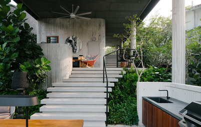
The 4.8 x 7.3-metre studio has a simple open gable plan. Rough-cut pine shiplap, milled just down the road, warms the cathedral ceiling. Douglas fir beams break up the ceiling’s expanse. The flooring is engineered hickory. Browne locally sourced as many of his materials from Maine as possible.
He wanted to include a loft in the design – until a friend sent over a photo of a lofted net. Browne took one look and thought, “This is going to be cheaper” – not to mention more fun. Natural light also wouldn’t be affected, since the netting wouldn’t obstruct any of the office’s windows.
Using fir beams to frame the 2.4 x 3.3-metre loft space, Browne secured a construction safety net using I-hooks and an aircraft cable. He says the net has stretched out a little, but he finds it even more loungeworthy now. (One of his sons is shown enjoying the net here.)
When the office occasionally serves as a guesthouse, the sofa folds out and the conference table can be moved aside.
Browne built a small bathroom with a shower in a corner of the studio. Its pine walls make the bathroom feel more like an element within the space rather than an additional room.
Your turn
Which of these four spaces is your favourite? Tell us in the Comments below. And while you’re at it, like this story, save the images for inspiration and join the conversation.
More
Keen to see inside more architects’ spaces? Get your next dose here with this Peek Inside an Irish Architect’s Bright and Open Modern Home

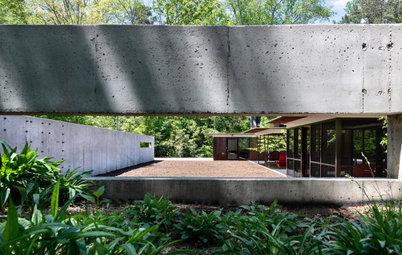
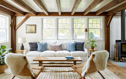


Location: Garrison in New York, USA
Size: 37 square metres
Architect: Annie Mennes of Garrison Foundry Architecture + Decor
Architect Annie Mennes and her family moved to New York’s Hudson Valley around the same time she started her own firm. After working out of their house for a few years, she decided to renovate a dilapidated barn on the property and transform it into a home office and guest suite.
Though her plan to renovate the barn became a complete rebuild due to the building’s structural issues, Mennes was able to recreate what had attracted her to the barn in the first place. “It was such a charming size and shape,” she says. “We wanted to honour the vernacular that’s here on the site.”
The new structure’s stucco siding, which was also used on the original barn exterior, nods to the past. Energy-efficient details and clean lines bring the building into the present. The building features warm, natural materials with simple details and clean lines, channeling Scandinavian design. “The idea was to bridge this rustic-modern vibe,” says Mennes.