

5 Hottest Paint Colour Trends for 2019
The paint experts have spoken – these are the five palettes we'll be wanting in our homes in the coming year

If you’re itching to pick up a paint brush and give your home a fresh look for the new year, you won’t want to miss this – five industry experts have shared their predictions for the must-know paint colours of 2019. And if you’re unsure how to translate these fashionable hues to your interior, don’t fret – you’ll also find practical tips for making them work in and around the home.
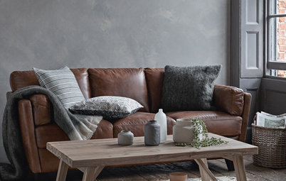
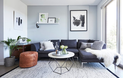
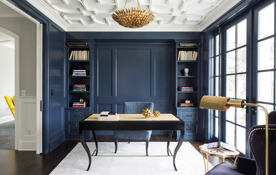
Key colours: Dulux’s Shepherd’s Warning (earthy pink), Deep Aqua (dark blue-green), Hothouse Orchid (deep purple), Legendary Lilac (smoky lilac), and Trustee (mid-blue).
If you prefer a less-saturated look, pair these colours with whites, such as Dulux’s Casper White Quarter or Natural White. Or for neutrals and greys, turn to Dieskau, Feather Soft or Silver Tea Set.
Where to use these colours: A formal living or dining space, bedroom, study, entrance or hallway.
Pair colours with: Leather, suede, velvet and plush textiles in deep-jewel tones of ruby, emerald and sapphire.
Accessorise them with: Pieces you have a personal connection with, a mix of heirlooms, or collected pieces interspersed with contemporary accessories.
Haymes Paint images from the Contribute palette
2. Rich and monochrome
Dark greys, wood hues and mid-tone neutrals will be capturing our attention in the coming year – particularly in kitchens, says Wendy Rennie, colour and concept manager at Haymes Paint.
“The colours in the Contribute palette were heavily featured in kitchens at Milan Design Week this year,” says Rennie. “Expect to see a shift away from the traditional white-on-white approach to a darker palette with natural materials, which creates a warm and inviting feel.
“The Contribute palette is all about tactility, bringing together tonal variations through colour and materials,” she says. “Greys are warmed with browns found in wooden flooring and accessories. Fluidity and texture is added through stone, travertine, marble and metallics, and a mix of gloss and matt finishes.
“This palette not only looks great, but also shows how beautiful design can also be sustainable and responsible,” says Rennie.
Key colours: Haymes Paint’s Memory as a mid-tone base; dark greys including Plantagenet and Night Moves; blacks such as Impact; and Castlegate for a rich brown.
Where to use these colours: Kitchens, bathrooms, and open-plan dining rooms.
Pair colours with: Dark-tone timber, marble and travertine.
Accessorise them with: Metallic accessories and dark-green indoor plants.
Where to use these colours: Kitchens, bathrooms, and open-plan dining rooms.
Pair colours with: Dark-tone timber, marble and travertine.
Accessorise them with: Metallic accessories and dark-green indoor plants.
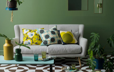
Wattyl images from the Green Scene palette
3. Soft, botanical greens
Green was the colour in 2018 so don’t expect it to go anywhere in 2019, says Sarah Stephenson, colour expert and brand and communications manager at Wattyl. “With health and wellness in full swing, along with the demand for sustainable and ethically sourced materials, we’ll look to surround ourselves with the natural and organic in the coming year,” she says. “Plants are having a huge influence on design trends, and are the inspiration for our Green Scene palette.”
This soothing, nature-inspired collection will give your home the feel of an urban oasis, Stephenson says. “It’s natural, relaxed and uplifting.”
Due to its light tones, the Green Scene palette is also fairly foolproof, according to Stephenson. “I’d recommend painting broad walls in soft greens as they look great as a backdrop and then decorating rooms with an assortment of hanging and standing plants.”
Key colours: Wattyl’s grey-green shades including Rhino, and a sage-green hue such as Cloud. For pinks, turn to Nougat and Peahen Egg.
Where to use these colours: Relaxed dining rooms, living rooms and bedrooms with plenty of natural light. The palette also works well on exteriors as it blends in beautifully with the natural environment.
Pair colours with: Light- and mid-tone timbers and soft furnishings in natural tones of earth, rust and clay.
Accessorise them with: Unglazed earthenware, hanging and standing plants, and tactile natural fabrics (ethically sourced, of course).
Taubmans images feature its Colour of the Year 2019: Night Watch.
4. Wild, forest hues
Taubmans chose Night Watch – a deep, sophisticated green – as their colour of the year for 2019. It’s a sumptuous shade that pairs beautifully with a variety of different tones, including peach, rust and taupe, says Taubmans’ colour consultant, Grace Garrett.
“Green is a colour we’ll be seeing more of in 2019, from forest to sea foam and all shades in between,” she says. It’s easy to see the appeal, Garrett adds. “From a psychological perspective, green creates an equilibrium between the head and the heart, which is perfect for creating a space that encompasses balance and harmony.”
The beauty of Night Watch lies in its versatility, says Garrett. “It works equally well with a glamorous Deco-inspired look or the eclectic and tribal trends. We are also seeing deep shades of indigo, violet, terracotta, dirty burgundy and dirty mustard coming through for 2019,” she says. “Together, they create a warm, earthy and sophisticated feel in your interior.”
Key colours: Taubmans’ Night Watch (a deep green), Ionian (an earthy neutral), Burano Peach (a peach shade), Dusky Taupe (an earthen hue), and Rusty Rail (a rust shade).
Where to use these colours: Consider painting your kitchen island or a feature piece of joinery in Night Watch and keep the rest of the scheme neutral; then add accents of the same deep-green shade throughout the rest of your home. Or, consider bathroom tiles in a deep, forest green or a feature wall in a bedroom or living room.
Where to use these colours: Consider painting your kitchen island or a feature piece of joinery in Night Watch and keep the rest of the scheme neutral; then add accents of the same deep-green shade throughout the rest of your home. Or, consider bathroom tiles in a deep, forest green or a feature wall in a bedroom or living room.
Pair them with: Luxe materials such as velvet and marble mixed with raw, natural materials including timber, rattan and raffia.
Accessorise them with: Eclectic and tribal pieces, woven rattan, tan leather, soft fur throws, beaded or cane pendant lights, statement wallpaper, forest-green bedlinen and artwork with a tropical feel.
Accessorise them with: Eclectic and tribal pieces, woven rattan, tan leather, soft fur throws, beaded or cane pendant lights, statement wallpaper, forest-green bedlinen and artwork with a tropical feel.
Porter’s Paints images
5. Fugitive blues
“Blues that are tricky and mysterious, and won’t let you pin them down will be popular in 2019,” says Clare Scanlan, marketing and colour development at Porter’s Paints. “These blues move and morph in different lights and change over time, creating wonderful mood shifts, and you can’t quite say whether you’re looking at a blue, green, grey or teal.”
They’re also very adaptable, says Scanlan. “These tones are a colour-lover’s dream as they form the perfect backdrop for so many other hues. Pair pale fugitive blues with light timbers for a Scandinavian or modern-Australian look. Or, go for deeper tones and mix with brass and dark timber for more of an English country-house vibe.
“Alternatively, look to the Australian landscape for design inspiration; think blue eucalyptus leaves, the turquoise ocean, the coral tones of flowering gums, and the black of the bush after fire,” says Scanlan.
Key colours: Fugitive blues by Porter’s Paints include Blue Spruce, Gulf Stream, Prussian Green, Moorehen, Hailstorm, Black Blue, Beach Grass and Double Newport Blue. For a two-toned paint finish, try a French Wash using a combination of Cuban Turquoise and Old Havana, or Blue Steel and Old Havana.
Where to use these colours: On an old, imperfect brick or plaster wall; the walls and trims in a master bedroom; in an entryway; as a backdrop to display art.
Pair them with: Brass, blackened steel or timber (to create a charred effect, stain timber with Porter’s Paints’ Palm Beach Black).
Accessorise them with: Textural accessories, Persian rugs, brass, linen, concrete and tan leather with an orange-brown undertone. Or, for a fashionable Milan moment, choose an artwork featuring acid yellow, mustard and dusty pink.
Tell us
Are you tempted to try one of these on-trend palettes? Tell us in the Comments below, like and share this story, save the images, and join the conversation.
More
Seeking more colour inspiration? Have a read through our practical and uplifting colour stories
Are you tempted to try one of these on-trend palettes? Tell us in the Comments below, like and share this story, save the images, and join the conversation.
More
Seeking more colour inspiration? Have a read through our practical and uplifting colour stories


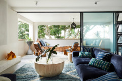
Photography by Lisa Cohen.
1. Old meets new
A decadent palette consisting of lilac, deep purple, pink and aqua will come to the fore in 2019, says Andrea Lucena-Orr, colour and communications manager at Dulux. “Our Legacy palette, which has a focus on craftsmanship and traditional skills, is one of the key palettes identified in the Dulux Colour Trends 2019,” she says. “It is inspired by old-world elegance that is reinvented for the modern day.
“It is a timeless and luxurious palette with something of a moody feel. Deep colours such as these stir something in us and can be quite moving – you’ll find they can make a real impact in a space.”