


5 Ways to Push the Envelope With Colour and Pattern
An experienced US designer explains how to mix colour and pattern for a bold yet balanced look in your decor
Sabrina Alfin
14 April 2021
California CID.
One of the biggest challenges homeowners face in decorating their homes is knowing how to execute bold choices for furnishings, finishes and decor with confidence. Here are five tips that I follow with my own clients when they want to push the design envelope with colour and pattern.
1. Create contrast
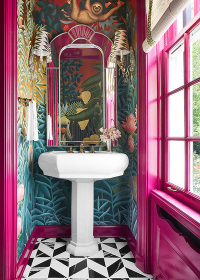
One great way to make a bold statement is to do the unexpected. For this eclectic powder room in Chicago, USA, Design Tuttoilmondo merged three distinct looks: floral wallpaper, hot-pink trims and graphic black-and-white floor tiles.
What makes it work is the scale of the patterns and the intensity of the colours. The large floral wallpaper has multiple colours in a matt finish that helps subdue the overall effect, letting it recede into the background. This allows the small but crisp black-and-white floor tiles and the high-gloss hot-pink trims to pop, creating the contrast that makes the whole composition come together.
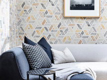
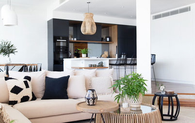
You can also create contrast by selecting a bold textile pattern to be the star among an otherwise neutral scheme. In this living room in St Louis, USA, JCR Design Group made the armchairs stand out in the predominantly white room. Coral paint in the adjacent room and blue accents throughout pick up the colours of the chinoiserie-inspired fabric on the chairs.
2. Stay on solid ground
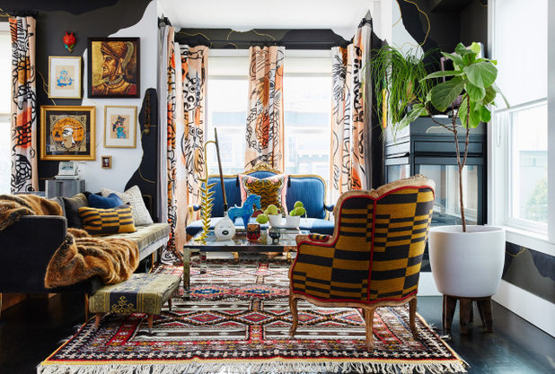
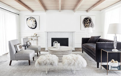
Noz Design is masterful at maximalism decor. This living room in San Francisco, USA, features a wide array of pattern and colour, but the overall look stays balanced thanks to the ebony-stained wood floor. A floor with various hues or a highly visible grain would make the space feel too busy and ungrounded.
You’ll note the camouflage-painted walls are a mix of black, white and olive – colours that are picked up through furniture fabrics and accessories. The two accent colours, orange and blue, are found in the curtains, the small settee and the artwork.
Finally, the designer selected furniture with leggy frames that aren’t visually dense, allowing the floor to peek through, even with the addition of a bold area rug. All combined, this room packs a punch without overwhelming the senses.
Find an interior decorator near you to expertly combine colour and pattern in your home
3. Dial up the drama with dark walls
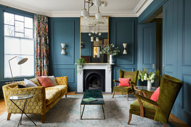
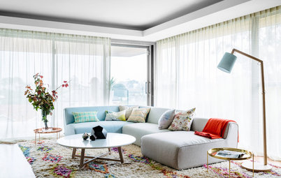
Walls and mouldings painted in the same dark colour provide the perfect backdrop for other colours and patterns to stand out. Rock + Poppins painted the walls and mouldings in this living room in London, UK, a deep marine blue, then introduced a complementary colour (the gold sofa) and an analogous colour (the green chairs and table) for a bold and moody effect.
The selection of a hexagonal-patterned velvet for the sofa reads as a solid while still providing texture. This is why the floral curtains don’t feel out of place.
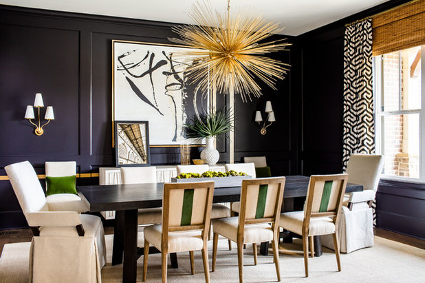
Here, Meriwether Design Group in Atlanta, USA, used dark eggplant walls to set the stage for a bit of dramatic whimsy. A large framed black-and-white painting is the focal point in the room, with a similar graphic pattern echoed in the curtains.
In their supporting roles, the backs of the side chairs are upholstered with a single green stripe. And a large gold-hued Sputnik-style chandelier adds shiny glamour and texture to the otherwise smooth surfaces.
In their supporting roles, the backs of the side chairs are upholstered with a single green stripe. And a large gold-hued Sputnik-style chandelier adds shiny glamour and texture to the otherwise smooth surfaces.
4. Mix up small-scale prints
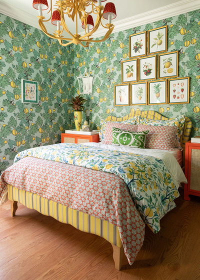
Nothing is more charming in an old ‘country inn’ sort of way than layering lots of small-scale prints together in different patterns and colours. Crystal Blackshaw Interiors grounded this Chicago bedroom in a green floral wallpaper and used complementary and analogous colours for the other elements.
The yellow striped upholstered bed sports a burnt-orange geometric patterned duvet, with a quilt on top that has a similar look to the wallpaper. The framed botanical prints artfully arranged create a visual break in the wallpaper. The room is then anchored with orange nightstands, featuring trays of colourful objects.
This room is a great example of how using multiple patterns in similar repeated sizes adds up to a unified whole.
5. Go monochrome
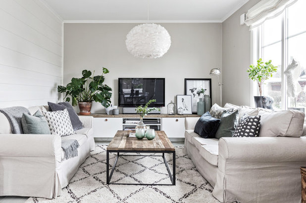
The beauty of going in a monochrome or tone-on-tone direction is that any pattern you pick will work well, as long as the colours are in the same tonal range. In this living space in Gothenburg, Sweden, Bjurfors Göteborg used a Moroccan diamond-patterned rug in white and charcoal and coordinated it with multiple cushion patterns, some with light backgrounds and others with dark ones. The key here is to get lots of patterns going, otherwise the end result will look too drab and one-note.
Browse beautiful living rooms for inspiration
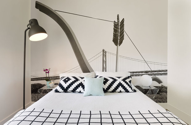
This monochrome guest bedroom was created by my team. We first had a photo taken of Cupid’s Span, the Claes Oldenburg sculpture on the Embarcadero, with the San Francisco Bay Bridge in the background. We then had the photo made into custom wallpaper scaled to fit the bed wall.
From there we chose black-and-white patterned fabrics for the bedding to create a graphic impact, with just a touch of soft blue for contrast. Clear acrylic Z-tables act as nightstands so the mural isn’t blocked.
Your turn
How have you used colour and pattern at home? Spill your styling secrets in the Comments. And if you enjoyed this story, like it, save the images and join the conversation.
More
Are you up-to-date with the latest ways to work with a designer? Get the inside scoop here with Convenience Is King: How Tech Is Making Interior Design Simpler
What are you working on?

Related Stories
Interior Design
The Golden Rules of Proportion: Decor Laws You Need to Know
An interior designer reveals the essential rules for achieving a perfectly balanced interior
Full Story
Interior Design
Design Masterclass: A Budget-Friendly Refresh of a Small Home
See how a designer's smart use of colour and considered storage solutions transformed a drab home for AUD$50,000
Full Story
Renovating Advice
Renovation Insight: How to Choose an Interior Designer
A skilled interior designer can help bring your decor dreams to life – three experts reveal how to choose the right one
Full Story
Interior Design
10 Decorating Rules Interior Designers Swear By
By Laura Downie
Want to give your home professional polish? An expert reveals the top 10 decorating rules you need to know
Full Story
Interior Design
8 Ways to Create Flow and Cohesion With Your Interior Design
These eight tips can help you select products, finishes and styles that work together from room to room
Full Story
Picture Perfect
22 Curtains That Dare to Be Different
Our coffee-break escape offers you five minutes' worth of images to inspire and delight. Jump right in...
Full Story
Project Of The Week
Before & After: A Cheap & Cheerful Makeover of a 1980s Caravan
Armed with an AU$1500 budget, a Melbourne couple rolled up their sleeves and transformed a caravan in just three months
Full Story
Houzz Tours
Melbourne Houzz: A Terrace Near Ruin Gets a Second Chance
See how a derelict Victorian terrace in Melbourne was transformed into a luxurious and serene family home
Full Story
Houzz Tours
Melbourne Houzz: A Family's Dream Home, 20 Years in the Making
Timeless, sophisticated and a little bit industrial – this heritage-home renovation is nothing short of spectacular
Full Story
Most Popular
Ask the Experts: What Goes With Tan Leather?
Embrace this versatile material, colour and texture with inspirational ideas from designers in the know
Full Story
Bathroom vanities
Love seeing the way people use colour. These examples are fabulous, joyous and inspiring.
I love greens, oranges, yellows and blues and there were some fun examples. I am not a fan of the pinks and purples on woodwork. But I have a bathroom and a guestroom painted coral in this house. I'm beginning to wonder if the orange dining room is a mistake but nothing is going to be done about it anytime soon. In bedrooms I generally want whites and soothing blues.
I do like pretty textiles in living rooms and applaud when people choose something eye-catching and original.