
6 Bathroom Colour Schemes That Will Never Date
If you'd love to splash some colour around your bathroom but fear it won't stand the test of time, stick with these failsafe colour combos

Bathrooms can be one of the most challenging rooms to overhaul – renovating them can put a strain on your budget and your time, not to mention putting them out of action while the work’s being done. No one wants to renovate their bathroom more often than they need to, and many people are scared to use colour for this reason – what happens if the colours you choose become outmoded and impact the value of your house? White isn’t the only way to go if you’re worried about colours dating – here are six enduring colour combinations that will always be winning choices, to create a timeless bathroom colour scheme for your home.
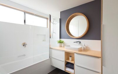
A contemporary bathroom design works just as well with a monochrome colour scheme as one that’s more Art Deco. Charcoal-painted walls alongside simple white tiles add some dramatic flair in this Melbourne bathroom.
Do: Jazz it up with some bold red or yellow towels and accessories.
Don’t: Make it too busy or feminine.
12 beautiful black and white bathrooms
Do: Jazz it up with some bold red or yellow towels and accessories.
Don’t: Make it too busy or feminine.
12 beautiful black and white bathrooms
2. Aqua, brown and white
This combination provides a perfect balance between traditional and contemporary. Use aqua (blue-green) and white to make the room feel cool and airy, especially useful to add perceived space to a smaller room, then bring in a deep brown vanity and other accents for warmth. If you’re looking for a spa-like feeling, this combo is a classic. Add aqua and white towels for extra luxury and you’ll never want to leave.
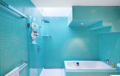
Natural timber can work as nicely as chocolate with this failsafe colour combo. This bathroom by Camilla Molders, featuring turquoise tiles alongside white-painted walls, may be bold, but it won’t ever go out of date.
10 Bold Bathrooms for the Colour Shy
This combination provides a perfect balance between traditional and contemporary. Use aqua (blue-green) and white to make the room feel cool and airy, especially useful to add perceived space to a smaller room, then bring in a deep brown vanity and other accents for warmth. If you’re looking for a spa-like feeling, this combo is a classic. Add aqua and white towels for extra luxury and you’ll never want to leave.
Natural timber can work as nicely as chocolate with this failsafe colour combo. This bathroom by Camilla Molders, featuring turquoise tiles alongside white-painted walls, may be bold, but it won’t ever go out of date.
10 Bold Bathrooms for the Colour Shy
If that bold an aqua is a little too out there for your sensibilities, or if you’re worried about making a small bathroom feel cramped with too-bold features, why not stick with the same colour scheme but tone it down a notch or two by focusing more on the white and using a pale-toned timber?
How to pick the best bathroom tiles
How to pick the best bathroom tiles
Alternatively, for a cosier feel in a smaller space, use chocolate as your base colour, and aqua and white as your accents. This look can work fantastically in a compact powder room, to add drama and warmth while remaining elegant and timeless.
3. Mocha and creamy white
Mocha tones make this bathroom warm and inviting. You can also start your colour palette with one shade of mocha and a creamy white, then layer with various espresso-inspired shades to create some movement and depth. Just remember that darker shades advance and lighter shades recede. Use blocks of colour to highlight areas such as the bathtub to provide interest and direction within the room.
Mocha tones make this bathroom warm and inviting. You can also start your colour palette with one shade of mocha and a creamy white, then layer with various espresso-inspired shades to create some movement and depth. Just remember that darker shades advance and lighter shades recede. Use blocks of colour to highlight areas such as the bathtub to provide interest and direction within the room.
If you’re looking to cool the bathroom down a little and creamy white isn’t your thing, use a crisp white instead. Contrast it with a rich, warm mocha in your floor tiles and bring it through to highlight the vanity and wall.
10 Unexpected Bathroom Colour Combos
10 Unexpected Bathroom Colour Combos
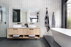
4. Monochromatic greys
To create a clean and simple look, add various shades of grey in both paint and tiles to keep your bathroom flowing and to provide depth and orientation. Add some fresh flowers or a lush and leafy potted plant and you’ll create a beautiful, classical environment too.
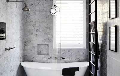
Carrara marble was first used in Ancient Rome and has featured on many notable monuments and buildings ever since. The grey-and-white veining of the marble gives any bathroom a luxe look, making even a compact wet room feel spacious and special.
To create a clean and simple look, add various shades of grey in both paint and tiles to keep your bathroom flowing and to provide depth and orientation. Add some fresh flowers or a lush and leafy potted plant and you’ll create a beautiful, classical environment too.
Carrara marble was first used in Ancient Rome and has featured on many notable monuments and buildings ever since. The grey-and-white veining of the marble gives any bathroom a luxe look, making even a compact wet room feel spacious and special.
Do: Go for a quartz product offering a similar look if Carrara marble is out of your price range.
Don’t: Use grey if you find it depressing rather than soothing or uplifting.
Get in the mood with fifty shades of grey
Don’t: Use grey if you find it depressing rather than soothing or uplifting.
Get in the mood with fifty shades of grey
5. Blue and yellow
If you’re ever in doubt of what colour combination will last the distance, look to nature. In this case, blue and yellow is a classic mix because it reflects the sun rising into a clear blue sky (or over the ocean), but is kept fresh and bright with the use of white.
If you’re ever in doubt of what colour combination will last the distance, look to nature. In this case, blue and yellow is a classic mix because it reflects the sun rising into a clear blue sky (or over the ocean), but is kept fresh and bright with the use of white.
For a cooler feel, use sky or ocean blue as your dominant colour, offset by basic white tiles to keep the look from becoming overwhelming, and accent with pops of bright yellow.
The Case for Colour in the Bathroom
The Case for Colour in the Bathroom
To warm your bathroom up a little, choose yellow as the dominant colour through tiles or paint and accent with blue in your towels, bath mats and other accessories. Given its sunny disposition, this combo is great if you live by the water.
Do: Think about using traditional blue mosaic tiles because they don’t ever seem to date.
Don’t: Overdo it with the yellow because it can become overbearing, particularly in a small room.
Do: Think about using traditional blue mosaic tiles because they don’t ever seem to date.
Don’t: Overdo it with the yellow because it can become overbearing, particularly in a small room.
6. Double complementary colours
In colour theory, this scheme just works. Complementary colour pairings, where two colours sit opposite each other on the colour wheel (blue and orange, for example) work well alongside another set of complementary colours (in this case, red and green). The result is called a double complementary colour scheme.
Add black and white to bring the colours into balance and, like a good piece of artwork, you’ll create a bathroom with wow factor. This combo is not for the faint-hearted, but if executed correctly it will definitely last the distance.
Do: Be strategic with the placement of colour to ensure the scheme is cohesive.
Don’t: Use this colour combo if you don’t love it wholeheartedly – it won’t date, but you might get sick of it.
Tell us
What colour scheme have you used in your bathroom? Share your photos and favourite colour combos in the Comments.
More
Browse more beautiful bathrooms for inspiration

This is a classic combination that became ultra-popular during the Art Deco period in the 1920s and ’30s. Along with Chanel’s launch of the little black dress in 1926, black and white became ultra chic and fashionable in bathroom interiors as well.
Bold black and white geometric shapes used in checkerboard tiles on floors and walls was right on trend and, like the little black dress, has stood the test of time. Use black and white floor tiles, chrome fittings and silver-framed mirrors and you’ll have a colour combo that works just as brilliantly today as it did way back when.