


6 Top Paint Colour Trends For 2020
If you're looking to refresh your home, these are the hottest colour palettes you need to know about, say the experts
Georgia Madden
24 September 2019
There’s no quicker or easier way to breathe new life into your home than with a coat of paint. But choosing colours can be a tricky business – what’s fashionable, what will work best where and (most importantly) what are you still likely to love a year or more from now? We asked six industry experts to reveal their top paint-colour predictions for 2020 to help make the selection process a little easier.
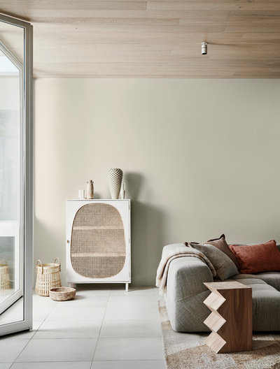
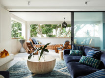
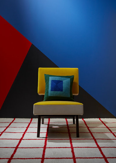
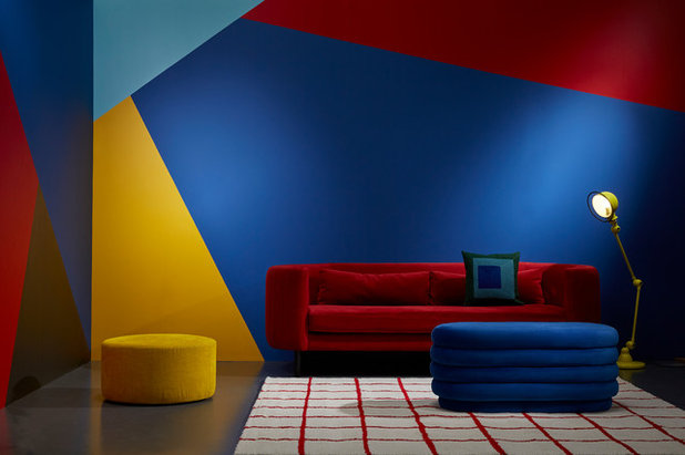
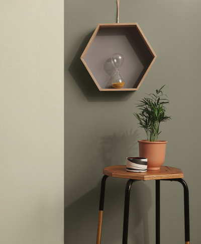
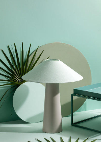
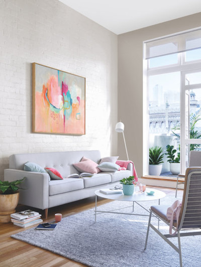
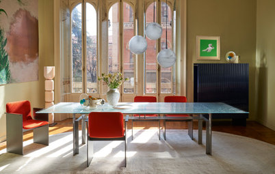
Dulux images from the Grounded palette
Styling by Bree Leech
Photography by Lisa Cohen
1. Zen zone
With its gentle and appealing mix of soft green and putty tones, the Grounded palette is the one to watch in 2020, says Andrea Lucena-Orr, colour planning and communications manager at Dulux. “It’s a soothing neutral and natural palette with a sense of warmth that works beautifully with this season’s underlying brown base,” she says.
“It’s also an easy palette to use and would work in just about any space in the home.”
Key colours: Dulux’s Pancake Mix (putty), Time Capsule (stony brown), Waitangi (pale olive), Ghost Town Quarter (pale grey) and Gold Pheasant (pink-coral).
Pair them with: Natural timber, rattan, matt-finish ceramics, bouclé-finish soft furnishings.
Prefer to leave choosing paint colours to a professional? Find a painter near you on Houzz who can help spruce up your home
Pair them with: Natural timber, rattan, matt-finish ceramics, bouclé-finish soft furnishings.
Prefer to leave choosing paint colours to a professional? Find a painter near you on Houzz who can help spruce up your home
Where to use them: The lighter colours from the Grounded palette are versatile enough to be used in any space in the home, inside or out.
Use accents of stronger brown (such as Dulux’s Knot) and coral to create a moody and sophisticated feel in a bedroom.
Use accents of stronger brown (such as Dulux’s Knot) and coral to create a moody and sophisticated feel in a bedroom.
Images by Wattyl
2. Spice trail
Expect to see deep, exotic hues making a statement in 2020, says Sarah Stephenson, senior brand communications manager at Wattyl. “Design will soften in 2020, with a focus on texture – think layering, quilting and padding,” she says. “Spicy colours such as plum and sunbaked pink, with accents of gold, will come to the fore, bringing a relaxed and nurturing feel to interior spaces.
Key colours: Brick, sunbaked pink, plum and gold.
Pair them with: Textured soft furnishings (think quilted, layered or padded), natural, handwoven fabrics, ribbing, ceramics with raw or matt pigmented finishes.
Pair them with: Textured soft furnishings (think quilted, layered or padded), natural, handwoven fabrics, ribbing, ceramics with raw or matt pigmented finishes.
Where to use them: Layer brick and terracotta tones to add a cosy, casual vibe to living spaces. Accents of brass or plum introduce a touch of sumptuousness.
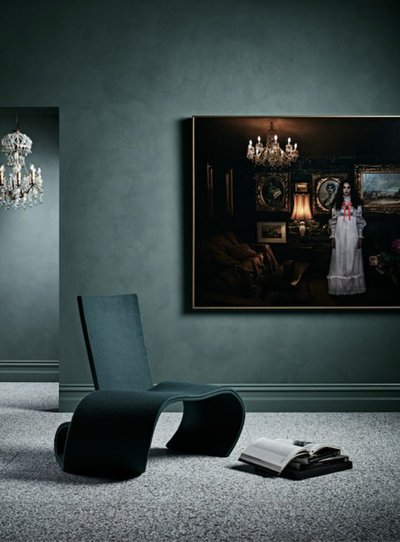
Colour Makes a Comeback! New Trends From Maison & Objet
Colour Makes a Comeback! New Trends From Maison & Objet
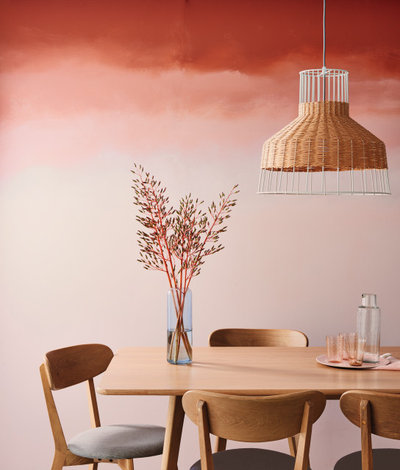
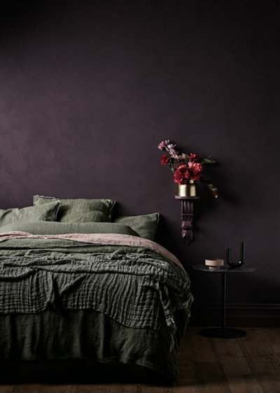
Taubmans images from the
Protect palette
3. Retro futuristic
The current catwalk trend of blending vintage style with futuristic touches will seep into interiors in 2020, says Taubmans colour category manager, Rachel Lacy. “As a response to current geo-political and climate concerns, a protective and nurturing mood has emerged – not just for ourselves, but for the planet. The Protect palette is our interpretation of this trend for the built environment,” she says.
“In the Protect palette, layers of red- and orange-based hues create a luxurious feel. Soft touches of mineral pink and green bring balance and calm.”
Key colours: Red, mineral pink and soft green.
Pair them with: Natural materials such as timber and rattan, curvy organic lines, bent-steel furniture, and black accents.
“The Protect palette calls for a considered approach to styling. Surfaces and materials are tactile and sophisticated, and combine to create a comforting feel,” says Lacy.
Pair them with: Natural materials such as timber and rattan, curvy organic lines, bent-steel furniture, and black accents.
“The Protect palette calls for a considered approach to styling. Surfaces and materials are tactile and sophisticated, and combine to create a comforting feel,” says Lacy.
Where to use them: The nature-based tones of this palette can be used throughout the home.
Colour Lessons From Nature: Glorious Green
Colour Lessons From Nature: Glorious Green
Images by Porter’s Paints
Styling by Heather Nette King
Photography by Mike Baker
4. Moody hues
“Smoky, cool and muted grey-blues are hugely popular, but the biggest standout we expect to continue in 2020 is green,” says Melanie Stevenson, marketing manager at Porter’s Paints. “Complex, deep greens, black forest greens, decaden, blue-greens and vibrant olive tones are creating a lot of interest.
“French Wash paints are also having a resurgence. Not the tobacco-yellow washes of the ’80s – a French Wash finish is now being used to create sophisticated concrete-look walls, using subtle tones of grey to create a concrete effect,” she says.
Key colours: Moody greens such as Prussian Green and Anchorage, softer greens such as Duck Egg and Frozen, and deep teals such as Viridian and Coast.
Pair them with: Dark timbers, tactile linens and terrazzo.
Pair them with: Dark timbers, tactile linens and terrazzo.
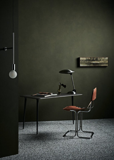
Where to use them: Anywhere you like. These paints and colours create beautiful backdrops without being intrusively dominating, so they will work with any decorative style.
Haymes Paint images from the
Equilibrium palette
5. Zesty greens
It’s no surprise that green will continue to reign supreme in 2020 – but the coming year will see it take a fresh, zesty turn, according to Wendy Rennie, colour and concept manager at Haymes Paint. “This palette incorporates varying tones of soft green and contrasts it with a gentle and grounding putty tone. It’s soft, fresh and focused.
“These colours infuse a sense of calm and positivity into a space,” she says. “They are a great alternative to traditional neutrals and the [putty pink] is a new take on the Millennial Pink we’ve come to love.”
Key colours: Fresh greens such as Haymes Paint’s Icy Morn, Leek Leaf and Pastel Pine, and a putty pink such as Haymes Paint’s Pale Cordovan.
Pair them with: Warm-grey tiles, natural timber, linen, and recycled pieces.
Pair them with: Warm-grey tiles, natural timber, linen, and recycled pieces.
Where to use them: Main living spaces, bedrooms and any interior space where you want to create a smooth transition between inside and out.
Best of the Week: Rooms With Indoor-Outdoor Flow
Best of the Week: Rooms With Indoor-Outdoor Flow
Images by British Paints
6. Warm neutrals
“Expect to see a shift towards warmer whites, greys and neutrals in 2020,” says Kelly Magee, a paint expert at British Paints. “Moving forward, the neutral palette will have an almost earthy tone to it.”
6. Warm neutrals
“Expect to see a shift towards warmer whites, greys and neutrals in 2020,” says Kelly Magee, a paint expert at British Paints. “Moving forward, the neutral palette will have an almost earthy tone to it.”
Key neutrals: British Paints’ White Disclosure (warm white), Gentle Wind (stony white), Neutral Grey, Refined Stone and Set in Stone (warm, mid-tone greys).
Pair them with: Warm, mid-tone timber and tiles, and luxe brass, bronze and copper accents.
Pair them with: Warm, mid-tone timber and tiles, and luxe brass, bronze and copper accents.
Where to use them: These versatile neutrals work equally well inside or outside the home. Consider combining them with deep colours, such as British Paints’ Glazed Rub (deep red), Hot Jam (burnt orange), Exotic Terracotta or a rich brown such as Dark Master for a deeper, more dramatic look.
Your turn
Which of these palettes are you tempted to try in your home? Tell us in the Comments below, like and share this story, save the images, and join the conversation.
More
Seeking more colour inspiration? Don’t mis 8 Hallway Colours That Aren’t White or Grey
Your turn
Which of these palettes are you tempted to try in your home? Tell us in the Comments below, like and share this story, save the images, and join the conversation.
More
Seeking more colour inspiration? Don’t mis 8 Hallway Colours That Aren’t White or Grey

What are you working on?


Related Stories
Interior Design
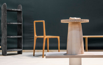
What's Next in Homes? 4 Design Experts Reveal
Do you know which colours, shapes and styles we'll be coveting in the year ahead? Four design pros give the inside scoop
Full Story
Trade Shows
10 Fresh Furniture and Decor Trends for 2023 From the USA
Greens and blues, art and artisanship, and mixed eras and textures filled the 2023 collections at High Point Market
Full Story
Interior Design
6 Trends From Salone de Mobile: The Stories Behind the Designs
See how the design industry is moving forward with one foot in tradition and the other in experimentation and innovation
Full Story
Kitchens
What Are the Popular Trends for Kitchen Renovations in 2023?
Find out this year's most coveted colours, styles, upgrades and added extras for kitchens from surveyed homeowners
Full Story
Trade Shows
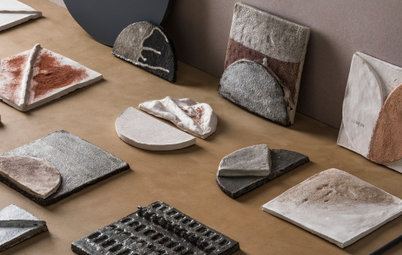
6 Surface Materials Your Clients Will Crave in 2023 and Beyond
Discover the top six innovative materials that were on display at this year’s Surface Design Show in London, UK
Full Story
Architecture
Global Architecture Trends From the World Architecture Festival
By Houzz AU
Nicky Drobis, architect and partner at Fender Katsalidis, reports on the big ideas shaping the industry in 2023
Full Story
Trade Shows
7 Interiors Trends from the Maison&Objet 2023 Design Fair
By Houzz France
From tending to our own wellbeing to showing a greater respect for the planet, this year’s theme was Take Care
Full Story
Trade Shows
6 Future Trends in Design From Europe's 2022 Trade Fairs
Continuity, cosiness and crisis response are the big takeaways from the latest fair season in Europe
Full Story
Trade Shows
4 Interior Design Trends From Spain's Hábitat Valencia 2022
Texture, colour and oh so chic comfort were in the spotlight at Hábitat Valencia, with a good dose of designer optimism
Full Story
Trade Shows
8 Inspiring Ideas from 2022’s London Design Festival
With sensory surfaces and a focus on wellbeing and sustainability, a positive vibe permeated this year’s event
Full Story
Reading this story took me to my happy place. Love a splash of colour.