6 Ways Designers Revived a Room in the Centre of a Floor Plan
Worried extending your home might create an awkward central space? See how these designers maximised every centimetre

When you add an extension to the rear or side of your property, you could be left with a middle room that you’re not sure how best to utilise. Take a look at how six Houzz architects and designers cleverly planned these central ‘middle’ spaces in homes in London, UK, to usher in function, light, and a better connection with the rest of the home.
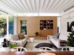
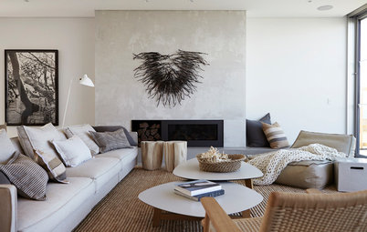
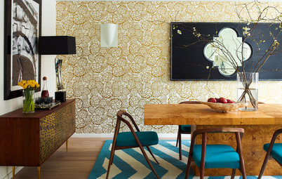
Seen here from the opposite direction, the central space works as a link between the three rooms and ensures light passes from one end through to the other.
Need to rethink your floor plan for improved function and flow? Find an architect near you on Houzz to make it happen
Need to rethink your floor plan for improved function and flow? Find an architect near you on Houzz to make it happen
2. Work with what you’ve got
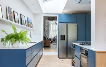
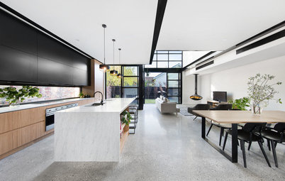
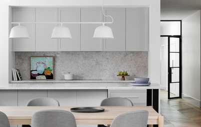
When designing a rear extension for this Victorian home in London, UK, the team at Rees Architects could have been tempted to create a large, open-plan kitchen/diner. However, they wanted to take a more careful approach in order to preserve the character of the period building, so the original rear wall was kept in place, creating a separate room behind the division.
The architects located the kitchen in this middle space and removed the window glazing to create an opening. The side return extension helps connect the two spaces, while a skylight over the dining table illuminates the whole area.
3. Tuck in a cooking zone
A similar approach was taken in this ground-floor apartment in London, UK, as the architects at Resi were careful to keep the original structural wall and chimney breast in the centre of the room.
A kitchen in the extension would have taken up too much space, so the team decided to locate the kitchen in the middle room behind the chimney breast.
The kitchen has been designed in a galley layout, with storage along the fireplace wall and preparation space along the opposite wall.
Once again, the side-return extension helps connect the two spaces and, in this case, a glazed roof brings light into the windowless kitchen. To add to the feeling of flow, the kitchen can also be accessed from the hallway.
Once again, the side-return extension helps connect the two spaces and, in this case, a glazed roof brings light into the windowless kitchen. To add to the feeling of flow, the kitchen can also be accessed from the hallway.
4. Maximise a walk-through area
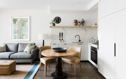
The kitchen was originally located at the back of this house in London, UK, but owner and designer Mel Massey decided to move it to the central area. The space would have been used as a thoroughfare, so it made sense to maximise it with a galley cooking zone.
The streamlined design gives it a spacious feel, and the glossy door and drawer fronts reflect light around the room and through to the spaces either side, brightening the area.
By creating a centrally located kitchen, Massey connected the home’s original front part and the new, modern space at the back.
Best of the Week: 19 Standout Home Extensions
Best of the Week: 19 Standout Home Extensions
5. Make to measure
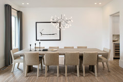
The middle zone in this home in London, UK, has become the dining room, and connects the rear living area to the kitchen at the front. The narrow space had to accommodate a large dining table, so architect Trevor Brown created a niche and tucked in a space-saving bench seat and the table.
The middle zone in this home in London, UK, has become the dining room, and connects the rear living area to the kitchen at the front. The narrow space had to accommodate a large dining table, so architect Trevor Brown created a niche and tucked in a space-saving bench seat and the table.
In order to do this, the team had to borrow space from the hallway, so they installed a new wall right next to the staircase, which forms the back of the banquette seat.
13 Ways to Decorate a Narrow Room
13 Ways to Decorate a Narrow Room
6. Move light around
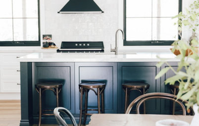
Before the owners of this Victorian home in London, UK, arrive in their beautiful extension, they need to pass through the centrally located kitchen.
Architect Lior Brosh of Brosh Architects decided to locate the kitchen in this middle area on the lower-ground floor, as it’s the first room you come to from the entrance hall, which makes it easy to dump shopping bags.
At the front is the living room and at the rear is the dining area, so the middle kitchen – which is open on both sides – provides a handy link between the two spaces.
Expert Advice: How to Read Patterns and Symbols on a Floor Plan
Expert Advice: How to Read Patterns and Symbols on a Floor Plan
The front of the property has less light than the back, so Brosh also used this kitchen space as a light-transfer zone. White high-gloss units are useful here, as they help reflect sunlight from the rear garden into the front living room, brightening up the space.
Your turn
How have you utilised rooms in the middle of your floor plan? Share your tips and tricks in the Comments below. And if you found this story useful, like it, save the images and join the conversation.
More
Keen to see how a Sydney terrace overcame renovation challenges? Don’t miss this Before & After: A Classic Living-Diner in a Sydney Terrace

The pitched-roof side extension at the rear of this Victorian apartment in London, UK, was already in place when the architects at Block Design & Build were brought in. Nevertheless, it felt disconnected from the rest of the house. There was a doorway that led to the middle room, but the living room at the front was blocked off by a wall.
The team opened up the three spaces by creating a wide doorway from the living room to the kitchen, enabling the middle area to be connected to both the front and rear of the property.