
Decorating

7 Moody Colour Alternatives to Black
Looking for a dark and moody colour that isn’t black? Try nautical navy, calming grey or these other alternatives instead

Want a deep, inky colour that brings the high-fashion appeal of black but without the attitude? Try one of these soft and sumptuous alternatives with plenty of personality to suit your mood and your space.
Despite having a large amount of navy surface, this study doesn’t feel dark and depressing the way it might if the walls were black. Rather, it’s studious and sophisticated.
Navy is a great shade for spaces where you need to concentrate, because it’s not too sombre and not too stimulating.
Wall paint in ‘Hale Navy’: Benjamin Moore
Navy is a great shade for spaces where you need to concentrate, because it’s not too sombre and not too stimulating.
Wall paint in ‘Hale Navy’: Benjamin Moore
This inky hue goes a little further down into the depths of the blue sea. A bright, white sofa and brown leather accents brighten an otherwise inky space.
Wall paint in ‘Baltica’: Dulux
Wall paint in ‘Baltica’: Dulux
2. Charcoal and warm grey
Grey is the truest ‘off-black’. It’s essentially black mixed with white. Warm grey, with a slight hint of brown, is an excellent choice for making a bedroom feel peaceful and cosy when black is too stark and dramatic for your taste.
Wall paint in ‘Rogue Blue’: Valspar
Grey is the truest ‘off-black’. It’s essentially black mixed with white. Warm grey, with a slight hint of brown, is an excellent choice for making a bedroom feel peaceful and cosy when black is too stark and dramatic for your taste.
Wall paint in ‘Rogue Blue’: Valspar
Warm greys can help make a modern space feel more inviting, even when mostly hard materials are used. They mix well with nearly any hue, but especially warm metal tones and soft shades like yellow and peach.
50 rooms that look gorgeous in grey
50 rooms that look gorgeous in grey
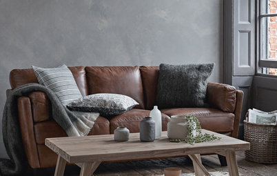
3. Chocolate
Deep chocolatey brown has been a little off the radar in the modern grey-obsessed world, but it’s more than possible to make this classic shade work for traditional or modern spaces. It pairs well with espresso woods, allowing the sense of warmth to carry through the entire space, and it helps tone down wild shades like orange.
Wall paint in ‘Beluga’: Behr
Chocolate also works quite well on dramatically textured surfaces like velvet or tufting, which keep it looking modern and elegant. Mix it with a little warm grey for contrast and you’ve got the look of a high-end boutique or café.
Perfect pairings for dark walls
Perfect pairings for dark walls
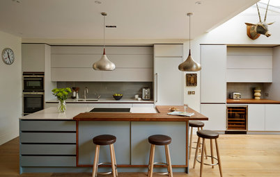
4. Cool grey
In kitchens and bathrooms, a cool grey with slightly blue and green undertones is a smart choice because it carries a sense of cleanness. It still works well with hot colours like vivid red, and it suits the glossy finishes typically found on appliances and fixtures. That it is less stark than black also helps the space feel a little more open, especially when used just on lower cabinets to anchor the space.
Base cabinet paint in ‘Mercury’: Fired Earth
This bathroom feels calm and spa-like with the mid-dark cool grey. Look for a cool grey with hints of lavender or aqua to give an extra sense of freshness to white fixtures, similar to the effect of navy but with much less undertone, for an even more ‘clean and serene’ atmosphere.
5. Forest and emerald
Deep forest or emerald greens are trendy new off-black shades with a classic upscale appeal that can feel traditional or modern depending on what they’re mixed with. Paired with a variety of warm colours and materials, they feel neutral while adding an extra layer of complexity, making them a great upholstery colour for must-sit sofas.
Sofas: Swaim; chairs: Lexington; wall paint in ‘Sandy Brown’: Benjamin Moore
Forest green is especially effective as a worn-in paint treatment for woods. This chair appears almost black at first glance, but the rustic green gives it a much softer, cottage-inspired vibe that looks beautiful even in an urban apartment.
Robbins Hill curtains: Ralph Lauren
Robbins Hill curtains: Ralph Lauren
Vivid emerald is a great option for bathrooms. It creates a moody shower space that cocoons you while maintaining that clean and fresh appeal, and not shocking you awake in the morning like a deep black might.
How you can bring green into your home
How you can bring green into your home
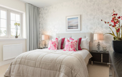
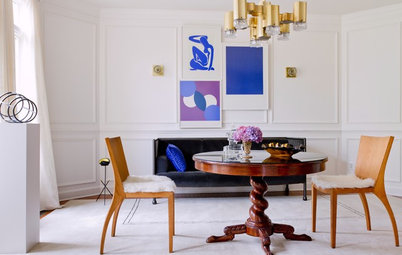
6. Burgundy
Possibly the ultimate in stately appeal, burgundy is no shy shade. But despite its red undertones, it can be just as easy, if not easier, to decorate with than true black. By pairing it with white, browns, golden metallics and woods, you can create a moody but welcoming scheme without the extreme contrast of black, for a true curl-up-by-the-fire vibe.
Possibly the ultimate in stately appeal, burgundy is no shy shade. But despite its red undertones, it can be just as easy, if not easier, to decorate with than true black. By pairing it with white, browns, golden metallics and woods, you can create a moody but welcoming scheme without the extreme contrast of black, for a true curl-up-by-the-fire vibe.
Burgundy may not match with every shade, but if you choose it for upholstery, you won’t need any accent pillows. Pair it with warm neutrals in clean lines and classic materials and you’ve got a timeless look that will outlive colour trends.
Coffee table: Bradley Hughes; wallpaper in ‘Sinkiang’: Wolf Gordon
Coffee table: Bradley Hughes; wallpaper in ‘Sinkiang’: Wolf Gordon
7. Chalkboard
If you want to soften the look of black without settling for a different shade, try a chalkboard finish. It gives an opportunity to add plenty of white and provides a more touchable, casual feel that cuts black’s seriousness and brings a sense of you back into the space, offering the best of both worlds.
TELL US
What do you think of inky colours like emeralds and burgundy over black? Which ones are you keen to try? Let us know in the Comments.
MORE
14 Brilliant Ways to Use Chalkboard Paint
Dark and Moody Rooms That Are Anything But Gloomy
Are You Ready to Go Over to the Dark Side?

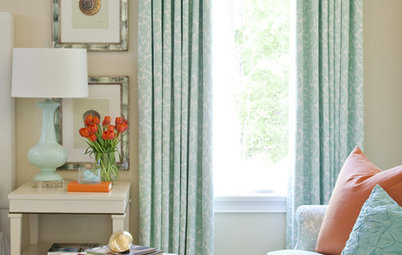


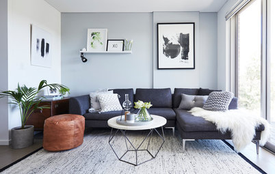
For inky appeal with a nautical twist, classic navy can’t be beat. It makes white look especially bright and fresh. In fact, the two of them together can be all you need. Plus, it balances masculine and feminine appeal, making it a great choice for a bedroom, especially a guest room.