


8 Hallway Colours That Aren’t White or Grey
Let these colour-confident schemes inspire you to shift your hallway out of neutral
Kate Burt
14 September 2019
Houzz UK. I'm a journalist and editor, previously for the Independent, Guardian and various magazines. I'm now excited to part of the editorial team at Houzz UK & Ireland, bringing the best of British and Irish design, interiors and architecture to Houzz.com.
Houzz UK. I'm a journalist and editor, previously for the Independent, Guardian and... More
According to the Houzz photo search function, white and grey are some of our favourite hallway colours, but they’re not the only hues in town. Take a look at these colourful examples and see if they inspire you to be bold.
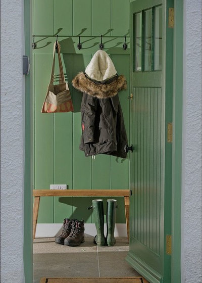
1. Go green
This rich pine-tree green conjures up images of forest walks – what a soothing environment to greet you as you arrive home. Perhaps it’s the reference to nature that helps the green hue evoke feelings of calm (green isn’t used in healthcare settings for nothing).
Here, mixing it with white woodwork gives this entrance a classic finish, perfect for a period property wanting to nod to its historical credentials.

2. Perk up with pink
While ‘cool’ green soothes the senses, ‘warm’ colours, such as pinks, reds and oranges, are said to be energising. Here, the classic clash of pink and red has been employed to give the mid-tone walls even more impact. (By the way, it’s a myth that pink and red shouldn’t be paired up – and here’s the proof.)
Stripped timber floorboards and classic white paintwork keep the effect of combining these vibrant colours elegant rather than quirky.
Find an interior designer or decorator near you on Houzz for professional advice on combining colours
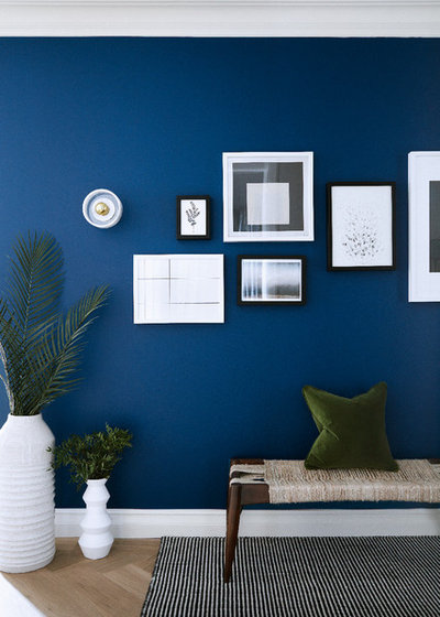
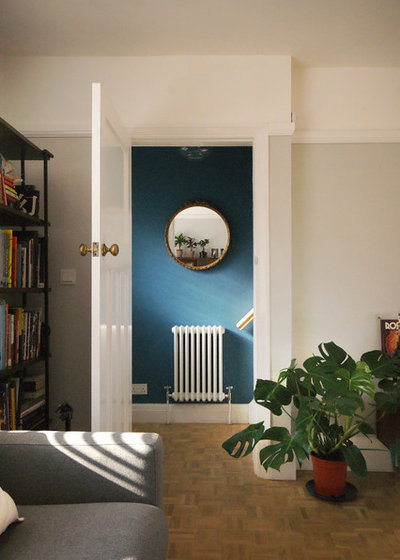
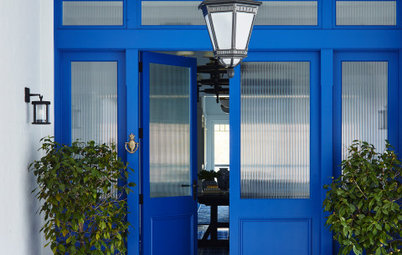
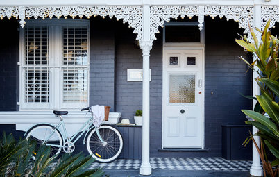
3. Dabble with dark blue
Hallways are often rather light-starved, and we tend to shy away from dark colours, worrying that these hues will make the space dingier still. However, choose a vibrant deep shade and you could enhance your hall.
Here, the rich blue has a luminous quality and the brightness makes it a colourful wall rather than a dark one. In spaces with little natural light, brights can be better than whites, which can take on a dull, grimy appearance rather than opening up the area.
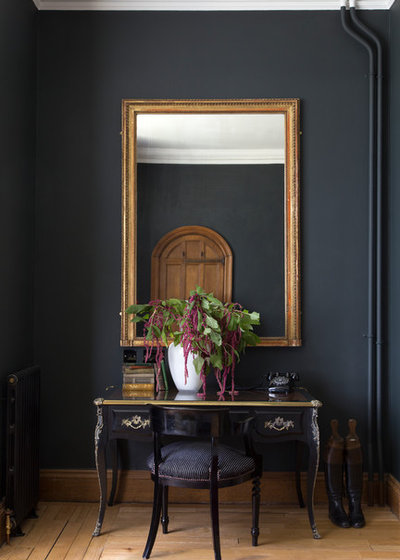
4. Embrace black
Where you really don’t have much hope of lightening up your hall, however, try going really dark. This almost-black scheme celebrates the intimate space a dark hallway can be. Hanging a large mirror will reflect the light you do have available and add a feeling of spaciousness.
7 Moody Colour Alternatives to Black
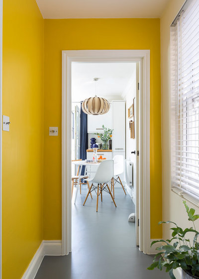
5. Make it sunny-side up
Research by the University of Manchester has put yellow at the top of the happy tree, so for a feel-good homecoming, this cheery colour is worth considering.
Before you look at the beautifully bright space pictured here and despair that you could never recreate the look in your dark hallway, remember your new mantra: gloomy spaces don’t have to be painted in pale colours! Counterintuitive as it may seem, they can really be lifted and warmed by bright hues.
This Colour, There: Where to Use Colour to Enhance Mood
6. Tie in with teal
Interior designers will often talk of a home having a palette. You may have a house full of different colours, but in a well-designed interior, they will all have a connection to one another.
The colour of your hallway or landing is perhaps one of the trickiest spaces to get right, as there are numerous doors opening into other rooms, meaning the various colours will be viewed together.
A colourful hallway could be the perfect complement to neutral main rooms. Let this gorgeous soft teal and pale grey combination inspire you – the colours complement rather than fight each other.
Of course, the success of any paint colour depends on the light, and in a hallway, that can vary hugely as you move through the space and up to the landing, so it pays to test a variety of shades first.
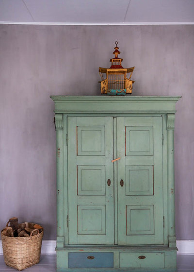
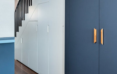
7. Take it easy with lilac
A soft lilac is a gentle way to bring colour into your hallway, especially in a velvety matt version like this lime paint.
You can enhance the colour on your hallway walls with similarly colourful furniture. Painting pieces, like this freestanding cupboard, in a complementary colour is an interesting way to build a palette in a space.
The lilac and minty sage green colours here work well together because they’re equal in tone – a little design rule that’s the secret behind many successful colour pairings.
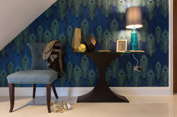
8. Colour with wallpaper
Paint isn’t the only way to brighten your hall walls – wallpaper can work equally well, especially if you prefer a mix of colours, or can’t settle on a single shade.
Here, a peacock-feather wallpaper combines deep greens and blues. Again, the space is not bathed in sunlight and the use of these rich, jewel-like tones illustrates just how well deep colours can work to cosy up a space.
Your turn
What colour is your hallway – and do any of these homes inspire you to redecorate? Share your thoughts in the Comments below, like this story, save the images for inspiration, and join the conversation.
More
Need more advice on contemporary colour combinations? Don’t miss Colour Makes a Comeback! New Trends From Maison & Objet
Related Stories
Picture Perfect
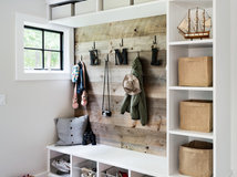
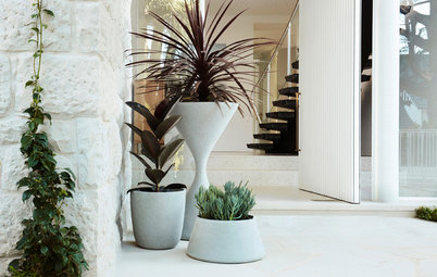
22 Smart, Stylish Storage Set-Ups for a Mess-Free Entrance
Our coffee-break escape offers you five minutes' worth of images to inspire and delight. Jump right in...
Full Story
Doors
What to Do if You Don’t Have a Front Entrance
By Becky Harris
Don't have a foyer, coat cupboard or mudroom? See how three US designers created clever spots for coats, shoes and bags
Full Story
Living Rooms
Before & After: From Dark-Cluttered to Calm-Nordic Living Area
Better spatial planning and a calming makeover have changed the entire tone and look of this living area, on a budget
Full Story
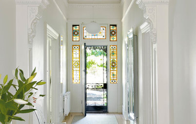
Picture Perfect
17 Excellent Front Doors That Create a Sense of Arrival
Our coffee-break escape offers you five minutes' worth of images to inspire and delight. Jump right in...
Full Story
Most Popular
8 Clever Ideas for Designing Your Dream Hallway Cupboard
Shoes, coats, bags… Keeping your hall free of clutter can be a challenge. The solution is well-designed storage
Full Story
Picture Perfect
Picture Perfect: 26 Entrances That Say Welcome Home
Our coffee-break escape offers you five minutes' worth of images to inspire and delight. Jump right in...
Full Story

Lifestyle
Safe as Houses: What's New in Home Security
From keyless locks and wifi-connected doorbells to AI-enabled cameras, home security just got a whole lot smarter
Full Story
Hallways & Entries
Best of the Week: 34 Entrances, Corridors and Connecting Spaces
Too often, the connecting spaces in our homes get ignored. Here are 34 well-considered corridors, hallways and entrances
Full Story
Best Of The Week
Best of the Week: 28 Entries With Impact From Around the World
By Joanna Tovia
Building or renovating? Don't overlook your front entrance – it's a great opportunity to make a style statement
Full Story
Found it!
Deep Space Blue by Little Greene!
I’m on it! Thanks
Walk Interior Architecture and Design. That should not work but it’s stunning! Love it.
So many do lilac, the green even the rich blue with hot of bright white trim. Colour is the way to go.