Interior Design

Decorating
A Designer's Masterclass on Material Selection & Custom Joinery
This Melbourne home is a masterclass on how to specify joinery, colours and materials for a warm and seamless feel

Interior designer Jacqui Koska had a lot of boxes to tick in the redesign of this Melbourne family home: ample storage, visual flow, a sophisticated yet lived-in feel, and poodle-proof seating. The results provide insightful lessons on how to use joinery, colours and materials to great effect in the home. Read on to see exactly what Koska did, and to pick up tips you can use in your own home.
The kitchen before works.
What wasn’t working for the client about the house?
The finishes, joinery and overall design were outdated. The house needed to be more functional, with more storage and a better use of space.
Which rooms did you work on?
The kitchen, main bathroom, study, dining room, living room and ensuite, plus selected paint colours throughout.
Want help bringing your own interior together? Find an interior designer near you on Houzz
The kitchen after works.
What was your brief for the house?
To design a new kitchen and main bathroom, study area and a few much-needed custom joinery pieces around the house.
The client wanted to create a warm, lived-in feel, with nothing too over-designed.
The design needed to work with the Californian bungalow style of architecture and the client’s existing vintage furniture and artwork.
What were the client’s must-haves?
- A dedicated study space.
- A more functional kitchen, with additional storage.
- A warm and fresh colour and materials palette; a timeless design.
The kitchen before works.
What was your brief for the kitchen?
To create more storage, update the finishes, and design a light and open space that didn’t feel sterile or clinical.
What did you do?
The kitchen was transformed with new joinery, fixtures and finishes. We widened the opening from the dining room and exposed and painted the existing brick on this wall.
There were originally two tall, narrow cabinets on either side of the window, which we changed for thick, floating shelves with a bench and drawers below to open up the space and allow more light to filter into the kitchen.
All walls (except the bathroom) painted in Snowy Mountains Quarter: Dulux; kitchen benchtops: solid walnut custom-designed by Jacqui Koska in a herringbone pattern and made by Noy Builders.
What was your starting point for the kitchen redesign?
The herringbone benchtop. The clients wanted to use a timber benchtop and when I showed them the concept for the herringbone timber top they fell in love with it.
This benchtop is the hero of the space. It’s timeless, original and adds warmth and interest to the kitchen.
Stained brush box timber flooring: Grimes and Sons.
What are the key elements in the colour and materials palette?
The palette is composed of warm whites, dark timbers and hints of grey. The handmade tiles and herringbone benchtop are important features in the kitchen, adding a warm, lived-in feel and a sense of craftsmanship to the space.
Why did you choose them?
Warm white maximises light and create a clean backdrop for the dark timbers and hints of grey.
Tell us about the floating shelves
Originally, there were two tall cabinets on either side of this window, making the space feel cramped and enclosed. We removed these cabinets and added floating shelves to open up the space and allow more light into the kitchen.
The shelves bring balance and symmetry to the design, while visually connecting to the other side of the kitchen.
Did you add the curved walls?
No, they are part of the original architecture of the house.
We carried this design language through to other elements in the kitchen, such as the curved edges on the range hood shroud and curved corners on the floating shelves.
No, they are part of the original architecture of the house.
We carried this design language through to other elements in the kitchen, such as the curved edges on the range hood shroud and curved corners on the floating shelves.
How did you address kitchen storage?
We maximised the storage and organisation in the kitchen by including lots of drawers rather than cupboards, which can often be difficult to access and impractical to use.
A tall cabinet between the kitchen and study provides additional storage for large appliances and helps create flow between the two areas.
Browse more contemporary Australian kitchens with dark timber joinery
What was here before you added the study?
It was a transitional ‘nothing’ space. The new built-in joinery and dark-stained timber floor give it a sense of purpose.
What was your starting point for the study?
The design began with the plan as this space was to be the centre of the house and would be seen from every room and the backyard. As such, it was important for the joinery to feel like it belonged and was a natural extension of the kitchen and dining room.
It needed to feel like an inviting place to sit and work. To achieve this, we kept the materials consistent with those in the kitchen and dining room.
Take us through the design
The client wanted a space for two people to work at the same time. They needed storage for their daughter’s artwork and a deep section of desk space in addition to a narrow desk section along the window wall.
We included plenty of storage; the desk has pencil drawers all the way along and under the worktop, plus two cabinets hidden in the corner below the desk.
There is also a display shelf for books or accessories and a pinboard above each section of the desk. This shelf was an important design element; it forms a backdrop to the view from the dining room and through the kitchen to the study.
What are the key elements in the colour and materials palette?
A white two-pack polyurethane paint finish, a grey pinboard and a walnut desk and detailing. We chose these as they reflect the colour and materials palette in the kitchen and dining room.
Why did you include the fine band of timber?
This band of walnut adds definition to the space and is a delicate way to finish off the exposed edge of the pinboard, while tying in with the surrounding finishes.
The main bathroom before works.
What was your brief for the bathroom?
To create a tranquil bathroom that was a little bit eclectic, incorporating some greenery and Moroccan-style tiles.
What was your starting point?
The original bathroom made poor use of the space, with two doors and an awkward layout. Our starting point was to improve the flow by removing the second door, reconfiguring the layout and adding a separate bath and shower.
The floor tiles drove the aesthetic for the bathroom. We used these as our starting point for the design direction and built the rest of the palette around them.
The main bathroom before works.
What did you do?
We completely refigured the layout, removed the corner bathtub, and added all-new joinery, fixtures and finishes.
What did you do?
We completely refigured the layout, removed the corner bathtub, and added all-new joinery, fixtures and finishes.
The main bathroom after works.
What are the key elements in the colour and materials palette?
We wanted to create a palette that felt fresh, luxurious and lived-in.
We chose white wall tiles and walnut details and joinery finishes to tie in the bathroom joinery with the colours and materials throughout the house.
We specified a Tundra blue-honed limestone for the vanity top to contrast with the simple ceramic wall tiles. It also adds an earthy element to the space and creates a high-end feel.
Stone bath: Stonebaths; Marrakech encaustic floor tiles: Teranova; Faux Raw Plaster specialist washable paint finish in Cloud Land: Colourville.
With such a high ceiling, we didn’t want to tile all the way to the ceiling. Instead we used a custom specialist paint finish by Pacquita Maher at Colourville. Unlike flat paint, this finish adds movement and texture to the walls, and really brings in that handcrafted feel to the bathroom.
What is the timber ledge for?
For display items such as candles, pictures and objects. The ledge defines the line between the tiles and the textured wall paint, while helping to define the bath as the focal point of the room.
Tell us about the vanity
This is a custom-designed vanity, with drawers for concealed storage and a ledge to store towels.
The medicine cabinet above it has one mirrored door and an open section for display, which added balance to the joinery and broke up the large expanse of mirror.
This is a custom-designed vanity, with drawers for concealed storage and a ledge to store towels.
The medicine cabinet above it has one mirrored door and an open section for display, which added balance to the joinery and broke up the large expanse of mirror.
Tundra Blue limestone vanity tops: RMS Marble.
Newport subway tiles: TileCloud.
We love the wall-tile layout in the shower – tell us about it
These are handmade matt tiles laid in a diagonal chevron pattern.
We chose to lay the wall tiles in this configuration as we wanted to reflect the angles in the printed patterns on the floor tiles. The floor tiles are a dominant feature in this space – we wanted the wall tiles to add dimension but not visually compete with the floor tiles.
What was your brief for the dining room?
The dining room needed to feel cohesive with the rest of the house.
Originally, there were some loose pieces of furniture in here, including a tall cabinet that made the room feel somewhat enclosed. The space needed to be simplified and visually opened up, and the design had to complement the client’s existing dining table, Persian rug and artwork.
What did you do?
We repainted the dining room the same colour as the rest of the house, removed the tall cabinet and loose storage pieces, and added a long, low cantilevered sideboard.
Glass sculptures: Pépite.
Tell us about the sideboard
We custom-designed this piece in American walnut veneer. It was carefully designed to include a combination of deep and shallow drawers to store alcohol, tableware and games.
Tell us about the sideboard
We custom-designed this piece in American walnut veneer. It was carefully designed to include a combination of deep and shallow drawers to store alcohol, tableware and games.
View through to the living room before works.
The living room before works.
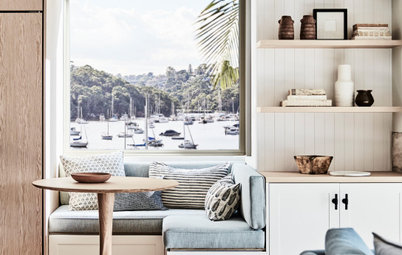
Tell us about the custom seat in the living room
In the living room, we designed a window seat with a walnut base and a custom seat cushion in a Zepel Fibreguard fabric to withstand any wear and tear from the family’s large poodle, Percy.
It provides an extra spot for reading, conversation or watching TV. It also seems to be Percy’s favourite spot to sit!
Your turn
Did you find this story useful? Tell us in the Comments below. And don’t forget to save these images, like this story and join the conversation.
More
Want more great design lessons? Check out this Design Masterclass: A Classically Beautiful Kitchen & Laundry

Sponsored
Who lives here: A couple with two children aged 11 and 13
Location: Brunswick, Victoria
Architectural style: A two-storey Californian bungalow
Bedrooms and bathrooms: Four bedrooms and two bathrooms
Budget: Around AU$250,000
Where did most of it go: The joinery and finishes
Interior design: Jacqui Koska
Styling: Bea+Co and Studio George
Builder: Noy Builders
Joinery: Designed by Jacqui Koska and built by Noy Builders
Specialist paint finishes: Pacquita Maher at Colourville