


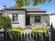


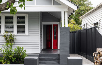
A Victorian Terrace Made Minimalist... With Hints of History
Gutting this run-down terrace revealed all sorts of surprises, many of which made it into the modern-minimalist redesign
Georgia Madden
26 September 2019
In this Q&A series, we turn the spotlight on one thought-provoking renovation or extension each week. Here, interior designer Emma Say at Tom Mark Henry shares the fascinating journey of transforming a dilapidated Sydney, NSW terrace. The former five-bedroom, two-bathroom home is now a minimalist masterpiece with three bedrooms and four bathrooms that beautifully balances old and new.
Images by Pablo Veiga
Answers by Emma Say, interior designer at Tom Mark Henry
Owners: A couple with teenage children
Location: Darlinghurst, NSW
Original size: 172.5 square metres
Size after works: 195 square metres
Interior designer: Tom Mark Henry
Builder: JCORP Construction
Engineer: ACOR Consultants
Styling: Claire Delmar
Landscape: Impact Gardening
Gained
- A new, more functional floor plan.
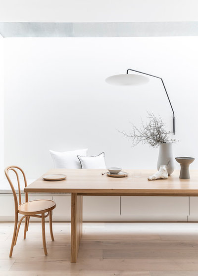
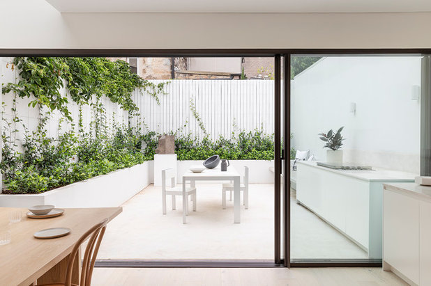
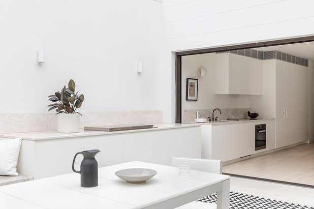
- A new open-plan layout to the ground floor that maximises space in the narrow site. The external wall was pushed out to the boundary and an unused side passage was converted into a dining area with a four-metre-long skylight overhead.
- A clear sightline from the front door through to the kitchen, dining space and courtyard.
- Two new bathrooms.
- An abundance of natural light throughout.
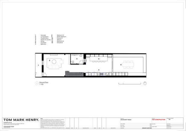
Ground-floor plan after works
What was the house like originally?
A run-down, three-storey Victorian terrace with five bedrooms and two bathrooms.
Thinking of renovating or extending? Chat with an architect on Houzz to find out what’s possible on your site
What was the house like originally?
A run-down, three-storey Victorian terrace with five bedrooms and two bathrooms.
Thinking of renovating or extending? Chat with an architect on Houzz to find out what’s possible on your site
First-floor plan after works
What problems did this project address?
What problems did this project address?
- Inhabitable space.
- An awkward layout.
- Not enough bathrooms.
- Poor natural light.
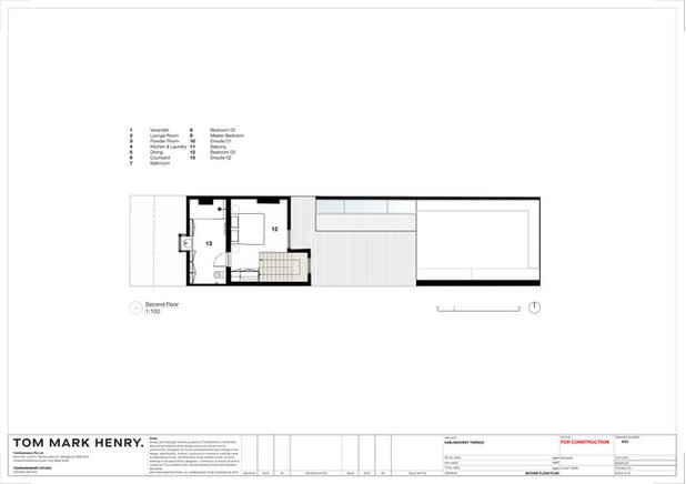
Second-floor plan after works
What was your approach to this project?
Our client was drawn to the fundamentally simple and beautiful homes of architectural designer John Pawson as inspiration.
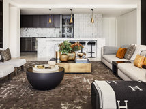
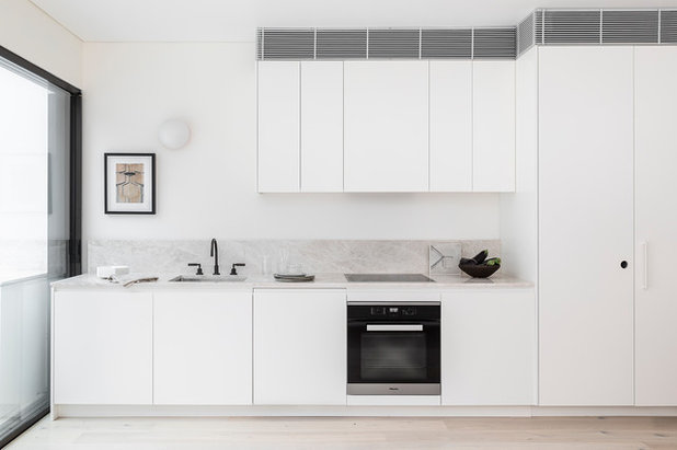
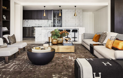
Use of colour was not on the agenda, so instead we focused on the interplay of texture, combining hard and soft finishes and contrasting matt and gloss surfaces to create depth in an otherwise monochromatic palette. These quiet juxtapositions were an exercise in restraint. It is what has been left out that makes the interior special.
Due to the nature of the palette, we were careful not to use a cool white on the walls or joinery.
Existing sandstone walls were revealed during demolition and swiftly adapted into the scheme, working perfectly with the selected oak timber floors and soft whites of the new walls and joinery.
What was your approach to this project?
Our client was drawn to the fundamentally simple and beautiful homes of architectural designer John Pawson as inspiration.
Use of colour was not on the agenda, so instead we focused on the interplay of texture, combining hard and soft finishes and contrasting matt and gloss surfaces to create depth in an otherwise monochromatic palette. These quiet juxtapositions were an exercise in restraint. It is what has been left out that makes the interior special.
Due to the nature of the palette, we were careful not to use a cool white on the walls or joinery.
Existing sandstone walls were revealed during demolition and swiftly adapted into the scheme, working perfectly with the selected oak timber floors and soft whites of the new walls and joinery.
What was the client’s brief?
To create a more functional floor plan, pull in natural light, and add a contemporary feel while preserving the home’s 100-year-old architectural imprint.
To create a more functional floor plan, pull in natural light, and add a contemporary feel while preserving the home’s 100-year-old architectural imprint.
What were the client’s must-haves?
- Natural light.
- Minimalist design.
- More bathrooms
- Retain the existing character of the house.
What exactly did you do?
- Pared the house back to its original shell and reinvented the floor plan.
- Carefully mediated the home’s heritage details with contemporary, minimalist design.
- Created a clear sightline upon entry, with a view from the front door through the kitchen and dining space to the courtyard.
- Opened up the ground floor by pushing the external wall out to the boundary.
- Converted a dark, unused side passage and put in a new dining area with a four-metre-long skylight overhead.
- Split one of the bedrooms in two and turned half into a new bathroom.
- Turned one of the two bedrooms in the attic into an ensuite.
- Retained the existing fireplaces and painted them black to give them a modern, minimalist look that honours the home’s history.
- Incorporated the original sandstone walls that were uncovered during construction into the new design.
Where did most of the budget go?
We were able to keep the costs within the client’s budget, even with some unexpected decisions to make. The biggest variation was finding the sandstone walls during the demolition. We decided that by exposing them (and re-grouting and sealing them), there was so much heritage value to gain. To control the costs, we selected only a few key walls where we would do this, in the living room and master bedroom.
Retaining ‘character’ items, such as windows and fireplaces where possible, also meant that the outcome of balancing heritage and minimalist values was achieved without having to replace everything.
What challenges did you have to work around?
Although a significant intervention was needed to make the place habitable, particular care was taken to retain the building’s original character. We wanted to preserve its 100-year-old architectural imprint and add a contemporary feel, which meant carefully mediating heritage detail and contemporary minimalist design.
Although a significant intervention was needed to make the place habitable, particular care was taken to retain the building’s original character. We wanted to preserve its 100-year-old architectural imprint and add a contemporary feel, which meant carefully mediating heritage detail and contemporary minimalist design.
What are the key features?
- Natural light.
- Lashings of white.
- Pared-back detailing.
- Subtle interest created by an intriguing mix of textures.
- A beautiful balance of old and new features.
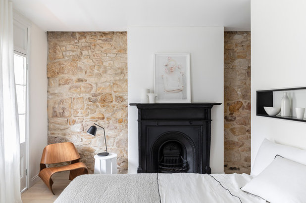
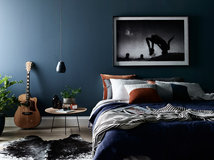
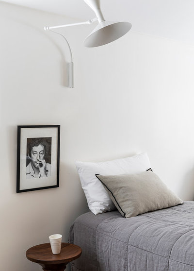
Tell us about the recessed niche in the master bedroom
We wanted to centre the bed within the master bedroom in order to retain the existing fireplace and maximise the wardrobe storage space.
Due to the spatial restrictions around the bed it wasn’t possible to use bedside tables, so we felt that utilising a recessed niche above the bed would provide enough general storage space for those using the room.
It also allowed us to integrated an LED light strip to the rear of the niche to provide ambient light around the bed at night.
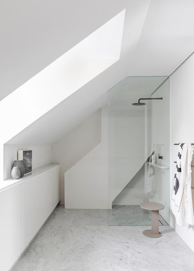
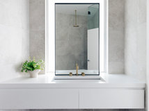
Tell us about the new attic bathroom
The attic space was initially divided into two bedrooms, both of which were upstairs from the nearest bathroom. We felt that turning one of the bedrooms into an ensuite would make more valuable use of the space.
We retained the existing roof structure and window to the front of the house and maximised its impact internally by using a render finish on the walls and placing the sink under the window.
The structure seen behind the shower screen is the existing flue from the fireplace, which we chose to retain, providing a subtle connection back to the rest of the home.
Why do you think this extension works so well?
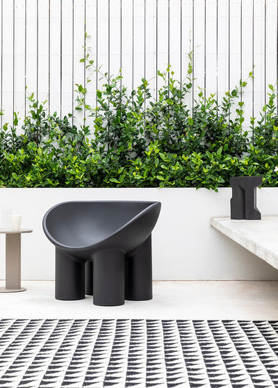
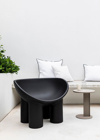
Because it allows for a more functional floor plan and overall, a larger floor space. The extension also opens up the house to the rear courtyard and allows more natural light to flood the living spaces.
Because it allows for a more functional floor plan and overall, a larger floor space. The extension also opens up the house to the rear courtyard and allows more natural light to flood the living spaces.
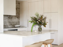
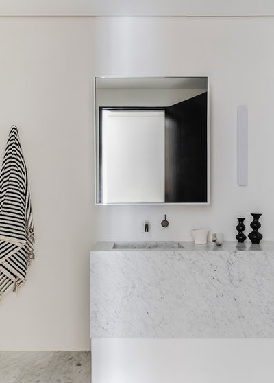
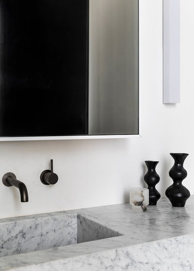
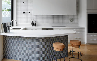
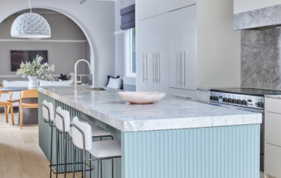
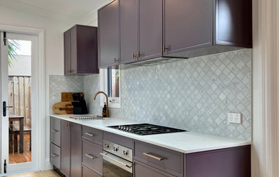
Interior materials palette
Exterior materials palette
- Oak Botany flooring from Havwoods.
- Joinery painted in Dulux Fair Bianca.
- White Emprador marble and Carrara marble to the bathroom and kitchen from Euro Natural Stone.
- Handmade Spanish tiles from Surface Gallery.
Exterior materials palette
- White concrete floor finish to the courtyard.
Key fittings and fixtures
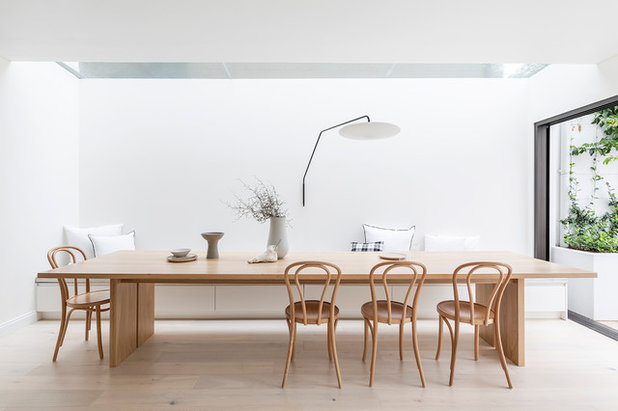
- Custom four-metre dining table from furniture maker Jonathan West.
- No 18 dining chairs from Thonet.
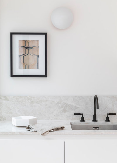
- Powder-room pendant from Porcelain Bear.
- Kitchen and bathroom fixtures in Iron Bronze finish from Astra Walker.
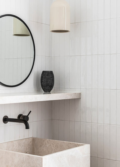
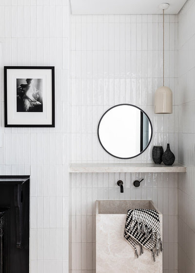
The powder room
Paint colours
Your turn
Do you love this minimalist redesign as much as we do? Tell us in the Comments, like this story, save the images and join the conversation.
More
Want to see more inspiring makeovers? Don’t miss this Project of the Week, Beautiful Bones: The Gentle Reimagining of a Heritage Home
Paint colours
- External paint is Dulux Mt Aspiring.
- Internal wall is Dulux’s Fair Bianca Half.
- Internal trims and ceiling paint is Dulux’s Vivid White.
Your turn
Do you love this minimalist redesign as much as we do? Tell us in the Comments, like this story, save the images and join the conversation.
More
Want to see more inspiring makeovers? Don’t miss this Project of the Week, Beautiful Bones: The Gentle Reimagining of a Heritage Home

Related Stories
Popular Houzz Series
A Dated Country Home in a Kiwifruit Orchard Made Modern
When their grown-up sons moved out, these NZ homeowners gave their much-loved country home a chic, modern makeover
Full Story
Renovating
An Inspired Solution for a Dark & Disjointed Californian Bungalow
See how an architect opened up a light-starved, closed-in Melbourne home, and connected it with the neighbouring park
Full Story
Popular Houzz Series
Before & After: A Leaky, Falling-Down Victorian Terrace Reborn
See how a small Melbourne terrace, untouched for over 100 years, was remade into a functional home for a modern family
Full Story
Before & After
Before & After: From 'White Box' to Luxe, Layered Apartment
Quiet luxury was the goal for the redesign of this Sydney waterfront apartment – see how the designer achieved it
Full Story
Popular Houzz Series
A Sweet Balmain Cottage Sure to Capture Your Heart
With an extension underway, this cottage was ready for a new decorative scheme that would bring old and new together
Full Story
Before & After
Before & After: A Cheap & Cheerful Makeover of a 1980s Caravan
Armed with an AU$1500 budget, a Melbourne couple rolled up their sleeves and transformed a caravan in just three months
Full Story
Projects Born on Houzz
Before & After: A Light-Drenched Home in the Heart of Coogee
This breezy family home in one of Sydney's beachside suburbs is the essence of relaxed Australian coastal style
Full Story
Interior Design
A Grand Federation Home Comes of Age for a Busy Young Family
See how a revamped layout, custom joinery and luxe touches transformed a dated heritage home in Sydney
Full Story
Architecture
From Tired 100-Year-Old Beach Cottage to Lush, Private Oasis
Encircled by beautiful gardens, this renovated weatherboard cottage in Sydney is all about indoor-outdoor connection
Full Story
Bathroom Renovations
Before & After: A Clunky & Dated Victorian Terrace Reborn
Rising damp, sagging floors and a dysfunctional layout were just some of the challenges this tired terrace offered up
Full Story
As a Not Naturally Organised person, I am not drawn to minimalist designs however I find this project quite restful and calming to look at. What a find those sandstone walls are!
Love it!
Love it too, but I personally like more colour. I'd have liked to see the front exterior. The niche above the bed is a great idea, even if there was room to have bedside tables.