


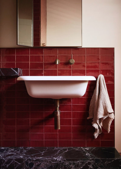
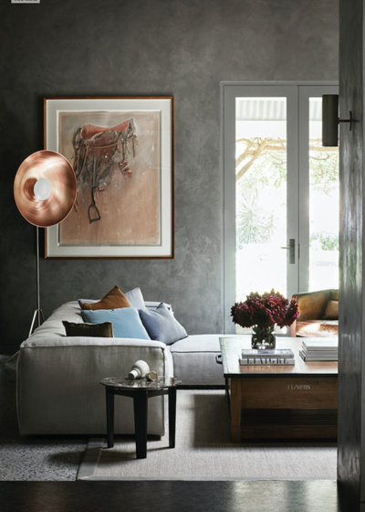
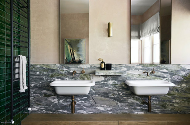
Award-Winning Homes With Inspiring Colour Schemes
Seeking colour palette ideas for your next paint job? Look no further – check out these award-winning homes
Georgia Madden
10 May 2019
It’s no secret that colour is one of the quickest and and most effective ways to dial up the wow factor in your home. But when it comes to choosing a palette, where do you start and which looks are trending? These winning residential projects from the 2019 Dulux Colour Awards are packed full of colour inspiration (not to mention gorgeous homes) – so pour yourself a cuppa and prepare to take notes.
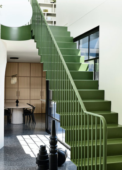
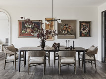
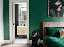
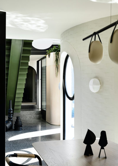
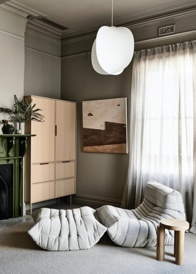
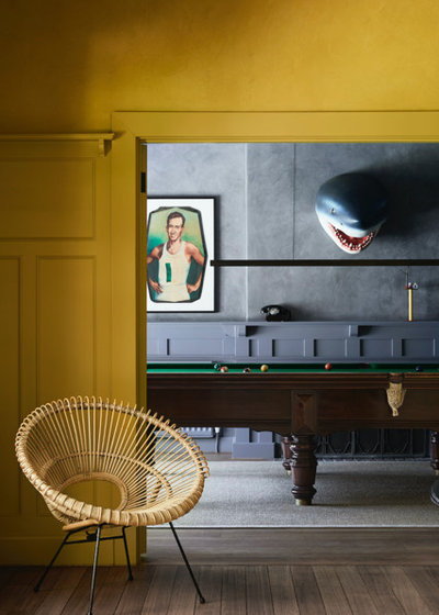
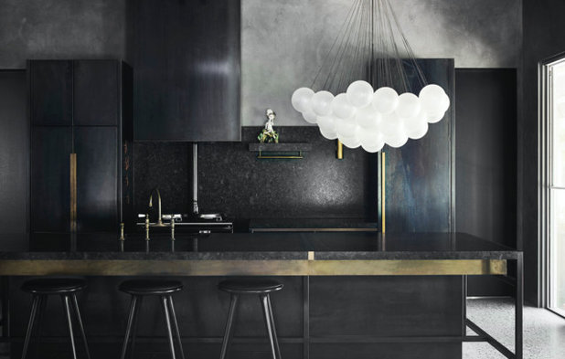
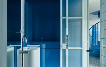
RESIDENTIAL INTERIOR WINNER
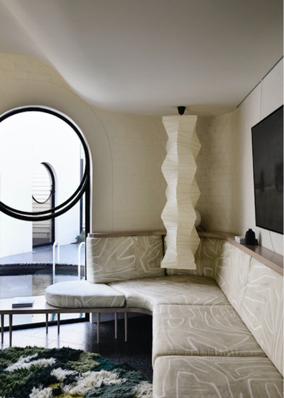
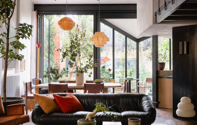
Project: Caroline House
Location: Victoria
Architecture/Design Practice: Kennedy Nolan
Photos: Derek Swalwell
Project: Caroline House
Location: Victoria
Architecture/Design Practice: Kennedy Nolan
Photos: Derek Swalwell
Architect’s notes: A restored and re-imagined existing Edwardian house, with an added pavilion separated from the original building by an internal courtyard containing a swimming pool.
A whimsical, formal approach is taken, with a balanced relationship between garden and interior space and a detailed and nuanced approach to texture, colour and pattern. Although the brief for the Caroline House does not challenge the paradigm of the family house in terms of accommodation requirements, our clients wanted this accommodation to be delivered in an expressive, engaging and memorable fashion.
Find an interior designer or decorator on Houzz to co-ordinate your scheme here
Find an interior designer or decorator on Houzz to co-ordinate your scheme here
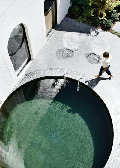
The most fundamental element of the brief is probably the swimming pool. The challenge of integrating swimming pools into domestic environments increases every year with new regulations that break down the immediacy of proximity to water.
Here, the proximity of water to the interior is immediate and dramatic with the sense that the edge of the building plunges into a deep pool. These effects are deliberate and aspire to create a setting that is poetic and evocative without being specific – an environment redolent of things in our city and in our imagination.
Here, the proximity of water to the interior is immediate and dramatic with the sense that the edge of the building plunges into a deep pool. These effects are deliberate and aspire to create a setting that is poetic and evocative without being specific – an environment redolent of things in our city and in our imagination.
Given its compact site, we made a complex plan with multiple courtyards to give a sense of disappearing space. A meticulous and complete approach to the interior aligns old rooms with new and results in a narrative experience that provides moments of delight and discovery within a singular aesthetic.
Judge’s comments: “Classic black and white with a punch of colour is eternally effective, and its articulation in this home is especially inspiring. The balanced tonal distribution ensures a subdued spatial feel, enabling detail and texture to come to the fore,” says judge Carole Whiting, director of Carole Whiting Interiors + Design.
“At the home’s core is an inspired iteration of colour: the near-apple-green hue on the stair, including its underside and handrail, is a central connecting device, mirroring the greens of the pool, itself a focal point of the home, and subtly aligning inside and out.
“It is timeless and understated or, as the architects state, ‘meticulous and complete’,” says Whiting.
Dulux colours used: Dark Rainforest and Grand Piano Quarter, Black, Calf Skin.
“It is timeless and understated or, as the architects state, ‘meticulous and complete’,” says Whiting.
Dulux colours used: Dark Rainforest and Grand Piano Quarter, Black, Calf Skin.
RESIDENTIAL INTERIOR COMMENDATION
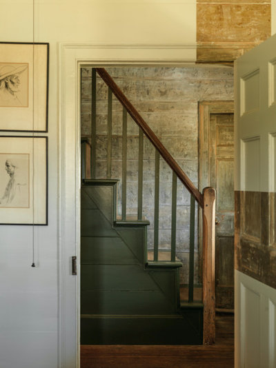
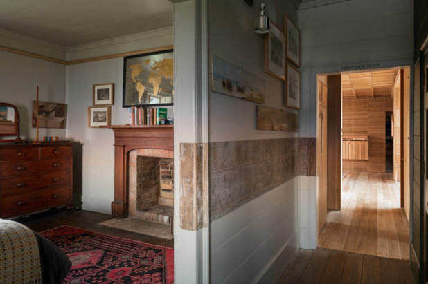
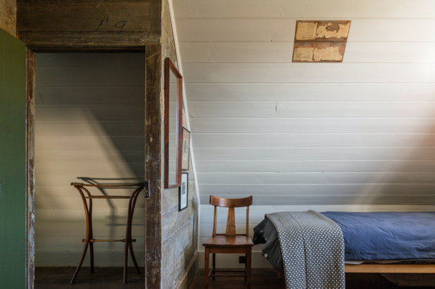
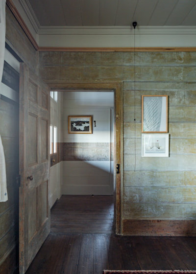
Project: Captain Kelly’s Cottage
Location: Bruny Island, Tasmania
Architecture/Design Practice: John Wardle Architects
Photos: Trevor Mein
Project: Captain Kelly’s Cottage
Location: Bruny Island, Tasmania
Architecture/Design Practice: John Wardle Architects
Photos: Trevor Mein
Architect’s notes: Captain James Kelly’s Cottage involves the painstakingly considered restoration of an original weatherboard cottage on a remote bay of Bruny Island, Tasmania.
The original cottage was deteriorating due to its age and harsh environment. Over its life there had been a number of unsympathetic alterations to the small cottage. Part of our work involved the removal of these non-original works to respectfully return the cottage to its original form.
The original cottage was deteriorating due to its age and harsh environment. Over its life there had been a number of unsympathetic alterations to the small cottage. Part of our work involved the removal of these non-original works to respectfully return the cottage to its original form.
Revealed in the outcome are unique construction techniques, some of which have been exposed in the new works so they can be fully appreciated.
Further contemporary interventions have also been undertaken and inserted within the heritage structure to make the building more responsive to today’s inhabitation standards.
Further contemporary interventions have also been undertaken and inserted within the heritage structure to make the building more responsive to today’s inhabitation standards.
Captain Kelly built the cottage in the early 1840s. As part of this project, extensive research has been carried out into the history of the cottage, tracking through libraries, original diaries and detailed logbooks. It is speculated that the various ship’s carpenters of Kelly’s whaling enterprise may have built the house during the whaling off-season.
The original cottage consisted of two structures: bedrooms and kitchen, surrounded by a wide verandah. Construction involved the meticulous removal of paint layers to reveal the original paint colours that have been left in parts, and provided inspiration in other areas. Yellowing newspaper clippings found under paint are on show.
The original cottage consisted of two structures: bedrooms and kitchen, surrounded by a wide verandah. Construction involved the meticulous removal of paint layers to reveal the original paint colours that have been left in parts, and provided inspiration in other areas. Yellowing newspaper clippings found under paint are on show.
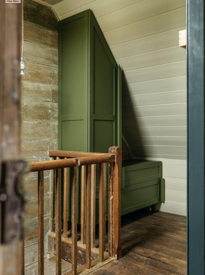
The original colours were matched, and restrained usage highlights features of the cottage while contrasting others. An elegant deep green is used to pick out doors and stairs, while bedrooms have been simply finished in subdued shades reminiscent of the sea.
History is acknowledged and showcased in the interior approach to this modest cottage, the paint finishes a deft gesture in understatement.
History is acknowledged and showcased in the interior approach to this modest cottage, the paint finishes a deft gesture in understatement.
Judge’s comments: “Colour and paint are important factors in restorations, and this project demonstrates their thoughtful use. It is not just the applied colour, but also the removal of colour to retain the original surface of the cottage and preserve its history that is so impressive.
“The use of green in the bedrooms is neither stark nor overbearing, and the matching of original colours is respectful and appropriate,” says Whiting.
Dulux colours used: Algae, Linseed and Leaf Tea.
“The use of green in the bedrooms is neither stark nor overbearing, and the matching of original colours is respectful and appropriate,” says Whiting.
Dulux colours used: Algae, Linseed and Leaf Tea.
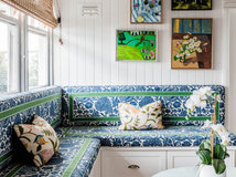
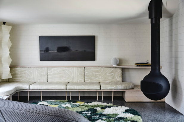
RESIDENTIAL INTERIOR COMMENDATION
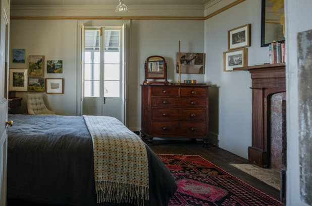
Project: Elmore Homestead
Location: Victoria
Architecture/Design Practice: Flack Studio
Photos: Sharyn Cairns
Project: Elmore Homestead
Location: Victoria
Architecture/Design Practice: Flack Studio
Photos: Sharyn Cairns
Designer’s notes: Grounded by a respect for Edwardian classicism and a desire to honour the home’s original heritage, this project was a second home base for a couple wanting to be close to family, echoing the feel of Sydney with the restrained elegance of a classic Melbourne Edwardian home.
A mix of finishes from dark to light provides visual relief and delineates between informal and formal spaces. Unexpected colour combinations, bold art and sculpture provide a sense of surprise.
Judge’s comments: “Much like a curated gallery, this is a finely wrought design whose effect relies upon the courageous use of colour,” says Whiting.
“Unexpected moments are created as dark tones give way to splashes of brightness, delineating informal and formal spaces, while also serving as a strong foundation for the contemporary art and sculpture peppered throughout,” she says.
Dulux colours used: White Duck, Topelo Honey, Pa Red, Recycled, Flinders Green, Purebred, Caps, Manifest, Shetland Lace and Black Caviar.
SINGLE RESIDENTIAL EXTERIOR WINNER
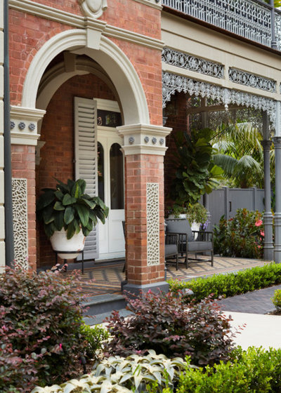
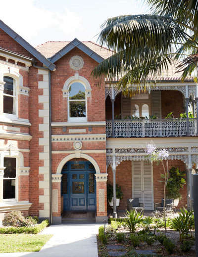
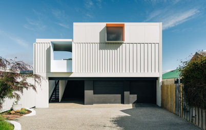
Project: Alma Residence
Location: NSW
Architecture/Design Practice: Studio Gorman
Photos: Prue Ruscoe
Project: Alma Residence
Location: NSW
Architecture/Design Practice: Studio Gorman
Photos: Prue Ruscoe
Designer’s notes: The brief was to restore Alma without it resembling a stuffy heritage restoration project. Traditional elements accent the more contemporary design, while also meeting strict state heritage guidelines.
Both the interior and exterior designs revere the original elements of the grand home. Character was preserved and enhanced by ensuring that the original timber decks, balconies, doors, windows, walls, roofs, chimneys and all other architectural detailing were carefully restored, allowing the patina of years to be honoured.
Both the interior and exterior designs revere the original elements of the grand home. Character was preserved and enhanced by ensuring that the original timber decks, balconies, doors, windows, walls, roofs, chimneys and all other architectural detailing were carefully restored, allowing the patina of years to be honoured.
Interior and exterior palettes were designed to have a connection so that moving from inside to out would feel seamless, and the story of the house would share the same elegant mood.
The exterior palette is a story of soft, harmonious hues that graduate gently, with painted surfaces contrasting against the original red bricks.
The challenge with the exterior was to create balance. Each face of the home looked significantly different and the various architectural elements varied greatly. We adapted typical methodology of colour placement, such as repeating the same colour on the same architectural elements on all sides of the home, and instead approached colour placement more artistically.
We rendered each face and adjusted meticulously until satisfied – a slow and rewarding process given Alma’s immense size. For example, front and rear guttering were specified in different colours, which provided better resolution for this home.
The north face is significantly red brick and needed to be softened to create a welcoming front facade. In contrast, the east face is made up of both shingles, decorative timber work and brick – this is a serene pale grey and white face. The result is a charming exterior that transforms as you walk around, yet still reads as a cohesive palette.
The exterior palette, which was crafted first, was pivotal in informing the interior palette. The interior palette builds from and extends the softer exterior colours, adding depth and gentle drama with quirky and bold colour combinations of duck egg, plum, olive, pale grey, old gold, charcoal and white.
Judge’s comments: “From the fabulous front door to the charming extension, the use of many and varied colours in this residence is sophisticated and refined. Anything but conservative, the subtle palette is full of surprising layers and complexity.
Dulux colour Linseed takes on a green tinge against the existing red bricks in a beautiful juxtaposition. Soft blues distinguish the exterior extension and are amped up through the interior. Even the impact of shade on colour has been considered. Overall, the quirky combinations create an understated drama and cohesive take on contemporary Victoriana,” says judge Mardi Doherty, director of Doherty Design Studio.
Dulux colours used: Raku, White Duck Quarter, Flooded Gum, Linseed, Traditional Cobalt Blue.
SINGLE RESIDENTIAL EXTERIOR COMMENDATION
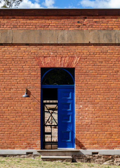
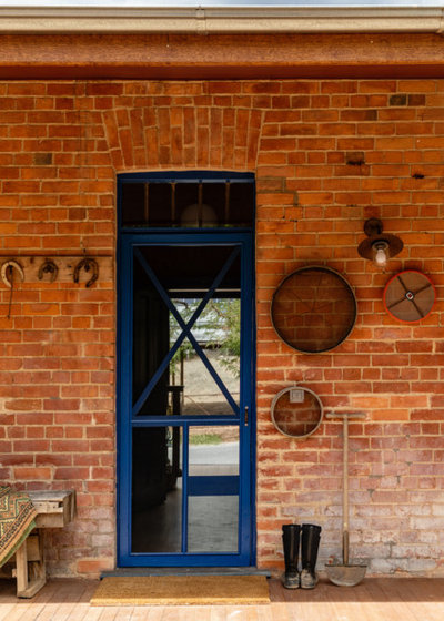
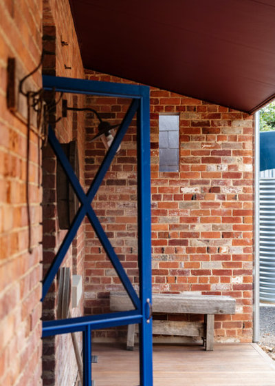
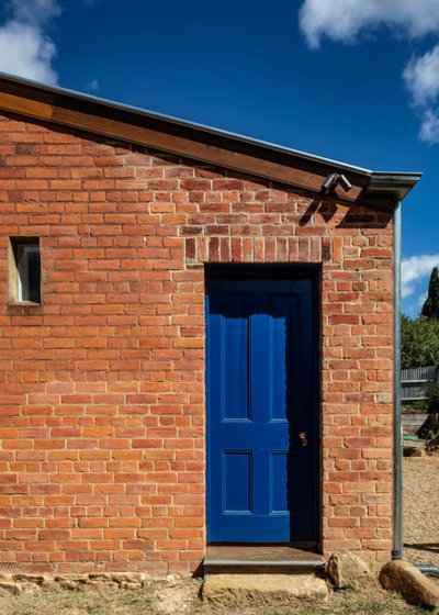
Project: The Bank
Location: Vaughan, Victoria
Architecture/Design Practice: Maria Danos Architecture
Photos: Trevor Mein
Project: The Bank
Location: Vaughan, Victoria
Architecture/Design Practice: Maria Danos Architecture
Photos: Trevor Mein
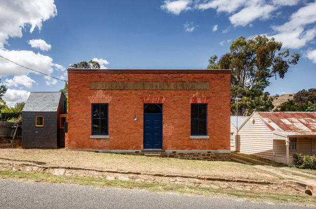
Architect’s notes: Resurrected from a ruinous state, The Bank in Vaughan reclaims its former stature through careful restoration and partnering with a new slate-clad ‘pod’ extension, adapting from a civic building to the next chapter as a country residence. The Bank’s original features reveal clues of the region’s first commercial building built in the 1850s servicing, briefly, the world’s richest alluvial goldfield.
The faded beauty of the original colour scheme observed through door and window trims and interior lining remnants, informed the new colour strategy. After rigorous investigation, Dulux Blue Expanse was selected to resonate with the soft red handmade bricks and sandstone base, reinstate prominence to the original door, delineate the strong symmetry of the window tracery and provide continuity from interior to exterior.
The faded beauty of the original colour scheme observed through door and window trims and interior lining remnants, informed the new colour strategy. After rigorous investigation, Dulux Blue Expanse was selected to resonate with the soft red handmade bricks and sandstone base, reinstate prominence to the original door, delineate the strong symmetry of the window tracery and provide continuity from interior to exterior.
Beyond salvaging, the north verandah timber linings were replaced with a fire-resistant soffit painted in Dulux Red Vine, referencing the heritage red ochre wash over fanning brickwork of door and windows, and the country earth. This colour ‘threshold’ draws warm northern light through the kitchen sink window, the true heart of the home.
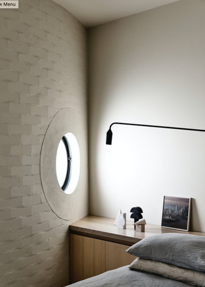
So You Live in a… Historical Brick Villa
So You Live in a… Historical Brick Villa
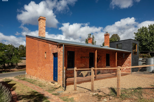
Annexed to the west, a new slate-clad pod is located to ‘service’ The Bank, containing a laundry, kitchen extension and bathroom. Whilst not humble in form, the new extension is deliberately humble in expression of colour to allow the Bank act as the protagonist.
A repository of currency and history, The Bank in Vaughan continues its public and private duties. Colour is used as a tool to reference the historical origins and as a strategy to engage with the original building exterior.
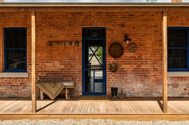
Judge’s comments: “A strikingly simple structure, this converted 1850s bank has been given new life as a dwelling by strategic injections of colour. The faded original exterior, with its warm, soft red bricks and sandstone base, is punctuated by a perfectly contrasting blue on the front door and window frames, articulating these elements in a simple and impactful gesture,” says Doherty.
Dulux colours used: Blue Expanse, Red Vine and Dark Secret.
Dulux colours used: Blue Expanse, Red Vine and Dark Secret.
Your turn
Which of these colour palettes sends your heart racing? Tell us in the Comments below, save the images, like this story and join the conversation.
Which of these colour palettes sends your heart racing? Tell us in the Comments below, save the images, like this story and join the conversation.

Related Stories
Architecture
Small Homes in Unexpected Places: Three Stories
Making do with what you've got can inspire serious creativity, as these three finalists in the 2023 Houses Awards show
Full Story
Interior Design
See Incredible Homes Shortlisted for the Interior Design Awards
The finalists of the 2023 Australian Interior Design Awards have just been unveiled – step inside some of our favourites
Full Story
Colour
Paintbrushes Poised! 2023 Dulux Colour Awards Finalists Are In
Looking for interesting ways to add colour at home? Check out these shortlisted projects in the 2023 Dulux Colour Awards
Full Story
Architecture
Sir David Alan Chipperfield Wins the 2023 Pritzker Prize
The English architect is known for honouring history and culture while creating timeless modern design
Full Story
Architecture
Winners of the 2022 National Architecture Awards
They're the best of the best – feast your eyes on the winning homes in the Institute of Architecture's national awards
Full Story
Trade Shows
2022 Decor + Design VIVID x Houzz People's Choice Award
By Houzz AU
See entries from emerging Australian designers in the 2022 VIVID design competition then vote for your favourite
Full Story
Interior Design
Uncontrived is Back! The 2022 Australian Interior Design Awards
We invite you to step inside Australia's best homes, which have just been honoured with a prestigious design award
Full Story
Sustainable Homes
10 of Australia's Greenest Homes in the Running for a Major Award
Step inside 10 eco-aware homes by Houzz pros, shortlisted in the Sustainability category of the 2022 Houses Awards
Full Story

Architecture
Best of the Best: Alterations & Additions Under 200 Square Metres
Planning to extend? Check out these standout alterations by Houzz pros shortlisted for a major Australian award
Full Story
Colour
Love Colour? See the Shortlisted Homes in Dulux's Colour Awards
The 28 homes that made the cut for the finals of the Dulux Colour Awards 2022 are in, and they're a feast for the eyes
Full Story
I just adore what has been done with the 1840s sea Captain's cottage! It is so important to acknowledge craftspeople of the past and have some kind of physical connection with the alternate universe that our forebears lived in. To expose, preserve and celebrate the humble origins of such a building was pure genius by the team who completed this project.
The bank is my fave! Love it! And all of these celebrate colour! Oh my goodness, colour at last!