


Before & After: A Futuristic Extension to a Classic Heritage Home
Aluminium cladding and a green-glazed chimney are just the start of the surprises in this heritage-home addition
Georgia Madden
17 February 2022
In this Q&A series, we turn the spotlight on one thought-provoking renovation each week. Here, Ammon Beyerle, architect and director at here studio takes us through the inventive extension to a traditional home in Ballarat, Victoria.
Images by Marnie Hawson.
Styling by Belle Bright.
Answers by Ammon Beyerle, architect and director at here studio.
Who lives here: A person who was returning to Australia after living in Shanghai for 14 years. They were in China during the entire design phase.
Location: Ballarat, Victoria
Size of house before works: About 120 square metres
Size of house after works: Around 160 square metres
Number of bedrooms and bathrooms before works: Three bedrooms, 1.5 bathrooms
Number of bedrooms and bathrooms after works: Two bedrooms, one study and two bathrooms
Number of storeys before works: One
Number of storeys after works: Two
Budget: About AU$750,000
Architecture: Ammon Beyerle, Phillipa Hall, Hella Wigge, Soledad Maldonado, Lewis Gallagher, Ramakrishnan Sekar at here studio
Interior styling: Stylesmiths
Builder: Buildspec
Engineer: McClellands Consulting Engineers
Landscaping: Beare Gardens
Kitchen design: BK Joinery
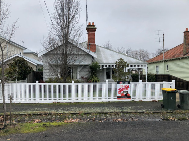
The facade before works.
What was the house like originally?
A simple Federation house with some ornate details. It had some charming features, including fireplaces in the living area and all the bedrooms, tall ceilings and sash windows.
There was a drab DIY extension at the rear, which brought down the whole feel of the house. It included an awkward kitchen, a dining room with a low, sloped ceiling and peeling French doors with faux hardware. The deck was large, but it integrated an unsightly water tank and overlooked a small, muddy backyard.
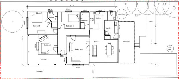
Original floor plan.
What state was it in?
Clean and liveable, but lacking in style.
What wasn’t working for the client?
The whole rear section, plus the other rooms were dark and felt disconnected from the outdoors.
Need more space? Find an architect on Houzz to help you explore the options
What state was it in?
Clean and liveable, but lacking in style.
What wasn’t working for the client?
The whole rear section, plus the other rooms were dark and felt disconnected from the outdoors.
Need more space? Find an architect on Houzz to help you explore the options
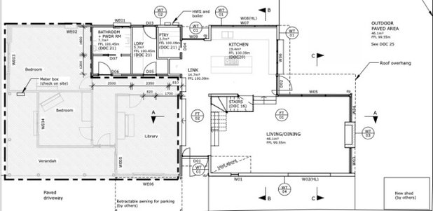
New ground floor plan.
What was your brief?
What was your brief?
- A mid-century-meets contemporary extension, with a kitchen that opens onto the backyard and features a servery window so the owner can pass out platters and cocktails when entertaining.
- A kitchen to accommodate Asian cooking with its flames, spices and smells, mess, pots and pans.
- The kitchen also needed enough space to accommodate entertaining.
- Minor to no renovation to the front of the house.
- A main bedroom with an ensuite and walk-in robe that allowed the client to pack quickly for travel.
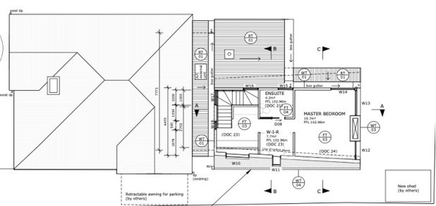
New first floor plan.
What exactly did you do?
What exactly did you do?
- Removed the 1980s extension.
- Installed a new kitchen, to the north east of the house, that connects to the outdoors.
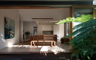
- Connected the existing living room down to a new dining and lounge area.
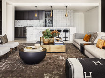
- Added a second-storey extension set back to maximise northerly sun, with a main bedroom suite above and a sunken lounge below.
- Used the space from the third bedroom to create a larger main bathroom and laundry.
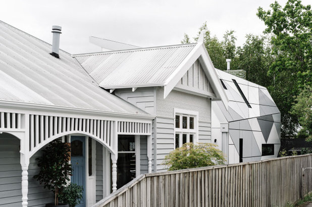
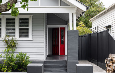
- Restored and repainted the heritage facade (which had a heritage overlay).
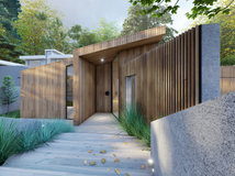
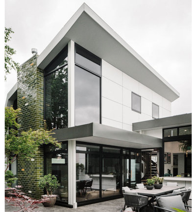
- Added sculptural aluminium panels to the south-facing part of the new extension to distinguish it from the original part of the home.
- Added a new feature two-storey chimney.
- New landscaping and outdoor entertaining area.
The rear of the house originally.
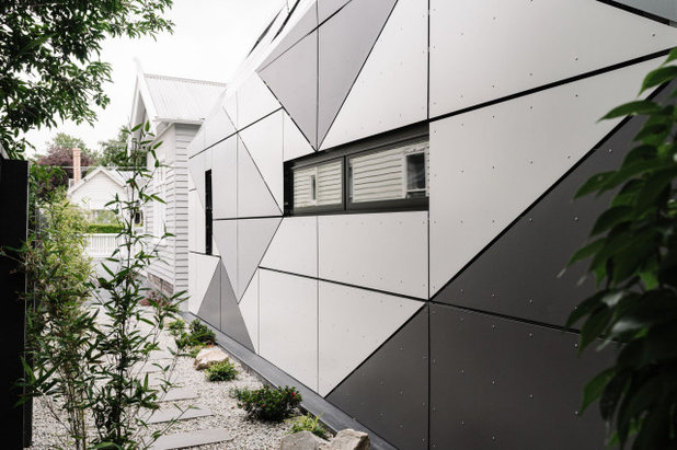
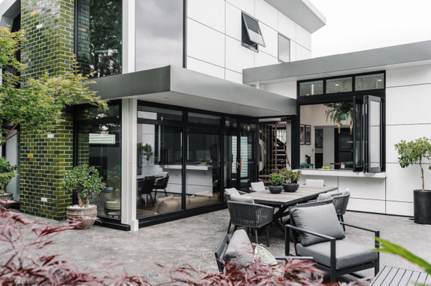
The new chamfered aluminium-clad addition.
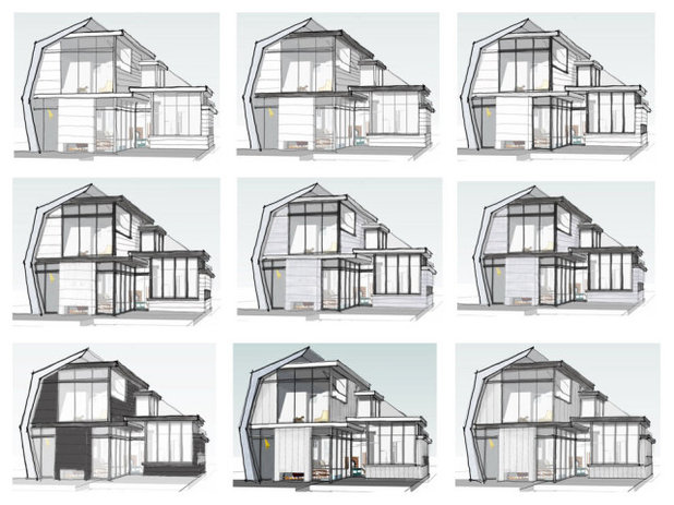
What was your thinking behind the modern exterior to the addition?
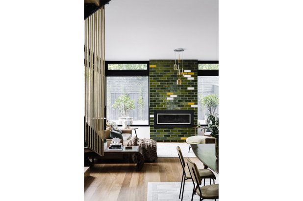
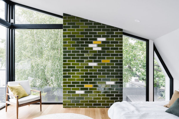
We wanted one side of the addition to have a modernist look; white, open, with black commercial-grade windows and a feature green-glazed brick chimney.
The south side of the new addition was close to the boundary and prominent beside the existing house, so it needed something special. We wanted it to be distinctively contemporary and to set up a surprise as you come around the back of the house.
What was your thinking behind the modern exterior to the addition?
We wanted one side of the addition to have a modernist look; white, open, with black commercial-grade windows and a feature green-glazed brick chimney.
The south side of the new addition was close to the boundary and prominent beside the existing house, so it needed something special. We wanted it to be distinctively contemporary and to set up a surprise as you come around the back of the house.
What was the budget?
Around $750,000.
Where did most of it go?
The extension and quality finishes in the kitchen and bathrooms.
Around $750,000.
Where did most of it go?
The extension and quality finishes in the kitchen and bathrooms.
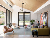
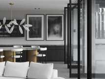
What was your thinking behind the colour and materials palette inside the house?
We were channelling a mid-century modern look, with white interior walls and ceilings, and black steelwork windows and staircase stringer as the background to finely considered natural materials.
To provide warmth and interest to the interior, we used deep colours such a rich eucalypt green for the fireplace, set against native timbers, such as blackbutt, spotted gum, messmate and Victorian ash.
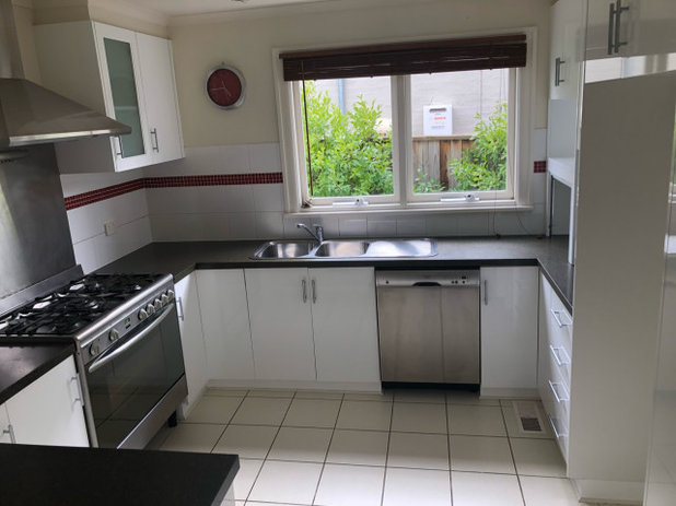
The original kitchen.
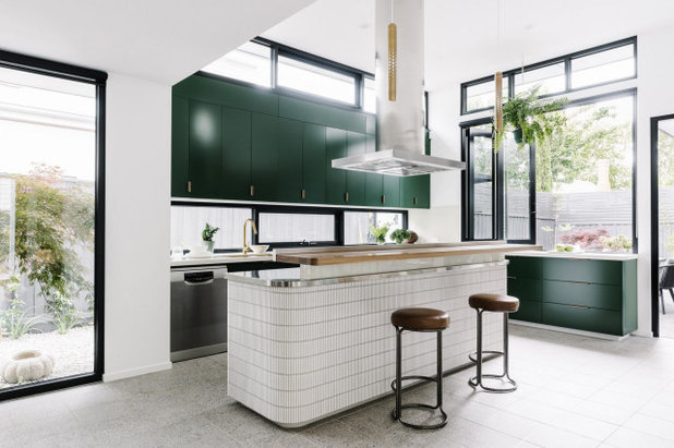
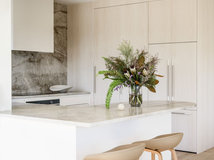
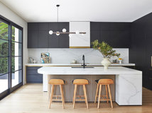
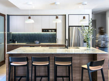
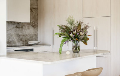
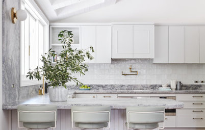
The new kitchen.
The kitchen was inspired by a bar and features green cabinetry with a highly functional stainless steel-topped bench.
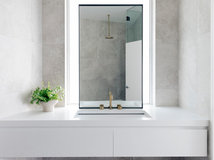
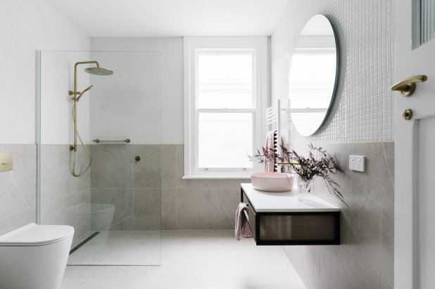
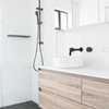
We installed unique and contrasting bathrooms; one dark and moody, the other modern and classic with a touch of rose. Brass features to both add a sense of luxury.
Browse more images of Australian kitchens on Houzz
The kitchen was inspired by a bar and features green cabinetry with a highly functional stainless steel-topped bench.
We installed unique and contrasting bathrooms; one dark and moody, the other modern and classic with a touch of rose. Brass features to both add a sense of luxury.
Browse more images of Australian kitchens on Houzz
What challenges did you have to work around?
A key challenge was the tight budget. Typically work on a house such as this would cost two or three times as much as this one did.
We also had to work on most of the design with the owner, who was based in China, over Zoom.
Configuring a two-storey extension on this small site was very hard, especially with the heritage overlay and the character of the street. It took many iterations.
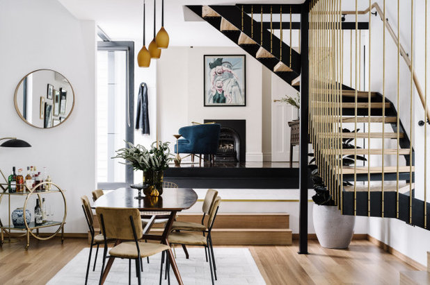
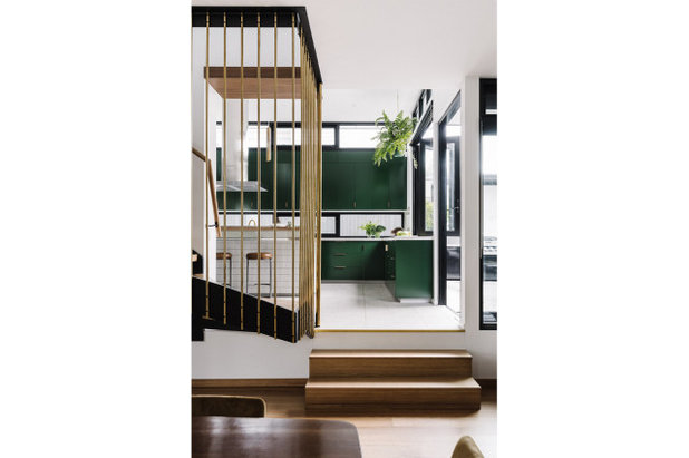
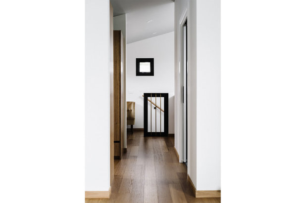
The bespoke staircase is finished with messmate treads and fine brass rods that are reminiscent of bamboo and maximise light.
The custom-made aluminium façade was challenging. However, we wanted to avoid the unnecessary cost and unsustainably of proprietary façade systems while integrating an eaves gutter.
The interior staircase required very tight planning, down to less than 30 millimetres in order to work and to save the client significantly on budget.
The interior design became much more luxe than originally anticipated.
During this project we used Houzz a bit for ideas, however this project gave us the confidence to join Houzz Pro and share our great work.
How do the new works sit beside the original home?
It’s a mix of complement, contrast and riff.
We developed a mid-century modern look as a step on from, and contrast to, the Federation era of the home.
We incorporated multiple elements to link the old and new, including continuation of spaces (the library links to the dining and living room), colours, geometries, room shapes and care for interior design room to room, including mixing classic and modernist styles in the guest bathroom and library.
Although the extension is two storeys, from the front we made it look smaller than the existing home, hiding the tall parts and working with a false perspective off the street.
What are the defining features of the house now?
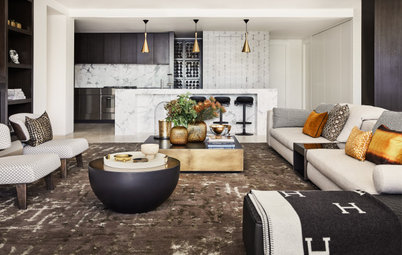
- A sophisticated green kitchen, which has the functionality of a commercial kitchen but evokes the stylish feel of a bar.
- A chic and contemporary backyard with a strong connection to the kitchen.
- A stylish sunken lounge and dining room with a strong connection to the existing house.
- Beautiful interior styling by the Stylesmiths.
- Two vertical feature elements: a two-storey glazed brick fireplace carefully designed with abstracted eucalyptus colours, and a twisting black steel, messmate-and-brass balustrade staircase.
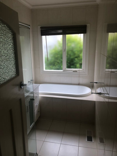
The original bathroom.
Why do you think the house works so well now?
The shape of the spaces, the connection between them, and the abundance of natural light.
Also, the colours, textural materials and furniture choices within the interior.
Why do you think the house works so well now?
The shape of the spaces, the connection between them, and the abundance of natural light.
Also, the colours, textural materials and furniture choices within the interior.
Materials palette
Interior palette
Interior palette
- Baltic pine floors with a walnut stain.
- Birds of Happiness Wallpaper to front hall, Natty & Polly.
- Beaumont Tiles Promenado glazed-porcelain floor tiles with a custom brass inlay.
- Euroa Clay tiles on the fireplace.
- Cora leather bar stools in the kitchen.
- About Space Xena pendant light in kitchen.
- ABI Interiors Vita brass kitchen sink.
- Reece Mizu Drift tapware.
- Masc 5 pendant in the living area.
- About Space Gerwin R3 pendant in the dining room.
- Globewest Hooper dining chairs.
- Illusion Australia Luminar gas fireplace.
- King Living Delta sofa in the living area.
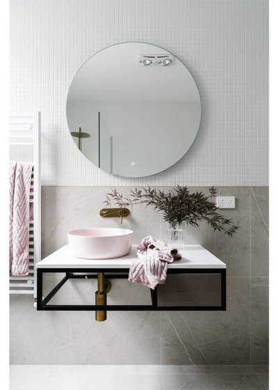
- ADP Cobalt Quartz vanity in the bathroom.
- Castano Sierra matt-pink sink.
- Reece Mizu Drift shower and tapware.
- Beaumont Tiles Ice Pietra Pearl tiles and Mono Square Mosaic Gloss white small tiles.
- International Building Products Australia aluminium panel cladding system.
- Interpon powder coating in Surfimist, Silver Pearl and Vintage Silver.
- Colorbond Orb roofing in Monument.
- James Hardie Scyon Matrix cement sheet cladding finished in Wattyl Stalactite.
- Haymes Paint Modesty White and Vivid White in the interior.
- Haymes Paint Balance Grey and Wattyl Stalacite on the exterior.
Your turn
What’s your favourite feature here? Tell us in the Comments below. And don’t forget to save these images, like this story and join the conversation.
More
Want to see more renovations to older homes? Warmth, Light & Garden Views For a Dull, Inner-City Terrace
What are you working on?
Related Stories
Popular Houzz Series
A Dated Country Home in a Kiwifruit Orchard Made Modern
When their grown-up sons moved out, these NZ homeowners gave their much-loved country home a chic, modern makeover
Full Story
Renovating
An Inspired Solution for a Dark & Disjointed Californian Bungalow
See how an architect opened up a light-starved, closed-in Melbourne home, and connected it with the neighbouring park
Full Story
Popular Houzz Series
Before & After: A Leaky, Falling-Down Victorian Terrace Reborn
See how a small Melbourne terrace, untouched for over 100 years, was remade into a functional home for a modern family
Full Story
Before & After
Before & After: From 'White Box' to Luxe, Layered Apartment
Quiet luxury was the goal for the redesign of this Sydney waterfront apartment – see how the designer achieved it
Full Story
Popular Houzz Series
A Sweet Balmain Cottage Sure to Capture Your Heart
With an extension underway, this cottage was ready for a new decorative scheme that would bring old and new together
Full Story
Before & After
Before & After: A Cheap & Cheerful Makeover of a 1980s Caravan
Armed with an AU$1500 budget, a Melbourne couple rolled up their sleeves and transformed a caravan in just three months
Full Story
Projects Born on Houzz
Before & After: A Light-Drenched Home in the Heart of Coogee
This breezy family home in one of Sydney's beachside suburbs is the essence of relaxed Australian coastal style
Full Story
Interior Design
A Grand Federation Home Comes of Age for a Busy Young Family
See how a revamped layout, custom joinery and luxe touches transformed a dated heritage home in Sydney
Full Story
Architecture
From Tired 100-Year-Old Beach Cottage to Lush, Private Oasis
Encircled by beautiful gardens, this renovated weatherboard cottage in Sydney is all about indoor-outdoor connection
Full Story
Bathroom Renovations
Before & After: A Clunky & Dated Victorian Terrace Reborn
Rising damp, sagging floors and a dysfunctional layout were just some of the challenges this tired terrace offered up
Full Story
@koula Patty I remember reading about this chimney breast feature wall before and I believe they blew up a pixelated picture of eucalyptus leaf and used the colours and pixelation patterns to map out the feature wall. I can’t remember whether the tiles were custom made to colour or whether they just used existing products to emulated the pixelations.
Looks like a space ship landed in the back yard..not a fan of the Aluminum panels but the interior is absolutely amazing.....can't fault it.
Love. so much better than the same ugly box extension as everyone else. also so much better (and more honest and appealing) than some pastiche of the past. well done in light of heritage facade and what had to stay