


Before and After: A Parisian Apartment Revamped and Restored
A designer restored a two-bedroom apartment to its original splendour with elegant accents and a few clever tricks
Claire Tardy
3 March 2019
The owners of this Parisian apartment, a couple in their thirties, chose to give their home a cosmetic upgrade to meet the needs of their future family, and restored it to its former glory in the process. They asked designer Anne Azoulay of Decor Intérieur in Paris, France, to assist them and the renovation was completed in 2018. “Everything had to be redone,” says Azoulay. “The existing materials were poor quality and the fittings seemed to have been patched together … We redid everything except the kitchen – the owners preferred to wait with that to prioritise budget for the other rooms.”
Houzz at a Glance
Who lives here: A couple
Location: Paris, France
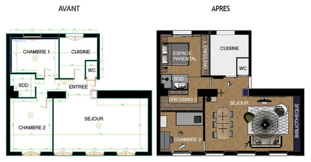
Size: Approximately 75 square metres with two bedrooms
Interior designer: Anne Azoulay of Decor Intérieur
Budget: More than AU$159,100 (€100,000)
The owners are very organised people who like tidy spaces, so the original layout did not suit their lifestyle. “The bedroom was too small to accommodate a closet, so it was in the living room,” says Azoulay.
The designer therefore got rid of the hallway leading to the two bedrooms and bathroom to create a large master suite, and shifted the door to the second bedroom – which now serves as an office and guest room – so it now opens into the living room.
Who lives here: A couple
Location: Paris, France
Size: Approximately 75 square metres with two bedrooms
Interior designer: Anne Azoulay of Decor Intérieur
Budget: More than AU$159,100 (€100,000)
The owners are very organised people who like tidy spaces, so the original layout did not suit their lifestyle. “The bedroom was too small to accommodate a closet, so it was in the living room,” says Azoulay.
The designer therefore got rid of the hallway leading to the two bedrooms and bathroom to create a large master suite, and shifted the door to the second bedroom – which now serves as an office and guest room – so it now opens into the living room.
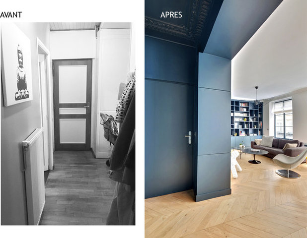
Before: The entrance originally had a false ceiling. Removing it revealed a pleasant surprise: “We discovered old mouldings underneath,” says Azoulay. On the other hand, this also exposed electrical wiring and pipes snaking in all directions.
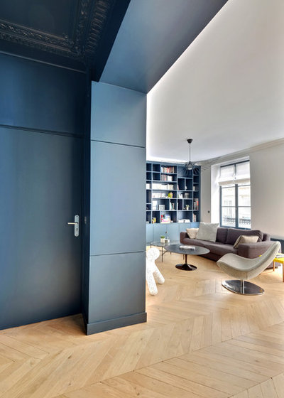
After: This area is now unrecognisable. The blue paint defines the space and brings out the intricate mouldings. “We played with contrasts, especially with the deep blue that is echoed on the bookcase and woodwork in the living room,” says the interior designer.
The electricity metre and other unsightly elements are now hidden in the box around the pillar.
Browse more living rooms with a blue colour palette
The electricity metre and other unsightly elements are now hidden in the box around the pillar.
Browse more living rooms with a blue colour palette
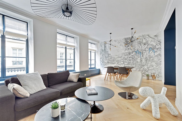
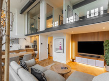
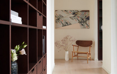
The entrance now leads into the living room. “It is a beautiful space that gets light from three large windows, a rare thing in Parisian apartments,” says Azoulay. “When the office door is open, you can see all four windows on that side in a row from the living room.”
The new oiled, light-coloured oak parquet floor enhances the room’s brightness. It was laid throughout the apartment in a herringbone pattern.
The wiring has been completely redone and new light fixtures added. The couple added two impactful pendant lights in the living room and put in floor sockets so lamps could be added in the future and to provide opportunities to charge electronics. “It keeps us from having cables lying around,” says Azoulay.
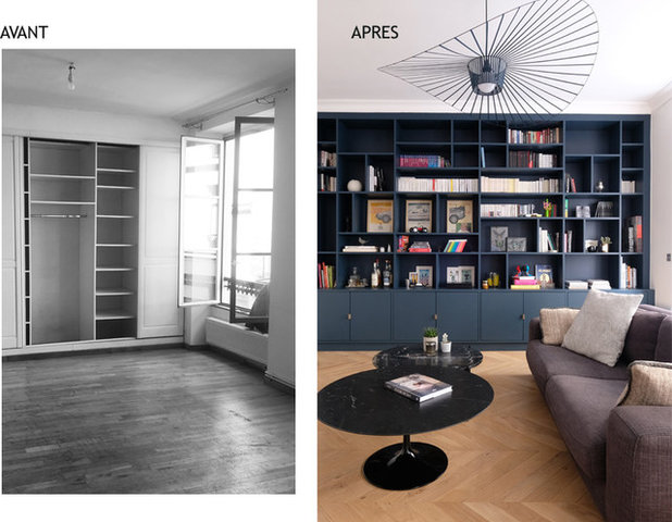
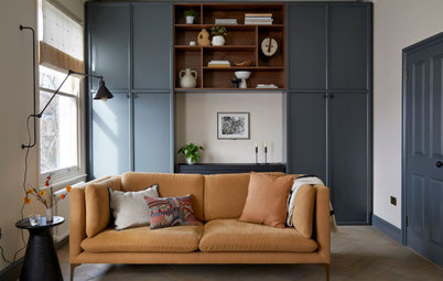
Before: A large wardrobe originally covered the wall of the living room to make up for the lack of storage space in the bedroom. “It was unacceptable for the owners, who like everything to be tidy,” says Azoulay. The radiator heaters under the windows were also visible.
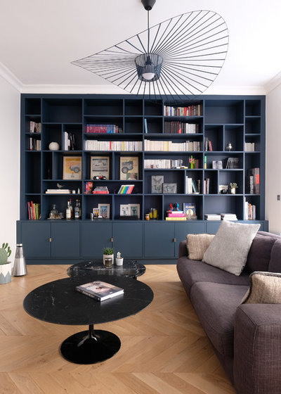
After: The wardrobe has now given way to a large, custom-made bookshelf in painted MDF, which echoes the colour of the entrance.
As a nod to the old mouldings in the entryway and to period style, new mouldings were added to the living room ceiling. “They are directly on top of the bookcase, to create a real sense of a frame for the room,” says the designer.
As a nod to the old mouldings in the entryway and to period style, new mouldings were added to the living room ceiling. “They are directly on top of the bookcase, to create a real sense of a frame for the room,” says the designer.
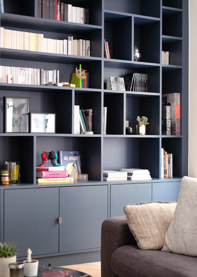
Azoulay’s original design for the built-in bookshelf was symmetrical, but there are now minor differences on both sides. “The owners wanted to display framed pictures and decorative accessories in very specific places, so everything was adapted,” says Azoulay.
The low storage cupboards hide any mess that the couple prefer not to see. “The Internet router is on the left and the TV connection goes directly into the wall, so no wires are visible,” says the designer.
The low storage cupboards hide any mess that the couple prefer not to see. “The Internet router is on the left and the TV connection goes directly into the wall, so no wires are visible,” says the designer.
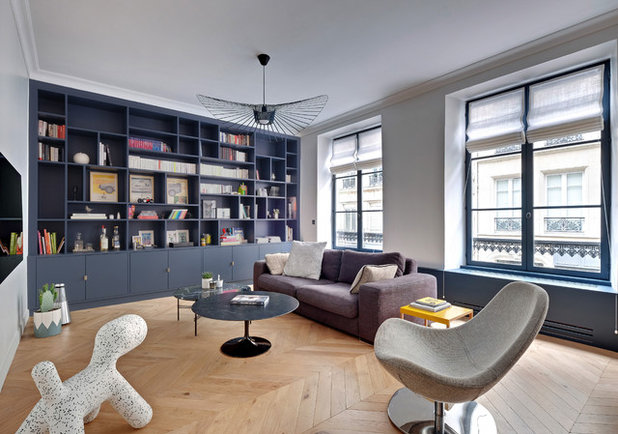
The apartment’s new wiring made it possible to mount the television onto the wall facing the sofa.
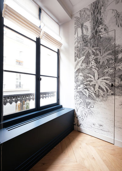
Custom-made MDF boxes now conceal the radiator heater. Like the window frames, they are the same colour as the bookshelf and entrance. The boxes form a nice line and a functional window ledge, highlighted by the custom-made white linen blinds.
Is Hydronic Heating Right for Your Aussie Home?
Is Hydronic Heating Right for Your Aussie Home?
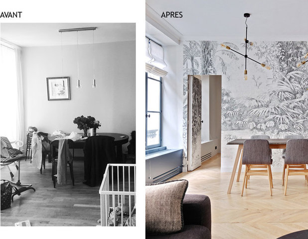
Before: The second bedroom, converted into an office and guest room, was originally accessed via the hallway that was removed in the renovation. Because of this, its entrance had to be moved to the living room, pictured here.
Now used as an office, this secondary room was renovated but not yet furnished at the time of our photo shoot, so the owners chose not to photograph it.
Now used as an office, this secondary room was renovated but not yet furnished at the time of our photo shoot, so the owners chose not to photograph it.
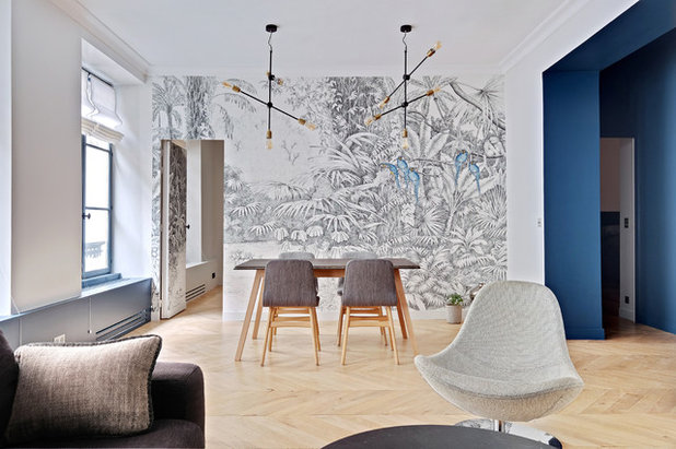
After: When closed, the new door is almost invisible thanks to the mural wallpaper that extends across it and the whole wall. “You almost forget that there is another room behind the partition,” says the interior designer with a laugh.
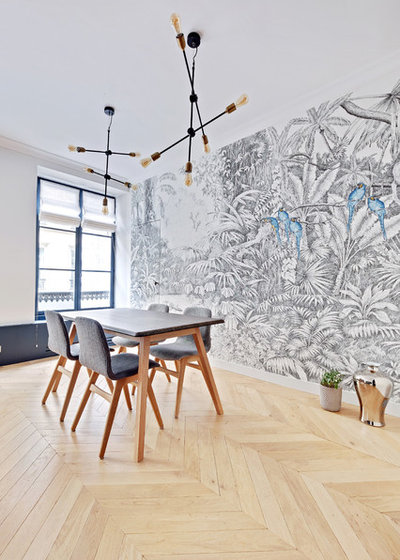
The wallpaper, Island of the Blue Parrots by Ananbô, is another of the apartment’s custom-made features. The mural gives depth to the living room, and its parrots echo the apartment’s blue leitmotif.
The couple already owned all the furniture. The designer helped select the lights only.
The couple already owned all the furniture. The designer helped select the lights only.
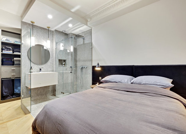
Creating the master bedroom was the biggest task in the renovation. “In addition to the wardrobe, the owners wanted a hotel-inspired bedroom with a shower inside the room, like they’d seen on their many trips abroad,” says Azoulay.
To accomplish this, Azoulay kept the shower enclosure in its original location, but opened it up on all sides to create a master suite. She also enlarged the suite by claiming space from what was once the hallway.
To accomplish this, Azoulay kept the shower enclosure in its original location, but opened it up on all sides to create a master suite. She also enlarged the suite by claiming space from what was once the hallway.
The walls are white to make the room brighter – its sole window overlooks a courtyard. The custom-made velvet headboard ties in with the shades of blue in the apartment. It is complemented by small cork bedside tables with metal legs that match the chrome finish of the electrical switches.
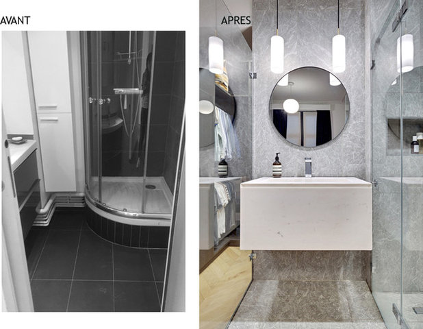
Before: The original shower was uninspiring, narrow and enclosed, on a raised shower tray the owners didn’t like. “They wanted a walk-in shower and for everything to be at the same level, an arrangement they had seen on a trip to Australia,” says Azoulay. “So we reworked the idea to adapt it to this old building.”
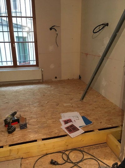
The drainage system was the main constraint. To accommodate it, the designer decided to raise the floor of the entire master suite. “Thanks to this platform, we got the necessary slope to connect the shower to the sewer system while also having a walk-in shower.”
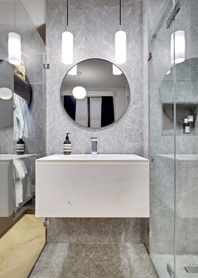
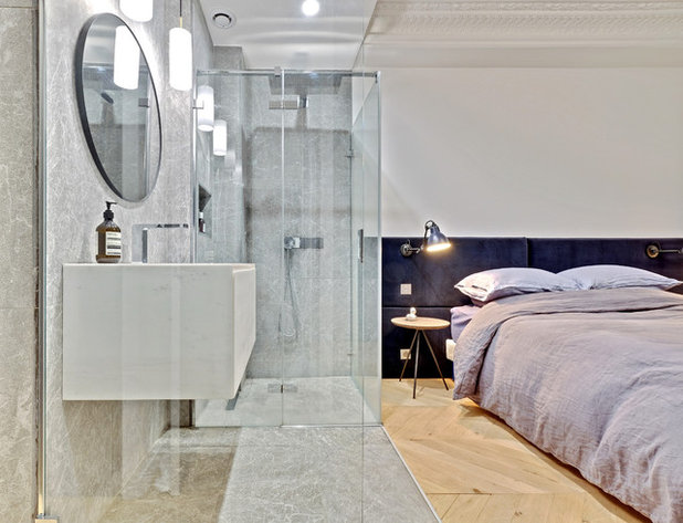
After: The new shower was conceived as a cube separating the bedroom from the walk-in wardrobe. Thanks to its glass walls, it doesn’t alter the sightlines or interfere with the light in the master suite. It is clad with grey-veined marble on the floor and two of the walls, while the vanity is white. The lights hang down from a dropped ceiling that enhances the cube feeling.
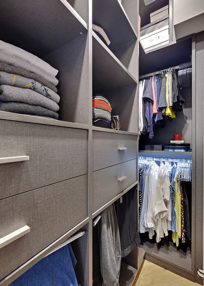
The owners needed a lot of storage space for their clothes. The walk-in wardrobe, built where the hallway had once been, was custom-made with a grey timber veneer – its finish recalls the texture of fabric. The walk-in wardrobe’s dimensions were calculated to the last centimetre to accommodate the couple’s clothes, even taking into account the height of their shirts.
The entrance to the master suite is flanked by the walk-in wardrobe, which is on the same level as the rest of the apartment and one step down from the couple’s sleeping space.
Expert Eye: How to Squeeze In a Walk-In Wardrobe
The entrance to the master suite is flanked by the walk-in wardrobe, which is on the same level as the rest of the apartment and one step down from the couple’s sleeping space.
Expert Eye: How to Squeeze In a Walk-In Wardrobe
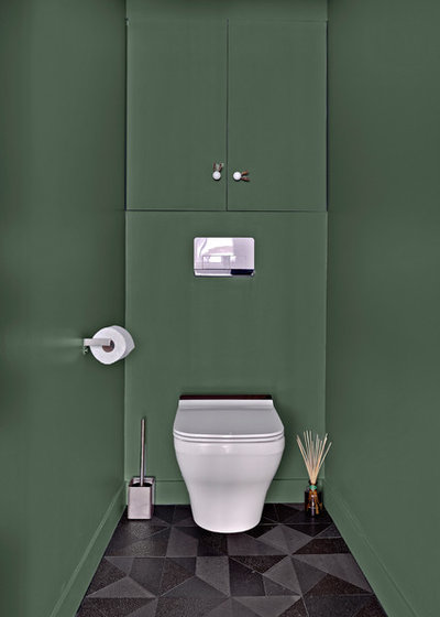
The green of the toilet room sets it apart from the rest of the home. It is enhanced with lava-stone ‘origami’ floor tiles in varying shades of grey. Even here, there are cupboards to keep the space tidy.
Tell us
Which detail in this apartment do you love the most? Tell us in the Comments below, like this story, save your favourite images and join the conversation.
More
Want more before-and-after renovations? You won’t want to miss this Houzz Tour: The Unbelievable Outcome of a Cosmetic Makeover
Tell us
Which detail in this apartment do you love the most? Tell us in the Comments below, like this story, save your favourite images and join the conversation.
More
Want more before-and-after renovations? You won’t want to miss this Houzz Tour: The Unbelievable Outcome of a Cosmetic Makeover
Related Stories
Houzz Tours
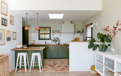
France Houzz: A New Island Home With an Old Soul
Check out this young family's welcoming and characterful French island home on Île d’Yeu, which embraces local style
Full Story
Houzz Tours
Germany Houzz: A Small Cabin Transformed Into a Forest Retreat
In this secluded area in the Taunus mountains of Germany, a family enjoys their weekends in 29 square metres of space
Full Story
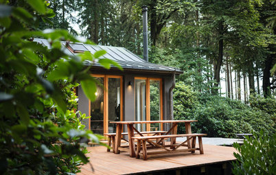
Houzz TV
London Houzz: Tour a Contemporary Loft in an Old Victorian School
Watch and read how a design firm updated this light and airy apartment in an old block with sleek style and warm touches
Full Story
Garden Design
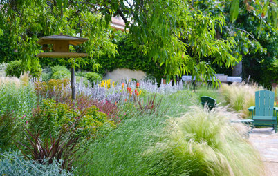
Spain Garden Tour: A Mediterranean Makeover With Colour & Texture
Once neglected, this naturalistic garden is now a series of outdoor rooms with idyllic spots to swim, dine and relax
Full Story
Houzz Tours
Berlin Houzz: A Touch of Japanese Forest Bathing in a German Home
Beloved memories of Japan come to life with the renovation of this 120-square-metre apartment in Berlin, Germany
Full Story
Houzz Tours
London Houzz: Daring Colour & Texture Transform a Victorian Home
By Kate Burt
The busy owners of this terrace sought help to design outside their decor comfort zone – the result is a cool classic
Full Story
Houzz Tours
Germany Houzz: Creating Summer & Winter Homes in a Converted Barn
One barn, two homes – see how architects designed separate zones for summer and winter living in an old country barn
Full Story
Houzz Tours
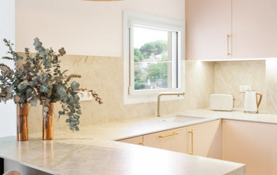
Before & After: Finding the Perfect Pink in a Barcelona Kitchen
Barely-there pink acts as a warm neutral in a new open-plan Spanish kitchen, replacing dark cabinets and drab finishes
Full Story
Houzz Tours
Before & After: Colour Blocking & Pattern Nod to Nature in Rome
Move and upsize or stay and renovate? This young family chose the latter in their small Italian apartment – here's why
Full Story
Houzz Tours
Barcelona Houzz: Style, Sustainability and Pattern in a Tiny Flat
Part-renovation, part-restoration, the owners of this Spanish apartment balanced historical style with forward thinking
Full Story
Beautiful finishes, but a bedroom door leading straight into the dining/living room would be a big no no for me, personally. Not to mention that bedroom 2 is now too far from the facilities. I am sure there must have been budget / structural constrains but swaping the kitchen and bedroom 2 would have made much more sense lay-out wise.
Lovely spaces! dramatic and dynamic.
I love the entire apartment, great design.