


Before & After: Clever Adjustments in a One-Bedroom Parisian Unit
Graphic contrasts, multi-functional units and tweaks to the layout turned this dated apartment into a functional space
Elen Pouhaer
21 March 2020
Contributrice Houzz, je suis journaliste déco/design, architecture et lifestyle.
This 33-square-metre apartment is perched on the fourth and top floor of a brick building in Paris, France, and enjoys an unobstructed view of the Eiffel Tower. The owners live in the suburbs and rent out several flats in the city. This one-bedroom property hadn’t been renovated for fifteen years when the couple decided to revamp it for their adult daughter.
Houzz at a Glance
Who lives here: The owners’ adult daughter
Location: Paris, France
Size: 33 square metres
Duration of work: Three months
Interior designer: Lagom Architects
To bring it up-to-date and improve the layout, they called on Déborah and Avinoam Bettan of Lagom Architects. As a result, this now contemporary and bright space has a sleek design with a focus on functionality and comfort while playing with colour contrasts.
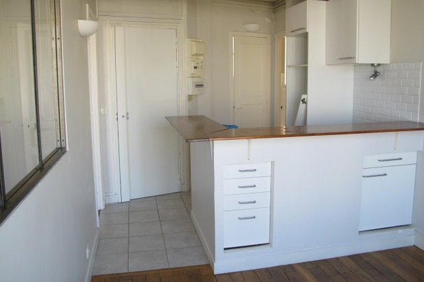
Before. The door pictured here on the left previously led to the bedroom. Behind the kitchen were the bathroom and toilet, which were combined during the renovation.
The flat’s layout needed improvement. The kitchen was originally too big, and took too much space away from the living room.
“We didn’t change the configuration of the space completely, but we did take down all the partitions. The size of the bedroom was reduced as much as possible to expand the living area,” says the interior designer.
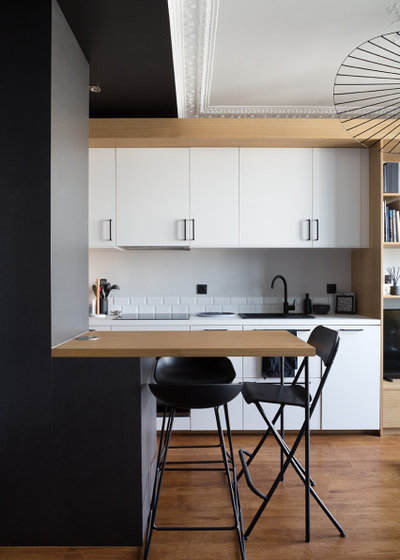
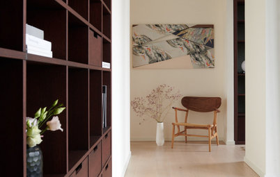
After. They preserved the floor and all the mouldings in order to maintain the flat’s charm and history. To zone the entrance hall and create a strong contrast with the kitchen, the owner went all-black – on the walls, MDF furniture and dropped ceiling.
“We had originally planned for the kitchen to be placed against the back wall only. We had not planned for it to wrap around to where we now find the fridge, a fixed table and a low cupboard for storing the toaster, among other things,” says Bettan. The change makes it possible to visibly separate the kitchen from the entrance. “This configuration has produced a large kitchen area to seat guests and make good food.”
Ready to renovate? Find an interior designer near you on Houzz, see images of their work and read previous client reviews
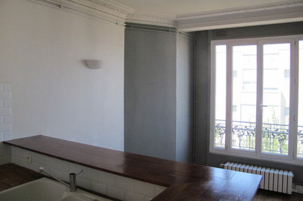
Before. The original raised benchtop cut the room in half, significantly reducing the size of the living room.
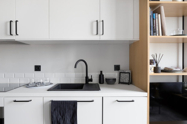
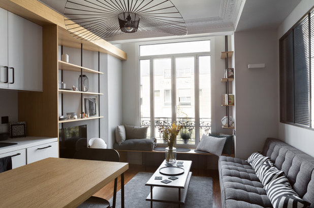
After. The owner opted for a contemporary style and a restrained greyscale palette that brings out contrast: the back wall of the kitchen, for example, features black, white and a touch of grey. This colour scheme runs throughout the flat.
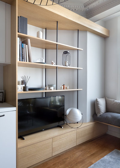
“To enhance the kitchen, we came up with an oak veneer frame that transforms into a bookcase with black powder-coated metal supports,” the interior designer says. This structure is the central decorative element in the uncluttered space.
This multi-functional shelving unit covers a whole wall and was the starting point of the entire layout. The fixed table, shelves and bench in the living room were designed to match it.
This multi-functional shelving unit covers a whole wall and was the starting point of the entire layout. The fixed table, shelves and bench in the living room were designed to match it.
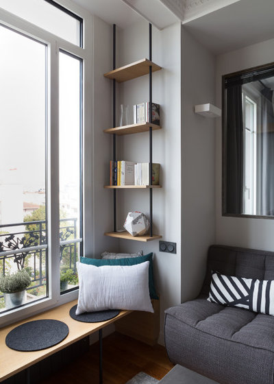
“The supports were originally curtain rods that have been given a new function. This lightweight support system fits well into a small place. It brings an interesting graphic rhythm,” says Bettan.
The designers kept the old internal window, but moved it from the entrance hall to the wall between the living room and bedroom.
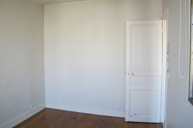
Before. The previous bedroom, which was about 11-square-metres, was reduced to about 8.5 square metres. “We started with a completely open space, and originally thought about using a box to create the sleeping area. But the young woman preferred a separate bedroom,” says Bettan. “So, we shifted the partition and created an internal window that allows for a view of both of the exterior windows.”
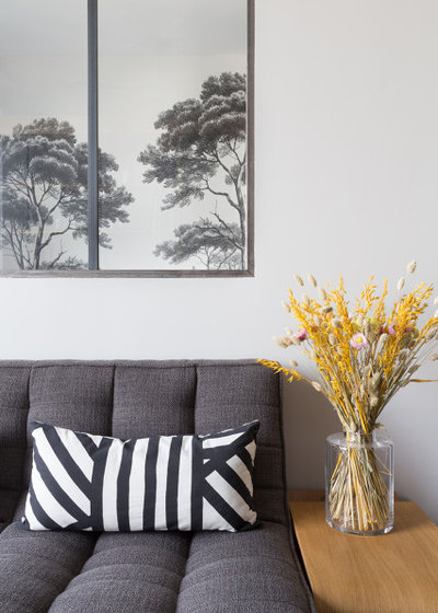
After. The wallpaper can be seen from the living room as well, through the internal window. This trick adds character to the flat. The forest design also creates the feeling of depth, to balance out the room’s diminutive dimensions.
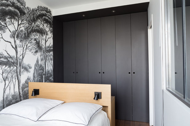
Behind the bed is a large floor-to-ceiling wardrobe. Its black MDF facades echo the look of the entrance hall.
Behind the bed is a large floor-to-ceiling wardrobe. Its black MDF facades echo the look of the entrance hall.
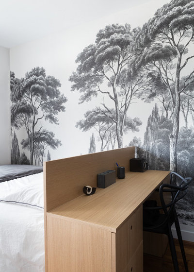
The owner sometimes works from home, and needed a desk. The designers went for an oak-veneer headboard that doubles as a desk and includes storage and lighting.
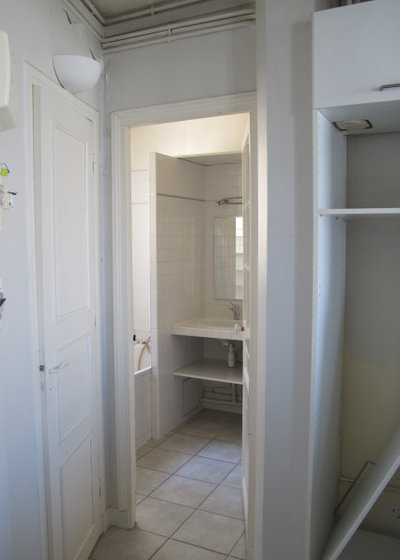
Before. Here you can see the old bathroom with the toilet door on the left. The water heater was between the toilet and the bathroom. It has been replaced by a smaller but equally powerful model to save space.
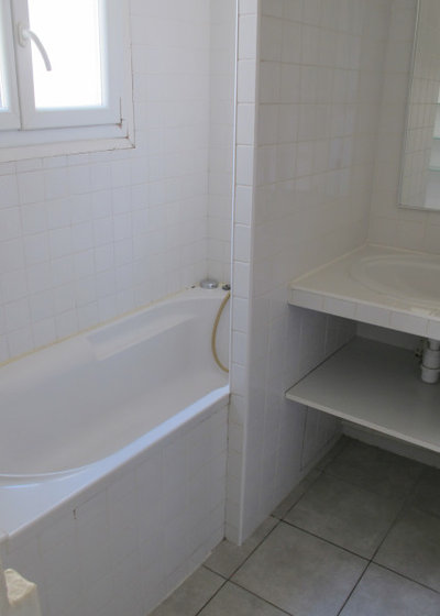
In the bathroom, a double window was replaced with a window without internal frames, which brings in more light.
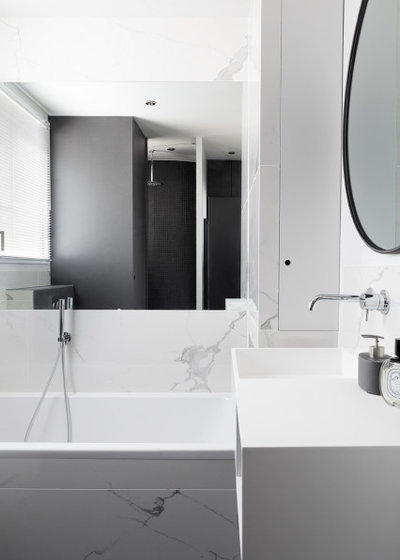
After. The 6.15-square-metre bathroom now has a shower, basin and toilet as well as a laundry area.
This minimalist bathroom has been decorated entirely in black and white. The black mosaic shower is juxtaposed against white marble-effect tiles and a white resin vanity unit. The black column is made of Valchromat timber-fibre panelling, and houses the washing machine, dryer and water heater.
Your turn
Which details in this apartment would work in your own home? Tell us in the Comments below, like this story, save the images, and join the conversation.
More
Love before-and-after stories? Get your next fix here with Before & After: A French Manor House Inspired by Houzz
Related Stories
Houzz Tours
France Houzz: A New Island Home With an Old Soul
Check out this young family's welcoming and characterful French island home on Île d’Yeu, which embraces local style
Full Story
Houzz Tours
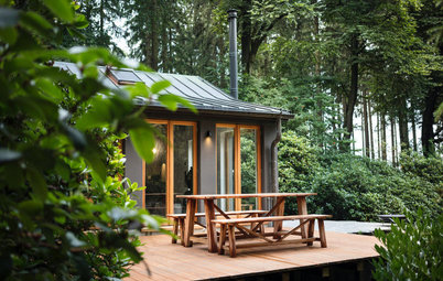
Germany Houzz: A Small Cabin Transformed Into a Forest Retreat
In this secluded area in the Taunus mountains of Germany, a family enjoys their weekends in 29 square metres of space
Full Story
Houzz TV
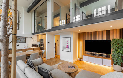
London Houzz: Tour a Contemporary Loft in an Old Victorian School
Watch and read how a design firm updated this light and airy apartment in an old block with sleek style and warm touches
Full Story
Garden Design
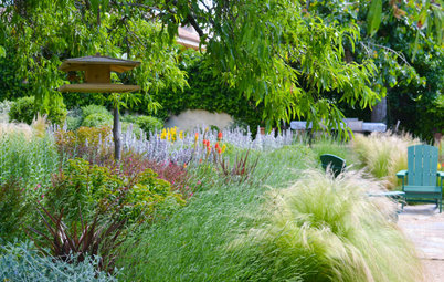
Spain Garden Tour: A Mediterranean Makeover With Colour & Texture
Once neglected, this naturalistic garden is now a series of outdoor rooms with idyllic spots to swim, dine and relax
Full Story
Houzz Tours
Berlin Houzz: A Touch of Japanese Forest Bathing in a German Home
Beloved memories of Japan come to life with the renovation of this 120-square-metre apartment in Berlin, Germany
Full Story
Houzz Tours
London Houzz: Daring Colour & Texture Transform a Victorian Home
By Kate Burt
The busy owners of this terrace sought help to design outside their decor comfort zone – the result is a cool classic
Full Story
Houzz Tours
Germany Houzz: Creating Summer & Winter Homes in a Converted Barn
One barn, two homes – see how architects designed separate zones for summer and winter living in an old country barn
Full Story
Houzz Tours
Before & After: Finding the Perfect Pink in a Barcelona Kitchen
Barely-there pink acts as a warm neutral in a new open-plan Spanish kitchen, replacing dark cabinets and drab finishes
Full Story
Houzz Tours
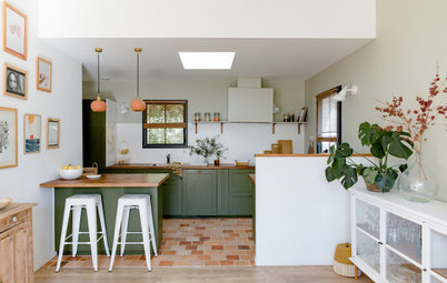
Before & After: Colour Blocking & Pattern Nod to Nature in Rome
Move and upsize or stay and renovate? This young family chose the latter in their small Italian apartment – here's why
Full Story
Houzz Tours
Barcelona Houzz: Style, Sustainability and Pattern in a Tiny Flat
Part-renovation, part-restoration, the owners of this Spanish apartment balanced historical style with forward thinking
Full Story
Absolutely wowed! This is inspired... SO many amazing ideas - the desk behind the bed; the continuity of the oak veneer framing in the kitchen that leads to the bookcase; that 'picture' window between living room/bedroom. Love that wallpaper. Love the bookcase design. Despite being a fan of colour, I really like this monochrome scheme... though I'd add the odd burnt orange pops of colour via say, the cushions, bathroom towels, a vase of flowers.
This is an inspiring transformation -- with the use of design, materials, colour, and light. And the re-design of the space without gutting it, which keeps costs down. This is another amazing story showing ingenious design to create a delightful home in minimal square footage in Paris. I really enjoy these stories on Houzz, displaying creative solutions to renovation and space challenges.
Wow!