


Deco House: A New Build That Elegantly Evokes the Past
With its soft curves and free-flowing living spaces, this new home takes its cues from the past, but with a modern spin
Georgia Madden
7 April 2022
In this Q&A series, we turn the spotlight on one thought-provoking renovation or new build each week. Here, Dean Dyson, architect and principal at Dean Dyson Architects, reveals how he took inspiration from the Art Deco home that originally sat on this site to create a home that effortlessly blends old and new for a young family.
Images by Timothy Kaye.
Answers by Dean Dyson, architect and principal at Dean Dyson Architects.
Who lives here: A couple with three children
Location: Essendon, Victoria
Size of the original house: Around 300 square metres
Size of house after works: Around 475 square metres
Number of bedrooms and bathrooms in original house: Three bedrooms, two bathrooms
Number of bedrooms and bathrooms in new house: Four bedrooms, three bathrooms and two powder rooms (one with external access via the gym and pool)
Architect: Dean Dyson at Dean Dyson Architects
Interior designers: Dean Dyson and Linda Dyson at Dean Dyson Architects
Builder: Barbat James
Structural engineer: La Porta Consulting Engineers
Building surveyor: Code Compliance
Did you use Houzz for this project?
We shared inspirational images on Houzz.
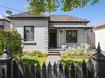
What was the original house like?
A run-down, single-storey, double-fronted 1940s clinker-brick house with three bedrooms and two bathrooms.
What didn’t the owners like about it?
It was lacking in natural light and was not functionally suited to their lifestyle.
Considering a knockdown-rebuild? Find an architect near you on Houzz who can help
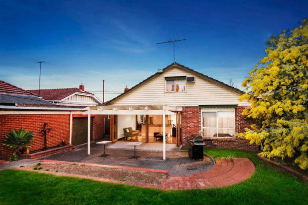
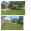
Rear of the original house.
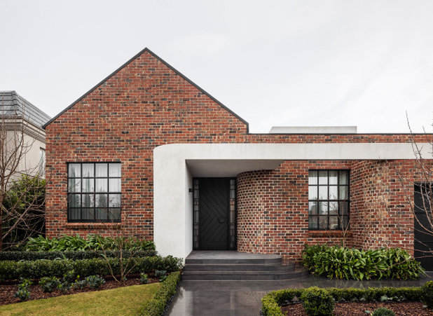
How would you describe this project?
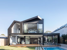
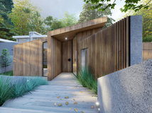
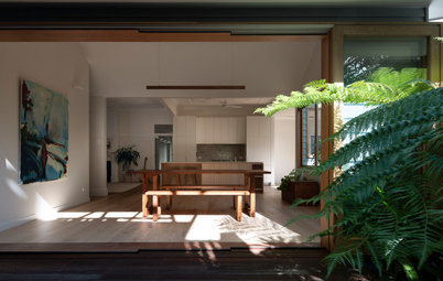
A knock-down rebuild. The new dwelling is a contemporary interpretation of the previously demolished 1940s Art Deco home that once occupied the site. It is a double-storey family home with a gym and swimming pool at the rear.
What are the surrounding homes like?
An eclectic mixture of period-style homes with character and charm.
How would you describe this project?
A knock-down rebuild. The new dwelling is a contemporary interpretation of the previously demolished 1940s Art Deco home that once occupied the site. It is a double-storey family home with a gym and swimming pool at the rear.
What are the surrounding homes like?
An eclectic mixture of period-style homes with character and charm.
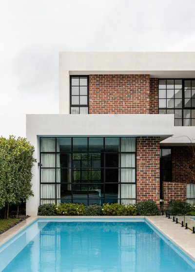
Rear of the newly built house.
What was the client’s brief?
Our client put a real emphasis on maintaining some connection to the historical past of the original home and wanted a design that seamlessly fitted in with the character of the street, yet had a new contemporary aesthetic.
A requirement of the new design was to ensure that it incorporated natural light and plenty of open and bright spaces for entertaining and family enjoyment.
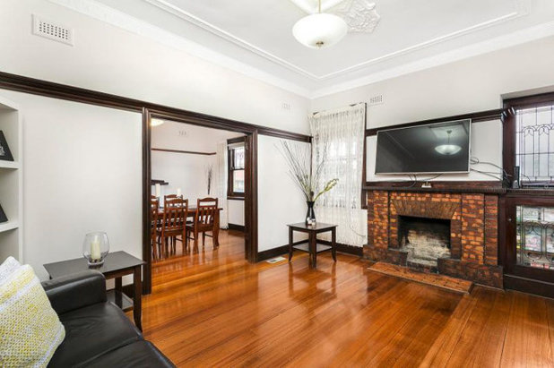
The living room in the original house.
What were their must-haves?
What were their must-haves?
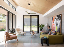
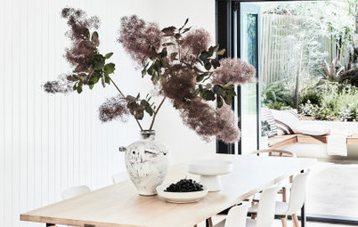
- A light-filled, open-plan living environment with a seamless visual and physical indoor-outdoor connection.
- A home that felt harmonious within the existing streetscape. They wanted the house to be known for its sensitivity and beauty, and not to be bold and inconsiderate.
- A dedicated home office.
- A design that encouraged the family to connect and come together, but that also provided spaces for them to retreat and relax.
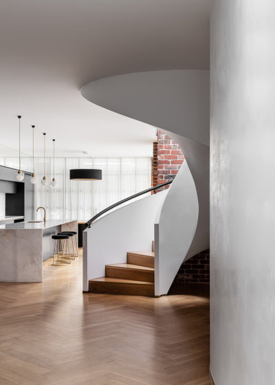
Stairway in the new house.
What was gained with the new works?
What was gained with the new works?
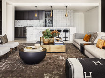
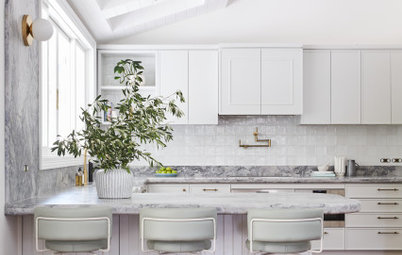
- A new four-bedroom, three- bathroom, two powder-room home with open-plan living, dining, kitchen and a concealed, walk-in pantry and laundry.
- A feature main bedroom on the ground level that overlooks the swimming pool with a walk-in wardrobe and ensuite.
- An internal powder room, dedicated cinema room and home office.
- A large home gym overlooking a lap pool next to a dedicated outdoor entertainment area with a hidden external powder room.
- A two-car garage and workshop.
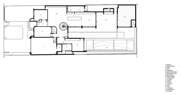
Ground floor plan of the new house.
Where did most of the budget go?
The budget split was 40 percent on architecture and 60 percent on interiors.
Where did most of the budget go?
The budget split was 40 percent on architecture and 60 percent on interiors.
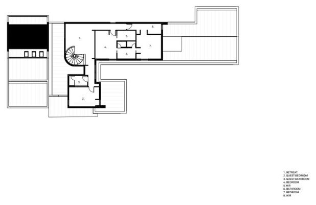
First-floor plan of the new house.
What was your thinking around the interior design?
It was important that the interior felt harmonious and at one with the architecture. We really wanted to play with and explore the traditional shapes and materials, but in a contemporary way to provide a classic yet contemporary feel.
What was your thinking around the interior design?
It was important that the interior felt harmonious and at one with the architecture. We really wanted to play with and explore the traditional shapes and materials, but in a contemporary way to provide a classic yet contemporary feel.
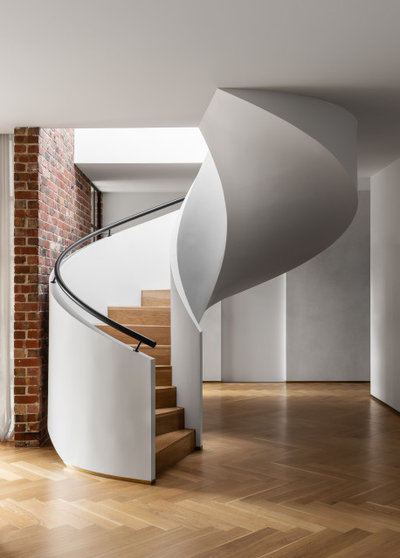
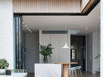
Tell us about the incredible helical staircase?
Our client absolutely fell in love with it when we first presented the design. It is such a special sculptural piece. It is key to the success of the design and creates a wonderful, flowing feeling at ground level as you move through the home.
Our client absolutely fell in love with it when we first presented the design. It is such a special sculptural piece. It is key to the success of the design and creates a wonderful, flowing feeling at ground level as you move through the home.
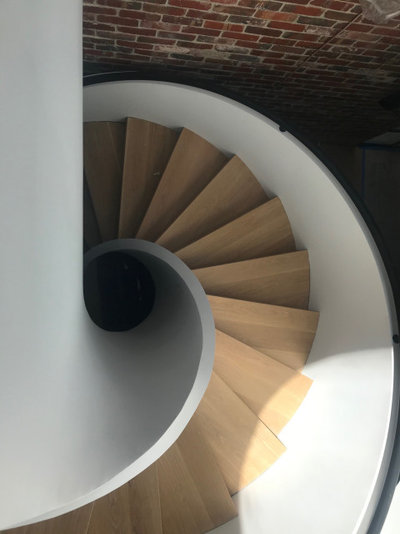
Its sweeping nature pulls you from one space to another via a circular journey, which is a delight.
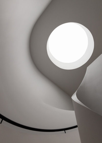
And the skylight above it?
The circular skylight above the staircase brings an amazing light down into this home and adds a real heavenly quality of filtered light as you walk you.
We love the way skylights allow us to connect our clients’ homes with the surrounding treetops and sky above.
The circular skylight above the staircase brings an amazing light down into this home and adds a real heavenly quality of filtered light as you walk you.
We love the way skylights allow us to connect our clients’ homes with the surrounding treetops and sky above.
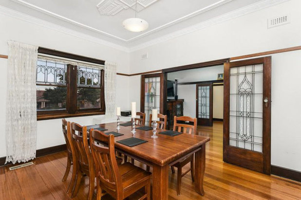
Dining room in the original house.
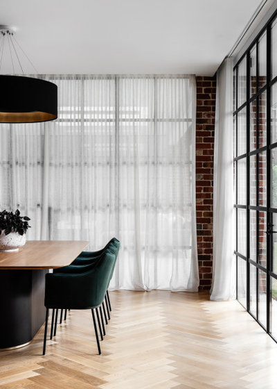
Dining area in the new house.
What was your thinking behind the colour and materials palette?
It was inspired by the original property and also derived from core Art Deco-era features.
What was your thinking behind the colour and materials palette?
It was inspired by the original property and also derived from core Art Deco-era features.
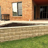
What challenges did you have to work around during this project?
The site is overlooked by surrounding properties. A real challenge we had to overcome was providing our client with a sense of privacy and seclusion, which we did by utilising the building’s form and shape.
The site is overlooked by surrounding properties. A real challenge we had to overcome was providing our client with a sense of privacy and seclusion, which we did by utilising the building’s form and shape.
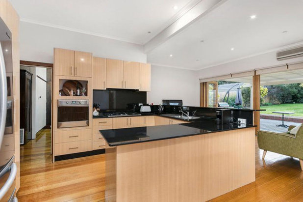
The kitchen in the original house.
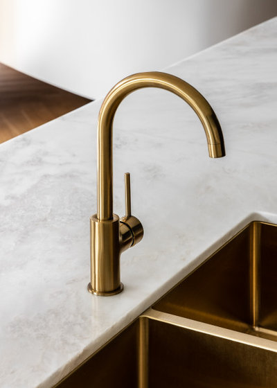
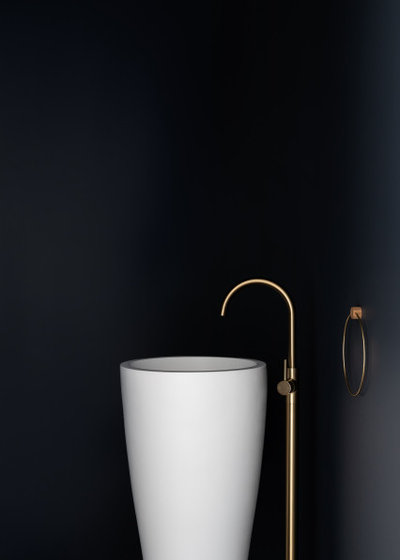
We love the touches of brass – why did you introduce them?
They add a softness and warmth to the interior. They embody a natural elegance that is subtle and understated, making them the perfect discoverable surprise.
They add a softness and warmth to the interior. They embody a natural elegance that is subtle and understated, making them the perfect discoverable surprise.
What sustainable design principles did you incorporate?
The floor plan is designed to maximise natural light. Glazing opens up to the east so that the sun can naturally heat and light the home from early morning until early afternoon. The western faces are treated with minimal glass to protect the home against overheating in the afternoon and provide cool, comfortable sleeping spaces.
We utilised solar hot-water heating systems and photovoltaics for natural energy generation.
The basic orientation principles ensure that the owners seldom use artificial lighting throughout the day and consume as little energy as required.
We also repurposed the brickwork from the original home in the new design, which was both sustainably beneficial and adds to the property’s nostalgic charm.
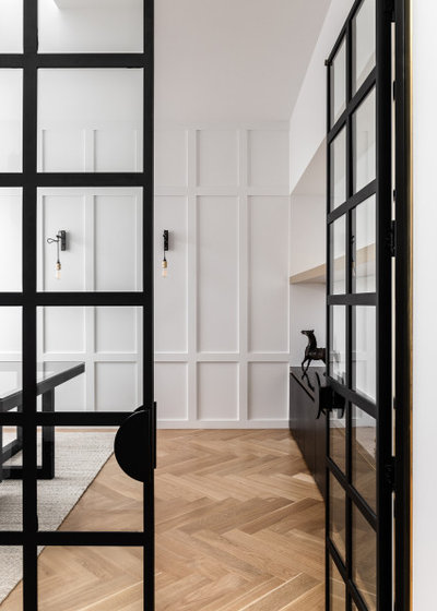
Tell us about the custom joinery
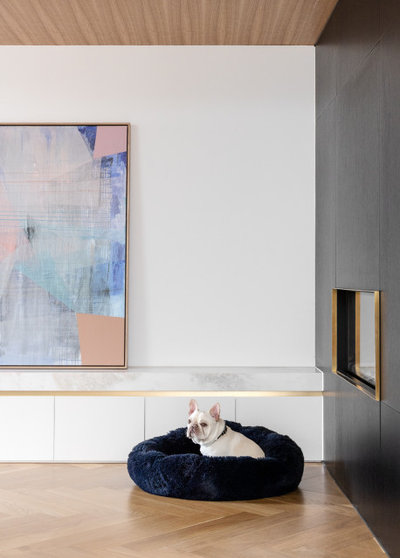
The custom joinery provides both practical storage and also a platform for the homeowners to express themselves ornamentally. It runs the full length of the living room and wraps into a dark timber wall that houses a built-in fireplace.
The custom joinery provides both practical storage and also a platform for the homeowners to express themselves ornamentally. It runs the full length of the living room and wraps into a dark timber wall that houses a built-in fireplace.
What are the defining features of the house now?
- The helical staircase.
- Curved brickwork on the exterior.
- The curved internal wall, which disappears from view as you move into the home.
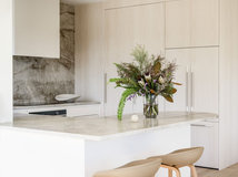
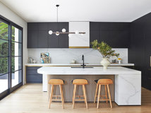
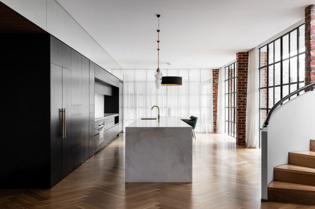
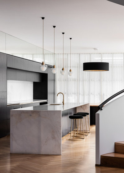
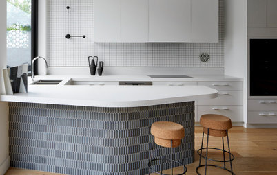
- The marble island bench in the kitchen.
- The skylights used throughout the home.
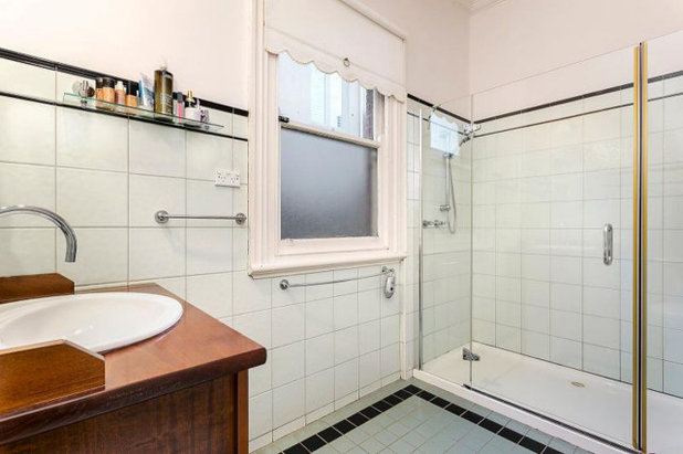
Main ensuite in the original house.
Why do you think it works so well?
The design beautifully responds to its surrounding context, providing a harmonious example of how contemporary architecture can be present among existing period homes.
The design avoids the look-at-me approach, instead choosing a path of respect and restraint that in turn gives the architecture elegance and a real sense of place.
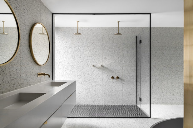
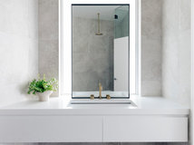
Main ensuite in the new house.
Materials palette
Interior palette
Materials palette
Interior palette
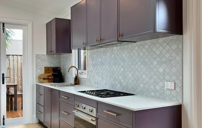
- First Element Biancospino French oak flooring.
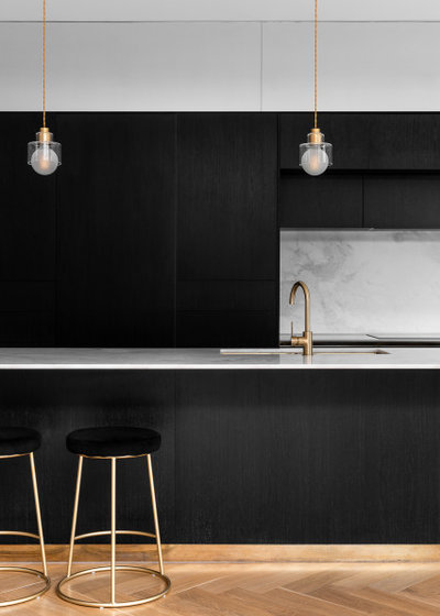
- CDK Stone Elba marble on the kitchen island and splashback.
- Elton Group Eveneer Black Matt timber veneer on the kitchen cabinetry.
- Teranova Tiles Greek Key encaustic black tiles in the ensuite shower.
- Terrazzo Australian Marble black-and-white terrazzo tiles in the ensuite.
- Elton Group WoodWall panelling in a custom colour on the living room ceiling.
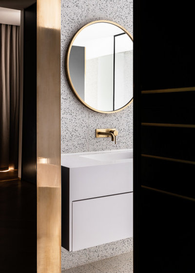
Fixtures and finishes
- Astra Walker Icon tapware in an eco-brass finish in the kitchen and bathrooms.
- Ross Didier Acorn pendants from Tongue and Groove in the kitchen.
- Dean Phillips Saturn Ring pendant from Tongue and Groove in the dining room.
- James McCormick Crane wall lights from Tongue and Groove in the home office.
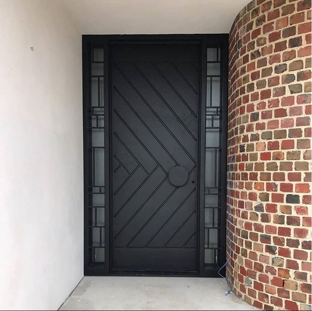
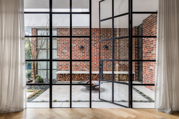
- Custom-designed and made steel-framed doors.
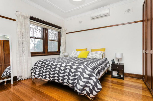
Main bedroom in the original house.
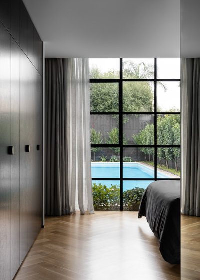
Main bedroom in the new house.
Furniture
Furniture
- Interior Secrets bar stools and kitchen chairs (style no longer available).
- Dulux Vivid White used throughout the interior.
The internal powder room in the new house.
Your turn
Do you love what the architect has done here as much as we do? What’s your favourite feature? Tell us in the Comments below. And don’t forget to save these images, like this story and join the conversation.
More
Want to see another exceptional new build? Check out this story – East Meets West: A Knockdown-Rebuild That Fuses Different Styles
What are you working on?
Related Stories
Popular Houzz Series
A Dated Country Home in a Kiwifruit Orchard Made Modern
When their grown-up sons moved out, these NZ homeowners gave their much-loved country home a chic, modern makeover
Full Story
Renovating
An Inspired Solution for a Dark & Disjointed Californian Bungalow
See how an architect opened up a light-starved, closed-in Melbourne home, and connected it with the neighbouring park
Full Story
Popular Houzz Series
Before & After: A Leaky, Falling-Down Victorian Terrace Reborn
See how a small Melbourne terrace, untouched for over 100 years, was remade into a functional home for a modern family
Full Story
Before & After
Before & After: From 'White Box' to Luxe, Layered Apartment
Quiet luxury was the goal for the redesign of this Sydney waterfront apartment – see how the designer achieved it
Full Story
Popular Houzz Series
A Sweet Balmain Cottage Sure to Capture Your Heart
With an extension underway, this cottage was ready for a new decorative scheme that would bring old and new together
Full Story
Before & After
Before & After: A Cheap & Cheerful Makeover of a 1980s Caravan
Armed with an AU$1500 budget, a Melbourne couple rolled up their sleeves and transformed a caravan in just three months
Full Story
Projects Born on Houzz
Before & After: A Light-Drenched Home in the Heart of Coogee
This breezy family home in one of Sydney's beachside suburbs is the essence of relaxed Australian coastal style
Full Story
Interior Design
A Grand Federation Home Comes of Age for a Busy Young Family
See how a revamped layout, custom joinery and luxe touches transformed a dated heritage home in Sydney
Full Story
Architecture
From Tired 100-Year-Old Beach Cottage to Lush, Private Oasis
Encircled by beautiful gardens, this renovated weatherboard cottage in Sydney is all about indoor-outdoor connection
Full Story
Bathroom Renovations
Before & After: A Clunky & Dated Victorian Terrace Reborn
Rising damp, sagging floors and a dysfunctional layout were just some of the challenges this tired terrace offered up
Full Story
Beautiful, and sophisticated. Love the minimal lines but with plenty of hidden storage.
I agree with Angela Ryan, the house needs a bit of living in to soften the hard edges.
Please tell me that the stunning windows and other period fixtures have been saved and recycled.
I understand that the owners wanted a modern house and that's their prerogative. It was nice to see the interior of the old house presented positively for a change and not made to look dingy.