


France Houzz: From Bare and Bland to a Bold Minimalist Beauty
See how an architect used custom furniture and clever ways with colour and space to tame this unwieldy layout
Agnès Carpentier
7 August 2022
This French house, located in Sainte-Geneviève-des-Bois, south of Paris, was built recently with the help of an architect, but the owners put a stop to the project when they decided to return to the south of France. Shortly after, a new family moved in: a couple in their thirties with two small boys. This is the story of how they transformed the house into their home.
Photos by Thierry Guillaume.
House at a Glance
Who lives here: A couple in their thirties with two young boys
Location: Sainte-Geneviève-des-Bois, France
Completion date: December 2021 after six months of work
Size: About 100 square metres
Architect: Marion Tixier of MarionTArchitecture
Carpenter: Dimension Services
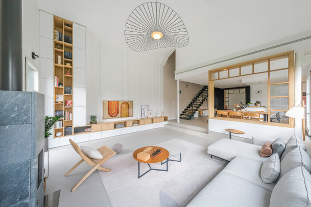
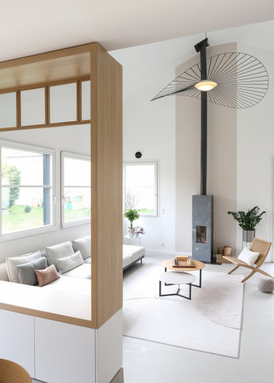
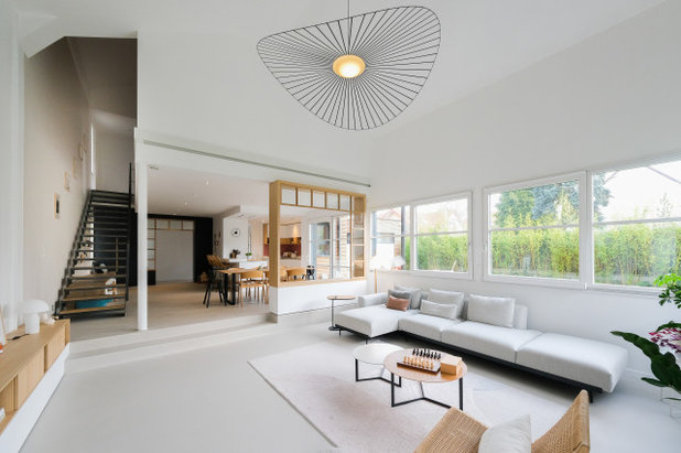
The living room’s unique proportions – this long, bright and spacious room, which also boasts a 4.5-metre ceiling – are what particularly drew the couple to the property. However, it was in need of warmth and coherence across its distinct zones, so the couple began looking for solutions. Impressed by one of her projects on Houzz, the owner contacted Marion Tixier of MarionTArchitecture and gave her free rein to reinvent the space.
House at a Glance
Who lives here: A couple in their thirties with two young boys
Location: Sainte-Geneviève-des-Bois, France
Completion date: December 2021 after six months of work
Size: About 100 square metres
Architect: Marion Tixier of MarionTArchitecture
Carpenter: Dimension Services
The living room’s unique proportions – this long, bright and spacious room, which also boasts a 4.5-metre ceiling – are what particularly drew the couple to the property. However, it was in need of warmth and coherence across its distinct zones, so the couple began looking for solutions. Impressed by one of her projects on Houzz, the owner contacted Marion Tixier of MarionTArchitecture and gave her free rein to reinvent the space.
Before Photo
Ground-floor plan before works.
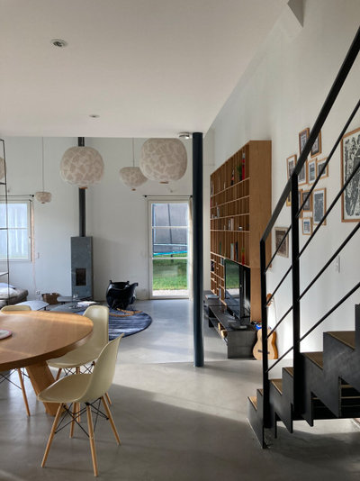
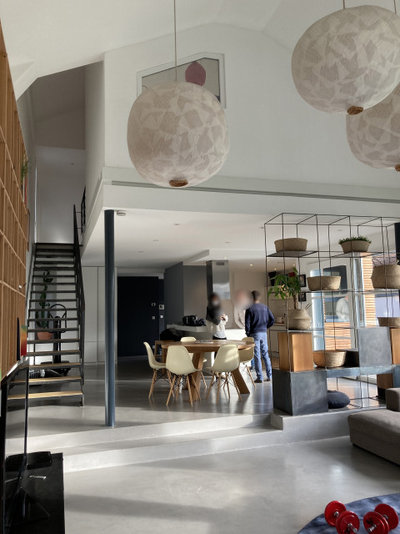
Proceeding on from the L-shaped entrance at the side of the existing house, two doorways lead to the living space – one through the kitchen and the other through the dining area, next to the metal staircase leading upstairs. Previously, the room had run the length of the space, with the various zones marked only by changes in level. Its first section – the kitchen and dining area – had normal 2.5-metre-high ceilings, while the living room two steps below, created an immense and impressive volume with a 4.5-metre ceiling height.
As an architect, Tixier is adept at large-scale renovations and redesigning spaces from scratch. She was keen on helping the family revamp the living area. “I felt that I could really help them bring personality to the home, instead of just working with the existing space,” she says.
Keen to renovate? Find an architect near you on Houzz, browse images of their projects and read reviews from previous clients
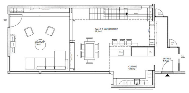
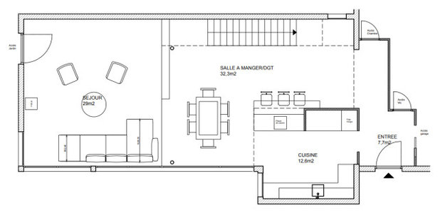
Ground-floor plan after works.
They wanted to avoid major demolition measures, such as moving the kitchen, that would involve knocking everything down and starting over. Instead, well-thought-out furnishings and touches of soft colour were used to add warmth and cosiness to different parts of the approximately 75-square-metre room.
“My clients were inspired by the timeless colours and understated decor of Japanese style. I suggested a design using tailor-made furnishings underscored with wood texture, touches of colour and artwork. Making lines stand out was actually one of the central ideas for achieving this,” says Tixier.
Before Photo
This is the view of the second entrance into the living room, alongside the metal staircase, before works began.
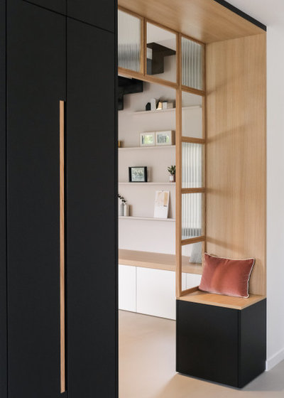
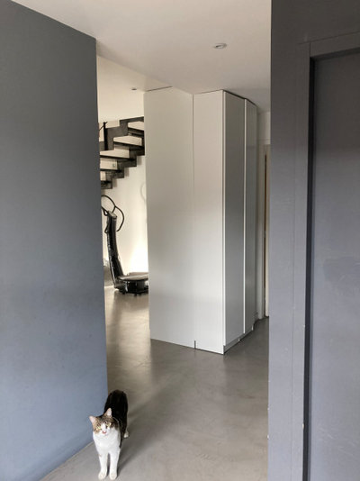
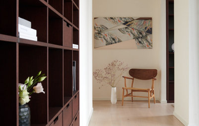
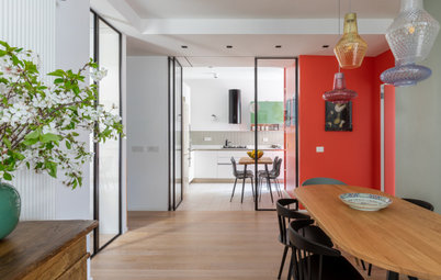
A fitted black laminate wardrobe and archway with a light oak finish from Egger in France replaced the previous white cupboards. “I wanted to incorporate a sort of passage at the entrance to each zone and to frame the living space. The square pattern on the studio-style divider, alternating transparent and patterned glass, reinforces the arch’s play with framing,” says Tixier.
Dimension Services, a France-based carpentry company, created this first piece of joinery. Its dark colour sets a clear boundary between the entrance and living area.
Details throughout this space pick up on the motif of extended lines, including the light timber handles on the black cupboards and the black border along the wooden finish, which accentuates the top of the arch.
Before Photo
The space below the staircase had no function, other than storing sports equipment and the cat-litter box, when the new owners took residence.
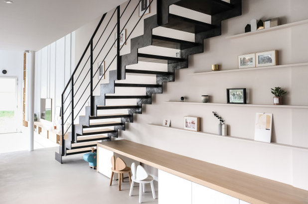
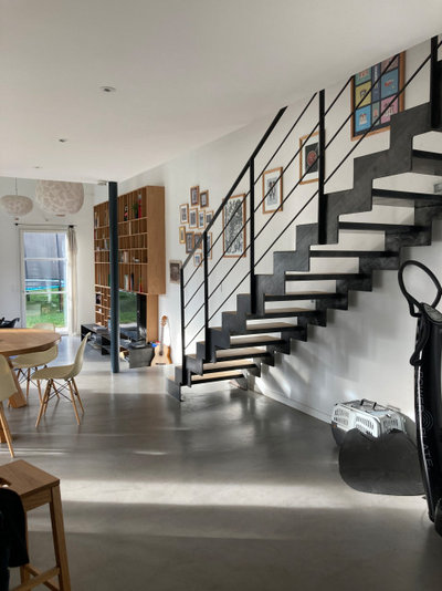
They wanted to make better use of this under-stair space and came up with the idea of a large closed storage cabinet. The architect advised against obstructing this beautiful piece of metalwork, so now the joinery and balustrade are both on show.
A kids’ play area – made of storage boxes adapted to their height and fitted beneath new shelves – was a smarter option. Tixier paid particular attention to highlighting lines throughout the design. “The carpenter created additional units to insert into the desk area when the kids grow up. The cupboard is made with a satin melamine coating that, unlike paint, doesn’t show finger marks,” she says.
A kids’ play area – made of storage boxes adapted to their height and fitted beneath new shelves – was a smarter option. Tixier paid particular attention to highlighting lines throughout the design. “The carpenter created additional units to insert into the desk area when the kids grow up. The cupboard is made with a satin melamine coating that, unlike paint, doesn’t show finger marks,” she says.
Before Photo
The living room was at a lower level than the kitchen/dining area. In this space, the existing timber TV stand and bookshelf did not reach the ceiling, which prompted a rethink.
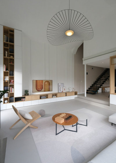
To underscore the living room’s spaciousness and 4.5-metre-high ceiling, a new piece of joinery now draws the eyes up with the soft contrast of white and wood. It extends to the staircase with a two-tone sideboard that draws attention to The Frame TV by Samsung, which looks like a painting when switched off.
“When you have large areas to work with, you should make the most of them with full-size furniture instead of pieces that would divide the space in two,” says Tixier. The combination of horizontal and vertical lines in the two-tone shelving, the staggered rows of storage, and even the unevenly spaced brackets punctuating the wall behind the TV screen make the room more vibrant.
“When you have large areas to work with, you should make the most of them with full-size furniture instead of pieces that would divide the space in two,” says Tixier. The combination of horizontal and vertical lines in the two-tone shelving, the staggered rows of storage, and even the unevenly spaced brackets punctuating the wall behind the TV screen make the room more vibrant.
Before Photo
This is the original living room area with the existing grey stone fireplace.
While the programmable fireplace – the only source of heat in the room – is very effective, the owners wanted to also bring visual warmth to this part of the home.
The original grey ambience, mainly dampened by the waxed concrete flooring, has made way for new, warmer and brighter hues, thanks to the beige Mercadier waxed-concrete flooring that was applied throughout the room. A large rug brings a cosier feel to the living room area with its embossed tufting, which lends the floor texture.
Tixier had the room repainted in a lighter shade of white with beige accent walls – behind the staircase and by the fireplace area – for a lighter, more inviting contrast that better differentiates the zones. The black pillar was also repainted in white.
Before Photo
A shelving unit originally separated the living room and kitchen/dining room areas. While it was a good idea, the structure looked too cold.
To revive this space, the architect stuck with the partial-partition idea, but reinvented it as a ‘liveable archway’ where the owners can sit down, set down a drink or even perch to play games. “The arch, which is completely parallel to the entrance, is made of wood for a smoother transition,” says Tixier.
She also advised the couple with their furniture selection. She chose a low sofa to avoid blocking the windows. “This modular model from Muuto was selected for its light design. The black legs offer contrast, and the shape of the round cushions adds even more softness,” she says.
Browse more modern living areas in crisp white
Before Photo
The previous owners had set up a stereo and two speakers in the existing metal wall divider. However, the acoustics left much to be desired, resulting in reverberation and sound interference.
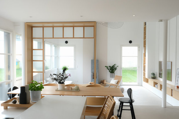
Now, the arch provides a bar top with a pleasant view of the living area, instead of a simple divider like the previous metal shelving unit. The open view frames the living room and other parts of the space, maintaining continuity. The timber elements offer better noise reduction to boot, and the space feels visually and acoustically warmer.
Before Photo
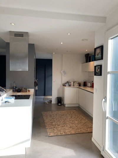
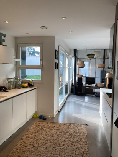
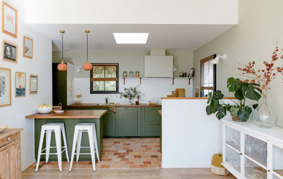
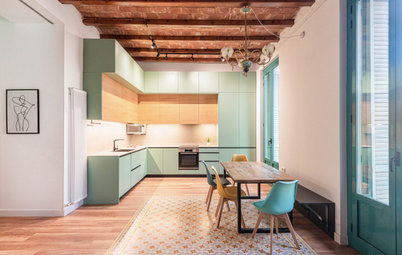
The homeowner loved the layout of the original kitchen but found the anthracite columns gloomy and dull compared to the entirely white decor.
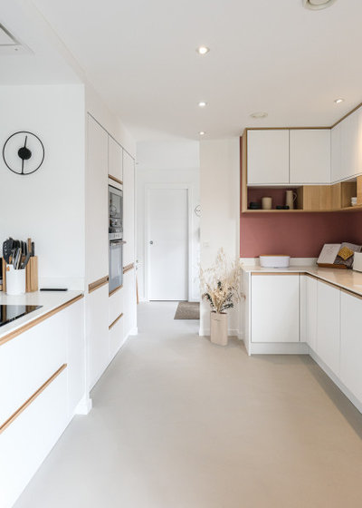
To solve this issue, they kept the bottom cupboards, but resurfaced and outfitted them with custom oak handles. “We used these elements to continue to highlight lines in this area,” says Tixier.
The anthracite columns were repainted white. An inconspicuous range hood unit built into the ceiling replaced the previous model, which the owner was not fond of as it obstructed the view from the kitchen.
The anthracite columns were repainted white. An inconspicuous range hood unit built into the ceiling replaced the previous model, which the owner was not fond of as it obstructed the view from the kitchen.
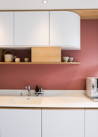
The upper cabinets were entirely redesigned and tailored to reach the ceiling, featuring oak details for a warm touch. While the owner is not a big fan of colour, she was won over by this rosy copper shade to lift the mood of the kitchen.
Before Photo
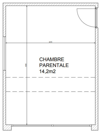
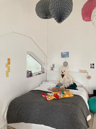
The main bedroom before works.
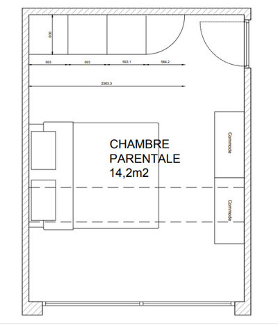
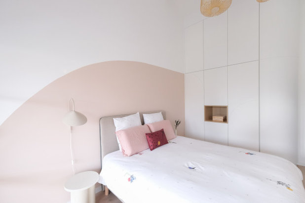
The main bedroom after works.
Before Photo
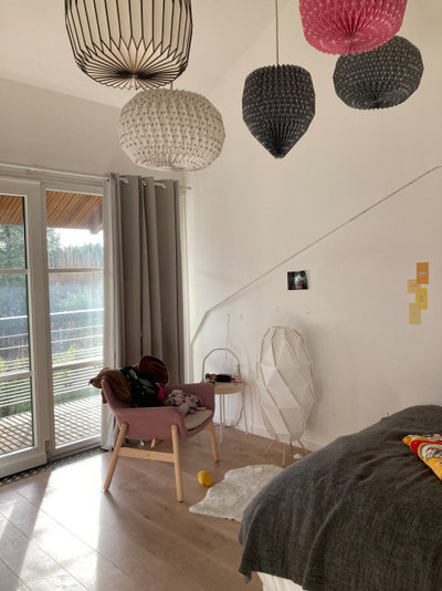
To truly make the most of Tixier’s work, the homeowners asked her to spruce up their upstairs bedroom, which was originally a nursery.
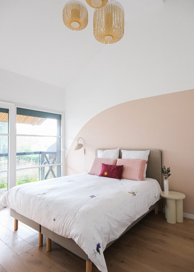
Tixier suggested adding a satin melamine wardrobe, custom-made by the joiner. She designed a dynamic, rounded groove on the wardrobe’s surfaces to bring a unique feel to the room at the lowest cost. This detail is extended by a soft-pink painted arch above the bed. “The pattern is entirely 2D but adds volume,” she says.
Before Photo
The original bedroom had dominated the area above the living room and had a small window to look down below. Tixier removed it, as it appeared to hover on the living room wall and interfered with the layout.
The result is a success and the homeowners’ comment on Tixier’s Houzz profile says a great deal about how much they appreciate her work: “The results went beyond our expectations! We hesitated for quite some time before deciding to find an interior designer, but we have no regrets as we would never have been able to develop the space as creatively and beautifully as Marion”.
As for Tixier, she says she liked “working with what was already there to transform this unconventional space by redefining the areas and experimenting with perspective and height. It was a very interesting experience that has changed how I do interior renovations”.
Your turn
Which elements of this design inspire you to rethink your interior? Tell us in the Comments below, like this story, save the images for inspiration, and join the renovation conversation.
More
Missed our previous Houzz Tour? Take a virtual trip to the USA with this Washington Houzz: Bold Colours and Art Energise a New Family Pad
What are you working on?
Related Stories
Houzz Tours
France Houzz: A New Island Home With an Old Soul
Check out this young family's welcoming and characterful French island home on Île d’Yeu, which embraces local style
Full Story
Houzz Tours
Germany Houzz: A Small Cabin Transformed Into a Forest Retreat
In this secluded area in the Taunus mountains of Germany, a family enjoys their weekends in 29 square metres of space
Full Story
Houzz TV
London Houzz: Tour a Contemporary Loft in an Old Victorian School
Watch and read how a design firm updated this light and airy apartment in an old block with sleek style and warm touches
Full Story
Garden Design
Spain Garden Tour: A Mediterranean Makeover With Colour & Texture
Once neglected, this naturalistic garden is now a series of outdoor rooms with idyllic spots to swim, dine and relax
Full Story
Houzz Tours
Berlin Houzz: A Touch of Japanese Forest Bathing in a German Home
Beloved memories of Japan come to life with the renovation of this 120-square-metre apartment in Berlin, Germany
Full Story
Houzz Tours
London Houzz: Daring Colour & Texture Transform a Victorian Home
By Kate Burt
The busy owners of this terrace sought help to design outside their decor comfort zone – the result is a cool classic
Full Story
Houzz Tours
Germany Houzz: Creating Summer & Winter Homes in a Converted Barn
One barn, two homes – see how architects designed separate zones for summer and winter living in an old country barn
Full Story
Houzz Tours
Before & After: Finding the Perfect Pink in a Barcelona Kitchen
Barely-there pink acts as a warm neutral in a new open-plan Spanish kitchen, replacing dark cabinets and drab finishes
Full Story
Houzz Tours
Before & After: Colour Blocking & Pattern Nod to Nature in Rome
Move and upsize or stay and renovate? This young family chose the latter in their small Italian apartment – here's why
Full Story
Houzz Tours
Barcelona Houzz: Style, Sustainability and Pattern in a Tiny Flat
Part-renovation, part-restoration, the owners of this Spanish apartment balanced historical style with forward thinking
Full Story
Beautiful. Where do they hide the ladder to access the top shelving in the living room?
thanks alot مركز صيانة ال جي
M