

Houzz Asks the Experts: Has Grey Had its Day?
Chic, luxurious and forgiving – there's much to love about grey. But is our love affair with the shade coming to an end?

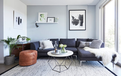
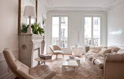
When it comes to neutrals, grey has reigned supreme for the past few years. From paint colours and furniture to soft furnishings, it has been the go-to choice for designers, architects and home owners alike, and no other neutral has had a look in. But with many of the big paint names set to release their colour trend predictions for 2019, we have to ask the question – is it time for grey to move out of the spotlight? And if so, which neutral will be stepping into its place? Three colour and design experts weigh in.
Sonia Simpfendorfer, creative director of Nexus Designs
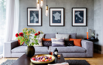
Grey has certainly had a huge amount of attention over the past few years, but that doesn’t make it a has-been. Architects and designers are particularly skilled at using greys beautifully in ways that go beyond any trend or fashion cycle, be it pale, silvery greys, mid-greys or charcoal. At the top end of design and architecture grey will always be strong.
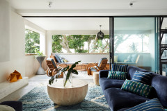
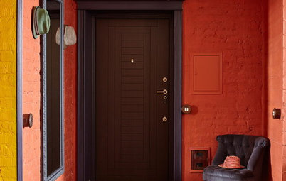
How Do I… Identify My Exterior Style?
Grey has certainly had a huge amount of attention over the past few years, but that doesn’t make it a has-been. Architects and designers are particularly skilled at using greys beautifully in ways that go beyond any trend or fashion cycle, be it pale, silvery greys, mid-greys or charcoal. At the top end of design and architecture grey will always be strong.
How Do I… Identify My Exterior Style?
Images by Craig Wall
Lynne Bradley, interior designer and principal at Lynne Bradley Interiors
I don’t think grey has had its day, but I feel it can safely move out of the spotlight to make space for other neutrals.
Grey is a fabulous and classic neutral that combines well with other colours. I use it quite a lot in my schemes and will continue to do so.
Which other neutrals are coming through?
Sonia Simpfendorfer
I’m like Switzerland when it comes to colour takeovers – I’m staying neutral! But I will say that we’ve been exploring and observing some gentle, nurturing, earth-based neutrals – paper-bag browns, warm grey, beige, cinnamon, nutmeg and clay colours.
Bradley
There is a strong need to reconnect with nature and without a doubt brown is poised to be the new grey. Earthy neutrals such as cinnamon and gold paired with warmer whites are soothing and grounding.
- Lucena-Orr
Sonia Simpfendorfer
I’m like Switzerland when it comes to colour takeovers – I’m staying neutral! But I will say that we’ve been exploring and observing some gentle, nurturing, earth-based neutrals – paper-bag browns, warm grey, beige, cinnamon, nutmeg and clay colours.
Bradley
There is a strong need to reconnect with nature and without a doubt brown is poised to be the new grey. Earthy neutrals such as cinnamon and gold paired with warmer whites are soothing and grounding.
What do these brown-based neutrals add to the look and feel of your home?
Lucena-Orr
They are warm, homely and welcoming, and remind us of the natural environment.
Bradley
There’s an honesty and simplicity to these earthy neutrals. They create a sense of balance, and contrast beautifully with energetic, bright palettes.
How Do I… Wallpaper my Bathroom?
Lucena-Orr
They are warm, homely and welcoming, and remind us of the natural environment.
Bradley
There’s an honesty and simplicity to these earthy neutrals. They create a sense of balance, and contrast beautifully with energetic, bright palettes.
How Do I… Wallpaper my Bathroom?
Which materials do they go with?
Bradley
Tumbled brass, titanium, natural stone, sisal, steel and glass.
Sonia Simpfendorfer
Warm neutrals and strong textures are very complementary. Think exaggerated weaves, tiles and bricks laid in interesting ways, and honed or brushed finishes, all of which draw attention to the beauty of the material itself. Matt finishes are particularly lovely in neutral, natural tones.
Lucena-Orr
Brown-based neutrals suit warmer metallics such as aged brass, gold, copper and pewter. Bright colours, on the other hand, suit cooler metallics such as silver and titanium.
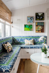
Where can I use brownish neutrals?
Lucena-Orr
Darker browns look beautiful in bedrooms and formal spaces as they feel very luxurious and decadent. They balance well with soft white trims and warmer metallics such as brass, copper and gold.
Soft tans and beige work well in larger rooms, such as living and family rooms, where a warm, cosy and sociable feel is called for.
And you don’t necessarily need a lot of light – there are many subtle browns such as camel, taupe and tan that work very well in fairly dark rooms. In a very bright room, choose a mid-tone brown with a subtle red or greenish undertone.
What other colours do brownish neutrals complement?
Sonia Simpfendorfer
Strong colours with a slightly ‘dirty’ undertone, such as terracotta and olive green, as well as clean, vivid colours like sky blue and sunshine yellow. Soft pastels including duck-egg blue and muted pink also sit well with earthy neutrals and create a calming feel.
See more striking living rooms
- Lucena-Orr
- Natural greens, oranges and brownish reds suit earthy neutrals. Most decorators would use a natural palette alongside a brown, instead of a bold, bright palette. But adding a small touch of a bright hue can really inject a sense of fun and energy into a space. Small accessories such as plant pots, lamps and soft furnishings are ideal spots for brights.
Images by James Deck
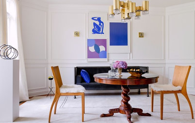
Bradley
Statement brights for 2019 include saturated blue, purple and orange. The saying “blue and green should never be seen” will be erased with the brilliant and very effective juxtaposition of these two hues.
Bright blue, green, yellow and red are some of my current favourites.
Bradley
Statement brights for 2019 include saturated blue, purple and orange. The saying “blue and green should never be seen” will be erased with the brilliant and very effective juxtaposition of these two hues.
Bright blue, green, yellow and red are some of my current favourites.
Where can you use these new brights?
Sonia Simpfendorfer
Use energising brights wherever they will bring you happiness. Perhaps paint your front door, letterbox or oversized plant pots in a wonderful bright colour. Or, choose sumptuous linen sheets, duvet covers and pillow cases in one or two shades of an intense colour – they will add warmth and a touch of the unexpected to your bedroom scheme. Alternatively, if your grey carpet has worn out, consider replacing it with a textural carpet in an earthy neutral.
Bradley
On bedheads, cushions, textiles, walls, joinery and lamp shades. Look to incorporate nature into the scheme, with indoor plants, shells, coral, seeds and pine cones.
On bedheads, cushions, textiles, walls, joinery and lamp shades. Look to incorporate nature into the scheme, with indoor plants, shells, coral, seeds and pine cones.
I’ve already committed to grey in my home… will I have to replace it?
Lucena-Orr
Not at all. There are plenty of ways to combine greys with a warm brown palette. Add grey with a brownish undertone and then build on this with natural green, burnished orange and tan.
Sonia Simpfendorfer
No – love what you have! But if you do decide you want to make a change, take your time to find the colours that make sense for your unique situation – not what’s necessarily on-trend.
Tell us
Are you ready to bid grey farewell? Tell us in the Comments section below, save this story for easy reference and join the conversation.
More
Find a painting professional near you
Are you ready to bid grey farewell? Tell us in the Comments section below, save this story for easy reference and join the conversation.
More
Find a painting professional near you
Styling by Bree Leech
Is the grey trend over?
Andrea Lucena-Orr, Dulux’s colour and communications manager
We certainly didn’t see as much grey in furniture and accessories on our travels to Europe this year, but I don’t think grey has had its day – it’s still very popular in Australia.