Popular Houzz Series
Popular Houzz Series
Appears in
See also
Fun HouzzFrom The ProsHouzz Around The WorldProject Of The WeekStickybeak Of The WeekQuizzesCreatives At HomeAt Home With...Best Of The WeekRoom Of The WeekDesigner Profiles3 Things I Wish My Clients KnewHow Do I...Buyer's GuidesExpert EyeInnovation AlertSo Your Style Is...Spotted!Picture PerfectBefore & AfterBudget BreakdownHome TimeMade Local
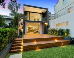
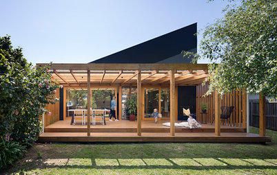
How Do I... Identify My Exterior Style?
Selecting colours and finishes for an exterior can be difficult – two experts reveal how to choose with confidence

In this practical series, we ask experts to answer your burning home and design questions. Here Sonia Simpfendorfer, creative director at Nexus Designs, and Jai Sanderson, general manager for marketing at PGH Bricks & Pavers, share some practical tips for creating an exterior look you’ll love.
We’ve accompanied their advice with some stunning exterior palettes, which Nexus Designs was commissioned to create for PGH Bricks & Pavers, plus some facades from the Houzz archives that capture the essence of these trending looks.
We’ve accompanied their advice with some stunning exterior palettes, which Nexus Designs was commissioned to create for PGH Bricks & Pavers, plus some facades from the Houzz archives that capture the essence of these trending looks.
Should my exterior palette blend into the streetscape and neighbours’ homes?
“It’s always good to consider the surrounding houses when selecting your exterior colours, but there are no hard and fast rules saying you have to blend in,” says Simpfendorfer.
“Again, consider how you want your house to feel. If you want to make a statement, choosing a palette that contrasts with your neighbour’s is a great way to stand out.
“You could also create a link with your neighbour’s home – without it looking too matched – by using just one colour from their house,” she says.
Dark and Stormy palette
How many colours should my exterior palette have?
“This will be determined by your home’s style,” says Simpfendorfer.
“An older period house with intricate architectural features, for example, may call for several base and accent colours. A contemporary house, on the other hand, provides endless opportunities for colour and finish, from an understated, neutral palette that uses fewer colours and focuses on texture for interest, through to dramatic, contrasting palettes.
“My advice is not to use too many colours and finishes on your exterior – less is generally more,” she says.
Which colours go where?
Simpfendorfer says:
Simpfendorfer says:
- Generally, base colours are used on the largest areas of your exterior, such as the walls, roof and garage door.
- Accent colours are used on smaller areas, such as guttering, fascias, window frames, screens and fencing.
- Don’t forget the front door – this is a very appealing spot for an accent colour and can provide guests with a warm welcome.
Perfect Imperfection palette
How important is texture?
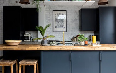
“Very! Texture is just as important as colour,” says Simpfendorfer. “Adding a textural touch can be as simple as using one material such as brick and laying it in several different ways. Or setting glossy materials next to matt ones to create an appealing contrast.
“Choosing finishes for their texture can add a handcrafted feeling to your home too,” she adds.
How important is texture?
“Very! Texture is just as important as colour,” says Simpfendorfer. “Adding a textural touch can be as simple as using one material such as brick and laying it in several different ways. Or setting glossy materials next to matt ones to create an appealing contrast.
“Choosing finishes for their texture can add a handcrafted feeling to your home too,” she adds.
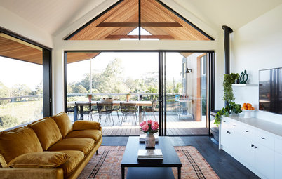
Should I use the same palette inside my home as well?
“Generally, an interior palette that flows seamlessly from the exterior one makes the most sense and creates a greater feeling of space. To open the door of a beautifully neutral exterior and find a wild mixture of colour and pattern inside could work – but not for me!” says Simpfendorfer.
“Generally, an interior palette that flows seamlessly from the exterior one makes the most sense and creates a greater feeling of space. To open the door of a beautifully neutral exterior and find a wild mixture of colour and pattern inside could work – but not for me!” says Simpfendorfer.
Back to Nature palette
Which of these palettes are you particularly loving?
“I find the Back to Nature palette, with its earthy and authentic colours inspired by nature, to be particularly inspiring. It has warmth and I love its links to mid-century architecture,” says Simpfendorfer.
Which of these palettes are you particularly loving?
“I find the Back to Nature palette, with its earthy and authentic colours inspired by nature, to be particularly inspiring. It has warmth and I love its links to mid-century architecture,” says Simpfendorfer.
“The Sophisticated Neutrals palette also appeals to me,” she says. “It’s calm and sophisticated and will visually enlarge a space and emphasise natural light.”
Red Revival palette
What makes brick such a great choice for exteriors?
“Australians love brick – more than six times as many houses here are built of brick than weatherboard and there are eight times as many brick homes than fibre cement ones,” says Sanderson.
“Homeowners are increasingly recognising the eco benefits of brick too, with its superior heating and cooling attributes,” she says.
The latest bricks come in a wide range of colours and finishes, says Sanderson, including smooth whites, concrete grey and charcoal, and rustic and recycled-look styles.
Sophisticated Neutrals palette
What are the biggest brick trends right now?
Sanderson says:
What are the biggest brick trends right now?
Sanderson says:
- White bricks for both inside and outside the home.
- Dark, near-black bricks paired with black mortar.
- Raw, earthy textures.
- Smooth, colour-through finishes.
- Recycled-look bricks with blend variation and tumbled edges, which are used to create an industrial chic look.
Industrial Chic palette
Which trend palettes would you recommend for different settings?
Sanderson says:
Which trend palettes would you recommend for different settings?
Sanderson says:
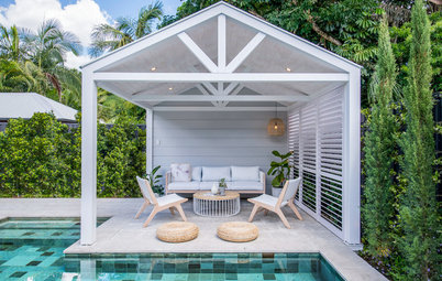
- A coastal setting: The Sophisticated Neutrals or Grey all the Way palettes would both work well. For a sophisticated, neutral look, consider mixing crisp shades of white, stone and cool concrete.
- An urban setting: The Perfect Imperfection palette is a great choice, offering depth and interest to a plain, urban exterior. To ramp up the rustic, eclectic feel, consider using a custom blend of bricks that appear handmade.
A Touch of Texture palette
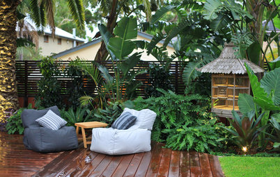
- A suburban, bushland setting: Try the Back to Nature palette, which draws its inspiration from plants, timber, stone and earth. It features natural tones and boasts a wonderfully textured feel.
Tell us
Did you find this story useful? Let us know in the Comments below. And don’t forget to like or share this story and save the photos. Join the conversation.
More
Find a painter near you
Did you find this story useful? Let us know in the Comments below. And don’t forget to like or share this story and save the photos. Join the conversation.
More
Find a painter near you

Where should I start?
“Working out your exterior style is a mixture of feelings and facts,” says Simpfendorfer. “Start by thinking about how you’d like your house to feel – do you picture it making a strong visual statement or blending into the neighbourhood? Should it be classic or a little more edgy?
“Consider where your house is located – is it in a metropolitan area, the suburbs, a rural or coastal setting? These different environments can inspire your colour and finish choices,” she says.
“It can be extremely helpful to build your own visual reference diary,” she says. “Do this by visiting display villages or driving around your neighbourhood and noting the house exteriors that particularly appeal to you.
“Then, visit selection centres where you can see colour and finish samples of similar elements up close. This will help you visually refine the style you like.”