


Ireland Houzz Tour: A Dated Duplex Gains Storage, Style and Light
The layout of this dingy two-storey home was limiting its potential; now it functions beautifully and feels welcoming
Kate Burt
21 February 2021
Houzz UK. I'm a journalist and editor, previously for the Independent, Guardian and various magazines. I'm now excited to part of the editorial team at Houzz UK & Ireland, bringing the best of British and Irish design, interiors and architecture to Houzz.com.
Houzz UK. I'm a journalist and editor, previously for the Independent, Guardian and... More
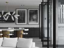
The owners of this duplex in Dublin, Ireland, enlisted local architect Eva Byrne to give the place a total overhaul. “It was drab and dreary and didn’t have enough storage,” says Byrne. “The kitchen didn’t work and was badly laid out.”
Byrne had free rein on the design, as her client had worked with her before and trusted her instincts. “They mainly wanted me to optimise the space,” she says. “We didn’t do anything major – it was more that we made lots of little changes that dramatically improved the flat.”
Byrne had free rein on the design, as her client had worked with her before and trusted her instincts. “They mainly wanted me to optimise the space,” she says. “We didn’t do anything major – it was more that we made lots of little changes that dramatically improved the flat.”
Houzz at a Glance
Who lives here: The home is currently being rented by two flatmates
Location: Dublin, Ireland
Property: A 1980s purpose-built duplex
Size: Two bedrooms and two bathrooms
Architect: Eva Byrne of Houseology
Byrne outlines the key areas she changed. “We reorganised the kitchen/diner/living room layout, plus the bedrooms, to give a better sense of space. We also redid the shower rooms,” she says.
Byrne also came up with an ingenious laundry idea and, because the project unfolded during various Covid-19 lockdowns, flexible spaces are also a key feature.
Renovating? Find an architect near you, browse images of their work and read reviews from previous clients
This is the ‘before’ view of the hallway, with the front door to the left and the living area and kitchen straight ahead.
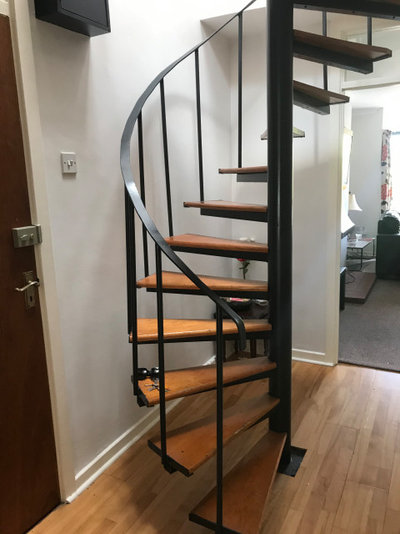
“This area was really just a decor job; we repainted all the surfaces, starting with the stair treads, which are [now] covered in a grey, non-slip paint,” says Byrne. “These set the slightly industrial theme for the whole apartment.”
“This area was really just a decor job; we repainted all the surfaces, starting with the stair treads, which are [now] covered in a grey, non-slip paint,” says Byrne. “These set the slightly industrial theme for the whole apartment.”
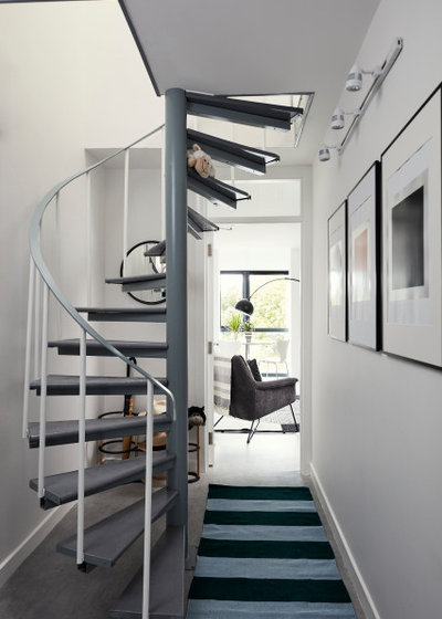
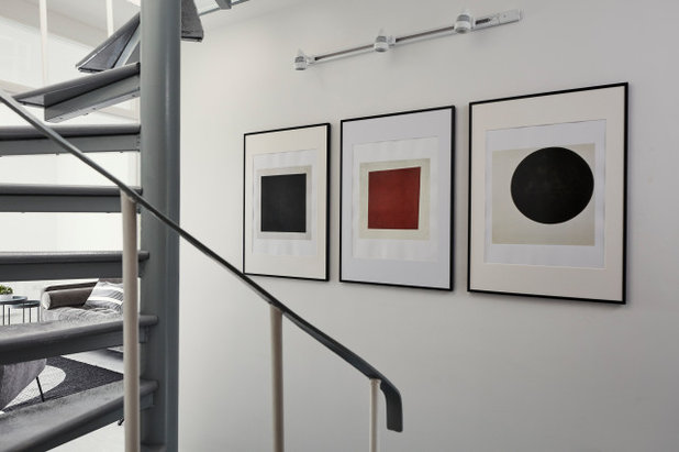
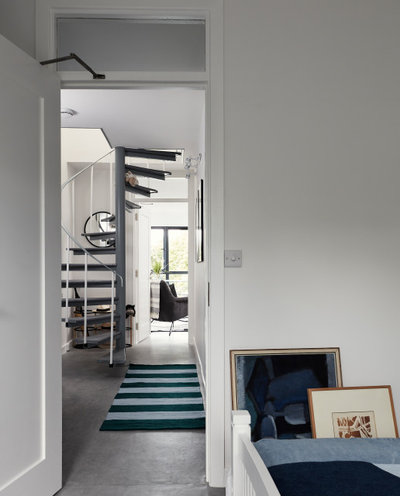
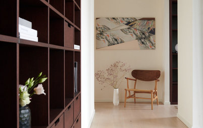
Here’s how the entrance hall looks now. The flooring is covered in new, cushion-backed grey vinyl. A striped runner and a trio of framed artworks add colour.
There are no ceiling lights, as the upper and lower floors in the flat are all concrete, making wiring difficult. Previously, there had been one lone wall light and Byrne swapped this for track lighting over the artworks. “I wanted to give it a nice art-gallery feel, which works with the grey industrial stairs,” she says.
Byrne bought three portfolios of artworks from a gallery for about AU$50, which she used throughout the flat, placing them in Ikea frames. “It’s not what you spend, it’s how you hang it – the height and precise location and colours,” she says.
Just out of shot, by the door, is a small cupboard that Byrne adapted and turned into a full-size coat storage space.
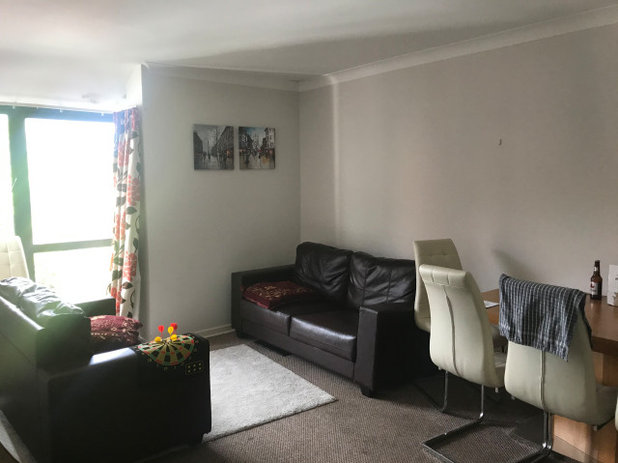
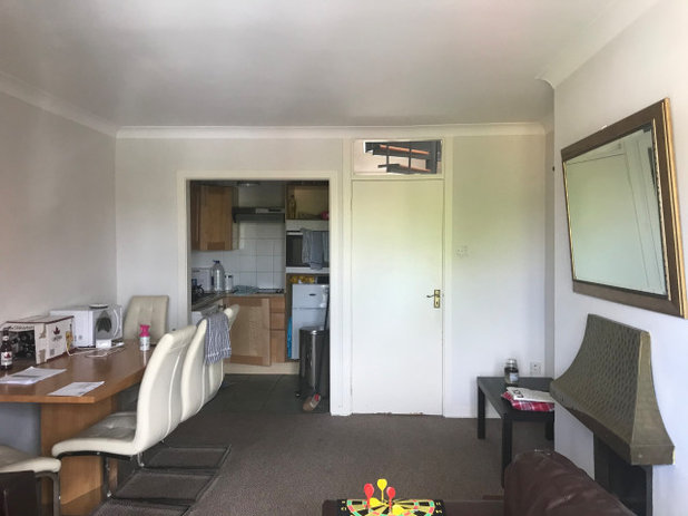
This is the flat’s living room before Byrne worked her design magic on it.
“The furniture was all slumped down in one corner, with a huge table and chairs – irrelevant in a flat of this size,” she says.
“The furniture was all slumped down in one corner, with a huge table and chairs – irrelevant in a flat of this size,” she says.
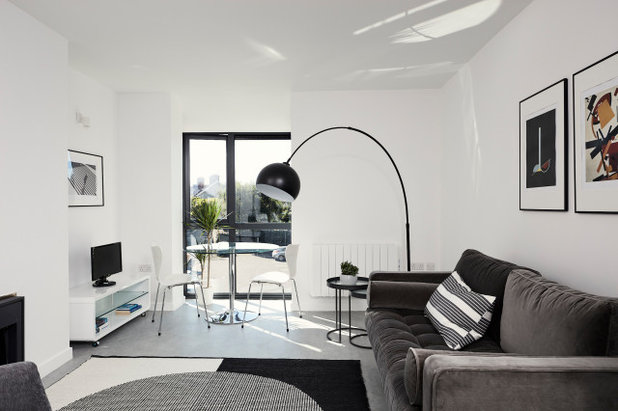
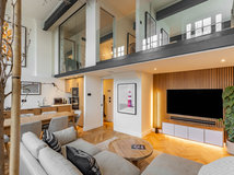
Simply reorganising the furniture and freshening the colours has made a dramatic difference to the room.
Byrne moved the dining area to a position by the glass doors – as well as reducing its size. “It seemed as if it would be a lovely place to sit,” she says. “A glass table with chrome legs isn’t something I’d normally use, but because the room faces west, the light really bounces off the surfaces of these and into the room, reflecting onto the ceiling.”
Byrne moved the dining area to a position by the glass doors – as well as reducing its size. “It seemed as if it would be a lovely place to sit,” she says. “A glass table with chrome legs isn’t something I’d normally use, but because the room faces west, the light really bounces off the surfaces of these and into the room, reflecting onto the ceiling.”
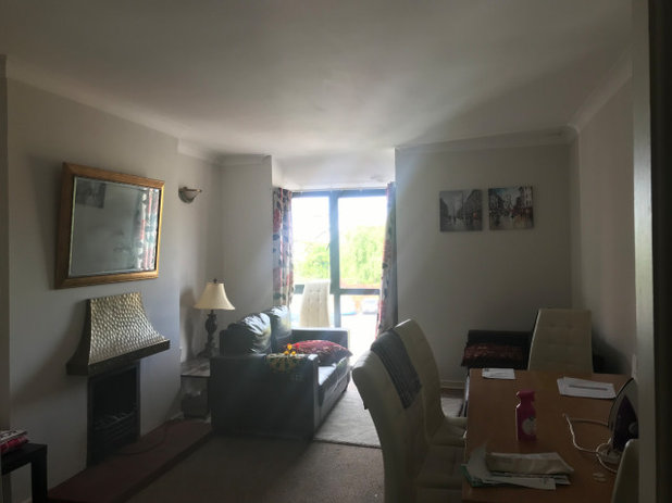
Another shot of the living room before the renovation shows that it had a fireplace with a prominent canopy and hearth. “It was a trip hazard,” says Byrne.
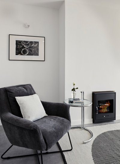
She replaced this with an electric fireplace. “There are three flights of stairs – do you really want to carry solid fuel up them?” says Byrne. “The electric stove also has a lovely, subtle flame and a nice heat – good on a chilly day when you don’t want the [central] heating on.”
The vinyl flooring in the hall continues into this room. “It looks like poured concrete, but of course it’s lovely and warm and soft,” says Byrne.
She also updated the wall lights in the alcoves to single versions of the design that she picked for the hall, upgraded the electric heaters and added more artwork. All the lights in the flat are on dimmer switches.
The original kitchen, glimpsed here through the square arch, was fairly cramped.
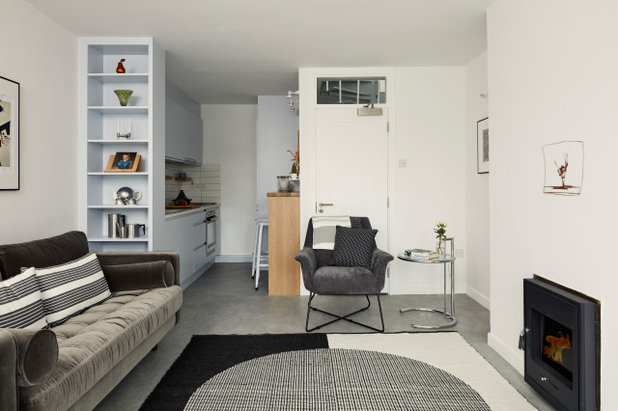
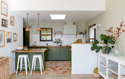
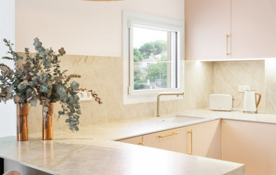
After Byrne’s redesign, the new pale blue/grey kitchen is still not huge, but functions much better thanks to the extra space she carved out for it. She ditched the L-shaped layout and went for a one-wall kitchen, leaving space for a breakfast bar on the opposite side.
The space is just 1.8 metres wide, so Byrne played with the standard distances between items she’d ordinarily aim for. “It’s a bit narrow at the far end, where the drawers are only 60 centimetres away from the fridge, and the breakfast counter is only 90 centimetres away from the units, but I thought it would work,” she says.
The space is just 1.8 metres wide, so Byrne played with the standard distances between items she’d ordinarily aim for. “It’s a bit narrow at the far end, where the drawers are only 60 centimetres away from the fridge, and the breakfast counter is only 90 centimetres away from the units, but I thought it would work,” she says.
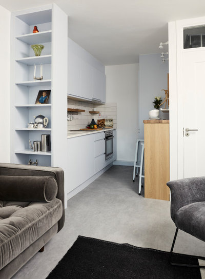
“I extended the wall in the kitchen on the left to 225 centimetres long based around what I wanted to fit into it,” says Byrne.
This includes a sink with bins beneath it, a dishwasher and an oven with drawers on either side. Byrne then removed the existing partial wall and replaced it with a useful bookcase, rather than have dead space there.
Another space-saver comes thanks to Byrne’s clever new location for the washing machine (scroll down to see where), meaning the appliance no longer has to squeeze into the kitchen.
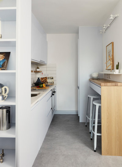
The breakfast bar has useful drawers to match the units opposite, and stools tuck out of sight underneath when not in use.
A shallow Ikea shelf above the bench allows for decorative display and reduces the visual impact of the sockets below it.
Browse more small and stylish kitchens for inspiration
A shallow Ikea shelf above the bench allows for decorative display and reduces the visual impact of the sockets below it.
Browse more small and stylish kitchens for inspiration
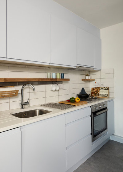
Flat subway tiles are laid in a grid pattern for a clean-lined splashback. The benchtop is quartz, and wall-mounted open storage helps keep the surface uncluttered.
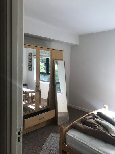
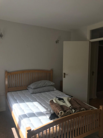
There are three more rooms and two bathrooms. This is the downstairs double bedroom in its pre-renovation state. A window is just out of shot on the right.
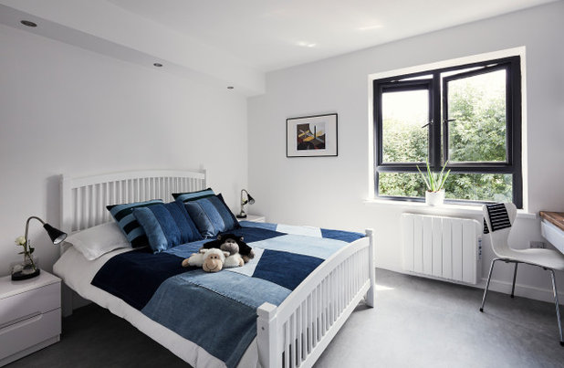
In this ‘after’ photo, taken from the same angle, you can see how simple changes have transformed the feel of this room.
Byrne removed the wardrobe and put the bed against the same wall. “When you walked in previously, it was straight into the wardrobe,” she says. She made use of the bulkhead above for dimmable downlights over the bed.
The ginger-pine bed is as before, but has had a whitewash and looks fresh and new. “We spent very smart,” says Byrne.
This view from inside the bedroom shows where it sits in the home’s layout.
One structural change Byrne made was to block a doorway surplus to requirements. “This room had a door into the downstairs shower room, but there was also an entrance from the hall, so I blocked this one up and the shower room is now only accessible from the hall,” she explains.
The paintings leaning against the wall are in the position of the blocked-up doorway.
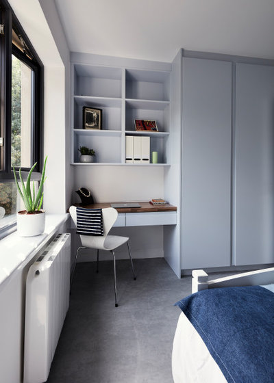
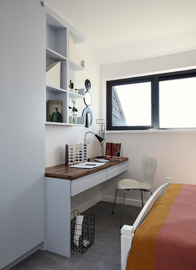
This is the other side of the bedroom. Byrne commissioned the kitchen company to create built-in wardrobes and a desk/dressing table the same colour as in the kitchen.
“The project began at the start of the pandemic,” says Byrne. “So I decided to put a desk in every room that could also be used as a dressing table.”
“The project began at the start of the pandemic,” says Byrne. “So I decided to put a desk in every room that could also be used as a dressing table.”
This shows the same angle pre-renovation. “Before, you’d look down the hall and see the bed straight away through the open door.”
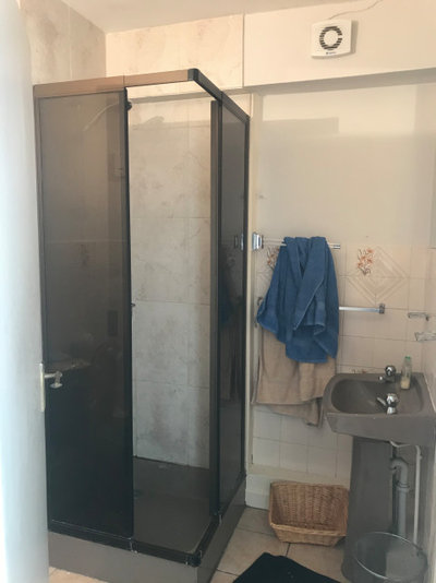
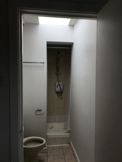
Here’s the original downstairs shower.
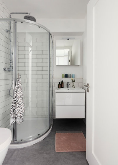
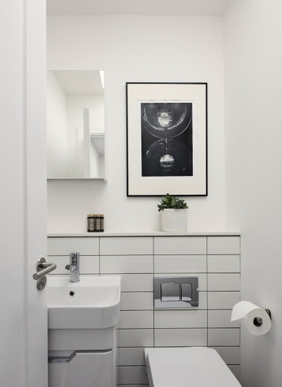
In this shot of the same room after its makeover, you can see again how simple tweaks have revitalised the space.
The quadrant shower and clear glass screen impose less on the space than the previous boxy, smoked-glass design. There’s also more storage, as well as light reflected in the mirrored cabinet.
The quadrant shower and clear glass screen impose less on the space than the previous boxy, smoked-glass design. There’s also more storage, as well as light reflected in the mirrored cabinet.
This room, upstairs, was a bedroom in its original incarnation, seen here.
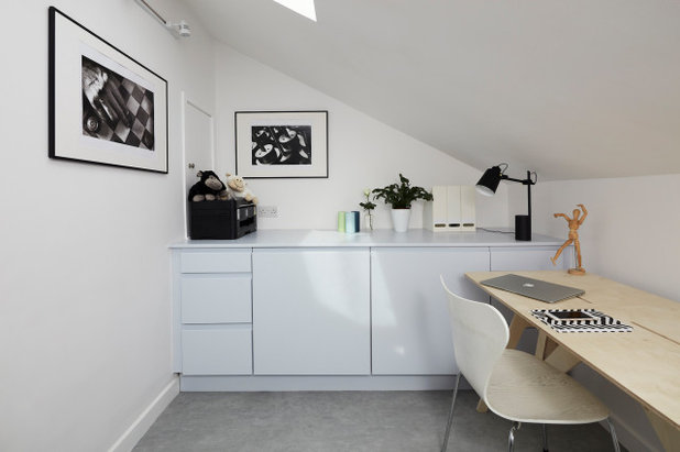
The room is now a flexible home office and yoga room. It also has another ingenious use: it backs onto the upstairs shower and Byrne noted the water pipes ran under the floor here. “I thought, why not really go for the flexible home office idea?” So she put a washing machine and tumble dryer in here, too. Wondering where they are?
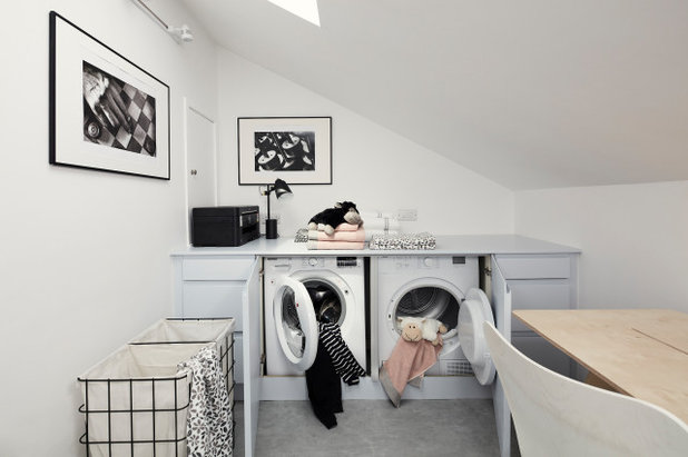
Voila! The appliances are concealed within units that match the kitchen cabinetry. Drawers provide space for laundry equipment. There’s no benchtop, as such, just a continuation of the cabinetry. “I didn’t want it to feel like a laundry room,” says Byrne.
“As the tenants only have the one social area downstairs, it’s nice to have a flexible space that could also just be a reading room,” she adds.
“As the tenants only have the one social area downstairs, it’s nice to have a flexible space that could also just be a reading room,” she adds.
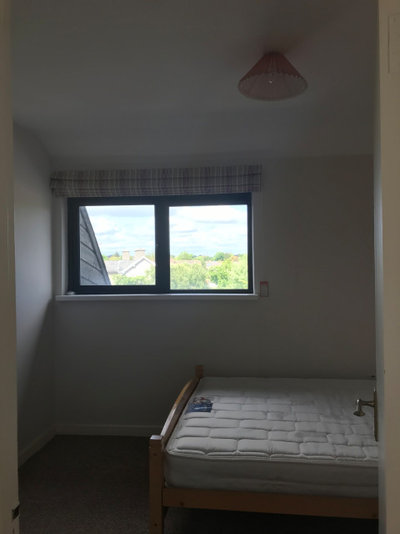
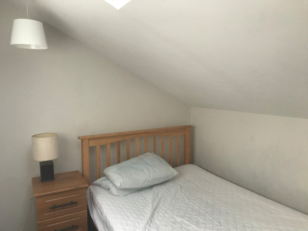
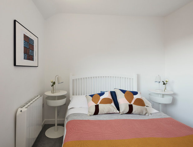
This is the second bedroom before the renovation.
Here’s the same room after Byrne’s revamp. Like the downstairs bedroom, it has bespoke, adaptable cabinetry.
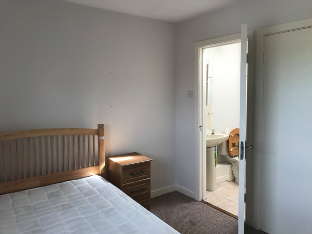
Again, Byrne blocked off a doorway into a shower, which can be seen in this photo.
The ‘after’ photo shows the room without the door. Byrne put a new doorway into the shower room in the hallway.
Again, Byrne reconfigured the layout in this bathroom.
Here’s how it looks now, seen through its new doorway from the landing.
Your turn
What are your favourite ideas from this renovation? Let us know in the Comments below. And remember to like this story, save the images for inspiration and join the conversation.
More
Craving more great makeovers? Don’t miss this UK Houzz Tour: An Unusual Side Extension Reinvents a Tired House
Related Stories
Houzz Tours
France Houzz: A New Island Home With an Old Soul
Check out this young family's welcoming and characterful French island home on Île d’Yeu, which embraces local style
Full Story
Houzz Tours
Germany Houzz: A Small Cabin Transformed Into a Forest Retreat
In this secluded area in the Taunus mountains of Germany, a family enjoys their weekends in 29 square metres of space
Full Story
Houzz TV
London Houzz: Tour a Contemporary Loft in an Old Victorian School
Watch and read how a design firm updated this light and airy apartment in an old block with sleek style and warm touches
Full Story
Garden Design
Spain Garden Tour: A Mediterranean Makeover With Colour & Texture
Once neglected, this naturalistic garden is now a series of outdoor rooms with idyllic spots to swim, dine and relax
Full Story
Houzz Tours
Berlin Houzz: A Touch of Japanese Forest Bathing in a German Home
Beloved memories of Japan come to life with the renovation of this 120-square-metre apartment in Berlin, Germany
Full Story
Houzz Tours
London Houzz: Daring Colour & Texture Transform a Victorian Home
By Kate Burt
The busy owners of this terrace sought help to design outside their decor comfort zone – the result is a cool classic
Full Story
Houzz Tours
Germany Houzz: Creating Summer & Winter Homes in a Converted Barn
One barn, two homes – see how architects designed separate zones for summer and winter living in an old country barn
Full Story
Houzz Tours
Before & After: Finding the Perfect Pink in a Barcelona Kitchen
Barely-there pink acts as a warm neutral in a new open-plan Spanish kitchen, replacing dark cabinets and drab finishes
Full Story
Houzz Tours
Before & After: Colour Blocking & Pattern Nod to Nature in Rome
Move and upsize or stay and renovate? This young family chose the latter in their small Italian apartment – here's why
Full Story
Houzz Tours
Barcelona Houzz: Style, Sustainability and Pattern in a Tiny Flat
Part-renovation, part-restoration, the owners of this Spanish apartment balanced historical style with forward thinking
Full Story
I love the electric stove in the lounge, any idea brand and where to purchase?
This has transformed the apartment from something from the 1980s/1990s era of Rathmines flats to something bang up-to-date. Wonderful job & I’m guessing that the work was substantial enough to bring the rent bang up-to-date too. Great job.
Thank you houseology for your reply. Much appreciated.