
Moscow Houzz Tour: Palm Springs Style Finds a New Home in Russia
This Russian designer's home faithfully channels the bright energy and colourful character of Californian interiors

Russian designer Marina Zhukova is a big fan of California’s iconic Palm Springs interiors, which celebrate geometric patterns and bright accents against a background of light-coloured walls. Despite being on the other side of the world, her own apartment in Moscow, Russia pairs this style with countless mesmerising works of art.
Houzz at a Glance
Who lives here: Designer Marina Zhukova, with her husband and two children
Location: Moscow, Russia
Size: Approximately 139 square metres
Designer: Marina Zhukova
Who lives here: Designer Marina Zhukova, with her husband and two children
Location: Moscow, Russia
Size: Approximately 139 square metres
Designer: Marina Zhukova
Floor plan of Zhukova’s apartment
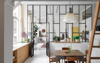
The family entertains often, so it was important to separate the public and private areas. The living room is a walk-through space that leads to all the other rooms, including the office, which can be turned into an additional bedroom when necessary.
The location of the windows was the main restriction when designing the layout – the living room, kitchen and office overlook the street, while the bedroom windows open up towards the courtyard.
The location of the windows was the main restriction when designing the layout – the living room, kitchen and office overlook the street, while the bedroom windows open up towards the courtyard.
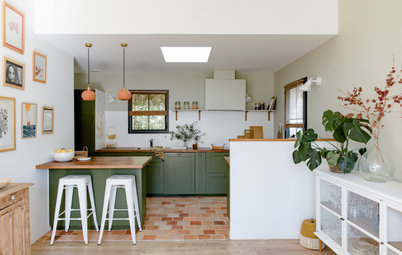
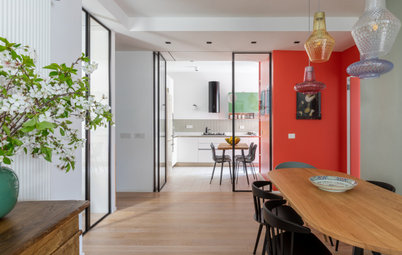
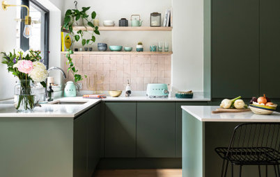
The kitchen area is an extension of the entryway. Zhukova says this is handy, because she can bring groceries in without having to take off her shoes – an advantage in Russian winters when footwear is routinely covered with snow.
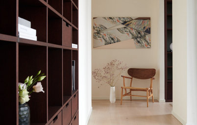
The doors near the entrance feature intricate mouldings and were made based on the designer’s sketches. One door leads to the guest bathroom and the other to the walk-in hall closet, which is positioned by the front door, ready to hide coats, gloves and scarves.
A narrow partition marks the width of the kitchen island and forms a boundary between the apartment’s open-plan spaces.
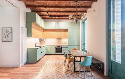
The kitchen runs along a single-wall, so extra bench space was created with an island. On the far wall to the left are tall cupboards with built-in appliances and shelves; on the right, two integrated refrigerators stand side-by-side.
A two-compartment refrigerator would not have worked for several reasons – first, it would not have held as much as two separate units; and second, Zhukova wanted to hide the refrigerators behind cupboard doors, but only one side-by-side built-in model is available in Russia, at triple the price of a normal fridge.
A two-compartment refrigerator would not have worked for several reasons – first, it would not have held as much as two separate units; and second, Zhukova wanted to hide the refrigerators behind cupboard doors, but only one side-by-side built-in model is available in Russia, at triple the price of a normal fridge.
The kitchen island has an ice-blue acrylic benchtop, fitted with a dishwasher, wine fridge, and a sink with garbage disposal. Measuring around 60 centimetres, the island is slightly narrower than the more common 80-centimetre-wide benches, to save space in the narrow kitchen.
“Many people tried to dissuade me, since a narrow island is often considered uncomfortable to use,” Zhukova says. “But in practice it was very successful. Now the island is a magnet for guests, and I often propose the same solution to my customers.”
“Many people tried to dissuade me, since a narrow island is often considered uncomfortable to use,” Zhukova says. “But in practice it was very successful. Now the island is a magnet for guests, and I often propose the same solution to my customers.”
The enclosed balcony was also incorporated into the kitchen. The designer opted not to install doors in between, thus connecting the two rooms and flooding the kitchen with light. Zhukova furnished this area with a ‘breakfast’ table, though in reality the family’s life revolves around this table at all times of the day.
The window treatment is made of several fabrics from Jim Thompson. A mix of orange and turquoise accents – Zhukova’s favorite colour combination – is visible throughout the apartment.
The window treatment is made of several fabrics from Jim Thompson. A mix of orange and turquoise accents – Zhukova’s favorite colour combination – is visible throughout the apartment.
A laser-cut plywood lattice conceals the kitchen heater. All the vents throughout the apartment were custom-made based on Zhukova’s sketches.
“My husband and I prefer bright, fresh colours, which in fact determined the color palette,” she says. “There are also a lot of contemporary paintings – I love artwork.”
“My husband and I prefer bright, fresh colours, which in fact determined the color palette,” she says. “There are also a lot of contemporary paintings – I love artwork.”
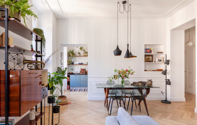
There were two load-bearing columns in the apartment’s original layout. One of them was on the border between the kitchen and the living room, and Zhukova decided to cover it in metallic wallpaper to help it blend into the rest of the space.
“It was not difficult to work with non-standard doorways,” Zhukova says.
“The only difficulty is that they are quite wide, so we had to make a joint in the middle of the decorative wooden moulding. When it’s cold and the heating is on, the material shrinks, and in spring and summer, when the humidity is a bit higher, the joint becomes slightly convex. I do not consider this a problem – I like to see how the material lives.”
“The only difficulty is that they are quite wide, so we had to make a joint in the middle of the decorative wooden moulding. When it’s cold and the heating is on, the material shrinks, and in spring and summer, when the humidity is a bit higher, the joint becomes slightly convex. I do not consider this a problem – I like to see how the material lives.”
The oak floor in the living room was laid in a herringbone pattern and painted white.
“The famous American designer Jonathan Adler said that you’ll feel carefree if you paint your floors white,” Zhukova says. “I absolutely agree with him. The truth is, you need to be prepared for the fact that natural wood grows old and changes over time.”
“The famous American designer Jonathan Adler said that you’ll feel carefree if you paint your floors white,” Zhukova says. “I absolutely agree with him. The truth is, you need to be prepared for the fact that natural wood grows old and changes over time.”
Zhukova and her son explore a picture book
The office, pictured here, is located next to the living room. Zhukova set up a reading space by the window, which boasts a comfortable upholstered seat, bookshelves on each side, and its own lighting.
“This is my favorite place in the house, my own little corner,” Zhukova says. “The windows overlook the road and the circus, which is lit up with its many lights. I’m fascinated with the movement at the intersection. I think I could stare at this view forever.”
The accent wall in the office is decorated with bright geometric wallpaper. It was Zhukova’s husband’s idea. The pattern from Cole & Son combines all the shades used throughout the apartment, and suggests new ones.
Zhukova imported a lot of the decor, including the light fixtures, from the US because the brands she and her husband liked were not available in Russia at the time. As a fun fact, Zhukova mentions the Russian postal system managed to deliver the two-metre-long headboard in their master bedroom without any issues.
The master bedroom’s decor concept rests on the pairing of bright prints and, for a quirky twist, zebra heads.
“Sometimes I joke that the design of any room begins with the search for the horse’s head – I am inspired by these animals,” Zhukova says.
The master bedroom’s decor concept rests on the pairing of bright prints and, for a quirky twist, zebra heads.
“Sometimes I joke that the design of any room begins with the search for the horse’s head – I am inspired by these animals,” Zhukova says.
The black-and-white of the zebra heads is echoed not only in the decorative pillows on the bed but also in the wallpaper of the bathroom ensuite.
Most of the ensuite is open to the bedroom, while only the toilet and shower area are hidden from view by a sliding door.
A large vanity features two sinks and three mirrors – the third mirror is a dedicated makeup station – and part of the vanity doubles as a dressing table.
Most of the ensuite is open to the bedroom, while only the toilet and shower area are hidden from view by a sliding door.
A large vanity features two sinks and three mirrors – the third mirror is a dedicated makeup station – and part of the vanity doubles as a dressing table.
The closed-off portion of the ensuite is finished in a black-and-white marble mosaic.
“I felt dizzy at first, but I like effective techniques that exercise your sensory organs – especially since you get used to bold decor over time,” Zhukova says. “Now we feel quite comfortable with it.”
“I felt dizzy at first, but I like effective techniques that exercise your sensory organs – especially since you get used to bold decor over time,” Zhukova says. “Now we feel quite comfortable with it.”
The nursery was designed with the owners’ two sons in mind. This is already the second, ‘grown-up’ version of its decor; the first scheme was aimed at the couple’s sons when they were toddlers. The main portion of this space is for rest and sleep, while the playroom is in the attached sunroom.
The owners chose geometric wallpaper in a shade that matches the headboards and carpet pattern.
The owners chose geometric wallpaper in a shade that matches the headboards and carpet pattern.
The walls in the children’s bathroom are covered with standard tiles in a herringbone pattern, creating the effect of coloured waves.
Zhukova says the guest bathroom is made for relaxation. The owners could not resist wallpaper with images of raccoons and birds.
“We assumed that the bright design would encourage guests to stay longer and think about the interior in detail,” Zhukova says. “In fact, children enjoy being here more than anyone else. I think my sons have spent a lot of time studying the animals on this wallpaper.”
Tell us
What is your favourite detail in this home? Tell us in the Comments, save the photos, like and share this story, and join the conversation.
More
Don’t miss last week’s Baltic Houzz Tour: A Slice of Tropical Summer in Russian Winter
“Once I sent some pictures of the interior to a magazine in California, and they were published,” Zhukova says. “The editors were very surprised that the apartment is in Moscow.”