


Paris Houzz Tour: A Light-Filled Loft With an Indoor Garden
This brightly lit French apartment features clever hidden storage, a living room winter garden, and a few daring twists
Agnès Carpentier
18 November 2018
This Parisian couple moved into a new apartment after their children flew the nest. To make sure they would end up with exactly the home they wanted, they reached out to interior designers before starting on their property hunt. They’d had a bad experience in the past when a designer didn’t supervise the work adequately, so finding the right professional was a sensitive issue. That’s why the couple turned to Houzz. Having seen photos of projects and read reviews by previous clients, the owners decided to work with Atelier Daaa. “They liked our style, our decor sensibilities and the fact that we put an emphasis on nature in many of our projects,” says Richard Guilbault of Atelier Daaa. The result was a fruitful collaboration that led to a bright and airy space that’s perfect for its owners.
Images by Bertrand Fompeyrine
Houzz at a Glance
Who lives here: A couple
Location: Central Paris, France
Size: About 75 square meters: 50 square meters on the lower level and 25 square meters on the upper level
Budget: Approximately AU$204,300
Interior designers: Richard Guilbault, Julien Ensarguet and Pierre Petit of Atelier Daaa
This experience really shows how good rapport between designer and client can make or break a project. “We instantly had good chemistry with the owners, who trusted us on the choice of apartment,” Guilbault says. “We visited several properties and indicated our preference for this 75-square-metre, two-level loft, which faces the Saint-Jacques Tower in the heart of Paris. We knew right away that it was the ideal place to create the cosy green nest the couple wanted.”
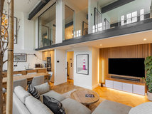
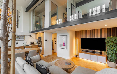
The apartment spans the sixth floor and attic of a 19th-century building. With its two-story layout and double-height living room, it already had the loft look – a feature the interior designers wanted to enhance. “One of our main ideas for the work was to maximise the brightness in all the rooms by tearing down partitions, especially on the second floor,” says Guilbault. “We renovated everything and emphasised the decor, but we didn’t actually move any of the rooms.”
The entrance to the apartment is on the fifth floor at the bottom of the stairs pictured here. To give the home a contemporary base, the team painted the walls white, and went for a light-coloured oak floor and a black steel balustrade.
The entrance to the apartment is on the fifth floor at the bottom of the stairs pictured here. To give the home a contemporary base, the team painted the walls white, and went for a light-coloured oak floor and a black steel balustrade.
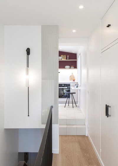
At the top of the stairs, a small hallway leads to the petit kitchen that overlooks the building’s courtyard. “You can see the beautiful courtyard on the north side and also have a view over the roof of the Pompidou Centre,” says Guilbault of the cultural and architectural icon in Paris that houses a public library and the National Museum of Modern Art.
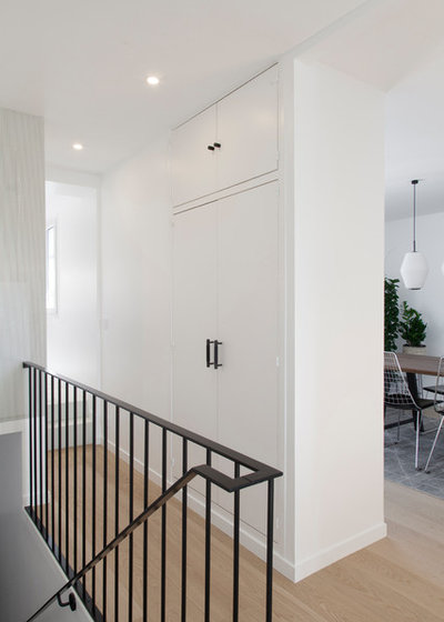
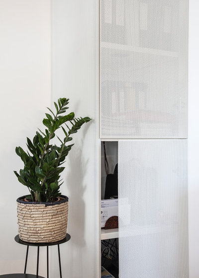
An area above the stairs conceals a hot water tank and a washing machine behind white perforated metal mesh.
An area above the stairs conceals a hot water tank and a washing machine behind white perforated metal mesh.
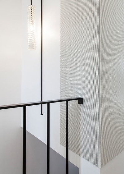
“We created this partitioned utility space on metal joints that we installed above the stairwell,” says Guilbault. “Its door is made of folded sheet metal, which has holes to provide ventilation while still looking good.”
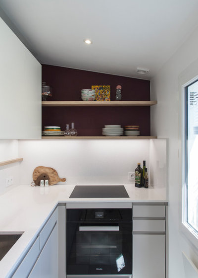
White cabinets and a quartz benchtop from Silestone make the kitchen brighter. The owners chose a good quality kitchen, and asked an acquaintance install it. “A touch of eggplant and light oak shelves lend the room some character,” says Guilbault.
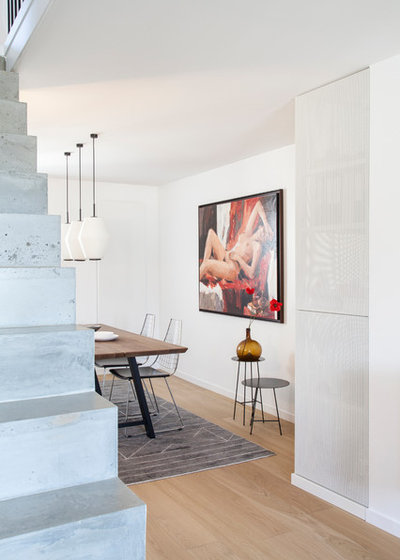
The dining room is situated in an intimate space just behind the staircase leading to the second story. It is partially open to the living room.
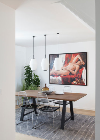
“We enhanced this cocoon effect by placing the furniture in the center and lowering the pendant lights over the table,” says Guilbault. “To add some fun and colour to the secluded room, we dug into the owners’ painting collection – they are great art lovers – and, with their help, selected this lovely risqué nude,” says the designer. The owners’ sense of humour and willingness to be daring were driving forces in this project.
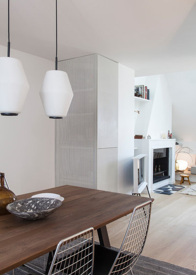
The oak table’s metal base adds a welcome industrial feel and the grid-like metal chairs were selected to match this aesthetic.
A second utility closet is found towards the living room. “Here, a 60x60-centimetre column drain presented a basic constraint,” says Guilbault. “We used it to attach a second structure of the same size, which houses all the video and sound devices, namely the router and the amp that controls a 5.1-surround system by Bose. For the sake of design, we played with positive and negative spaces and installed an openwork [perforated] door, which is also convenient for ventilating the appliances,” Guilbault says.
The door of this closet is also made of white-painted perforated sheet steel. A 45-degree fold on the side makes for an easy grip, and is a better fit for the minimal design scheme than a handle.
The door of this closet is also made of white-painted perforated sheet steel. A 45-degree fold on the side makes for an easy grip, and is a better fit for the minimal design scheme than a handle.
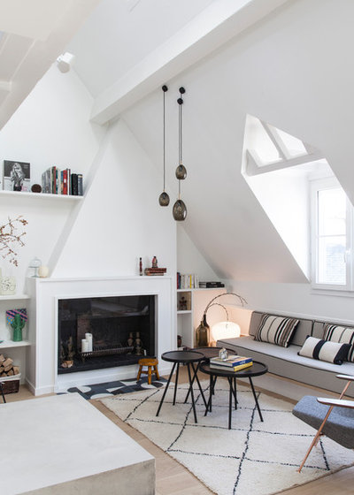
The living room is long and narrow, divided into two sections by the staircase leading to the second floor, which sits at its center. “As the room was not wide, we couldn’t design it like a typical living room,” says Guilbault. “What’s more, there was a structural barrier [one of the building’s beams] under the windows along the entire length of the room, which meant we couldn’t put a traditional sofa there. We turned things over in our heads and decided to create two areas: a warm and cosy indoor living room around the fireplace and then another area, designed like an ‘outdoor’ living room,” says Guilbault.
The interior designers did their best to take advantage of the beautiful double-height ceiling on both sides of the room.
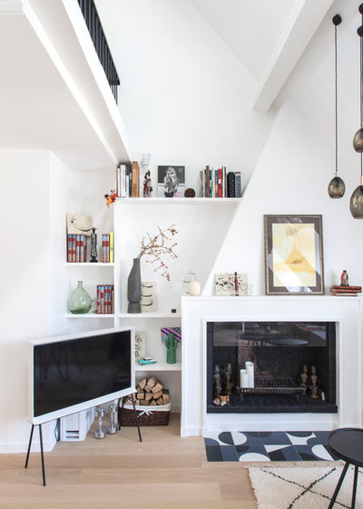
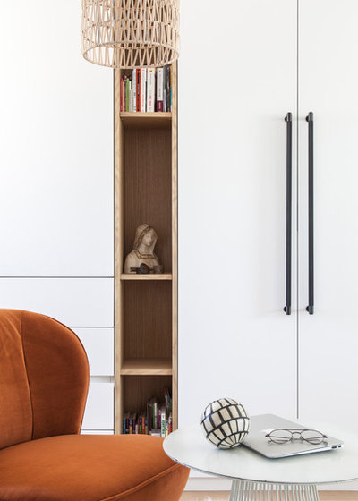
On one side stands a built-in bookcase that reaches to the second story. To let this corner breathe and to highlight it as part of the decor, they abandoned the easy but space-consuming solution of placing a TV stand there and went for a lighter option instead: the Serif TV, designed by Ronan and Erwan Bouroullec for Samsung in 2015.
On one side stands a built-in bookcase that reaches to the second story. To let this corner breathe and to highlight it as part of the decor, they abandoned the easy but space-consuming solution of placing a TV stand there and went for a lighter option instead: the Serif TV, designed by Ronan and Erwan Bouroullec for Samsung in 2015.
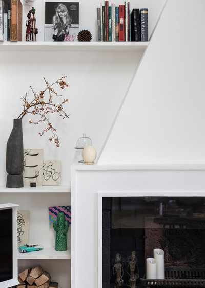
The original fireplace was in working condition, but covered in bricks and ceramic tiles. The team finished it with plaster moulding instead, to give it a more discrete, contemporary look. “We played with the black and white contrast, which we based on Art Deco style,” says Guilbault.
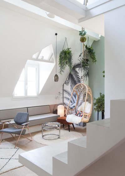
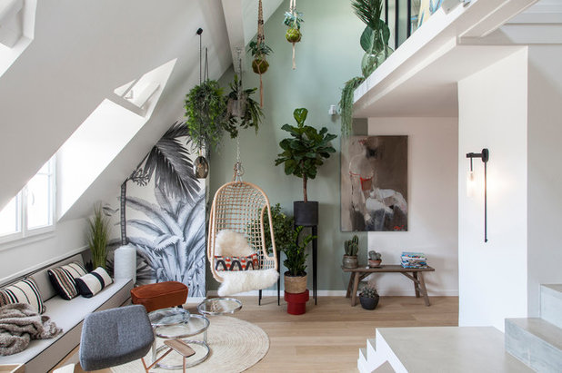
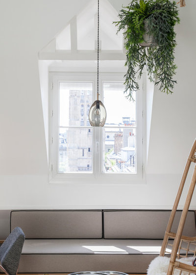
The cosy second sitting area was designed to look like an outdoor space. “The concept behind this living room design was to transpose the idea of a greenhouse into the interior,” says Guilbault. “We were inspired by the south-facing dormer windows that overlook the Saint-Jacques Tower. We also worked the colours and vertical aspects of the space to make it feel like you’re really outdoors.”
A wide step under the windows hides one of the building’s structural beams. The designers fitted this with two adjoining banquettes that make the room look wider. “We split them into two, one-by-two-metre modules,” says Guilbault. “One is for the fireplace side and the other is on the green living area side. These serve as two extra beds when the owners have people over.”
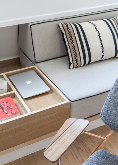
The two banquettes were custom-made by upholsterer Patricia Barbot. Fitted between the seats, a coffee table offers a tidy place to stow laptops or devices, or put down a book. The unit is equipped with storage underneath.
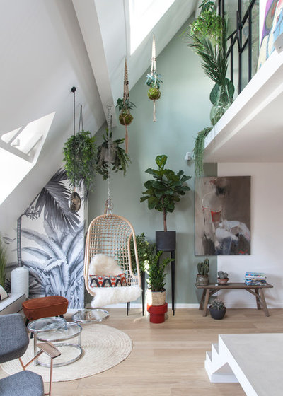
This ‘outdoor’ living room plays on the current trend of bringing nature into the heart of urban homes. It has become the owners’ favourite reading corner.
The original plan for greening this corner was more radical. “Originally, we had imagined a three-metre-tall tree on this side of the living room, to emphasise the ceiling height,” says Guilbault.
However, as it was difficult to bring large items up the small stairwell and into the tiny lift, they found other tricks to pull the eye upward: plants suspended in macrame planters, a hanging chair, and wallpaper with a tropical theme.
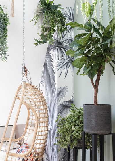
The light-coloured greenery and macrame create the perfect atmosphere – halfway between Scandinavian and bohemian.
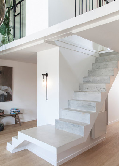
The central staircase provides additional casual seating when the owners have guests over.
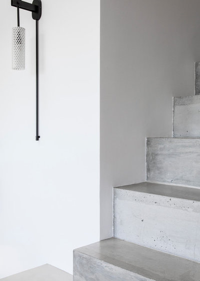
The staircase has changed a lot since the owners’ first visit. “It had been covered with brown laminate that we took off,” says Guilbault. “The concrete underneath looked like it had seen better days. We had it completely re-covered with a new layer of concrete that we then varnished to protect.”
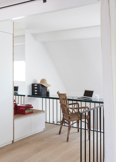
The 25-square-metre second floor hosts the master bedroom, dressing room and landing, which the designers transformed into an office corner “to give it a function,” says Guilbault.

“We enjoyed transforming part of the mezzanine handrail into a 50-centimetre-wide desk,” says Guilbault. “We placed it at the right height for sitting behind – 75 centimetres – and from below, it looks better than seeing a standard-height railing of 110 centimetres,” says Guilbault, because it leaves more of the room visible. As a bonus, the office faces the Velux skylight, so the owners can look out as they work.
Just behind the desk is the couple’s walk-in wardrobe, which ends with a chair on the landing.
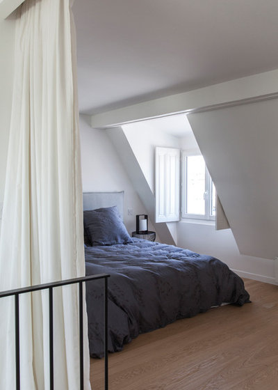
The bedroom is next to this walk-in robe.
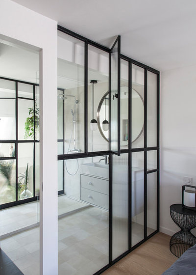
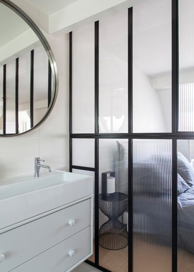
To the left of the bed is the completely redesigned bathroom. “This was the crux of the apartment renovation,” says Guilbault. “The room had been completely partitioned, which made it gloomy and darkened the living room below. We proposed this daring layout
to let light through, and the owners trusted us and agreed with us completely. The idea for this space was to create a ‘greenhouse within a greenhouse’, making it possible to take a shower while enjoying the view of nature, as if you were outside,” says the interior designer.
to let light through, and the owners trusted us and agreed with us completely. The idea for this space was to create a ‘greenhouse within a greenhouse’, making it possible to take a shower while enjoying the view of nature, as if you were outside,” says the interior designer.
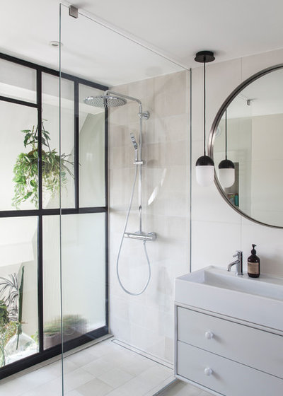
The bathroom breaks the rules with its two glass walls, which leave the shower visible from both the living room and the bedroom. “It didn’t bother the owners, who live here alone and like the grins this arrangement brings to their guests’ faces,” says Guilbault with a smile.
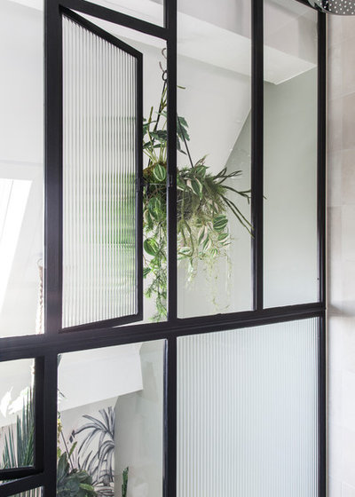
The interior designers made the glass partitions with a black industrial-style frame. The alternating clear glass and rippled panes with printed 3D patterns play on the contrast between transparency and opacity. These panes open to both sides for better ventilation.
The renovation was a rewarding experience for both the owners and the designers – they even became friends over the course of this project. “They relied on us fully and everything went as well as possible,” says Guilbault. “For our part, we thank them for giving us our first opportunity to design a loft and for going along with our unusual suggestions.”
Tell us
What do you love most about this Parisian apartment? Tell us in the Comments, like this story, and save your favourite images. Join the conversation.
More
Want more international design? Take a look at this Mumbai Houzz Tour: Innovative Minimalism in India
Tell us
What do you love most about this Parisian apartment? Tell us in the Comments, like this story, and save your favourite images. Join the conversation.
More
Want more international design? Take a look at this Mumbai Houzz Tour: Innovative Minimalism in India

Related Stories
Houzz Tours
France Houzz: A New Island Home With an Old Soul
Check out this young family's welcoming and characterful French island home on Île d’Yeu, which embraces local style
Full Story
Houzz Tours
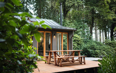
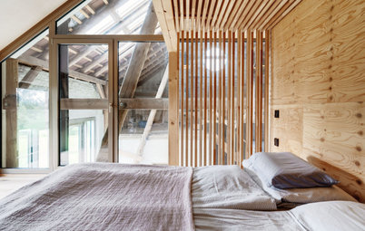
Germany Houzz: A Small Cabin Transformed Into a Forest Retreat
In this secluded area in the Taunus mountains of Germany, a family enjoys their weekends in 29 square metres of space
Full Story
Houzz TV
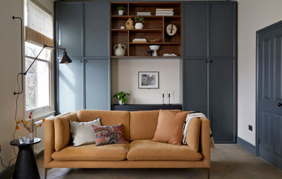
London Houzz: Tour a Contemporary Loft in an Old Victorian School
Watch and read how a design firm updated this light and airy apartment in an old block with sleek style and warm touches
Full Story
Garden Design
Spain Garden Tour: A Mediterranean Makeover With Colour & Texture
Once neglected, this naturalistic garden is now a series of outdoor rooms with idyllic spots to swim, dine and relax
Full Story
Houzz Tours
Berlin Houzz: A Touch of Japanese Forest Bathing in a German Home
Beloved memories of Japan come to life with the renovation of this 120-square-metre apartment in Berlin, Germany
Full Story
Houzz Tours
London Houzz: Daring Colour & Texture Transform a Victorian Home
By Kate Burt
The busy owners of this terrace sought help to design outside their decor comfort zone – the result is a cool classic
Full Story
Houzz Tours
Germany Houzz: Creating Summer & Winter Homes in a Converted Barn
One barn, two homes – see how architects designed separate zones for summer and winter living in an old country barn
Full Story
Houzz Tours
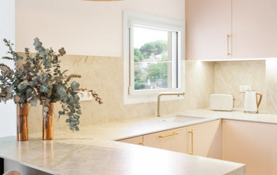
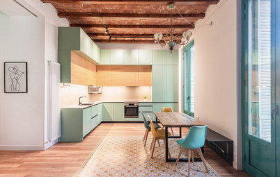
Before & After: Finding the Perfect Pink in a Barcelona Kitchen
Barely-there pink acts as a warm neutral in a new open-plan Spanish kitchen, replacing dark cabinets and drab finishes
Full Story
Houzz Tours
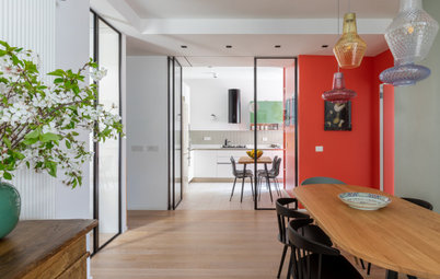
Before & After: Colour Blocking & Pattern Nod to Nature in Rome
Move and upsize or stay and renovate? This young family chose the latter in their small Italian apartment – here's why
Full Story
Houzz Tours
Barcelona Houzz: Style, Sustainability and Pattern in a Tiny Flat
Part-renovation, part-restoration, the owners of this Spanish apartment balanced historical style with forward thinking
Full Story
Wow, in love with the apartment. Atelier Daaa did a fantastic job !