Project Of The Week
Popular Houzz Series
Popular Houzz Series
Appears in
See also
Fun HouzzFrom The ProsHouzz Around The WorldProject Of The WeekStickybeak Of The WeekQuizzesCreatives At HomeAt Home With...Best Of The WeekRoom Of The WeekDesigner Profiles3 Things I Wish My Clients KnewHow Do I...Buyer's GuidesExpert EyeInnovation AlertSo Your Style Is...Spotted!Picture PerfectBefore & AfterBudget BreakdownHome TimeMade Local
Interior Design

Parisian Chic in an Oversize Apartment for a Family With 4 Teens
Exquisite Georgian detailing, stunning views and space for the kids' sports gear – a classic apartment is reborn

In this Q&A series, we turn the spotlight on one thought-provoking renovation each week. Here, Mishell Wise, co-director at Conway + Wise Interior Design, charts the journey of transforming a spacious but tired and disjointed Sydney apartment into a sophisticated and highly functional home for a large family.
Describe the apartment
An oversize, two-level apartment in a small block of three with Georgian-style architecture. The apartment feels more like a house as it has two levels, a private entrance, a large garden and terrace. It also has sweeping harbour views over a canopy of lush trees.
Need clever solutions for your upcoming renovation or makeover? Find an interior designer near you on Houzz
The kitchen before works
What state was the apartment in when you came onboard?
Our client had already started demolishing the kitchen without a plan or council or strata approval when we met them. The site was on shut-down until approval had been obtained.
The apartment was one of three in a complex that boasted incredible harbour views. However, the kitchen was small, old and dark and located at the rear.
Two of the bedrooms were uninhabitable. There was a chaotic tangle of partially removed walls and electrical wires and the client wasn’t clear on exactly what they wanted moving forward.
What wasn’t working for the client about the apartment?
The kitchen was small and insufficient for a family of this size. A shared bathroom made life almost impossible for the family of six and the overall house – although liveable – was not beautiful.
A variety of past additions had resulted in a fragmented appearance with different skirtings and cornices in every room and even differing ceiling heights.
The interior designer reimagined the apartments’s entry by creating a wide arch with a new, custom-made curved architrave.
Brief
The client did not have a particular design style in mind. Her brief was simple – to design a family home in sympathy with the original Georgian architecture that embraced natural materials. She sought beauty and comfort without compromise to relaxed living, and a colour palette that strongly connected to the view.
The library
What were the client’s must-haves?
What were the client’s must-haves?
- A stylish but relaxed interior that would cope with the punishment of teenagers.
- A soothing colour palette.
- An entertainer’s kitchen.
- An abundance of storage to house a multitude of sports gear for this sports-loving family (tennis, surfing, skiing and golfing equipment, just to name a few).
Gained
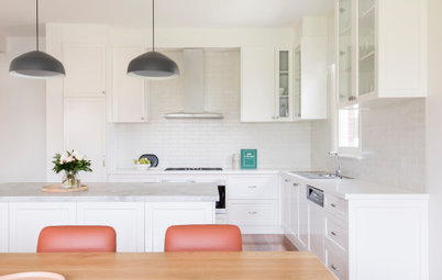
- A new, open galley-style kitchen with abundant storage.
- A new combined butler’s pantry and laundry.
- Two extra bedrooms.
- An extra bathroom.
- Custom built-in storage throughout.
- A new study nook.
- A new library.
- A new fireplace.
- Restoration to the original ornate Georgian ceilings.
The floor plan before works
What exactly did you do?
The apartment had good bones and solid construction, and for the sake of time and budget, the rooms remained in their existing areas. It was crucial not to take down walls just for the sake of it. Being in an apartment, there were also a number of structural walls. Because of this, we took the following approaches:
- Renovated the entire two-level apartment. The bedrooms remained in their existing locations, but some were redesigned for improved functionality.
- Designed, reconfigured and developed materials, finishes and fixtures palettes.
- Replaced the original closed-in, U-shaped kitchen with a new, open galley kitchen.
- Gutted the original laundry and turned it into a butler’s pantry and laundry.
- Removed the kitchen wall to create an open-plan living area.
- Orientated the new kitchen towards the view.
The ground-floor plan after works
- Uncovered a bricked-in fireplace and installed a new functioning fire.
- Created a library.
- Added extensive custom joinery throughout the house to provide both storage and for design cohesion.
- Created a proper-sized third bedroom by blocking a window in the sunroom and taking space from an adjoining bedroom.
- Split one of the larger bathrooms in two to become a master ensuite and a bathroom to service bedrooms two and three.
- Converted the attic into two new bedrooms.
- Gutted and reconfigured the upstairs bathroom.
- Removed the front garden and added new fencing and a front door.
Artwork: Nashi Pears by Angus McDonald
Tell us about the beautiful joinery
The apartment had virtually no storage, so we designed 26 pieces of custom joinery. With four sporty kids, an enormous amount of storage is required.
It was important to achieve a cohesive look. However, with so many joinery pieces we needed subtle differentiation. We needed to keep the overall look classic but wanted to add some visual interest. We achieved this by:
- Using a Shaker profile for the joinery visible to the living and dining areas.
- Using a fine beading profile for the joinery in the living and dining areas to complement the wall panelling.
- The master bedroom had a double-beading profile to exude elegance.
- The other bedrooms used a VJ profile to ensure joinery was in keeping with the rest of the apartment, but with a younger look to suit the ages of the rooms’ occupants.
Which joinery did you add in?
- Cupboards and drawers under the stairs.
- Four metres of joinery in the kitchen for a pantry.
- An additional three metres of joinery hidden in the back of the galley kitchen, including wine storage.
- Further storage in the butler’s pantry/laundry.
- A 3.5-metre-long joinery piece to house all things related to the TV and also serve as a bench seat.
- A four-metre bookshelf.
- A beautiful wardrobe with brass handles to the master bedroom, with a slip of bookshelf for books and decorative items.
- Wardrobes, a built-in desk and storage to the second bedroom.
- A wardrobe to the new third bedroom.
- Built-in wardrobes and drawers and a double study desk in the attic bedrooms.
- We removed the existing linen cupboard and created a study nook in the space adjacent to the library with storage, a charging station and a leather-topped desk.
Mirror: Creative Frames
Tell us about the gorgeous wall panelling
The apartment had been added onto and butchered over the years. The only original item we kept were the ornate ceilings. No wall had any panelling. In keeping with our ‘Parisian Chic’ concept, we installed panelling throughout.
We used a master joiner to install the panelling and he was amazing. He drew in pencil every single line for our approval. He then sought our approval again once he had installed part of the panelling to ensure we were all on the same page.
The owner was worried the result would be busy, but she trusted us and is delighted with the end result.
The entry/lobby area to the house was a crude, oversize square that didn’t provide a sense of arrival or intimacy. We reduced the size of the entry, installed an arch and used decorative beading to make it look as though it was always there.
What problem or constraint did this project address?
The strata body was obstructive and took a while to get across the line.
An additional constraint was budget, as ideally we would have installed a large front balcony and French doors to take advantage of the spectacular, north-facing views.
Finally, extra care was required to restore the ornate ceilings.
How does the new work address these issues?
The true test is how the owners feel in their new home, and they love it. There are spaces for connection and zones for a little time out.
The owner said she wouldn’t ever have thought to do the wainscoting and while she was initially hesitant about it, she is now delighted with the space.
The home is now functional and the owner loves that she can be ‘messy’ (her natural disposition by her own admission) in the butler’s pantry and no-one can see.
What was the budget?
Around $700,000, excluding furnishings.
Where did most of it go?
On the 26 items of custom-designed joinery.
Browse more striking contemporary dining spaces
Around $700,000, excluding furnishings.
Where did most of it go?
On the 26 items of custom-designed joinery.
Browse more striking contemporary dining spaces
What challenges did you have to work around?
The most challenging aspect was the delicate nature of the ornate ceiling. Trying to either rectify or install new cornices was extremely tricky.
The most challenging aspect was the delicate nature of the ornate ceiling. Trying to either rectify or install new cornices was extremely tricky.
The master bedroom
Why do you think this renovation works so well?
We were fortunate to have great clients who trusted us to complete our vision. Often people will engage a designer but don’t want to extend themselves, which defeats the purpose of hiring a professional.
When a concept can be fully executed without impediment to the overall design, the best result is usually achieved. It can be quite difficult for homeowners to trust and take that leap of faith and that’s why it’s important to engage a designer you are completely comfortable with.
Key features
- Natural materials, such as marble, timber, leather, brass and silver, with design details of knurled hardware against a crisp white backdrop.
- A classic, sophisticated interior that also manages to be thoroughly modern by combining original features (the ornate ceiling), classic elements (a chevron floor) and modern elements (crisp white walls and contemporary furnishings).
- Customised joinery.
- Beautiful detailing such as brass handles and panelling.
- A grand and spacious feel thanks to the careful addition and removal of certain walls.
Tell us about the attic bathroom
We wanted to keep it young and fresh, so we used hexagonal tiles in three colours, which we gradated around the room.
The shower wall has the feel of an artwork installation as we developed an ‘escaping hexagonal tile’ pattern using the three colourways.
We wanted to keep it young and fresh, so we used hexagonal tiles in three colours, which we gradated around the room.
The shower wall has the feel of an artwork installation as we developed an ‘escaping hexagonal tile’ pattern using the three colourways.
And the ensuite?
The ensuite needed to be sophisticated and have a resort feel. We book-matched two slabs of marble, which provides a real wow element when entering what is essentially a small ensuite. With fewer grout joins, the room feels spacious.
The ensuite needed to be sophisticated and have a resort feel. We book-matched two slabs of marble, which provides a real wow element when entering what is essentially a small ensuite. With fewer grout joins, the room feels spacious.
What made you choose chevron tiles for the main bathroom?
As it can be seen from the living room (which has chevron flooring) when the door is open, we wanted it to relate directly to the adjacent rooms. We chose a textured chevron tile with a strong variation in colour. We ran it up the wall and along the floor to make this small room appear larger.
As it can be seen from the living room (which has chevron flooring) when the door is open, we wanted it to relate directly to the adjacent rooms. We chose a textured chevron tile with a strong variation in colour. We ran it up the wall and along the floor to make this small room appear larger.
The attic study
Materials palette
Paint colours
Materials palette
- European Oak Floors Chevron engineered oak floor in Madison Avenue.
- Custom joinery hand painted in Dulux Snowy Mountains Quarter.
- Intrim Group wall panelling, skirtings, timber mouldings and architraves.
- Fireplace mantel in Artedomus Elba Marble to kitchen and fireplace mantel.
- Custom kitchen joinery.
- Rear of island in New Age Veneers Navlam sandblasted Arcadian oak veneer.
- Schoolhouse Electric knurled pull handles in satin nickel to cabinetry.
- Lo & Co Interiors matt-black knurled handle to integrated fridge.
- Two-pack polyurethane to the pantry/laundry, finished in Dulux Snowy Mountains Quarter.
- Artedomus Bianco Gioia marble to the guest bathroom vanity top.
- Guest vanity in New Age Veneers Navlam sandblasted Wood Drift veneer.
- Di Lorenzo Abaco Chevron Mini Greige tiles to guest bathroom walls.
- Caesarstone Raw Concrete to attic vanity.
- Ocean & Merchant Hopi hexagon, Gesso Hopi and Cenere Hopi to attic bathroom walls.
Paint colours
- Dulux Snowy Mountatins Quarter to the walls and ceilings throughout.
- Dulux Monument Aquanamel semi-gloss to the window frames.
- Dulux Snap-Shot low-sheen acrylic to VJ panelling.
- Porter’s Paints Dusty Mule to VJ wall panelling and built-in daybed base in converted sunroom.
The converted sunroom
Fixtures and furniture
Your turn
What’s your favourite feature here? Tell us in the Comments below. And don’t forget to save these images, like this story and join the conversation.
More
Eager to see more renovations to classic homes? Don’t miss this Room of the Week: A Secret Kitchen With a Dash of French Flair
Fixtures and furniture
- Arthur G William modular sofa to living room.
- ACS Designer Bathrooms Moda Ellipsis Freestanding bath to attic bathroom.
- Designer Rugs rug to library.
- Future Classics Furniture Pluto Brass coffee table to library.
- Future Classics Furniture armchair to library.
- HG Furniture Walter dining table.
- Marlow & Finch curtains to master bedroom.
Your turn
What’s your favourite feature here? Tell us in the Comments below. And don’t forget to save these images, like this story and join the conversation.
More
Eager to see more renovations to classic homes? Don’t miss this Room of the Week: A Secret Kitchen With a Dash of French Flair
Answers by Mishell Wise, co-director at Conway + Wise Interior Design
Who lives here: A family of six with four teenagers
Location: Bellevue Hill, NSW
Size of the apartment: 270 square metres
Number of bedrooms and bathrooms originally: Three bedrooms and two bathrooms
Number of bedrooms and bathrooms after works: Five bedrooms and three bathrooms
Interior design and architecture: Conway + Wise Interior Design
Builder: Burmah Constructions
Did you or the client use Houzz for this project?
The husband came across our profile when he was browsing through Houzz for design ideas. He contacted us from there.