Room Of The Week
Popular Houzz Series
Popular Houzz Series
Appears in
See also
Fun HouzzFrom The ProsHouzz Around The WorldProject Of The WeekStickybeak Of The WeekQuizzesCreatives At HomeAt Home With...Best Of The WeekRoom Of The WeekDesigner Profiles3 Things I Wish My Clients KnewHow Do I...Buyer's GuidesExpert EyeInnovation AlertSo Your Style Is...Spotted!Picture PerfectBefore & AfterBudget BreakdownHome TimeMade Local
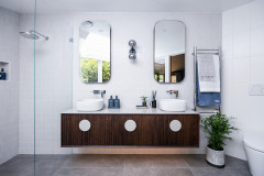
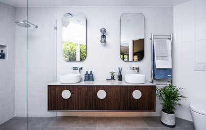
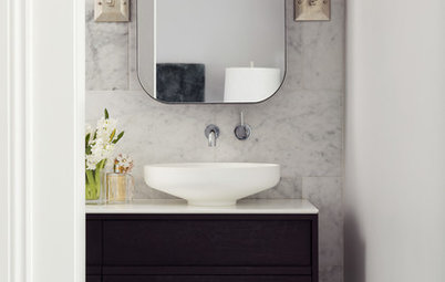
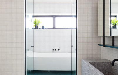
Room of the Week: A Tiny Ensuite Transformed With Luxe Touches
Sophisticated details have turned this modest basement ensuite into something truly special

In a Q&A format, we talk to the designers – and examine the creative thinking – behind some of Houzz’s most loveable rooms.
Brief
This is the parents’ ensuite and the brief was for the design to tie in with the other bathrooms in the house, but with the addition of a few luxury elements not used elsewhere. This is their forever home and they wanted a classic design that wouldn’t date quickly.
The room is quite small and, as it is tucked into the basement of the house, has only a small amount of natural light coming from a light well in the ceiling. So it was important to the clients that we use light materials to make it feel bright and contemporary.
Starting point
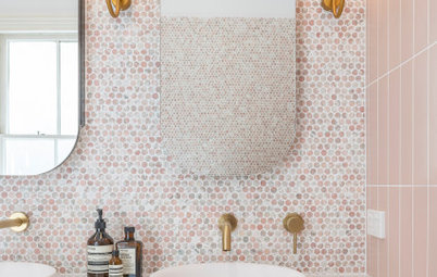
The jumping-off point was the marble hexagonal mosaic tiles from Di Lorenzo; my client spotted them when we were out shopping one day and fell in love.
These tiles were very pricey, so we used them sparingly in the bathroom to create the luxury look my clients were after. We used them on the vanity/toilet wall and on the back wall of the shower recess.
They were a great addition to the bathroom as they made the space feel light and bright by bouncing the available light around, while adding texture and interest to the space.
Key design aspects
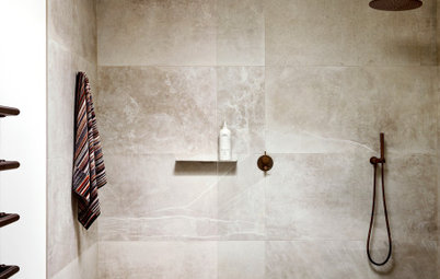
Colours and materials used: Porcelain 1200 x 1200 millimetre floor tiles (these were used throughout the house), marble mosaic tiles and satin white rectified tiles for the walls, and black fixtures.
Colours and materials used: Porcelain 1200 x 1200 millimetre floor tiles (these were used throughout the house), marble mosaic tiles and satin white rectified tiles for the walls, and black fixtures.
Furniture and fittings used
Black bathroom fittings are from Astra Walker, and the vanity is from Reece Australia.
Black bathroom fittings are from Astra Walker, and the vanity is from Reece Australia.
There is an LED strip light feature in the shower recess that gives a luxury feel to the bathroom, but didn’t cost very much. It is on a separate switch so it can be turned on independently from the rest of the lighting – very practical for nighttime toilet trips when you don’t want to turn on overhead lighting.
Thinking behind the arrangement of furniture/fixtures: The layout was set by the architect prior to my involvement in the project, but as the room is so small there was very little room to do much else with the floor plan.
We had originally chosen a built-in vanity for this spot, but as the project started to run over-budget, it had to come out. We chose a floating vanity instead. It worked really well in the end, serving to open up the area and maximise the sense of spaciousness.
We installed a custom mirrored cabinet that ran the full length of the wall for two reasons – one, to bounce the limited amount of natural light around, and two, to provide decent overhead storage.
Challenges you worked around
Building beneath a house – and one that is heritage – came with its challenges. But the renovation of this room went smoothly.
Building beneath a house – and one that is heritage – came with its challenges. But the renovation of this room went smoothly.
Why do you think this room works?
This is a very classic bathroom design with simple materiality. But it’s not boring and still has interest via the black fixtures, feature lighting and the statement mosaic tiles.
Tell us
What do you love about this room? Tell us in the Comments below. And don’t forget to save your favourite images, save the story, and join in the conversation.
More
Love having a stickybeak? Check out last week’s Houzz Tour: Spacious Family Home Sits on Sliver of a Site
Interior design by The Little Design Corner
Architecture by John Greenwood & Associates
Who lives here: A professional couple with two teenage children
Location: Rozelle, NSW
Room size: 1.75 metres x 3 metres (5.25 square metres)
Scenario: The renovation of this compact ensuite formed part of the whole-house renovation of a family home.