

Russia Houzz Tour: A Designer's Moody St Petersburg Apartment
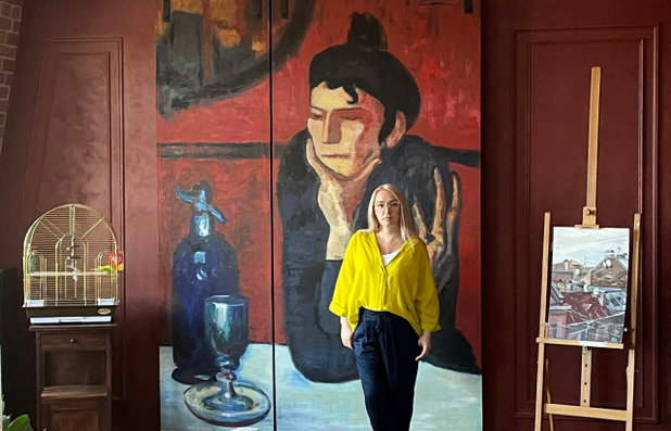
A Picasso reproduction served as the inspiration for this apartment's bold colour scheme – and screens the TV from view
Евгения Назарова
28 November 2021
Interior designer Arina Volkova bought a flat on the top storey of a building so that she would be able to look out over the picturesque roofs of St Petersburg, rather than neighbours’ windows. The interior colour scheme was suggested by her favourite Picasso painting, and she filled the space with, not only modern objects, but family heirlooms ranging from her grandmother’s sculptures to a vintage sewing machine table, which has followed her from flat to flat for nearly 20 years.
Photos by Ivan Sorokin, styling by Diana Remizova.
Apartment at a glance
Who lives here: Arina Volkova and her family
Where: St Petersburg, Russia
Size: 135 square metres
Designer: The flat’s owner, Arina Volkova
One craftsperson, a friend of the owner, carried out the entire renovation. “Like all clients, we wanted it completed by September 1, and on August 31 the beds were delivered and we really moved in,” says arina Volkova.
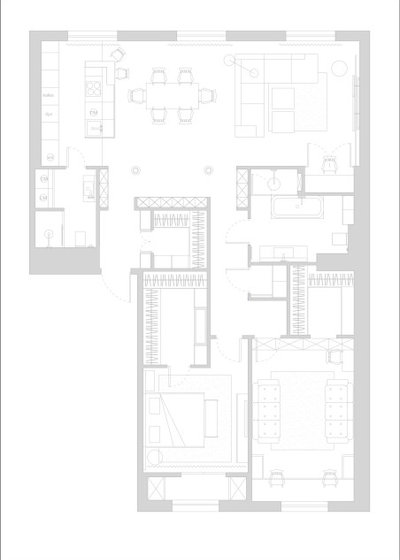
The floor plan.
Before
The flat was originally unfinished, with exposed cement. Its initial set-up made it possible to completely change the layout. Volkova borrowed space from the hallway to expand the social areas and walk-in wardrobe, and combined the kitchen and living room. The family often entertains, and she wanted to carve out as much space as possible for evenings with friends and family. She created a second wardrobe by the nursery, and added a small utility room to the layout.
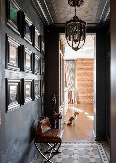
The entrance is small, but highlights the artistic character of the interior right from the threshold. The walls and ceiling are finished in blue decorative plaster: In contrast to the dark entrance, the kitchen-living area with its bright finishes seems even more spacious. A mirrored door to the right of the entrance, which leads to a walk-in coat storage area, visually expands the space.
Find fabulous interior designers and decorators near you on Houzz
Find fabulous interior designers and decorators near you on Houzz
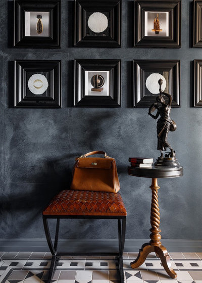
On the walls is a gallery of photographs of classical statues, framed with Ikea frames.
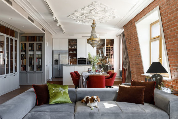
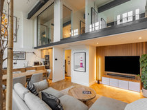
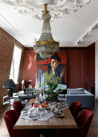
The angled outer wall in the living room scared real-estate agents off, but Volkova really liked it: the unusual geometry gives the space the feel of a Parisian loft. The engineered-wood flooring, in a herringbone pattern, also added a French touch, as did the plaster ceiling rose that accentuates the light fixture over the dining table. They added plaster directly on the ceiling to avoid lowering it. All of the ventilation and air-conditioning systems run over the hallway and coat storage.
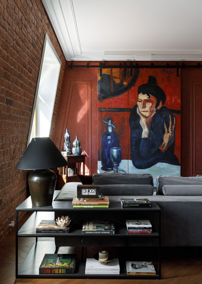
The home’s colour scheme was inspired by this reproduction of Pablo Picasso’s ‘The Absinthe Drinker’. Not only is the painting a bold feature in the interior, but it also screens the television from view. “I am always accused of putting a lot of grey into my projects. This project’s colour scheme also builds on grey tones, but the painting suggested terracotta and wine shades,” says Volkova.
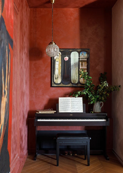
Volkova had earmarked the niche to the right of the TV area for her work space, but during the renovation it was already obvious that things would have to be squeezed together. Now the piano, which Volkova’s daughters play, stands here, decorated with a work by artist Alexander Votsmush.
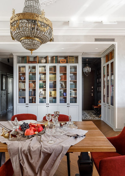
It was important to Volkova to put a bookshelf in the living room to house the books she had inherited from her grandmother. The glass-fronted bookcases were made to order. Volkova found the vintage European light at a local showroom: in spite of the Covid-19 pandemic, the company was able to deliver it in only three weeks.
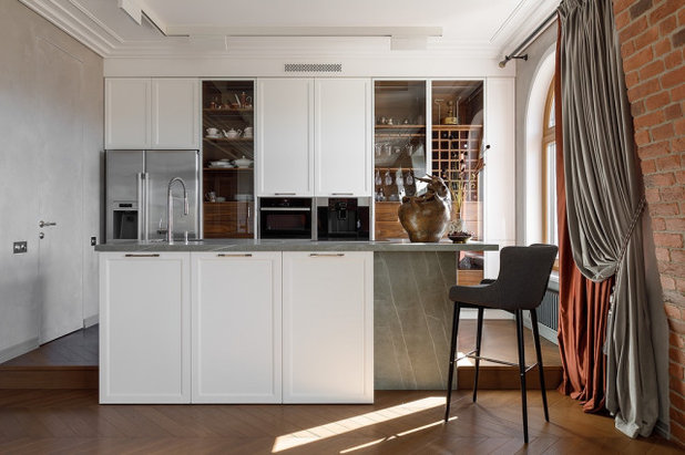
Volkova raised the kitchen onto a platform, so that she could connect the island bench to water and electrical services, and create a walk-in shower in the bathroom on the other side. The matt-white MDF kitchen fronts are matched with American nut veneer inserts and a ceramic countertop.
“The glass cabinet doors are a solution that clients never ask for: clients are usually afraid of mess. But during the photo shoot, the stylist did not even touch my dishes: it turns out that all you need for a pretty vignette is to buy dinnerware all in one colour,” says Volkova.
“The glass cabinet doors are a solution that clients never ask for: clients are usually afraid of mess. But during the photo shoot, the stylist did not even touch my dishes: it turns out that all you need for a pretty vignette is to buy dinnerware all in one colour,” says Volkova.
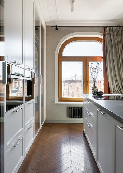
Volkova and her family chose a flat on the top floor, “so that we could see the roofs over St Petersburg, and not our neighbours’ windows”. This is why the windows in the kitchen-living room have no day curtains, which are common in Russia. Instead, Volkova gave them classic drapes. These do not get in the way of the view, but serve as a visual accent.
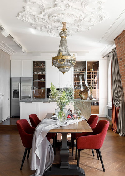
The dinner table was one of the most difficult aspects of the project. It was put together in parts, with the table top and legs sourced separately. “I would not have recommended this to my clients, but I thought I could manage it,” says Volkova. “I ordered the legs in Turkey: the manufacturer promised to carve out and paint the supports. It was quickly clear that they would not be able to paint the legs, and they gave me a partial refund. When the legs were finally delivered after a few months, it turned out that they were terrible quality: our craftsman had to prime the surface something like 10 times before we could paint it. In the end we got a decent result, which we then rounded off with the table top – but at what cost.”
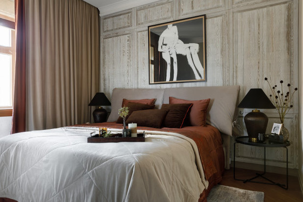
The main bedroom.
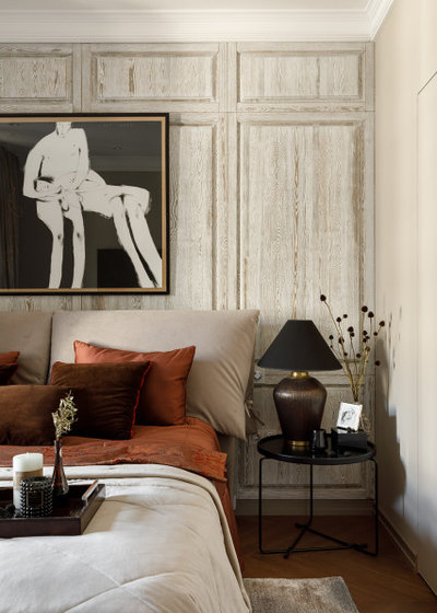
The wall behind the bed is finished in solid wood: “I always liked projects that use old doors and windows as features in the interior. I wanted something in this style, but more tidy,” says Volkova. Another painting by Alexander Votsmush completes the decor. Its black accents are picked up in features of the decor.
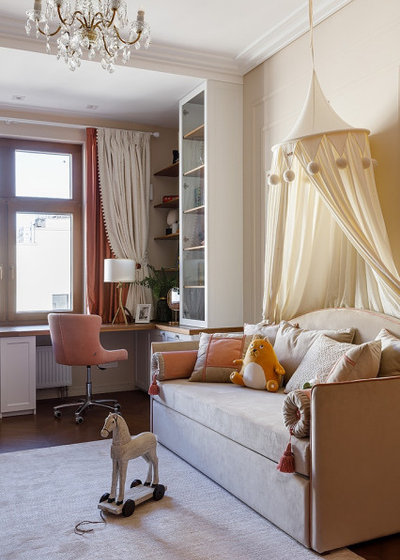
The children’s room was designed for the twin girls, so all of the objects are identical, and the decor is symmetrical. There is one table with two desks for studying stretched out along the windows. An adjacent wardrobe provides storage space. “To be honest, it’s hell in there, but the room itself looks decent,”says Volkova.
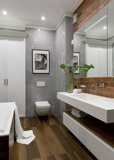
The main bathroom is finished in stone- and wood-look porcelain stoneware. The splashback is the same brick-look tile they used in the living room. The various installations in the room created a niche, which was turned into a 40-centimetre-deep recess for towels, bath robes and cosmetics.
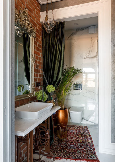
The guest bathroom is cavernous and bohemian: the draping, the classical mirror and the carpet on the floor give it character. When the designer was a child, this carpet hung on the wall in the family flat. Volkova bought the 1930s light fixture at a flea market in Paris. Another item with a long history is the sewing machine stand. “I found it in a garbage dump in 2004,” says Volkova. “At first it supported a small table, which still had a rotary phone on it. Afterwards it turned into a desk, and it now serves as a vanity. It is symbolic that this antique support has travelled with me to every flat, while modern things quickly go out of order.”
Your turn
What’s your favourite feature here? Tell us in the Comments below. And don’t forget to save these images, like this story and join the conversation.
More
Want to see another appealing exterior from around the world? Read Japan Houzz Tour: Picture Windows and Private Courtyards
Your turn
What’s your favourite feature here? Tell us in the Comments below. And don’t forget to save these images, like this story and join the conversation.
More
Want to see another appealing exterior from around the world? Read Japan Houzz Tour: Picture Windows and Private Courtyards


Related Stories
Houzz Tours
France Houzz: A New Island Home With an Old Soul
Check out this young family's welcoming and characterful French island home on Île d’Yeu, which embraces local style
Full Story
Houzz Tours
Germany Houzz: A Small Cabin Transformed Into a Forest Retreat
In this secluded area in the Taunus mountains of Germany, a family enjoys their weekends in 29 square metres of space
Full Story
Houzz TV
London Houzz: Tour a Contemporary Loft in an Old Victorian School
Watch and read how a design firm updated this light and airy apartment in an old block with sleek style and warm touches
Full Story
Garden Design
Spain Garden Tour: A Mediterranean Makeover With Colour & Texture
Once neglected, this naturalistic garden is now a series of outdoor rooms with idyllic spots to swim, dine and relax
Full Story
Houzz Tours
Berlin Houzz: A Touch of Japanese Forest Bathing in a German Home
Beloved memories of Japan come to life with the renovation of this 120-square-metre apartment in Berlin, Germany
Full Story
Houzz Tours
London Houzz: Daring Colour & Texture Transform a Victorian Home
By Kate Burt
The busy owners of this terrace sought help to design outside their decor comfort zone – the result is a cool classic
Full Story
Houzz Tours
Germany Houzz: Creating Summer & Winter Homes in a Converted Barn
One barn, two homes – see how architects designed separate zones for summer and winter living in an old country barn
Full Story
Houzz Tours
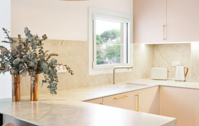
Before & After: Finding the Perfect Pink in a Barcelona Kitchen
Barely-there pink acts as a warm neutral in a new open-plan Spanish kitchen, replacing dark cabinets and drab finishes
Full Story
Houzz Tours
Before & After: Colour Blocking & Pattern Nod to Nature in Rome
Move and upsize or stay and renovate? This young family chose the latter in their small Italian apartment – here's why
Full Story
Houzz Tours
Barcelona Houzz: Style, Sustainability and Pattern in a Tiny Flat
Part-renovation, part-restoration, the owners of this Spanish apartment balanced historical style with forward thinking
Full Story
I love the apartment and could so live there if it could be transported to the sunny climate here in Australia! I can’t help wishing that the small second bathroom and the entry cloakroom could have been swapped over but I realise that the raised floor needed for the bathroom plumbing resulted in the current layout. Had it been possible to switch, then the main bedroom could have had an ensuite bathroom which would have been much more convenient. But I understand why it didn’t happen.
I’m wondering also where the daughters sleep? Do those sofas have pull-out trundle beds? The room is called a nursery and there’s also a piano for them to play in the living area, but I couldn’t work that out where their beds are.
Love NEARLY everthing, EXCEPT the ”brick” tile tile, looks cheap and fake in direct contrast to the lux look of everything else.
Меня тоже ОЧЕНЬ смущает ковёр у унитаза. Раз он такой старый, видимо, шерстяной? В любом случае в стиралку его не запихнешь? Как решается вопрос его гигиены - ведь перед унитазом нет нет да и образуются брызги. Как его чистить и дезинфицировать?