

Russian Houzz Tour: Careful Reshuffling Creates a Liveable Home
Colourful accents, organic-looking lights and creative touches turn this apartment's odd shape into an asset
Евгения Назарова
22 February 2018
Designer Olga Arapova was asked to work on an unusual space: the kitchen was triangular and there was a long entry hall that had no space for a closet. The new layout evolved as a way to make sense of the difficult geometry. Curvy lines now connect different zones and conceal structural features. The resulting design is low on frills: every bend and bright accent was carefully thought through and motivated by a design need.
Photos by Nina Petukhova
Houzz at a Glance
Location: Yekaterinburg, Russia
Size: About 114 square metres
Who lives here: A young businessman
Designer: Olga Arapova
“The owner of the apartment is an energetic and emotional person. When we first met, he confessed that he does not like sharp angles and was always getting snagged on everything in the house. So we chose smooth lines. They are justified here, though I prefer simpler layouts,” says Arapova.
Before Photo
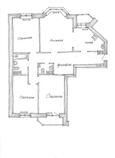
Before: Original apartment layout. From top left: bedroom, living room, kitchen, entry hall, two bedrooms.
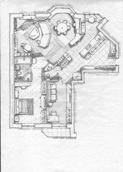
After: Current layout
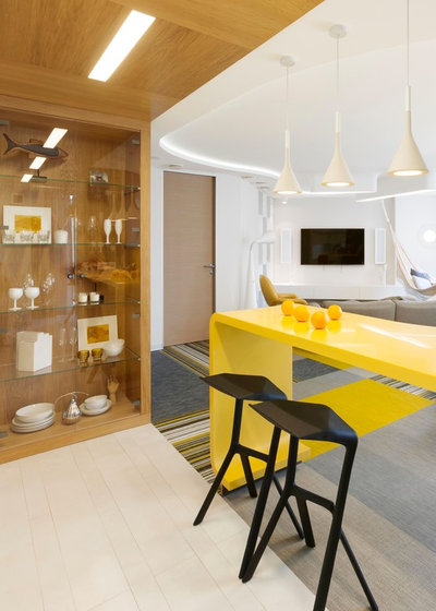
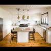
Arapova merged the kitchen and living room, creating space for an entryway and a laundry room.
Arapova merged the kitchen and living room, creating space for an entryway and a laundry room.
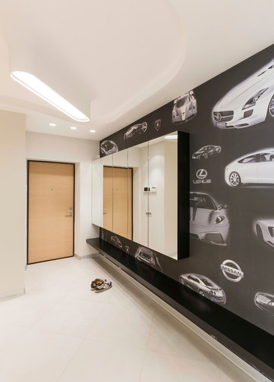
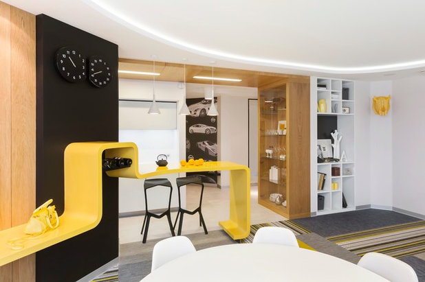
One of the walls in what used to be the hallway is now decorated with a mural. This was also a deliberate choice. The owner sells cars, and the pattern was designed according to his preferences. This wall is visible from the living room and goes well with the other black details throughout the apartment.
The electrical panel, parts of the smart home system and several storage shelves are concealed behind the mirrors.
The electrical panel, parts of the smart home system and several storage shelves are concealed behind the mirrors.
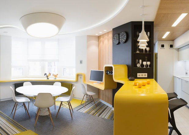
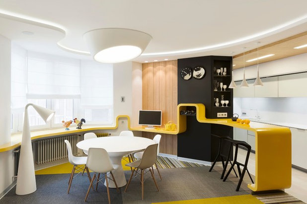
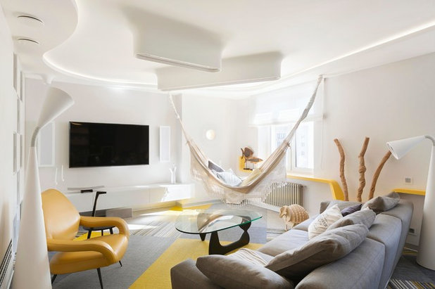
After the wall was torn down, it turned out that the windows in the kitchen and the living room were at different heights. That is how the idea of a line connecting the different levels came about. The bar benchtop, which is made of Corian, turns into the windowsill and acts as the focal point of the interior: “Initially we thought about making it blue like a river, but in the end we picked yellow. In the Urals we have cold, short summers, so warm accents give the interior a sunnier feeling,” says Arapova.
Bright colours can also be seen on the floor. “The vinyl flooring was laid down like puzzle pieces. It’s a very durable material that is often used in airports and hotels. We chose it because of the low ceilings – wood would have taken away another 5-7 centimetres.”
Bright colours can also be seen on the floor. “The vinyl flooring was laid down like puzzle pieces. It’s a very durable material that is often used in airports and hotels. We chose it because of the low ceilings – wood would have taken away another 5-7 centimetres.”
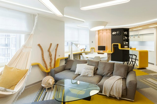
Curved lines are echoed in the light fixtures, which look like they are growing out from the ceiling. The plaster lamps were mounted into the ceiling and shaped for a seamless effect.
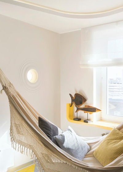
The recessed wall light creates meditative evening lighting – that is why it was installed next to the hammock. “This chill-out area was the finishing touch. The hammock can be removed, but the owner is so in love with it that he lies on it constantly,” the designer says.
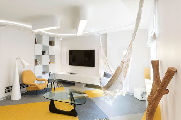
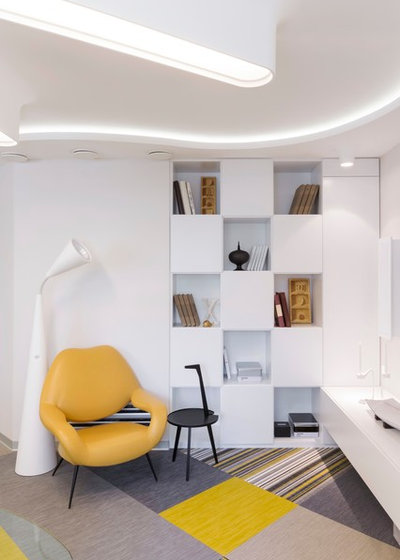
Every piece of furniture in the living room was chosen based on availability, because the owner did not want to have to wait months for delivery. The only imported element of the decor are the Italian textured branches that adorn the wall between the windows. Arapova is especially pleased that she was able to find the iconic yellow DU 55 armchair designed for Poltrona Frau in 1954.
The kitchen features two colours: the cabinet fronts are made of white frosted glass (these appear completely opaque on the photo) and seem to vanish in the space, while the black columns with appliances are next to the area that used to be a balcony.
“We lowered the ceiling slightly to accommodate the built-in lights, but this is justified aesthetically as the panel highlights the kitchen area,” says Arapova.
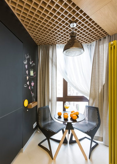
The wall of what was once the balcony is painted with chalkboard paint, so the owner can draw on it or record the menu for the week. The small table with two chairs is perfect for morning coffee.
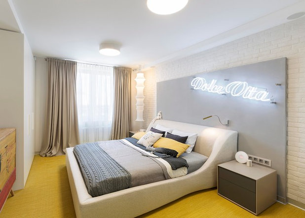
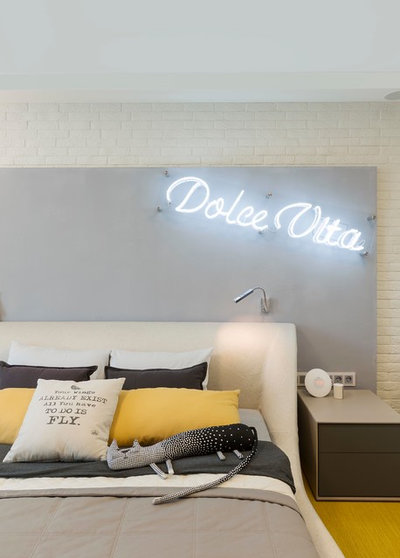
There is a bright detail – a yellow floor – in the otherwise more restrained bedroom. The neon inscription on the bedhead livens up the simple walls.
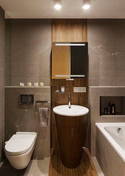
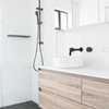
The tall sink and cabinet designed by Philippe Starck is now the central element of the bathroom. It was paired with faux-wood and faux-stone tiles.
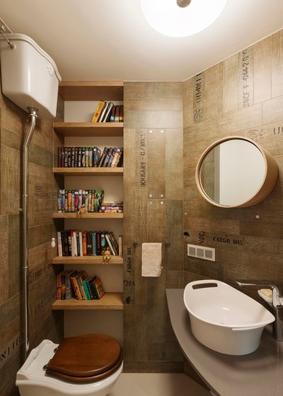
The guest bathroom turned into an “adventure library.” Books can be placed on open shelves in a narrow niche, and the wall tiles imitate cargo crates.
Tell us
What do you love about this home? Tell us in the Comments below. And don’t forget to save your favourite images, bookmark the story, and join in the conversation.
More
Danish Houzz Tour: A Clever DIYer Transforms Her Family Home
Tell us
What do you love about this home? Tell us in the Comments below. And don’t forget to save your favourite images, bookmark the story, and join in the conversation.
More
Danish Houzz Tour: A Clever DIYer Transforms Her Family Home
What are you working on?
Related Stories
Houzz Tours
France Houzz: A New Island Home With an Old Soul
Check out this young family's welcoming and characterful French island home on Île d’Yeu, which embraces local style
Full Story
Houzz Tours
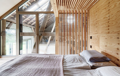
Germany Houzz: A Small Cabin Transformed Into a Forest Retreat
In this secluded area in the Taunus mountains of Germany, a family enjoys their weekends in 29 square metres of space
Full Story
Houzz TV
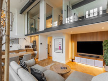
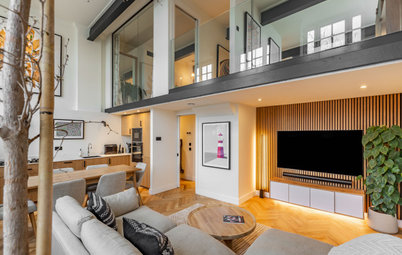
London Houzz: Tour a Contemporary Loft in an Old Victorian School
Watch and read how a design firm updated this light and airy apartment in an old block with sleek style and warm touches
Full Story
Garden Design
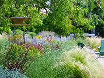
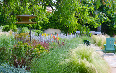
Spain Garden Tour: A Mediterranean Makeover With Colour & Texture
Once neglected, this naturalistic garden is now a series of outdoor rooms with idyllic spots to swim, dine and relax
Full Story
Houzz Tours
Berlin Houzz: A Touch of Japanese Forest Bathing in a German Home
Beloved memories of Japan come to life with the renovation of this 120-square-metre apartment in Berlin, Germany
Full Story
Houzz Tours
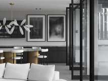
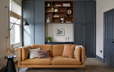
London Houzz: Daring Colour & Texture Transform a Victorian Home
By Kate Burt
The busy owners of this terrace sought help to design outside their decor comfort zone – the result is a cool classic
Full Story
Houzz Tours
Germany Houzz: Creating Summer & Winter Homes in a Converted Barn
One barn, two homes – see how architects designed separate zones for summer and winter living in an old country barn
Full Story
Houzz Tours
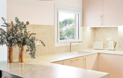
Before & After: Finding the Perfect Pink in a Barcelona Kitchen
Barely-there pink acts as a warm neutral in a new open-plan Spanish kitchen, replacing dark cabinets and drab finishes
Full Story
Houzz Tours
Before & After: Colour Blocking & Pattern Nod to Nature in Rome
Move and upsize or stay and renovate? This young family chose the latter in their small Italian apartment – here's why
Full Story
Houzz Tours
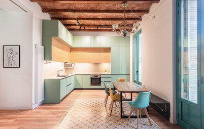
Barcelona Houzz: Style, Sustainability and Pattern in a Tiny Flat
Part-renovation, part-restoration, the owners of this Spanish apartment balanced historical style with forward thinking
Full Story
God! How much did this cost? I wish I had customers with this amount of money!
Never thought I'd like the yellow accents but I do. Wonderful look.
How very clever. Clearly a costly endeavour but the creative attention to detail and the personality it captures is a joy.