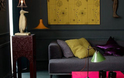
Decorating

Serial Renovators On How to Work With White, Grey and Beige
Find out the basics of creating a neutral colour scheme, from someone who's been renovating properties for 10 years

Creating a colour scheme is one of my favourite aspects of interior design. I love finding the ultimate combination of colours that work together perfectly. When done well, colours have a stunning way of complementing each other and together create undeniable atmosphere in a room. And while I love bringing colour into a home, a neutral wall colour is non negotiable in how I start my colour schemes.
See the whole space
The first aspect of selecting a wall colour is understanding that creating a colour scheme isn’t just about your wall colour; your scheme includes trims and doors, cabinetry, flooring, curtains or blinds and furniture. Your floor colouring may also completely change the way your wall colour appears, so don’t decide on a wall colour in isolation from every other hue in your house.
Tip: The best way to decide on a wall colour is when you have a swatch surrounded by all the other colour samples you plan on having in the space.
Make a triangle of tones
I plan my neutral colour schemes using a rule of three, focusing the bulk of the space on three hues or tones. Too many colours create confusion and distraction, and too few create a one-dimensional room without depth.
Tip: As a rule I have one dominant colour (normally for the wall), the second is subsidiary (for example flooring, cabinetry or furniture), and the final one is for accents or trim (light features, doors, feature walls, rugs or window dressings).
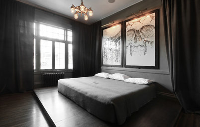
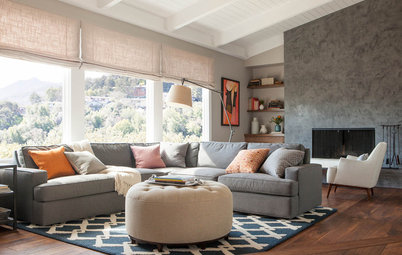
This room showcases this rule well. The light-cream walls provide the dominant colour, the charcoal carpet is the subsidiary colour and the black fireplace is the accent colour.
Which paints for which walls?
I plan my neutral colour schemes using a rule of three, focusing the bulk of the space on three hues or tones. Too many colours create confusion and distraction, and too few create a one-dimensional room without depth.
Tip: As a rule I have one dominant colour (normally for the wall), the second is subsidiary (for example flooring, cabinetry or furniture), and the final one is for accents or trim (light features, doors, feature walls, rugs or window dressings).
This room showcases this rule well. The light-cream walls provide the dominant colour, the charcoal carpet is the subsidiary colour and the black fireplace is the accent colour.
Which paints for which walls?
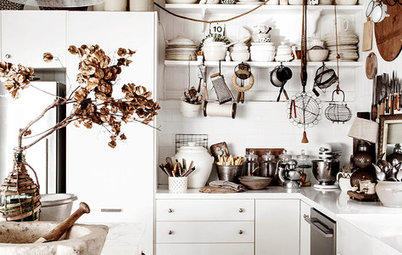
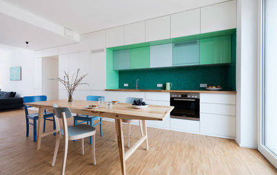
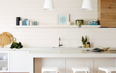
That said – there are stunning colour schemes that are white on white on white. This kitchen is an excellent example – white walls, white floors and white cabinetry. There are touches of colour, in the mustard glass and the green rug along with the art on the walls, that create depth and contrast.
The prominence of white creates a sense of space and light. This is a small kitchen, though with this colour scheme that is not the first impression, and that is exactly what a good colour scheme can achieve.
Tip: If this look is a bit too white for your taste, bringing the splashback up higher or adding a soft grey on the back wall would add contrast to the white cabinetry and beams.
Pick your neutral
Most colours evoke emotion. The same is true of neutral tones. For example:
Most colours evoke emotion. The same is true of neutral tones. For example:
- White evokes a purity, sense of space, and neutrality
- Taupe or beige provides reliability, stability and warmth
- Grey doesn’t evoke emotion the ways other colours do; in fact, it is described as a neutral, non-invasive colour.
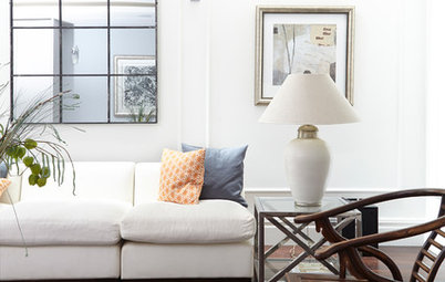
White: In my first three renovations I steered clear of using white because I had the notion that white made a house feel like a hospital. But in exploring the potential of white interiors over the years, I have found that, done the right way, it looks incredible.
There is nothing like a strong white wall as a backdrop for colourful art or a stunning piece of furniture. In a room full of light, white walls amplify that illumination. And if you want a colour scheme that will appeal to most people, white is a safe bet.
Tip: My favourite white for walls is Dulux ‘Okarito’. Resene ‘Alabaster’ would be one of the most used and well-known whites in interiors. If I am creating a colour scheme with white walls, I would go for a natural wood colour or medium tone, and then large dark-toned light features or furniture.
Beige: When I started the colour scheme for our first project nearly 10 years ago, I decided on the colour everyone seemed to be using at the time, ‘Quarter Tea’, a light beige that was a common interior colour. There is a reason this colour works well; it’s warm, it complements other colours and textures and is adaptable to a variety of interior styles.
Browse beige living areas
Browse beige living areas
There are some homes that need the warmth and depth of beige on the walls, for example if there is a lot of dark timber or there is limited light in a house. I have found that beige is a very complementary colour, and the tones within beige are straightforward to match.
When I am creating a colour scheme with limited time, I lean towards beige because it is a colour that suits most spaces. If you are new to colour scheming, my advice would be to start with beige.
Tip: My favourite beige colours are Resene ‘Quarter Tea’ and Dulux ‘Mason Bay Quarter’. If using this beige colour on the wall, I would select a walnut stain for wooden floors and have a complementary white for the trims, ceiling and doors.
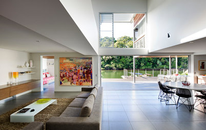
Grey: Grey is a popular colour for walls. It creates an instant modern look within a home as it’s sharp and strong. Using grey well on your walls is all about how you work with the colour to draw out its warmth, as you can run the risk of it making a room feel colder and smaller.
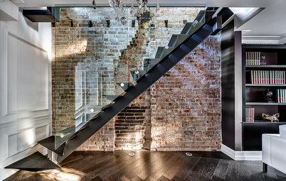
Here you see an example of a light grey being used on the walls to accentuate the stunning detailing of the architecture in the interior and gently draw your eye to the white windows, the view and the angle of the roof line. This is where grey’s ability to be neutral and not draw attention excels, as it showcases what causes emotion in the room perfectly. Grey needs to be matched well. Other colours in the room are going to affect how the grey looks, so don’t trust how it looks in the paint store – you need to test it on your own walls.
Tip: In selecting a grey for your walls I would recommend Dulux ‘Lyttelton Quarter’ or Resene ‘Black White’. In using grey for my walls, I would decide on white for the trims, ceiling, curtains and lights and have a strong charcoal or black for the flooring.
Help! I spilled paint on my clothes
Creating a colour scheme is not an easy undertaking, hence why there are colour consultants who do this for a living. Most paint suppliers have additional tools and services to help, including technology that can show you what your room will look like with a new paint colour, and information about what paint colours complement each other.
And this I know from my own experience: spending some time considering your wall colour before making a decision is far better than having to repaint a whole room because you didn’t think it through.
Your say
If you enjoyed this story, like it, bookmark it, save the photos and share your thoughts below. Join the conversation!
More
Browse more neutral palettes

Although a colour may be neutral, its base may not match your colour scheme as perfectly as you had hoped. I have spent some serious time with colour samples and have found a process for deciding on a neutral wall colour that suits both the house I am creating a colour scheme for, as well as my style.