

The Best Colours to Paint Your Bedroom Walls
White may be the safe option but, as these experts tell, a splash of colour can work wonders in your bedroom

While most people still tend to stick to safe shades of white or cream for the walls of their sleep-time sanctuary, they are certainly not the only hues that work to create the necessary tranquil and relaxing vibe for this important space. From warm and cosy reds to elegant duck-egg blues, versatile greys and dramatic – yet surprisingly calming – black, we take a spin of the colour wheel to help you figure out the best colours for your bedroom walls.
Interior designer: Nelly Reffet, of Twinkle and Whistle in Perth, WA
Reffet also enjoys working with grey in the bedroom. “Both light greys and dark greys are timeless and lovely, however, they don’t suit every bedroom,” she says. “If you want a relaxing but not too intense atmosphere, go for a light to medium grey. If your bedroom receives little natural light, opt for a light grey – it will always look darker in your room.
“While I do love the look of a super cosy and dramatic dark grey bedroom, I do not recommend this shade for a poorly lit bedroom … unless you are going for a cave-like look. Dark grey actually requires lots of natural light to make the statement it is supposed to make without feeling oppressive. It is also at its best when balanced out with some other lighter elements and by some texture, too – think driftwood, a wicker basket, knitted throw, linen curtains, kantha quilt, etc.
“Generally speaking, I do enjoy using grey in a bedroom because it immediately brings a kind of ‘cosiness’ to the room, while staying gender neutral. It is also a very versatile colour, which works with many other colours and materials. This means you can have a bit of fun with creating different styles and atmospheres, just by changing bedlinen and small accessories in the bedroom,” says Reffet.
Designer picks: “My favourite greys tend to be quite earthy, so they don’t look too cold. Check out Dulux ‘Dieskau’, ‘Grey Pebble Half’, ‘Ghosting’, ‘Timeless Grey’, ‘Teahouse’ and ‘Raku’.”
Interior designer: Camilla Molders of Camilla Molders Design in Melbourne, Vic
In this room, Molders says the grey was used to bring depth to the space that otherwise had no architectural interest. “The space has a lot of natural light, which allowed us to use a deeper shade, which in turn made the room feel more intimate and cosy,” she says. “Grey is a great wall colour as it isn’t too heavy and allows other colours to pop against it.”
Wall paint: Dulux ‘Strap’ (painted on a Haymes base paint)
Be inspired by more grey bedrooms
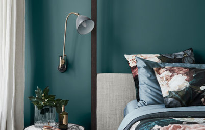
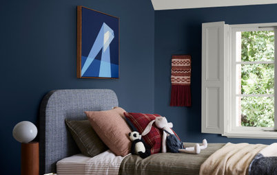
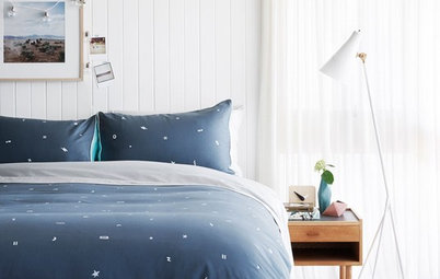
Blue
Interior designer: Luci Dibley of Luci.D Interiors in Exeter, NSW
The colour for this master bedroom was matched to the room’s original duck-egg blue wallpaper. The owner took a chip of the wallpaper to her local Dulux store and had them come up with a custom colour to match.
“The soft pastel shade of blue sets a calming and relaxed atmosphere within the room, and provides an elegant backdrop to the owners’ heavy antique furniture and colourful chandelier,” says Dibley. “Choosing a soft duck-egg blue or similar blue tone for your bedroom is a great way of introducing colour into the room, while still maintaining the enduring style of a neutral palette that will work with almost any selection of furniture and decor over an extended period of time.”
Interior designer: Lauren Macer of Sisalla Interior Design in Melbourne, Vic
A deeper shade of blue can also be used to add necessary warmth to bigger rooms. “With a lot of new houses the master bedrooms are very large, and if they are left all white, they feel cold and sparse,” explains Macer. “Dark blue walls for a large bedroom give the room a more intimate and calming feeling. It helps you relax and feels quite separate from the rest of the house so you can really retreat. Generally, all shades of blue will look beautiful on bedroom walls, but I would avoid mixing blue with yellow – that colour combination is very dated. Instead, mix silvery greys, linen and a dash of gold to give it a lift.”
Wall paint: Haymes ‘Darlington’
Browse accent walls for inspiration
Get the look: Midnight and navy shades of blue can be really effective and, while dramatic, still offer a restful feel. Pair navy shades with white for a contemporary, nautical feel, or add similar jewel-toned decor for a rich, opulent effect. Here, by adding bright accents and quirky touches, it lends a wonderfully eclectic look to the room. For best (less cave-like) results, ensure the room receives lots of light and is on the bigger side, with high ceilings.
Be inspired by more blue bedrooms
Be inspired by more blue bedrooms
Purple
Interior designer: Kathryn Hooper of Dallape Chant in Sydney, NSW
“Soft shades of grey-based lilacs and deep, rich aubergines are some of my favourite colours when I’m looking to introduce colour into the bedroom, as they both provide for a relaxing environment,” says Hooper, who worked on this bedroom renovation. She adds that the colour works particularly well in this room because of vast amounts of natural light, as well as the Dulux ‘Whisper White’ used on the top half of the wall, which brings a lightness to the room without being cold.
“Softer shades of purple present a light and airy feeling, while darker aubergines are perfect for that masculine edge. I tend to steer clear of bright purples as I find they don’t provide that relaxing environment which is essential in a bedroom,” says Hooper.
Wall paint: Dulux ‘Tranquil Retreat’ and Dulux ‘Whisper White’
Get the look: If you opt for a darker aubergine, make sure the room receives plenty of natural light – oversize floor-to-ceiling windows and a high ceiling would be ideal. Light, bright and feminine accents and soft furnishings will also help to lift the colour rather than create a sombre feel.
Be inspired by more purple bedrooms
Be inspired by more purple bedrooms
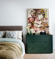
Green
Interior designer: Nelly Reffet, of Twinkle and Whistle in Perth, WA
Green is one of those colours that can be tricky to work with. Get it right and you’ll love it for life. Get it wrong and you could regret it in two weeks.
The green used here is actually a green-grey (a green with lots of grey in it), which can be a safer way to go. “This makes it a muted, neutral yet interesting colour,” says Reffet. “I particularly like this shade as it creates a very soothing, relaxing atmosphere. Surprisingly, despite the green undertone, it can be paired with a wide range of colours – white, taupe, pale pink, red, light tangerine, black, or even navy blue, are some of my favourite combinations with this colour.”
Wall paint: Dulux ‘Still’ at half-strength
Get the look: Soft mossy tones can also look beautiful and wonderfully serene, especially when paired with light timber details and accents as in this room.
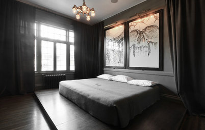
Black
Interior designer: Kit Scholley of Alida and Miller in Bangalow, NSW
This paint is actually a very, very dark shade of grey, but it’s so close to black we’ve decided to include it in this category. “My partner was shocked when I told him I was going to paint the bedroom almost black,” says Scholley. “He was worried that the room would feel too dark and heavy. He was happily surprised with the end result, and couldn’t quite believe how light and airy the room felt.
“I chose such a dark colour for our bedroom because I had purchased a fresh white ’70s-style ornate cane bedhead, and I felt this piece of furniture was quite feminine, so I wanted the wall colour to have a masculine feel to create a perfect balance for myself and my partner.
With the combination of white cane furniture, polished concrete floors, grey/pink and maroon Afghani rug, a fun magenta velvet bed end ottoman, and a white raw linen doona cover, the bedroom has a great balance and flow to it.”
Wall paint: Taubmans ‘Trendy’
20 Fabulous Feature Wall Ideas
Get the look: When a room is filled with as much light as this one, you almost need a black wall to add enough depth to the space. The black here looks anything but oppressive and cave-like, thanks to the huge doorway and white furnishings.
Black also looks great in industrial-style spaces, with high ceilings and a range of contrasting materials around the wall to balance its strength – such as the timber ceiling and exposed brick walls in this room.
Even limiting black to a feature wall still makes an impact. The overall look of this bedroom is warm and cosy, especially when paired with deep beige on the remaining walls.
Be inspired by more black bedrooms
Be inspired by more black bedrooms
Red
Interior designer: Janine Monks of Colour Pop Interior Design in Melbourne, Vic
It could be easy to shy away from such a bold colour in the bedroom, but when used in the right way, as in this bedroom in coastal Victoria, red can be wonderfully warm and cosy, rather than garish and overpowering.
“As Apollo Bay is a small coastal town typically characterised by high rainfall and mild average temperatures, a warm colour applied here in a feature wall immediately makes the room warm and inviting, without being overbearing,” explains Monks. “Wattyl ‘Copper Moon’ is a lovely rich and earthy shade that works well with monochrome and enables accent warm tones to really pop, as with the use of the vivid yellow throw blanket and cushion. It evokes visions of warming log fires and wood smoke, so typical of the area during winter.”
Be inspired by more red bedrooms
White
Interior designer: Bronwyn Poole of Touch Interiors in Sydney, NSW
In this home, Poole painted the entire home in Porter’s Paints Milk Paint and wanted to continue it into the bedrooms on the upper floor of the home. “But I wanted the wall colour in the bedrooms to be more pure, I hence mixed it half strength,” she says. “I do adore white in bedrooms for many reasons; it provides the perfect canvas to layer any colour you desire and I am a big believer that our spaces need to evolve as we do. Having the flexibility to swap out cushions or linen is a powerful thing.
“I also prefer to apply white where the architecture is more complicated. If your room is a simple box, then painting it a colour is much more feasible and very effective. In this example, however, the geometry of the ceilings and a feature such as the bay window lends itself to the simplest of paint work to make the architecture really sing. White on white gives a room that breath of fresh air where one can easily gain respite from a busy day and feel expansive in more personal thought.”
Get the look: “There are many types of white, and here are a few of my considerations for choosing the right one: when adding accent colours of blue or green, I opt for a cooler, more basic white,” says Poole. “I always consider the other elements I am working with such as bedlinen, artwork, textiles, furniture, drapes. If any of these elements have a hint of a cream I warm up my white so it does not ostracise these elements.”
Be inspired by more white bedrooms
Neutrals
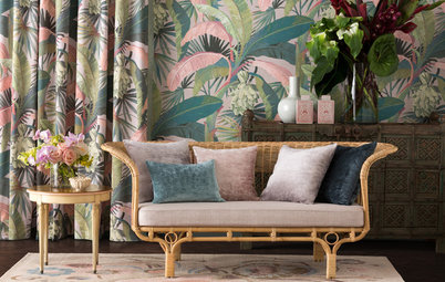
If, however, you still prefer the look of soothing neutrals in your sleep space, there’s no need for them to be bland and uninteresting. There are a number of warm, comforting shades of beige, cream, off-white and other neutrals that work well to create a light-filled yet serene space to retreat to. As seen here, they can easily be lifted by fun soft-furnishings such as the soft blue cushions, lively patterned blinds and other small details such as mirrors and furniture upholstery.
If, however, you still prefer the look of soothing neutrals in your sleep space, there’s no need for them to be bland and uninteresting. There are a number of warm, comforting shades of beige, cream, off-white and other neutrals that work well to create a light-filled yet serene space to retreat to. As seen here, they can easily be lifted by fun soft-furnishings such as the soft blue cushions, lively patterned blinds and other small details such as mirrors and furniture upholstery.
Tell us
Which of the colours above do you like best for a bedroom? Let us know in the Comments section. And if you found this story helpful, like it, bookmark it, save the photos and share your thoughts below. Join the conversation.
More
Bedroom Colour Combos That Soothe Your Soul
Put a Little Colour Into Your Dreams: Paint Your Bed
8 Rooms, 4 Ways to Go Big and Bold With Colour

Interior designer: Chloe Stacey of Collected Interiors in Perth, WA
“Grey works well in rooms with lots of natural light, high ceilings, light floors and a large space,” says Stacey. But she warns that when using grey you need to be careful selecting the right hue. “Avoid greys that have a purple or pink undertone as this can completely change the look or feel you were initially hoping for,” she advises.
“We love using grey, particularly deep, strong greys in the bedroom because it is a neutral colour and goes with anything. It also allows a space to become dramatic without being overbearing,” explains Stacey.
Wall paint: Dulux ‘Tristan’