Average rating: 4.8 out of 5 stars47 ReviewsView Profile
Colour contrasts: so above, so below
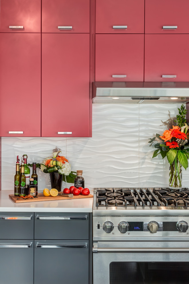
This design was a delight. We loved the symmetry of the cupboards and the aqueous sense of waves and water reflecting the wall of windows within the tilework.
(Rob Moroto, Calgary Photos)

Backsplash in a bright color to contrast with the light color of cabinets.