Expansive Kitchen with Grey Splashback Design Ideas
Refine by:
Budget
Sort by:Popular Today
41 - 60 of 6,662 photos
Item 1 of 3
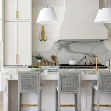
At 66 stories and nearly 800 feet tall, Architect Sir David Adjaye’s first New York City high-rise tower is an important contribution to the New York City skyline. 130 William’s hand-cast concrete facade creates a striking form against the cityscape of Lower Manhattan.
Open-plan kitchens are characterized by custom Pedini Italian millwork and cabinetry, state-of-the-art Gaggenau appliances and cantilevered marble countertops.
Elegant Salvatori Italian marble highlights residence bathrooms featuring spacious walk-in showers, soaking tubs, custom Pedini Italian vanities, and illuminated medicine cabinets.
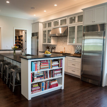
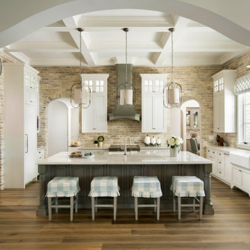
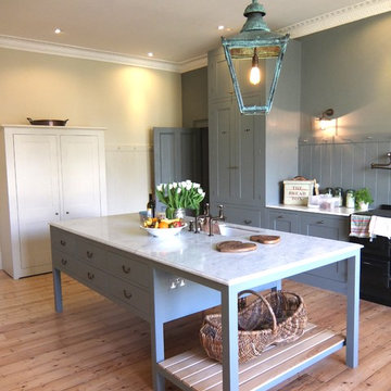
Raised island ends create storage for cookbook display adding a touch of farmhouse charm. At the end of the kitchen is a large walk-in pantry.
Mandi B Photography
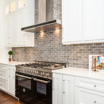
White Macabus Quartzite Counter tops adorn this coast kitchen. Waterworks back splash behind stove. Construction by Borges Brooks Builders and photography by Fletcher Isaacs
There are so many design elements to this kitchen, I almost don’t know where to start. Bright and airy with crisp clean white cabinets, the kitchen is open and welcoming. Still crisp but gently contrasting, the stainless steel appliance add depth amid the white. To keep this kitchen warm, natural oak covers the floors and a toasted wheat color washes the walls. And then there is the architectural elements. You know. That post and beam in the middle of the room. It’s the center of attention.
When you walk into a room your eyes roam around, establishing the size and shape of the room as your feet take you forward. From the front door of this home straight ahead you encountered this wall. The dining area to the right gives you a glimpse of things to come. Where there is a dining room you will usually find a kitchen.
The architecture of years gone by consistently hides the kitchen, the heart of the home, behind walls. I sympathize with my Mom, and all the other Moms, who have had to spend so much time tucked into a tight kitchen, away from the family. This wall had to go, but it was structural. We needed its support but not its bulk.
So we got rid of the bulk and only the bulk. Instead of a wall we have a post and beam, offering all of the structure we need. We could have installed a huge steel beam and reconfigure the joists to upset the beam, but why? The small beam and post add an incredible architectural element. It’s turning lemons into lemon, we simply made the most of what we had. It may be functional but it’s so fantastic. It looks like we created the effect just for the drama.
The original kitchen may have had a working triangle and some counter space, but it was fairly small, with each area only a step or two away. The dark cabinets made the space feel even smaller and the butcher block patterned laminate counter tops were very dated. The appliances were feeling their age as well, from a coil burner electric stove to a top freezer refrigerator. To keep this kitchen within its space, a half wall separated it from the dining area.
With the wall gone we borrowed some space from the living room and extended what was a U shaped kitchen into an L. At the living room window we start our new kitchen. We kept a small part of the wall to support the other end of our decorative beam. Sandwiched between a large pantry and our new French door refrigerator, the wall disappears. With our new open floor plan a sizable island was in order.
We split our cooking areas and installed a continuous grill gas cooktop into the island. A sleek island hood takes care of exhaust and adds an extra element to our architectural feature. Under the cooktop we added over-sized drawers for pots and pan storage. The frameless cabinets from New River Cabinetry are maple, painted white, with the Herndon door style. With the cooktop safely nestled into our island, we still had to add an oven.
We used the space where the old range sat for a large single oven of stainless steel and glass. If it worked for one, why not two? We created a home for a microwave in the wall cabinets. It’s perfect for heating leftovers so close to the refrigerator.
An important consideration for hot spots in your kitchen is landing zones. Each of our cooking areas have generous landing zones, one on each side of the cooktop and an entire counter area above or below the ovens, depending on which one you’re using.
We wanted to give the sink area more room so the half wall had to come out. We moved the trash and recycle cans into a cabinet, removed the heavy soffits and kept the sink under the window.
With that little bit of extra space we were able to add a larger cabinet above the dishwasher and slide it all down. This used to be where the carpeting met the vinyl floor, but all of it is gone. Long oak planks eliminate that final divide between the kitchen and the dining area, while adding visual length to the area. White wall cabinets on each side of the window reflect the sunlight for a brighter view.
With all of the darker cabinetry the backsplash walls had been painted white. Even still, there was a darkness in the corners and it wasn’t very exciting. We wanted to add visual interest and reflect the new under-cabinet lighting, eliminating the shadows in this corner.
With 1″x 2″ Arabescato Honed marble mosaics and those under-cabinet lights, we achieved the perfect balance. The marble has subtle swirls in gray and beige on a clean white background, but with the honed finish the light is softly reflected instead of glaring. For granite, we chose the soft gray tones of Luna Pearl. The speckles of gray and beige are a gentle contrast to the white cabinets and emulate the color of the stainless steel.
Between the carpet, red half wall, dark railing and dated light fixture, the dining area felt tired. Since the kitchen lacked sufficient storage, a large utility cabinet crowded the table space without adding any decorate elements.
Although it didn’t get any bigger, our dining area feels fresher and more open too. With the oak flooring joining the area to the rest of our space and the toasted wheat on the walls, the white table and chairs compliment the cabinetry while contrasting the warmer colors. We replaced the chandelier with recessed lighting and changed that railing too.
With our new open floor plan, we ended up with a fairly open area in between our foyer closet and the living room window. Not one to miss an opportunity, we filled the space with a multi-functional work space.
With the sunlight streaming in this bright corner works for anything this family needs.
There’s plenty of space for a chair under this large desk drawer. A closed cabinet below, glass doors above and lots of open shelving let you store and or showcase your belongings. We added a lite area at the top to keep away the darker corners.
The transformation is complete. This kitchen and all of its features are truly the center of attention in this home.
RJK Construction, Inc
DETAILS THAT CARRY THROUGH THE HOUSE: METAL , THICK SLABS,RECLAIMED WESTERN WOODS AND SWEEPING VIEWS OF ASPEN. This mountain house features hand-crafted, forged iron crown; custom-made hood and tile; and reclaimed elm and walnut wood details.
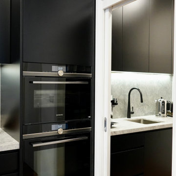
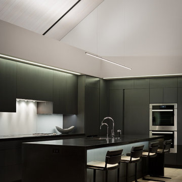
BOLD MINIMAL
- Matte black polyurethane custom built cabinetry
- Walk in pantry
- Natural 'Super White' Dolomite stone was used throughout this job, on the splashback, benchtops and on the all the island details
- Recessed LED strip lighting to the underside of the cabinetry and island
- Integrated french door fridge & freezer
- Blum hardware
Sheree Bounassif, Kitchens by Emanuel
Their family expanded, and so did their home! After nearly 30 years residing in the same home they raised their children, this wonderful couple made the decision to tear down the walls and create one great open kitchen family room and dining space, partially expanding 10 feet out into their backyard. The result: a beautiful open concept space geared towards family gatherings and entertaining.
Wall color: Benjamin Moore Revere Pewter
Cabinets: Dunn Edwards Droplets
Island: Dunn Edwards Stone Maison
Flooring: LM Flooring Nature Reserve Silverado
Countertop: Cambria Torquay
Backsplash: Walker Zanger Grammercy Park
Sink: Blanco Cerana Fireclay
Photography by Amy Bartlam
Painted kitchen island with ash slats for feet rest. The cabinet in the background is a double cabinet specially built for the fridge and freezer.
2016 MBIA Gold Award Winner: From whence an old one-story house once stood now stands this 5,000+ SF marvel that Finecraft built in the heart of Bethesda, MD.
Susie Soleimani Photography
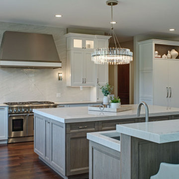
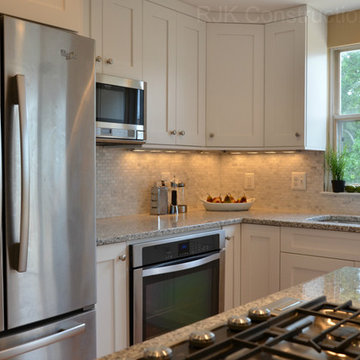
Our clients were ready to update their kitchen with soft and subtle colors to blend in with the home’s recently updated interior. It was also time to improve the layout. The kitchen needed to be reconfigured in order to facilitate a three-generation family and occasional entertaining.
Design Objectives
-Brighten up to blend with the home’s interior and flow into the adjacent family room area
-Incorporate specific storage for pantry items like bulk ingredients and small appliances
-Designate areas for a coffee bar, multiple prep areas and seating while highlighting a dry bar for display
-Keep clutter off of counters for a seamless design that facilitates visual flow through the entire area
Design Challenges
-Make a subtle statement with contrasting cabinets and countertops
-Incorporate a stand-alone, statement-making dry bar just outside the main kitchen space
-Design a statement hood that serves as a focal point without interrupting visual flow
-Update and add lighting to add more task, accent and overhead brightness.
-Have the space be usable for different tasks by different family members at the same time
-Create a space that looks classy and formal but is still inviting.
Design Solutions
-A soft grey stain and white paint were used on all the cabinets. On only the wall cabinets flanking the window was the grey introduced on the frame to make a pop against the white paint.
-The white-painted refrigerator and freezer door panel style is a custom reeded look that adds a soft contrasting detail against the main door style. Along with the open grey-stained interior cabinet above, it looks like a piece of furniture.
-The same soft tones were used for the countertops and a full, high backsplash of Chamonix quartzite that tied everything together. It’s an elegant backdrop for the hood.
-The Dry Bar, even though showcasing a dark stained cabinet, stays open and bright with a full mirror backsplash, wood retained glass floating shelves and glass wall cabinet doors. Brushed brass trim details and a fun light fixture add a pop of character.
-The same reeded door style as the refrigerator was used on the base doors of the dry bar to tie in with the kitchen.
-About 2/3 of the existing walk-in pantry was carved out for the new dry bar footprint while still keeping a shallow-depth pantry space for storage.
-The homeowners wanted a beautiful hood but didn’t want it to dominate the design. We kept the lines of the hood simple. The soft stainless steel body has a bottom accent that incorporates both the grey stain and white-painted cabinet colors.
-Even though the Kitchen had a lot of natural light from the large window, it was important to have task and subtle feature lighting. Recessed cans provide overall lighting while clear pendants shine down on the 2nd level of the seating area on the island.
-The circular clear chandelier is the statement piece over the main island while the pendants flanking the hood emphasize the quartzite backsplash and add as accent lighting in the evening along with the interior cabinet lights.
With three generations living in the home it was important to have areas that multiple family members could use at the same time without being in each other’s way. The design incorporates different zones like the coffee bar, charging station, dry bar and refrigerator drawers.
The softness of the colors and classic feel of the wood floor keep kitchen is inviting and calming.
Expansive Kitchen with Grey Splashback Design Ideas
3