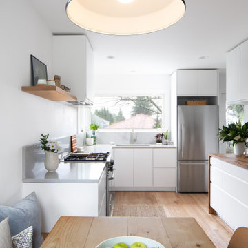
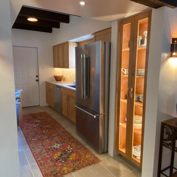
Kitchen with no Island and Exposed Beam Design Ideas
Refine by:
Budget
Sort by:Popular Today
1 - 20 of 1,176 photos
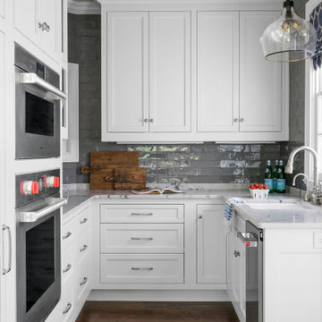
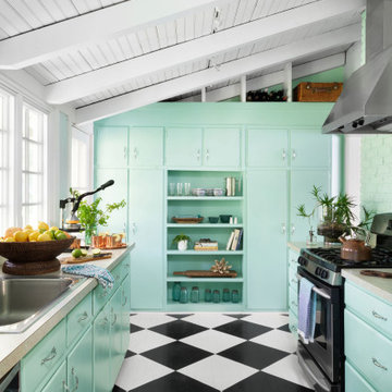
Transitional kitchen pantry with white inset-construction cabinets. Built-in appliances. Rollout shelves in tall pantry cabinets. Lazy Susan in base cabinet. Icemaker.
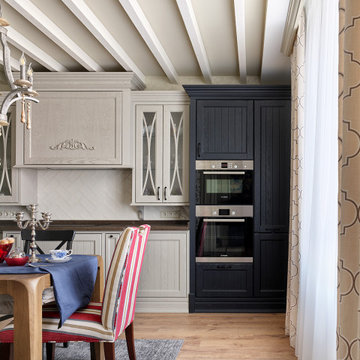
Авторы проекта:
Дизайн: Ярослав и Елена Алдошины (бюро Aldo&Aldo)
Фото: Михаил Чекалов
Стиль: Катя Klee
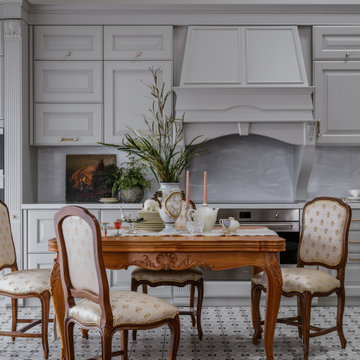
Отправной точкой в идейном и стилистическом направлении послужила давняя мечта заказчиков жить не просто в новом доме, а создать дом с историей. Интересно, что еще задолго до строительства заказчица получила в подарок прелестные вазоны 18 века, можно сказать с них все и началось. Вместе с заказчиком мы объехали несколько стран в поиске нужных предметов, что-то привезли сами из поездок. Работали с антикваром в Париже. Нами было подобрано искусство близкое по духу.
Владельцы дома - Успешные предприниматели и энергичные люди средних лет, живущие вдвоем, но часто принимающие в гостях своих детей, внуков, родственников и друзей. Предпочитают слушать хорошую музыку на виниле, собираться шумной компанией в кабинете главы семейства, хозяйка дома играет на барабанах, при чем их группа даже сделала камерный концерт «для своих» прямо в гостиной после сдачи объекта. Главное пожелание было создать интерьер с ощущением, что в этом доме прожило уже несколько поколений семейства, создать дом с историей семьи и ее духом.
Основной функциональной задачей было создать закрытую террасу-оранжерею, в которой можно было бы отдохнуть от городской суеты, трансформирующуюся в открытую веранду в теплое время года, спроектировать изразцовую печь, для приготовления блюд и создания особой атмосферы с помощью открытого огня.
Спроектировать кухню, объединённую с гостиной, таким образом, чтобы выделить немалое пространство для отдыха и релаксации у камина, без вмешательства в пространство приготовления блюд.
Так же необходимо было проанализировать оптимальныt маршруты передвижения владельцев по дому, учесть все требования к приватным зонам и спроектировать их максимально комфортно и с учетом ритма жизни хозяев. Исходя из этого родилось планировочное решение, отвечающее требованиям всего семейства.
Планировка создавалась нами с нуля, так как мы вели проектирование с самого начала, еще до возведения конструкций. Поэтому все что было необходимо учесть мы учли на начальных этапах и необходимости в переносе стен и других конструкций не возникло.
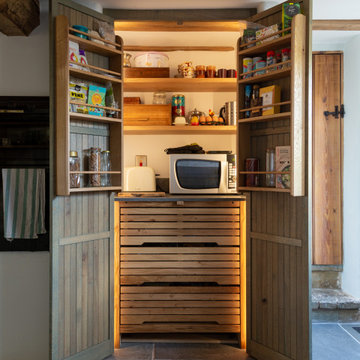
Что касается систем хранения. К этому вопросу хозяева дома относятся очень щепетильно и взвешено. Поэтому мы организовали целое помещение площадью 30 м2 в подвальном этаже здания, для хранение сезонных вещей и постирочной, где располагаются как системы хранения, так и техника по уходу за одеждой.
В приватной зоне хозяев на первом этаже мы расположили гардеробную комнату, для хранения вещей владельцев дома.
При входе расположен большой шкаф, для верхней одежды, обуви и других предметов.
Под лестницей мы так же заложили большое пространство для хранения инвентаря для уборки.
Помимо этого, каждая жилая комната имеет внушительный платяной шкаф и другие системы хранения.
Отдельное место в проектировании занимает раздел освещения. Разработаны разные сценарии, как повседневный для уютных посиделок в семейном кругу, так и парадный вариант для встречи гостей. Так например в кухне-гостиной мы разместили две люстры с плафонами в несколько ярусов, т.к высота потолка восемь метров и добавили технический рассеянный свет. В зоне камина расположили две напольные лампы для придания уюта. В зоне кухни продумана подсветка рабочей поверхности. В приватных зонах дома так же использовался технический свет, люстры больше выполняют декоративную функцию, прикроватные лампы для чтения. В зоне террасы располагается верхний свет, люстра над столом, бра и настольные лампы в мягкой зоне.
Цветовая палитра дома выполнена преимущественно в светлых оттенках с добавлением акцентов. В главной парадной части дома палитра возникла из маленького образца ткани для портьер. В других помещениях отправными точками стали винтажные предметы мебели, ковры купленные на антикварных рынках. Стены мы оставили нейтральными чтобы со временем можно было менять настроение с помощью замены текстиля и оббивки мебели. Но одно помещение все же получилось отличным от остальных- это винотека. Там мы создали атмосферу камерную в достаточно насыщенных древесных оттенках, природных зеленых, терракотовых. Терраса получилась садом, и сама продиктовала спокойную серо-древесную гамму.
Предметы мебели тщательно подбирались на протяжении нескольких месяцев поиска. Заказчики очень любят предметы с историей, большинство винтажных привезли из Франции. Хотелось создать смесь Европы и Азии, мы побывали в Китае и привезли несколько аутентичных вещей. Многие вещи коллекционировались годами и были перевезены из прежнего дома. Столярные изделия выполнялись под заказ по нашим эскизам. Кухню заказывали у фабрики Scavollini. Два спальных гарнитура Francesco Pasi в спальне хозяев и гостевой спальне.
К выбору декора мы отнеслись с неменьшим энтузиазмом, получилось целое приключение, в котором участвовали мы и заказчики. Поиски были по разным странам, что-то куплено у нас. Сказать можно одно, что каждую вещь, что вы видите на снимках не была привезена на объект для красоты кадра, а это именно те предметы, которые живут в доме. Например, у заказчицы огромная коллекция фарфора.
Текстиль во многом предопределил интерьер в доме, его мы выбрали практически первым с чего и завязалась цветовая гамма. Ткани преимущественно использовались английские и французские.
Стиль интерьера предопределила архитектура дома, а прежде всего посыл заказчика.
Работали мы в команде с архитектором, т.к считаем важным создавать цельные, гармоничные проекты, где все слажено и дополняет друг друга. Определить стилевое направление достаточно сложно, мы создавали портрет обитателей этого дома с их характером, дом получился очень персонализированным. Но есть одна примечательная черта, в новый дом мы внесли оттенки старины, будто дом живет уже не одно десятилетие.
Как же без сложностей! Кто вам скажет, что можно построить дом мечты легко, слукавит! В процессе стройки возникает множество вопросов, которые требуют четкости, слаженной работы команды, компетентных подрядчиков. В этом проекте сложным узлом было проектирование лестницы и финишных покрытий. Мы перебрали не один вариант и никак не могли найти нужное решение. Но упорство и картинка в голове сделали свое дело, решение было найдено и воплощено в жизнь.
Сроки вместе с проектированием, стройкой дома и отделкой заняли 2,5 года.
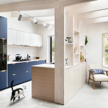
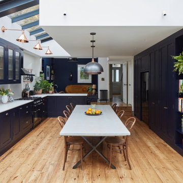
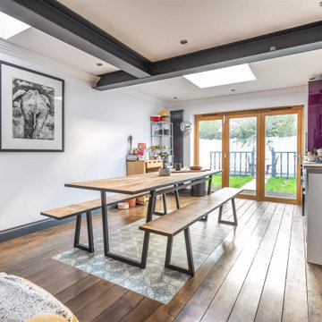
Amos Goldreich Architecture has completed an asymmetric brick extension that celebrates light and modern life for a young family in North London. The new layout gives the family distinct kitchen, dining and relaxation zones, and views to the large rear garden from numerous angles within the home.
The owners wanted to update the property in a way that would maximise the available space and reconnect different areas while leaving them clearly defined. Rather than building the common, open box extension, Amos Goldreich Architecture created distinctly separate yet connected spaces both externally and internally using an asymmetric form united by pale white bricks.
Previously the rear plan of the house was divided into a kitchen, dining room and conservatory. The kitchen and dining room were very dark; the kitchen was incredibly narrow and the late 90’s UPVC conservatory was thermally inefficient. Bringing in natural light and creating views into the garden where the clients’ children often spend time playing were both important elements of the brief. Amos Goldreich Architecture designed a large X by X metre box window in the centre of the sitting room that offers views from both the sitting area and dining table, meaning the clients can keep an eye on the children while working or relaxing.
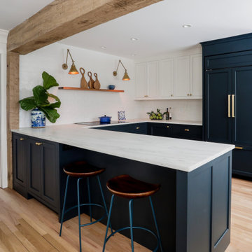
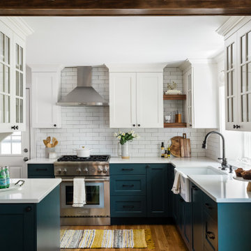
Amos Goldreich Architecture enlivened and lightened the home by working with materials that encourage the diffusion of light throughout the spaces. Exposed timber rafters create a clever shelving screen, functioning both as open storage and a permeable room divider to maintain the connection between the sitting area and kitchen. A deep blue kitchen with plywood handle detailing creates balance and contrast against the light tones of the pale timber and white walls.
The new extension is clad in white bricks which help to bounce light around the new interiors, emphasise the freshness and newness, and create a clear, distinct separation from the existing part of the late Victorian semi-detached London home. Brick continues to make an impact in the patio area where Amos Goldreich Architecture chose to use Stone Grey brick pavers for their muted tones and durability. A sedum roof spans the entire extension giving a beautiful view from the first floor bedrooms. The sedum roof also acts to encourage biodiversity and collect rainwater.
Continues
Amos Goldreich, Director of Amos Goldreich Architecture says:
“The Framework House was a fantastic project to work on with our clients. We thought carefully about the space planning to ensure we met the brief for distinct zones, while also keeping a connection to the outdoors and others in the space.
“The materials of the project also had to marry with the new plan. We chose to keep the interiors fresh, calm, and clean so our clients could adapt their future interior design choices easily without the need to renovate the space again.”
Clients, Tom and Jennifer Allen say:
“I couldn’t have envisioned having a space like this. It has completely changed the way we live as a family for the better. We are more connected, yet also have our own spaces to work, eat, play, learn and relax.”
“The extension has had an impact on the entire house. When our son looks out of his window on the first floor, he sees a beautiful planted roof that merges with the garden.”
We added chequerboard floor tiles, wall lights, a zellige tile splash back, a white Shaker kitchen and dark wooden worktops to our Cotswolds Cottage project. Interior Design by Imperfect Interiors
Armada Cottage is available to rent at www.armadacottagecotswolds.co.uk
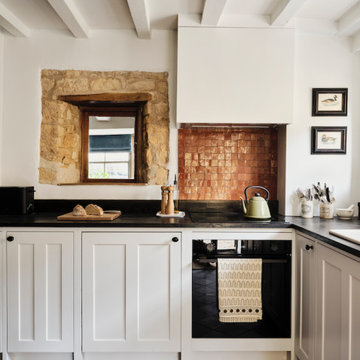
Large airy open plan kitchen, flooded with natural light opening onto the garden. Hand made timber units, with feature copper lights, antique timber floor and window seat.
A modern-meets-vintage farmhouse-style tiny house designed and built by Parlour & Palm in Portland, Oregon. This adorable space may be small, but it is mighty, and includes a kitchen, bathroom, living room, sleeping loft, and outdoor deck. Many of the features - including cabinets, shelves, hardware, lighting, furniture, and outlet covers - are salvaged and recycled.
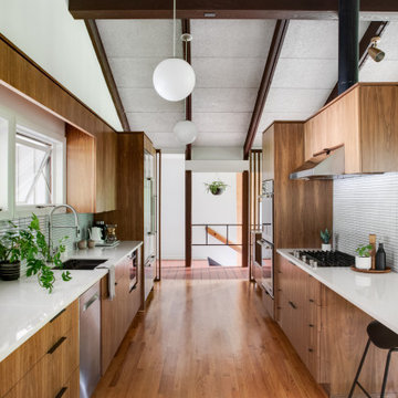
A modern kitchen remodel that incorporates that craftsmanship of the home. By flattening out the breakfast bar it opened up and brought the the two spaces together.
Looking into the U shape kitchen area, with tiled back wall, butternut floating shelves and brass library lamps. The base cabinets are BM Midnight, the wall cabinet BM Simply White. The countertop is honed Imperial Danby marble.
Remodel of an existing kitchen to incorporate a functional space for a family of four. The design included custom floating shelves and new energy efficient corner windows at the kitchen sink.
We added chequerboard floor tiles, wall lights, a zellige tile splash back, a white Shaker kitchen and dark wooden worktops to our Cotswolds Cottage project. Interior Design by Imperfect Interiors
Armada Cottage is available to rent at www.armadacottagecotswolds.co.uk
Opening up to the dining room plus natural light from window and added light from sconces, display cabinet, undercabinet LEDs and ceiling pendant enliven what was a dark galley kitchen.
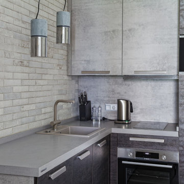
Кухня NOLTE выполнена в комбинации двух самых интересных фасадов:Artwood-имитация обожженного дерева и Stone-имитация бетона в стиле лофт. Рабочая зона кухни переходит в обеденную( в выдвижных секциях удобно хранить и одновременно сидеть на них)
This 1940’s Colonial style home in Boston’s Jamaica Plain had strong bones and rich character but lacked the space, modern conveniences, and storage that our clients desired. While they wished to retain the look of the exterior, as well as some of the home’s unique original features,, the kitchen and dining room needed to be reimagined in design, layout, and functionality.
Key considerations were the compact size of the home and a smaller lot that didn’t give our client the flexibility of an addition. Without adding on to the existing floor plan, we needed to find a way to gain vital extra space in the kitchen, which, with walls enclosing it on all sides, was dark and disconnected from the rest of the house. Our design team coordinated with our client to reconfigure the space by opening up the wall between the dining room and the kitchen to add a few extra inches – just enough to create an open flow between the two rooms. With the removal of that wall, the formerly dark kitchen was flooded with the natural light coming from the existing dining room windows, making the entire space feel brighter and more cohesive.
The original kitchen dated back to the mid-20th century and lacked, among other conveniences, a dishwasher, enough storage, or even countertop space for food prep. In redesigning the kitchen, we visually expanded the space by incorporating white upper cabinetry, open shelving, and white subway tiles extending from the backsplash to the ceiling. A new, larger window featuring a deep stone sill brought in even more light, and the appliances and apron sink were selected to retain the traditional look of the home while delivering modern functionality.
Considering how our client would use this space, we focused on creating a purposeful workspace and storage, ensuring that there was ample countertop space and cabinetry between the sink and range. A multi-purpose cabinet and countertop which serves as a microwave station and food service area were added to the backside of the dining room wall, packing a lot of utility into a small space.
Prior to this renovation, our client had painted the dining room in Mount Saint Anne by Benjamin Moore, a tranquil blue-gray that suited the room well and allowed the original built-in corner cabinetry to stand out, highlighting the home’s charm. With the newly opened floor plan extending into the kitchen, we selected a deep custom color for the base cabinets, Yorktowne Green by Benjamin Moore, to complement the dining room and pull all of the elements together in a cohesive space.
This transformation was remarkable, both functionally and visually. The kitchen is now a bright and inviting space that flows seamlessly into the rest of the house. The homeowners are thrilled with the results, and the small changes we incorporated that made a big difference in the overall feel and functionality of the space.
The Harris Kitchen uses our slatted cabinet design which draws on contemporary shaker and vernacular country but with a modern rustic feel. This design lends itself beautifully to both freestanding or fitted furniture and can be used to make a wide range of freestanding pieces such as larders, dressers and islands. This Kitchen is made from English Character Oak and custom finished with a translucent sage coloured Hard Wax Oil which we mixed in house, and has the effect of a subtle wash of colour without detracting from the character, tonal variations and warmth of the wood. This is a brilliant hardwearing, natural and breathable finish which is water and stain resistant, food safe and easy to maintain.
The slatted cabinet design was originally inspired by old vernacular freestanding kitchen furniture such as larders and meat safes with their simple construction and good airflow which helped store food and provisions in a healthy and safe way, vitally important before refrigeration. These attributes are still valuable today although rarely used in modern cabinetry, and the Slat Cabinet series does this with very narrow gaps between the slats in the doors and cabinet sides.
Emily & Greg commissioned this kitchen for their beautiful old thatched cottage in Warwickshire. The kitchen it was replacing was out dated, didn't use the space well and was not fitted sympathetically to the space with its old uneven walls and low beamed ceilings. A carefully considered cupboard and drawer layout ensured we maximised their storage space, increasing it from before, whilst opening out the space and making it feel less cramped.
The cabinets are made from Oak veneered birch and poplar core ply with solid oak frames, panels and doors. The main cabinet drawers are dovetailed and feature Pippy/Burr Oak fronts with Sycamore drawer boxes, whilst the two Larders have slatted Oak crate drawers for storage of vegetables and dry goods, along with spice racks shelving and automatic concealed led lights. The wall cabinets and shelves also have a continuous strip of dotless led lighting concealed under the front edge, providing soft light on the worktops.
Kitchen with no Island and Exposed Beam Design Ideas
1