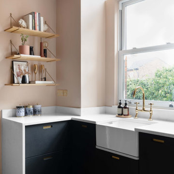
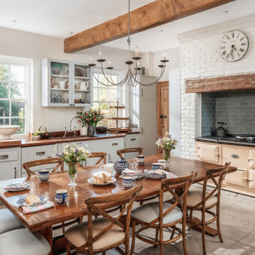
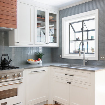
Kitchen with no Island Design Ideas
Refine by:
Budget
Sort by:Popular Today
161 - 180 of 136,749 photos
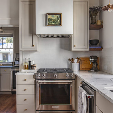
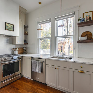
The kitchen after the renovation features black smooth front drawers with shaker style doors, custom solid wood open shelves and a custom built range hood box. Brass accents abound in the lighting and hardware for a fresh and warm pop. .
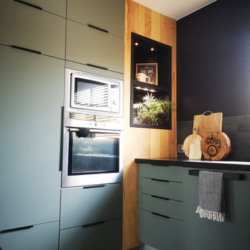
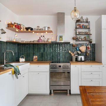
L'ancienne cuisine laquée rouge a laissé place à une cuisine design et épurée, aux lignes pures et aux matériaux naturels, tel que le béton ciré , le bois ou encore l'ardoise et la couleur tendance: le vert
L'idée première pour la rénovation de cette cuisine était d'enlever la couleur laquée rouge de l'ancienne cuisine, les caissons étant en bon état, juste les portes ont été changées.
Cuisine IKEA verte et noire, plan de travail béton ciré, crédence ardoise - Jeanne Pezeril Décoratrice UFDI Montauban GrenadeCuisine IKEA verte et noire, plan de travail béton ciré, crédence ardoise - Jeanne Pezeril Décoratrice UFDI Montauban Grenade
Cuisine IKEA verte et noire, plan de travail béton ciré, crédence ardoise - Jeanne Pezeril Décoratrice UFDI Montauban Grenade
Les portes : le choix de la couleur s'est fait naturellement ayant eu un coup de cœur pour le coloris vert BODARP IKEA , la texture velours à fini de me décider pour ce modèle!
Les poignées très design ont été commandées séparément car je souhaitais une ligne pure pour souligner le plan de travail et la couleur des portes
Les placards supplémentaire ont été créés afin de monter jusqu'au plafond et ainsi optimiser l'espace; ajout également de placards dans le retour Bar
Cuisine IKEA verte et noire, plan de travail béton ciré, crédence ardoise - Jeanne Pezeril Décoratrice UFDI Montauban GrenadeCuisine IKEA verte et noire, plan de travail béton ciré, crédence ardoise - Jeanne Pezeril Décoratrice UFDI Montauban Grenade
Cuisine IKEA verte et noire, plan de travail béton ciré, crédence ardoise - Jeanne Pezeril Décoratrice UFDI Montauban Grenade
Le retour Bar a été complétement créé, en effet l'ilot central en haricot, un peu démodé, a été supprimé, pour laisser place à un grand plan Bar en chêne massif traité à la résiné époxy pou un maximum de facilité d'entretien. Des placards supplémentaires ont ainsi pu être créés et un grand plan de travail également
Les luminaires ont été ajoutés au dessus du bar afin de souligner cet espace
La crédence en ardoise a été posée sur tout le tour du plan de travail qui lui a été travaillé en béton ciré noir
L'association des ces deux matières naturelles matchent bien, leur couleur étant irrégulières et profondes
Le mur noir côté fenêtre apporte du caractère à la pièce et souligne la crédence et le bois , Les stores vénitiens en bois viennent donner le rappel du bois massif de l'alcôve et du bar
Cuisine IKEA verte et noire, plan de travail béton ciré, crédence ardoise - Jeanne Pezeril Décoratrice UFDI Montauban GrenadeCuisine IKEA verte et noire, plan de travail béton ciré, crédence ardoise - Jeanne Pezeril Décoratrice UFDI Montauban Grenade
Cuisine IKEA verte et noire, plan de travail béton ciré, crédence ardoise - Jeanne Pezeril Décoratrice UFDI Montauban Grenade
L'alcôve déjà présente dans l'ancienne cuisine a été conservé et agrandi afin d'y insérer de la déco et créer un bac végétal pour des plantes aromatiques par exemple. De l'éclairage a été mis en place afin de mettre en valeur la décoration de l'alcôve mais aussi un luminaire spécifique aux plantes afin de leur permettent de pousser dans de bonnes conditions.
Les tabourets quand à eux, ont été dessinés par moi même et créé par un artisan métallier sur mesure
This once crowded, dark space is now bright and organized! Maximum storage achieved!
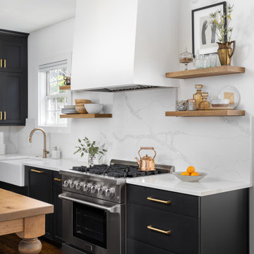
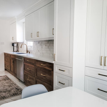
A two-tone, walnut and white shaker kitchen with modern gold accents and a distinct mid-century modern ethic that boasts a statement chandelier and Calacatta inspired tiles. Layers of texture and movement create a space that requires very little in means of décor to be elevated.
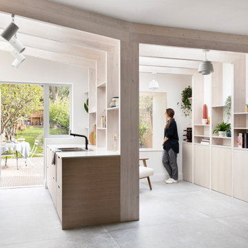
Amos Goldreich Architecture has completed an asymmetric brick extension that celebrates light and modern life for a young family in North London. The new layout gives the family distinct kitchen, dining and relaxation zones, and views to the large rear garden from numerous angles within the home.
The owners wanted to update the property in a way that would maximise the available space and reconnect different areas while leaving them clearly defined. Rather than building the common, open box extension, Amos Goldreich Architecture created distinctly separate yet connected spaces both externally and internally using an asymmetric form united by pale white bricks.
Previously the rear plan of the house was divided into a kitchen, dining room and conservatory. The kitchen and dining room were very dark; the kitchen was incredibly narrow and the late 90’s UPVC conservatory was thermally inefficient. Bringing in natural light and creating views into the garden where the clients’ children often spend time playing were both important elements of the brief. Amos Goldreich Architecture designed a large X by X metre box window in the centre of the sitting room that offers views from both the sitting area and dining table, meaning the clients can keep an eye on the children while working or relaxing.
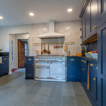
Amos Goldreich Architecture enlivened and lightened the home by working with materials that encourage the diffusion of light throughout the spaces. Exposed timber rafters create a clever shelving screen, functioning both as open storage and a permeable room divider to maintain the connection between the sitting area and kitchen. A deep blue kitchen with plywood handle detailing creates balance and contrast against the light tones of the pale timber and white walls.
The new extension is clad in white bricks which help to bounce light around the new interiors, emphasise the freshness and newness, and create a clear, distinct separation from the existing part of the late Victorian semi-detached London home. Brick continues to make an impact in the patio area where Amos Goldreich Architecture chose to use Stone Grey brick pavers for their muted tones and durability. A sedum roof spans the entire extension giving a beautiful view from the first floor bedrooms. The sedum roof also acts to encourage biodiversity and collect rainwater.
Continues
Amos Goldreich, Director of Amos Goldreich Architecture says:
“The Framework House was a fantastic project to work on with our clients. We thought carefully about the space planning to ensure we met the brief for distinct zones, while also keeping a connection to the outdoors and others in the space.
“The materials of the project also had to marry with the new plan. We chose to keep the interiors fresh, calm, and clean so our clients could adapt their future interior design choices easily without the need to renovate the space again.”
Clients, Tom and Jennifer Allen say:
“I couldn’t have envisioned having a space like this. It has completely changed the way we live as a family for the better. We are more connected, yet also have our own spaces to work, eat, play, learn and relax.”
“The extension has had an impact on the entire house. When our son looks out of his window on the first floor, he sees a beautiful planted roof that merges with the garden.”
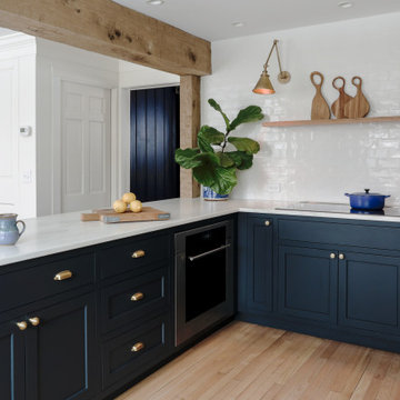
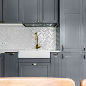
Looking into the U shape kitchen area, with tiled back wall, butternut floating shelves and brass library lamps. The base cabinets are BM Midnight. The countertop is honed Imperial Danby marble.
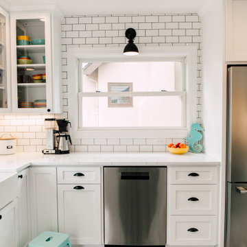
This tiny kitchen got the makeover of a lifetime. From dated 70's red and brown to light and bright black and white (plus some turquoise thrown in). We took this kitchen down to the studs so that we could start fresh. Included in the remodel was enclosing the equally tiny back porch which gives better access into the kitchen from the back deck.
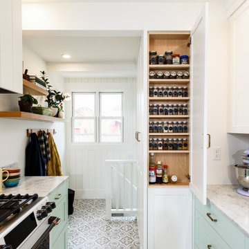
Blueberry english kitchen with white kitchen appliances, slate floor tile and zellige tile backsplash.
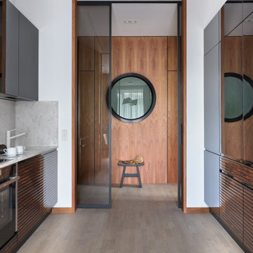
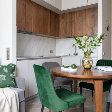
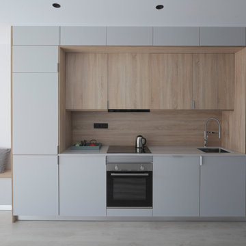
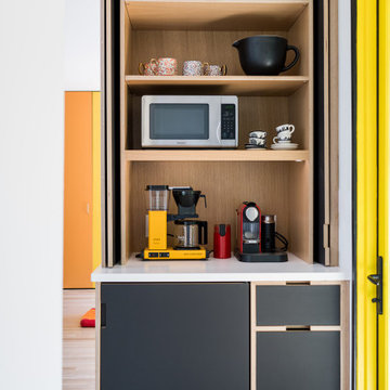
Проект компактной квартиры (73 кв.м.) в московской новостройке. Дизайнер - Татьяна Виталина, студия Decoround. Дизайнер решила превратить московскую квартиру в средиземноморскую яхту.
Стиль: Татьяна Виталина.
Проект был опубликован на сайте журнала "Интерьер+Дизайн".
https://www.interior.ru/place/12285-tatiyana-vitalina-kvartira-v-moskovskoi-novostroike.html
@natalie.vershinina
Nearly two decades ago now, Susan and her husband put a letter in the mailbox of this eastside home: "If you have any interest in selling, please reach out." But really, who would give up a Flansburgh House?
Fast forward to 2020, when the house went on the market! By then it was clear that three children and a busy home design studio couldn't be crammed into this efficient footprint. But what's second best to moving into your dream home? Being asked to redesign the functional core for the family that was.
In this classic Flansburgh layout, all the rooms align tidily in a square around a central hall and open air atrium. As such, all the spaces are both connected to one another and also private; and all allow for visual access to the outdoors in two directions—toward the atrium and toward the exterior. All except, in this case, the utilitarian galley kitchen. That space, oft-relegated to second class in midcentury architecture, got the shaft, with narrow doorways on two ends and no good visual access to the atrium or the outside. Who spends time in the kitchen anyway?
As is often the case with even the very best midcentury architecture, the kitchen at the Flansburgh House needed to be modernized; appliances and cabinetry have come a long way since 1970, but our culture has evolved too, becoming more casual and open in ways we at SYH believe are here to stay. People (gasp!) do spend time—lots of time!—in their kitchens! Nonetheless, our goal was to make this kitchen look as if it had been designed this way by Earl Flansburgh himself.
The house came to us full of bold, bright color. We edited out some of it (along with the walls it was on) but kept and built upon the stunning red, orange and yellow closet doors in the family room adjacent to the kitchen. That pop was balanced by a few colorful midcentury pieces that our clients already owned, and the stunning light and verdant green coming in from both the atrium and the perimeter of the house, not to mention the many skylights. Thus, the rest of the space just needed to quiet down and be a beautiful, if neutral, foil. White terrazzo tile grounds custom plywood and black cabinetry, offset by a half wall that offers both camouflage for the cooking mess and also storage below, hidden behind seamless oak tambour.
Contractor: Rusty Peterson
Cabinetry: Stoll's Woodworking
Photographer: Sarah Shields
Kitchen with no Island Design Ideas
9