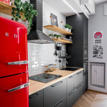
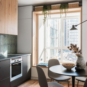
Kitchen with no Island Design Ideas
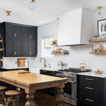
The kitchen after the renovation features black smooth front drawers with shaker style doors, custom solid wood open shelves and a custom built range hood box. Brass accents abound in the lighting and hardware for a fresh and warm pop.
Amos Goldreich Architecture has completed an asymmetric brick extension that celebrates light and modern life for a young family in North London. The new layout gives the family distinct kitchen, dining and relaxation zones, and views to the large rear garden from numerous angles within the home.
The owners wanted to update the property in a way that would maximise the available space and reconnect different areas while leaving them clearly defined. Rather than building the common, open box extension, Amos Goldreich Architecture created distinctly separate yet connected spaces both externally and internally using an asymmetric form united by pale white bricks.
Previously the rear plan of the house was divided into a kitchen, dining room and conservatory. The kitchen and dining room were very dark; the kitchen was incredibly narrow and the late 90’s UPVC conservatory was thermally inefficient. Bringing in natural light and creating views into the garden where the clients’ children often spend time playing were both important elements of the brief. Amos Goldreich Architecture designed a large X by X metre box window in the centre of the sitting room that offers views from both the sitting area and dining table, meaning the clients can keep an eye on the children while working or relaxing.
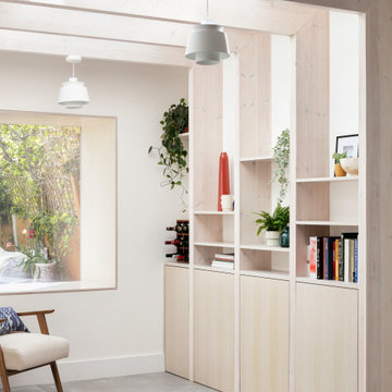
Amos Goldreich Architecture enlivened and lightened the home by working with materials that encourage the diffusion of light throughout the spaces. Exposed timber rafters create a clever shelving screen, functioning both as open storage and a permeable room divider to maintain the connection between the sitting area and kitchen. A deep blue kitchen with plywood handle detailing creates balance and contrast against the light tones of the pale timber and white walls.
The new extension is clad in white bricks which help to bounce light around the new interiors, emphasise the freshness and newness, and create a clear, distinct separation from the existing part of the late Victorian semi-detached London home. Brick continues to make an impact in the patio area where Amos Goldreich Architecture chose to use Stone Grey brick pavers for their muted tones and durability. A sedum roof spans the entire extension giving a beautiful view from the first floor bedrooms. The sedum roof also acts to encourage biodiversity and collect rainwater.
Continues
Amos Goldreich, Director of Amos Goldreich Architecture says:
“The Framework House was a fantastic project to work on with our clients. We thought carefully about the space planning to ensure we met the brief for distinct zones, while also keeping a connection to the outdoors and others in the space.
“The materials of the project also had to marry with the new plan. We chose to keep the interiors fresh, calm, and clean so our clients could adapt their future interior design choices easily without the need to renovate the space again.”
Clients, Tom and Jennifer Allen say:
“I couldn’t have envisioned having a space like this. It has completely changed the way we live as a family for the better. We are more connected, yet also have our own spaces to work, eat, play, learn and relax.”
“The extension has had an impact on the entire house. When our son looks out of his window on the first floor, he sees a beautiful planted roof that merges with the garden.”
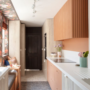
This kitchen is full of colour and pattern clashes and we love it!
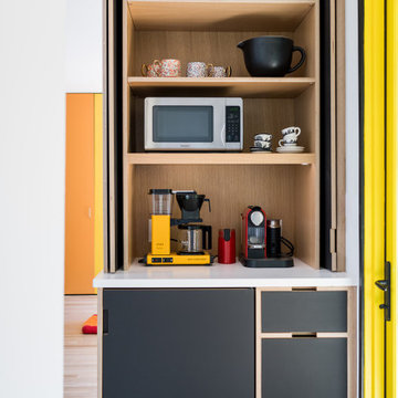
This kitchen is full of tricks to make the most out of all the space. We have created a breakfast cupboard behind 2 pocket doors to give a sense of luxury to the space.
A hidden extractor is a must for us at Studio Dean, and in this property it is hidden behind the peach wooden latting.
Another feature of this space was the bench seat, added so the client could have their breakfasts in the morning in their new kitchen.
We love how playful and fun this space in!
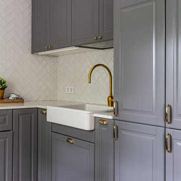
Marble farmhouse sink is highlighted on this window wall with pendant accent lighting.
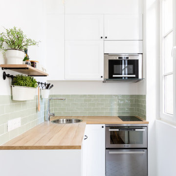
On adore cette jolie cuisine lumineuse, ouverte sur la cour fleurie de l'immeuble. Un joli carrelage aspect carreau de ciment mais moderne, sous cette cuisine ikea blanche aux moulures renforçant le côté un peu campagne, mais modernisé avec des boutons en métal noir, et une crédence qui n'est pas toute hauteur, en carreaux style métro plat vert sauge ! Des petits accessoires muraux viennent compléter le côté rétro de l'ensemble, éclairé par des suspensions design en béton.
Nearly two decades ago now, Susan and her husband put a letter in the mailbox of this eastside home: "If you have any interest in selling, please reach out." But really, who would give up a Flansburgh House?
Fast forward to 2020, when the house went on the market! By then it was clear that three children and a busy home design studio couldn't be crammed into this efficient footprint. But what's second best to moving into your dream home? Being asked to redesign the functional core for the family that was.
In this classic Flansburgh layout, all the rooms align tidily in a square around a central hall and open air atrium. As such, all the spaces are both connected to one another and also private; and all allow for visual access to the outdoors in two directions—toward the atrium and toward the exterior. All except, in this case, the utilitarian galley kitchen. That space, oft-relegated to second class in midcentury architecture, got the shaft, with narrow doorways on two ends and no good visual access to the atrium or the outside. Who spends time in the kitchen anyway?
As is often the case with even the very best midcentury architecture, the kitchen at the Flansburgh House needed to be modernized; appliances and cabinetry have come a long way since 1970, but our culture has evolved too, becoming more casual and open in ways we at SYH believe are here to stay. People (gasp!) do spend time—lots of time!—in their kitchens! Nonetheless, our goal was to make this kitchen look as if it had been designed this way by Earl Flansburgh himself.
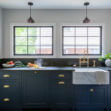
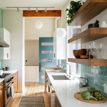
The house came to us full of bold, bright color. We edited out some of it (along with the walls it was on) but kept and built upon the stunning red, orange and yellow closet doors in the family room adjacent to the kitchen. That pop was balanced by a few colorful midcentury pieces that our clients already owned, and the stunning light and verdant green coming in from both the atrium and the perimeter of the house, not to mention the many skylights. Thus, the rest of the space just needed to quiet down and be a beautiful, if neutral, foil. White terrazzo tile grounds custom plywood and black cabinetry, offset by a half wall that offers both camouflage for the cooking mess and also storage below, hidden behind seamless oak tambour.
Contractor: Rusty Peterson
Cabinetry: Stoll's Woodworking
Photographer: Sarah Shields
This Cornish county home required a bespoke designed kitchen to maximise storage yet create a warm, fresh and open feel to the room.
Remodeled kitchen for a 1920's building. Includes a single (paneled) dishwasher drawer, microwave drawer and a paneled refrigerator.
Open shelving, undercabinet lighting and inset cabinetry.
This outdated kitchen came with flowered wallpaper, narrow connections to Entry and Dining Room, outdated cabinetry and poor workflow. By opening up the ceiling to expose existing beams, widening both entrys and adding taller, angled windows, light now steams into this bright and cheery Mid Century Modern kitchen. The custom Pratt & Larson turquoise tiles add so much interest and tie into the new custom painted blue door. The walnut wood base cabinets add a warm, natural element. A cozy seating area for TV watching, reading and coffee looks out to the new clear cedar fence and landscape.
Kitchen with no Island Design Ideas
5