Living Room Design Photos with No Fireplace
Refine by:
Budget
Sort by:Popular Today
1 - 20 of 4,460 photos
Item 1 of 3
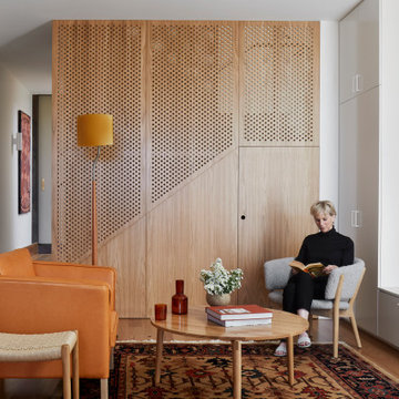
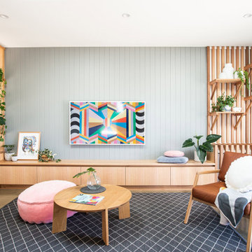
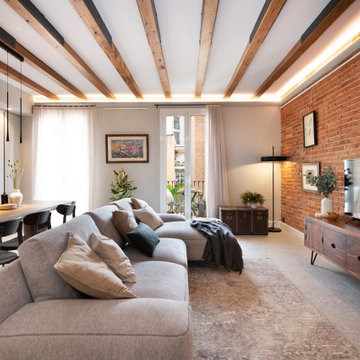
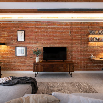
Hood House is a playful protector that respects the heritage character of Carlton North whilst celebrating purposeful change. It is a luxurious yet compact and hyper-functional home defined by an exploration of contrast: it is ornamental and restrained, subdued and lively, stately and casual, compartmental and open.
For us, it is also a project with an unusual history. This dual-natured renovation evolved through the ownership of two separate clients. Originally intended to accommodate the needs of a young family of four, we shifted gears at the eleventh hour and adapted a thoroughly resolved design solution to the needs of only two. From a young, nuclear family to a blended adult one, our design solution was put to a test of flexibility.
The result is a subtle renovation almost invisible from the street yet dramatic in its expressive qualities. An oblique view from the northwest reveals the playful zigzag of the new roof, the rippling metal hood. This is a form-making exercise that connects old to new as well as establishing spatial drama in what might otherwise have been utilitarian rooms upstairs. A simple palette of Australian hardwood timbers and white surfaces are complimented by tactile splashes of brass and rich moments of colour that reveal themselves from behind closed doors.
Our internal joke is that Hood House is like Lazarus, risen from the ashes. We’re grateful that almost six years of hard work have culminated in this beautiful, protective and playful house, and so pleased that Glenda and Alistair get to call it home.
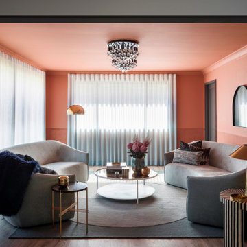
Main living space - Dulux Terracotta Chip paint on the upper and ceiling with Dulux suede effect in matching colour to lower Dado. Matching curved sofas with graphic black and white accents. All lighting custom designed - shop today at Kaiko Design
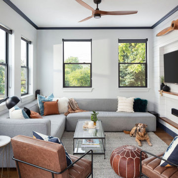
This 1910 West Highlands home was so compartmentalized that you couldn't help to notice you were constantly entering a new room every 8-10 feet. There was also a 500 SF addition put on the back of the home to accommodate a living room, 3/4 bath, laundry room and back foyer - 350 SF of that was for the living room. Needless to say, the house needed to be gutted and replanned.
Kitchen+Dining+Laundry-Like most of these early 1900's homes, the kitchen was not the heartbeat of the home like they are today. This kitchen was tucked away in the back and smaller than any other social rooms in the house. We knocked out the walls of the dining room to expand and created an open floor plan suitable for any type of gathering. As a nod to the history of the home, we used butcherblock for all the countertops and shelving which was accented by tones of brass, dusty blues and light-warm greys. This room had no storage before so creating ample storage and a variety of storage types was a critical ask for the client. One of my favorite details is the blue crown that draws from one end of the space to the other, accenting a ceiling that was otherwise forgotten.
Primary Bath-This did not exist prior to the remodel and the client wanted a more neutral space with strong visual details. We split the walls in half with a datum line that transitions from penny gap molding to the tile in the shower. To provide some more visual drama, we did a chevron tile arrangement on the floor, gridded the shower enclosure for some deep contrast an array of brass and quartz to elevate the finishes.
Powder Bath-This is always a fun place to let your vision get out of the box a bit. All the elements were familiar to the space but modernized and more playful. The floor has a wood look tile in a herringbone arrangement, a navy vanity, gold fixtures that are all servants to the star of the room - the blue and white deco wall tile behind the vanity.
Full Bath-This was a quirky little bathroom that you'd always keep the door closed when guests are over. Now we have brought the blue tones into the space and accented it with bronze fixtures and a playful southwestern floor tile.
Living Room & Office-This room was too big for its own good and now serves multiple purposes. We condensed the space to provide a living area for the whole family plus other guests and left enough room to explain the space with floor cushions. The office was a bonus to the project as it provided privacy to a room that otherwise had none before.
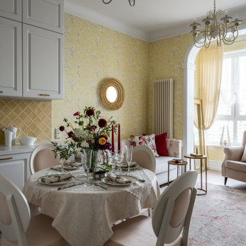
Светлая классическая кухня-гостиная, располагающая к отдыху и встрече гостей. Арочный проем придает пространству интерес и парадность, теплый желтый цвет обоев - уюта, цветочный рисунок уводит от каменных джунглей в загородные сады и покой.
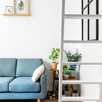
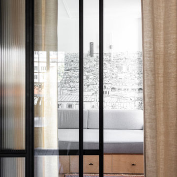
On arrive dans le salon par la partie la plus basse, qui est celle qui accueille la mezzanine.
L'espace est assez large pour laisser l'échelle de manière fixe, et non amovible. La vue est sympathique en arrivant, et surtout accueillante avec le salon.
Decor and accessories selection and assistance with furniture layout.
Le projet :
D’anciennes chambres de services sous les toits réunies en appartement locatif vont connaître une troisième vie avec une ultime transformation en pied-à-terre parisien haut de gamme.
Notre solution :
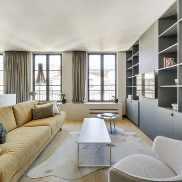
Nous avons commencé par ouvrir l’ancienne cloison entre le salon et la cuisine afin de bénéficier d’une belle pièce à vivre donnant sur les toits avec ses 3 fenêtres. Un îlot central en marbre blanc intègre une table de cuisson avec hotte intégrée. Nous le prolongeons par une table en noyer massif accueillant 6 personnes. L’équipe imagine une cuisine tout en linéaire noire mat avec poignées et robinetterie laiton. Le noir sera le fil conducteur du projet par petites touches, sur les boiseries notamment.
Sur le mur faisant face à la cuisine, nous agençons une bibliothèque sur mesure peinte en bleu grisé avec TV murale et un joli décor en papier-peint en fond de mur.
Les anciens radiateurs sont habillés de cache radiateurs menuisés qui servent d’assises supplémentaires au salon, en complément d’un grand canapé convertible très confortable, jaune moutarde.
Nous intégrons la climatisation à ce projet et la dissimulons dans les faux plafonds.
Une porte vitrée en métal noir vient isoler l’espace nuit de l’espace à vivre et ferme le long couloir desservant les deux chambres. Ce couloir est entièrement décoré avec un papier graphique bleu grisé, posé au dessus d’une moulure noire qui démarre depuis l’entrée, traverse le salon et se poursuit jusqu’à la salle de bains.
Nous repensons intégralement la chambre parentale afin de l’agrandir. Comment ? En supprimant l’ancienne salle de bains qui empiétait sur la moitié de la pièce. Ainsi, la chambre bénéficie d’un grand espace avec dressing ainsi que d’un espace bureau et d’un lit king size, comme à l’hôtel. Un superbe papier-peint texturé et abstrait habille le mur en tête de lit avec des luminaires design. Des rideaux occultants sur mesure permettent d’obscurcir la pièce, car les fenêtres sous toits ne bénéficient pas de volets.
Nous avons également agrandie la deuxième chambrée supprimant un ancien placard accessible depuis le couloir. Nous le remplaçons par un ensemble menuisé sur mesure qui permet d’intégrer dressing, rangements fermés et un espace bureau en niche ouverte. Toute la chambre est peinte dans un joli bleu profond.
La salle de bains d’origine étant supprimée, le nouveau projet intègre une salle de douche sur une partie du couloir et de la chambre parentale, à l’emplacement des anciens WC placés à l’extrémité de l’appartement. Un carrelage chic en marbre blanc recouvre sol et murs pour donner un maximum de clarté à la pièce, en contraste avec le meuble vasque, radiateur et robinetteries en noir mat. Une grande douche à l’italienne vient se substituer à l’ancienne baignoire. Des placards sur mesure discrets dissimulent lave-linge, sèche-linge et autres accessoires de toilette.
Le style :
Elégance, chic, confort et sobriété sont les grandes lignes directrices de cet appartement qui joue avec les codes du luxe… en toute simplicité. Ce qui fait de ce lieu, en définitive, un appartement très cosy. Chaque détail est étudié jusqu’aux poignées de portes en laiton qui contrastent avec les boiseries noires, que l’on retrouve en fil conducteur sur tout le projet, des plinthes aux portes. Le mobilier en noyer ajoute une touche de chaleur. Un grand canapé jaune moutarde s’accorde parfaitement au noir et aux bleus gris présents sur la bibliothèque, les parties basses des murs et dans le couloir.
Living Room Design Photos with No Fireplace
1