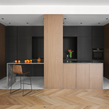
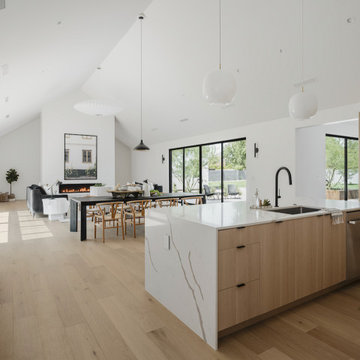
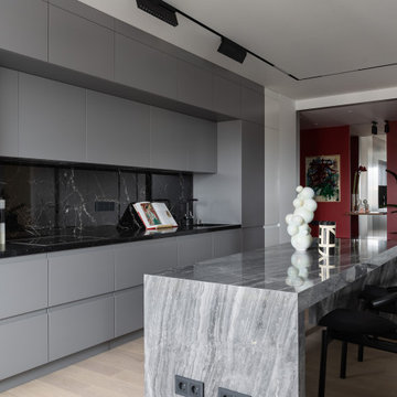
Open Plan Kitchen with Flat-panel Cabinets Design Ideas
Refine by:
Budget
Sort by:Popular Today
101 - 120 of 116,179 photos
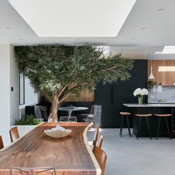
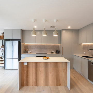
One wowee kitchen!
Designed for a family with Sri-Lankan and Singaporean heritage, the brief for this project was to create a Scandi-Asian styled kitchen.
The design features ‘Skog’ wall panelling, straw bar stools, open shelving, a sofia swing, a bar and an olive tree.
Чистый, лаконичный интерьер, с нестандартными объемными решениями и цветовыми акцентами по проекту дизайнеров из Краснодара, отвечает самым современным трендам в дизайне
История этого проекта не совсем обычна. Хозяева квартиры в Краснодаре – молодая семья с ребёнком. Только, встречи с дизайнерами и общение проходили только при участии главы семьи, так как покупка квартиры и сам процесс создания интерьера держались им в строгом секрете. «Наш заказчик хотел преподнести домочадцам роскошный сюрприз, поэтому семья не должна была ничего знать, - вспоминает Ярослав Алдошин. – При этом он максимально детально озвучил все свои предпочтения, что очень помогло нам при проектировании. Основной задачей стало создание лаконичного, технологичного пространства, с нестандартными объемными и конструктивными решениями. Никаких элементов классических стилей, все должно отвечать современным визуальным требованиям о дизайне».
Особенностью проекта стало объединение двух квартир площадью 73 и 58 кв. метров. У обоих квартир – хорошие исходные данные: панорамное остекление во всех жилых помещениях, минимальное количество несущих перегородок, высота 2,9 метра, расположение на 21 этаже, что обусловило великолепную изоляцию – комнаты буквально залиты светом. Из минусов: маленькая ванная и очень узкая, вытянутая хозяйская спальня. Для семейного времяпрепровождения дизайнеры организовали объединенную зону гостиной-кухни с большим кухонным островом, увеличили площадь ванной комнаты за счёт нежилой площади, тем самым получив дополнительное пространство для размещения большой душевой и ванны, а также предусмотрели детскую комнату. Недостатки спальни исправили с помощью расстановки мебели (кровать установили по длине комнаты, изголовьем к окну) и переносом стены глубь соседней детской. Благодаря этому, в помещении удалось получить комфортную, хорошо освещенную рабочую зону с полноценным письменным столом, а также установить системы хранения и макияжный столик. При выходе из спален ближайшее помещение — вместительная гардеробная (в ней хранится основной объем вещей), что очень удобно в плане эргономики: хозяевам не нужно метаться по квартире в поисках нужных вещей, на это уходит минимум времени. К слову, алгоритмы передвижения по квартире спроектированы так, что все пути жильцов ведут в гостиную, где каждый сможет заняться своими любимыми делами, от просмотра ТВ до кулинарных поединков и отдыха у камина с книгой в руках».
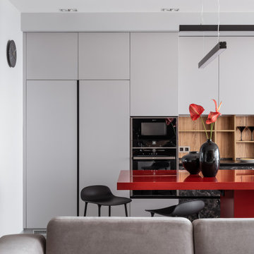
Интерьер построен на контрасте тёплых и холодных цветов, фактур и паттернов. Это создает необходимую динамику и наполняет пространство его смыслами. «Главной нашей задачей было создание тактильного контраста материалов, в котором современный человек нуждается не меньше, чем в цветовом и тональном разнообразии, - объясняет Ярослав, - Так, в общественной зоне мы использовали природные паттерны теплого дерева и холодного камня, нанесённые на крупноформатный керамгранит. «Местом встреч» выступает яркий, красного цвета кухонный остров. Красный цвет выбран не случайно! Василий Кандинский описывал красный как цвет, который производит впечатление почти необъятной мощи. Таким образом мы хотели подчеркнуть характер владельцев квартиры - успешных и сильных духом людей. Остров – главная точка притяжения этого пространства, соседствует с большим диваном из матового приятного на ощупь велюра, изготовленного по нашим эскизам. Обязательным условием было наличие камина в гостиной. Мы выбрали камин на биотопливе, который встроен в инсталляцию, отделанную фактурным кермогранитом и перетекающею в ТВ-зону, декорированную уже гладким керамогранитом. Световые сценарии продуманы, исходя из назначения каждой зоны. Мы предусмотрели разные типы осветительных приборов: технический потолочный свет, направленные светильники, мягкие подсветки в виде бра, торшеров и настольных светильников, создающих обволакивающую атмосферу и интересные световые акценты».
Фрагмент гостиной. «Мы не привыкли сильно ориентироваться на моду, ведь она быстро меняется, а хороший интерьер должен быть актуален долгие годы, без этого весь его смысл исчезает, - замечает Елена, - Поэтому работаем на нюансах, на правильном построении колористического решения, светового сценария, очень любим использовать тактильные контрасты. Все это (даже по результатам научных исследований) помогает комфортно находиться в интерьере долгое время и получать от этого удовольствие». Вазы ручной работы. На стене – часы Menu Norm
Центральный элемент интерьера — это, конечно же, большой кухонный остров красного оттенка, с консольным вылетом столешницы – центр притяжения и самое «тусовочное» место квартиры, где можно встречаться с родными после рабочего дня, проводить кулинарные поединки, устраивать шумные вечеринки или просто завтракать каждое утро. Диван изготовлен на заказ. На полу – керамогранит Colorker
Общий вид гостиной. Кухня изготовлена по эскизам авторов проекта. Обеденный стол и стулья AM.PM, La Redoute. Барные стулья, Normann Copenhagen. Подвесной светильник, SWG. Ковёр, Kover.ru
Портал камина облицован керамогранитом Porcelanosa, на полу в ТВ-зоне – керамогранитом URBATEK, кресло Saba Italia, торшер Artemide, каминная топка — салон Арт-Рум.
Коридор дизайнеры оформили как миниатюрную картинную галерею, ведь особое место в интерьере всей квартиры занимает искусство! «Для владельцев - это совершенно новый опыт, и они с большим удовольствием позволили нам наполнить пространство картинами, - отмечает Елена Алдошина, - Кроме того, мы предусмотрели дополнительные места для новых полотен, расположив в местах стыка потолка и стен специальные крепления для подвесов картин. Это избавит в будущем от сверления поверхностей, картины можно будет передвигать без ущерба для стен. Все картины, находящиеся в интерьере — работы Сергея Яшина».
В ванной комнате установлена умная стеклянная перегородка, которая изменяется от прозрачной к полностью непрозрачной
Особого внимания в спальне заслуживает тумба-изголовье кровати в виде инсталляции из цветного глубоко-синего стекла, за которой находится хорошо освещённая рабочая зона с письменным столом. «Прозрачный лист стекла установлен в тумбу-изголовье, отделанной декоративной штукатуркой, - объясняет Ярослав, - Внутрь изголовья мы заложили электрические выводы для подключения прикроватных светильников, чтобы все провода были спрятаны и не портили общую картину. Таким образом изголовье кровати и его стеклянная инсталляция стали самыми технически сложными элементами этого пространства». Синее кресло, Sits Mokka. Рабочее кресло, Zuiver Nikki. На столе – вазы LSA International. Светильники, ЦЕНТРСВЕТ. Прикроватные светильники, Artemide
Ванная комната. В качестве особого декоративного и конструктивного приёма выступает перегородка из smart-стекла. Таким образом, при желании можно «впустить» интерьер гостиной в ванную комнату и наоборот. По словам дизайнеров, все гости приходят в восторг при ее виде. Душевая перегородка выполнена из цветного стекла синего оттенка и в сочетании с плиткой в душевой с эффектом «кривого зеркала» образует броскую световую, цветовую и рельефную композицию. Лепной декор, Orac Décor. Керамогранит, Mirage (стены), Venis (душевая).
Детская комната. Мебель изготовлена на заказ. Бра, подвесной светильник, GROK
isola con piano snack in marmo collemandina
Cucina di Key Cucine
Rivestimento pareti in noce canaletto
Colonne e cucina in Fenix nero
Кухня без ручек с фрезеровкой на торце, сочетание темно-серого и белого фасада
Cocina alargada pero muy iluminada. Reforma completa de la cocina, abrimos la pared que separa con el salón para dar mayor funcionalidad al espacio, Electrodomésticos Siemens de alta gama y eficiencia energética. Muebles Santos y encimera Silestone.
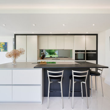
Keith met this couple from Hastings at Grand Designs who stumbled upon his talk on Creating Kitchens with Light Space & Laughter.
A contemporary look was their wish for the new kitchen extension and had been disappointed with previous kitchen plan/designs suggested by other home & kitchen retailers.
We made a few minor alterations to the architecture of their new extension by moving the position of the utility room door, stopped the kitchen island becoming a corridor and included a secret bookcase area which they love. We also created a link window into the lounge area that opened up the space and allowed the outdoor area to flow into the room with the use of reflected glass. The window was positioned opposite the kitchen island with cushioned seating to admire their newly landscaped garden and created a build-down above.
The design comprises SieMatic Pure S2 collection in Sterling Grey, Miele appliances with 12mm Dekton worktops and 30mm Spekva Breakfast Bar on one corner of the Island for casual dining or perching.
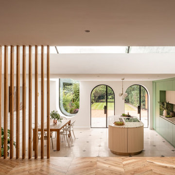
Amos Goldreich Architecture has completed an asymmetric brick extension that celebrates light and modern life for a young family in North London. The new layout gives the family distinct kitchen, dining and relaxation zones, and views to the large rear garden from numerous angles within the home.
The owners wanted to update the property in a way that would maximise the available space and reconnect different areas while leaving them clearly defined. Rather than building the common, open box extension, Amos Goldreich Architecture created distinctly separate yet connected spaces both externally and internally using an asymmetric form united by pale white bricks.
Previously the rear plan of the house was divided into a kitchen, dining room and conservatory. The kitchen and dining room were very dark; the kitchen was incredibly narrow and the late 90’s UPVC conservatory was thermally inefficient. Bringing in natural light and creating views into the garden where the clients’ children often spend time playing were both important elements of the brief. Amos Goldreich Architecture designed a large X by X metre box window in the centre of the sitting room that offers views from both the sitting area and dining table, meaning the clients can keep an eye on the children while working or relaxing.
Amos Goldreich Architecture enlivened and lightened the home by working with materials that encourage the diffusion of light throughout the spaces. Exposed timber rafters create a clever shelving screen, functioning both as open storage and a permeable room divider to maintain the connection between the sitting area and kitchen. A deep blue kitchen with plywood handle detailing creates balance and contrast against the light tones of the pale timber and white walls.
The new extension is clad in white bricks which help to bounce light around the new interiors, emphasise the freshness and newness, and create a clear, distinct separation from the existing part of the late Victorian semi-detached London home. Brick continues to make an impact in the patio area where Amos Goldreich Architecture chose to use Stone Grey brick pavers for their muted tones and durability. A sedum roof spans the entire extension giving a beautiful view from the first floor bedrooms. The sedum roof also acts to encourage biodiversity and collect rainwater.
Continues
Amos Goldreich, Director of Amos Goldreich Architecture says:
“The Framework House was a fantastic project to work on with our clients. We thought carefully about the space planning to ensure we met the brief for distinct zones, while also keeping a connection to the outdoors and others in the space.
“The materials of the project also had to marry with the new plan. We chose to keep the interiors fresh, calm, and clean so our clients could adapt their future interior design choices easily without the need to renovate the space again.”
Clients, Tom and Jennifer Allen say:
“I couldn’t have envisioned having a space like this. It has completely changed the way we live as a family for the better. We are more connected, yet also have our own spaces to work, eat, play, learn and relax.”
“The extension has had an impact on the entire house. When our son looks out of his window on the first floor, he sees a beautiful planted roof that merges with the garden.”
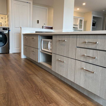
Pictured here is a closeup of the microwave and island storage which includes 4 pantry drawers, under cabinet microwave, drawers for pots and pans easily located near the cooktop and drawers for kitchen supplies, napkins, and other items. The kitchen was originally planned to mimic the location of appliances in her current kitchen to minimize re-learning of appliance locations. The only change was adding a trash cabinet between the fridge and the sink. A french door fridge allows someone in a wheelchair to easily access frozen and cold foods, while the water and ice dispenser on the outside of the door make it easy to stay hydrated rather than using the sink each time. She can roll up to the kitchen sink due to the recessed cabinetry under the sink or stand at counter height to put away dishes from the dishwasher. The dishwasher is ADA and very simple to use , and is raised off the floor so whether she is sitting or standing it's easier to reach. The gas cooktop has controls at the front making it easy to reach from the wheelchair and the exhaust fan above also has a control at the front. All cabinet door handles are D-shape, which makes them easy to grasp and there is plenty of electric outlets for charging phones, computers and small appliances. The kitchen island is table height at 30" so meal prep can be easily done in a wheelchair while guests and can be seated in a chair or wheelchair around the island. The dining chairs can also be turned around to add extra seating in the living room area. Pendant lights above the kitchen island light up the space, while recessed lighting in the kitchen and living room provide overall room lighting. There is also under cabinet lighting which makes the room glow at night! Wainscoting made of commercial grade material is strategically placed on sharp corners and exposed walls to reduce and minimize damage from the wheel chair, while creating a finished and complete look! We selected a free standing microwave to sit below the island, which is easy to use and is the same style as in her previous apartment. The island is 48" from the appliance wall, leaving ample space to open doors and maneuver around in the wheelchair and has easy access to the laundry area as well. We eliminated the pocket doors that had been in front of the laundry area for easy access, and since it was exposed, dressed it up with coordinating tile to the kitchen with additional cabinets above. There is a coordinating quartz counter on top of the washer and dryer for folding laundry or storing additional supplies.
Open Plan Kitchen with Flat-panel Cabinets Design Ideas
6