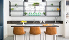
194,354 Red Home Design Photos


Graced with character and a history, this grand merchant’s terrace was restored and expanded to suit the demands of a family of five.
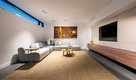
An eclectic and sophisticated kaleidoscope of experiences provide an entertainer’s retreat from the urban surroundings.
Fuelled by the dream of two inspiring clients to create an industrial warehouse space that was to be designed around their particular needs, we went on an amazing journey that culminated in a unique and exciting result.
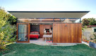
The unusual layout is particular to the clients’ brief whereby a central courtyard is surrounded by the entertainment functions, whilst the living and bedroom spaces are located on the perimeter for access to the city and harbour views.
The generous living spaces can be opened to flow seamlessly from one to the other, but can also be closed off to provide intimate, cosy areas for reflection.
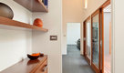
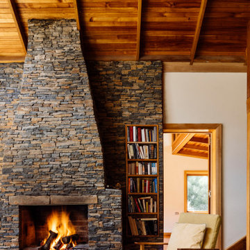
With the inclusion of materials such as recycled face-brick, steel, timber and concrete, the main living spaces are rich and vibrant. The bedrooms, however, have a quieter palette providing the inhabitants a variety of experiences as they move through the spaces.
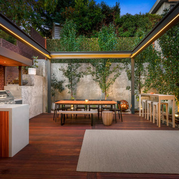
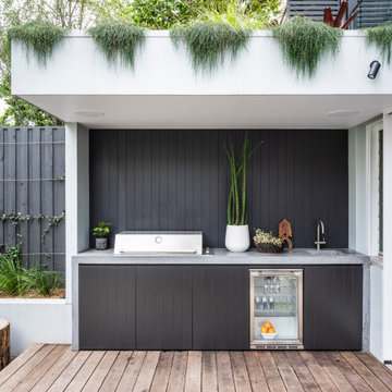
Beefeater Signature 3000SS Matte Steel Grey Corian Ash Concrete Outdoor Kitchen Ascot Vale
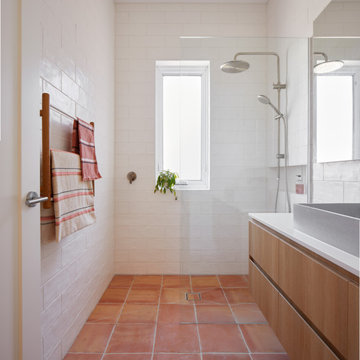
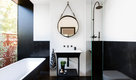
A unique, bright and beautiful bathroom with texture and colour! The finishes in this space were selected to remind the owners of their previous overseas travels.
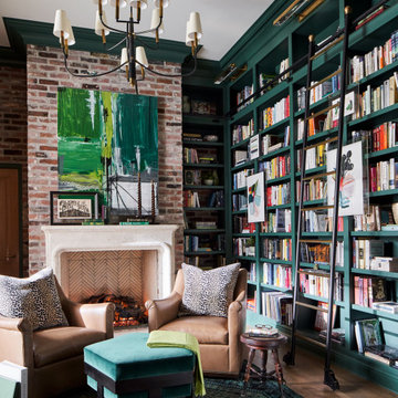
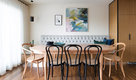
Warm and inviting this new construction home, by New Orleans Architect Al Jones, and interior design by Bradshaw Designs, lives as if it's been there for decades. Charming details provide a rich patina. The old Chicago brick walls, the white slurried brick walls, old ceiling beams, and deep green paint colors, all add up to a house filled with comfort and charm for this dear family.
Lead Designer: Crystal Romero; Designer: Morgan McCabe; Photographer: Stephen Karlisch; Photo Stylist: Melanie McKinley.
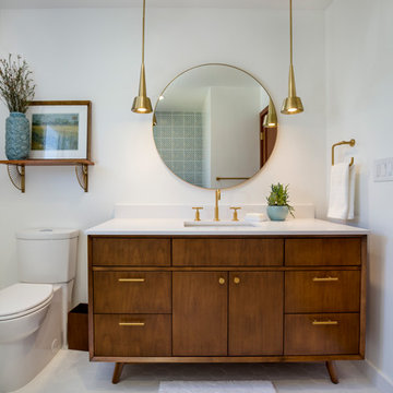
This project is a whole home remodel that is being completed in 2 phases. The first phase included this bathroom remodel. The whole home will maintain the Mid Century styling. The cabinets are stained in Alder Wood. The countertop is Ceasarstone in Pure White. The shower features Kohler Purist Fixtures in Vibrant Modern Brushed Gold finish. The flooring is Large Hexagon Tile from Dal Tile. The decorative tile is Wayfair “Illica” ceramic. The lighting is Mid-Century pendent lights. The vanity is custom made with traditional mid-century tapered legs. The next phase of the project will be added once it is completed.
Read the article here: https://www.houzz.com/ideabooks/82478496
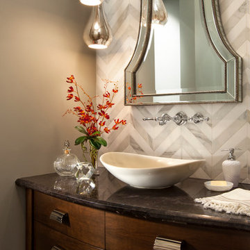
The powder room has a beautiful sculptural mirror that complements the mercury glass hanging pendant lights. The chevron tiled backsplash adds visual interest while creating a focal wall.

194,354 Red Home Design Photos
1