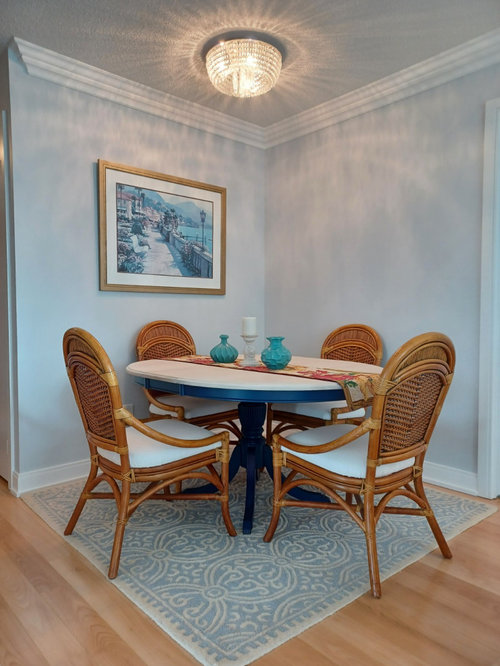
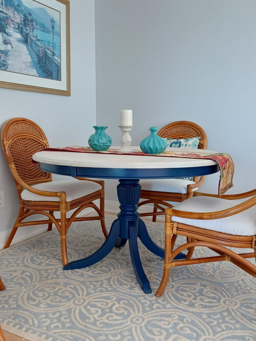
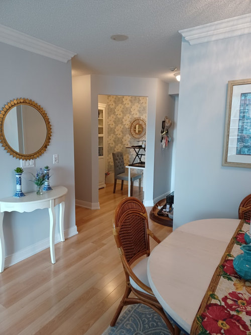
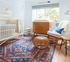
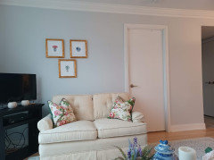
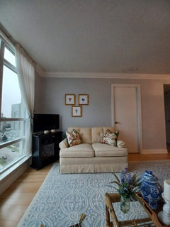
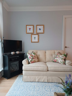
Big reveal (pics): Took all your advice...how did I do?!?
nancyfancy77
2 years ago
last modified: 2 years ago


Featured Answer
Sort by:Oldest
Comments (80)
Related Discussions
1940's NZ kitchen - small, awkward-ish layout.
Comments (121)I would suggest you take out the cabinet that is to the right of the stove and use it elsewhere in the house -- perhaps in the bathroom or dining room with a hutch above it. Then, I would suggest you have someone install a lazy susan cabinet in the corner between the sink counter and the stove, meaning you would move the stove down a bit and have a small cabinet/counter top to the right of the stove. I would suggest you have the cabinets refinished in white and then paint the walls a pastel you like. If you would prefer white walls, then add white-painted crown molding and paint the ceiling a light neutral blue, such as Sherwin Williams Niagara Falls Blue. Then, I would suggest you choose a favorite accent color and use this sparingly in accessories like towels, pot holders, small vases or floral arrangements, and a valence above the triple windows. For a genuine 1940s look, you might have white ceramic square tiles with a rectangular red border installed as a back splash behind and above the stove. If you are replacing counter tops, I would suggest a light color such as white with a beige or light grey vein or striation for some sort of pattern. You might be able to find the same color and design in floor tile OR opt for a wood floor as another poster suggested....See MoreWhat colours do I use?
Comments (57)Hi anne, that's what I was originally thinking, my issue is what colour I use for the 'pop' :) I keep coming back to a teal/turquoise colour (it's one of my favourite colours!!), I love blues, purples, teal/turquoise - many on here have suggested yellow but I'm really not sure about it. Here in New Zealand we're in Autumn, nearing Winter so uncertain about the yellow. I found these cushions that I've fallen in love it, and wondering how I could make these work.. do I try teal and mustard together, as an interior designer suggested?...See MoreCurb appeal indecision... advice please!
Comments (91)Sorry I am so late coming to your site - you are an inspiration to all, homeowners and advisers alike. For your planting advice, I suggest you call Merrifield Garden Center to see if they will come out your way. They currently have wonderful garden centers in Merrifield and Fairfax (both in Fairfax County) and a new one in Gainesville, but they may come further south to wherever you reside. (www.MerrifieldGardenCenter.com) Even if they don't send designers to your area, they are worth a trip to see their huge selection for a day of pleasure and inspiration, or to pick up some plants. Most of my clients are in the Fairfax and greater Washington area, but I am currently living out west below Front Royal, VA on the Shenandoah mountainside - wonderful views. cascio.offsite@gmail.com...See MoreNot sure what to do to my kitchen
Comments (17)Lighting - pendants over the servery bench should be another feature that complements your chosen kitchen surfaces. So whilst I love the copper pendants in picture 1.. They could work depending on the rest of your decor and would be a highlight in a neutral white/timber kitchen = Good! If you choose copper you would complement it with a couple of copper bench top items. These are beautiful! (I collect copper because I love it, my kitchen pendants are silver, I renovated to sell in the next 3-5 years) You will see a picture starting to form in your mind and there is nothing wrong with making a statement with your lighting. I found that when I wasn't sure I would get a very strong sense of what was right and what was wrong for a space, then common sense or passion would determine the outcome! Here are another couple that might work, look her on Houzz under lighting, search pendants, then have fun looking!Timber tones with black or white to complement your cabinets... or Statement white pendants for a bit of quirky fun! Your personality can be reflected in your lighting and accessories creating that point of difference from the predictable white on timber look. Plus don't forget the power of greenery to punctuate the theme!...See More
nancyfancy77
2 years agonancyfancy77
2 years agonancyfancy77
2 years ago
Lizzie Borden
2 years agoheatherabramski
2 years agonancyfancy77
2 years agoloobab
2 years agolast modified: 2 years agonancyfancy77
2 years agolast modified: 2 years agocda1028
2 years ago
KW PNW Z8
2 years agonancyfancy77
2 years agolast modified: 2 years agoloobab
2 years ago
chinacatpeekin
2 years ago
Mino Cat
2 years agolast modified: 2 years agocda1028
2 years agocda1028
2 years agonancyfancy77
2 years agocda1028
2 years agocda1028
2 years agonancyfancy77
2 years agonancyfancy77
2 years ago
freedomplace1
2 years agocda1028
2 years agonancyfancy77
2 years ago


Sponsored
KW PNW Z8