Houzz Tours
Popular Houzz Series
Popular Houzz Series
Appears in
See also
Fun HouzzFrom The ProsHouzz Around The WorldProject Of The WeekStickybeak Of The WeekQuizzesCreatives At HomeAt Home With...Best Of The WeekRoom Of The WeekDesigner Profiles3 Things I Wish My Clients KnewHow Do I...Buyer's GuidesExpert EyeInnovation AlertSo Your Style Is...Spotted!Picture PerfectBefore & AfterBudget BreakdownHome TimeMade Local
Architecture
Auckland Houzz: A Multi-Generational Home on a Tight Block
See how an architect created separate yet connected dwellings for two generations on a small block in a heritage zone
After finding architect Kate Beilby of Milieu Architecture + Design on Houzz, these homeowners sought a clever solution for their small section of a subdivided block in Mount Albert, New Zealand. Their brief called for a home that included two separate dwellings – one for themselves and another for one set of their parents, who live in New Zealand for part of the year – which gave everyone a sense of privacy, while allowing for times of togetherness. Read on to learn all about the architect’s inspired solution.
Situated on a rare subdivided block in an area of predominantly interwar period bungalows with tight heritage restrictions, the new home also needed to get the tick of approval from council that it would blend sympathetically with the existing streetscape.
Looking to build? Find an architect near you on Houzz who has experience working with your local council
Looking to build? Find an architect near you on Houzz who has experience working with your local council
Ground-floor plan.
The couple sought a stylish, low-maintenance and contemporary home for their compact suburban block that would accommodate themselves and their much-loved dog in the main house, with a separate dwelling for one set of their parents.
“They wanted to maximise potential views to Mount Albert and the Waitakere Ranges and incorporate full-height glazing and high stud ceilings to maximise the sense of space and connection to the garden,” says Beilby. “Privacy from the neighbours was also a must, along with privacy between the two generations living in the house.”
First-floor plan.
“In terms of spatial requirements, the main house needed to have three bedrooms, two bathrooms, a study and a gym, along with an open-plan kitchen/living/dining space. The apartment was to have one bedroom, one bathroom, plus a small kitchen, dining and living space,” she says.
“In terms of spatial requirements, the main house needed to have three bedrooms, two bathrooms, a study and a gym, along with an open-plan kitchen/living/dining space. The apartment was to have one bedroom, one bathroom, plus a small kitchen, dining and living space,” she says.
San Selmo Aged Red bricks: The Brickery.
Beilby started by creating diagrams of the site layout, looking at where she could place the main house and apartment to ensure that both had a distinct entry point, privacy and a sunny outdoor space. At the same time, she looked for opportunities to capture the mountain views.
Beilby started by creating diagrams of the site layout, looking at where she could place the main house and apartment to ensure that both had a distinct entry point, privacy and a sunny outdoor space. At the same time, she looked for opportunities to capture the mountain views.
Beilby’s solution involved separate, overlapping volumes: a kitchen/living/dining space downstairs where everyone can congregate, a bedroom suite for the homeowners above the garage, and a parent’s home encased in a single-storey brick form at the front of the site.
“The main house and the separate apartment were designed so they could function separately,” she says. “They have distinct entries, and the apartment has its own kitchen, laundry and a private garden. The idea was that the parents could live in the apartment, but it would also provide the opportunity to be rented out, so privacy between the two was imperative.”
“The main house and the separate apartment were designed so they could function separately,” she says. “They have distinct entries, and the apartment has its own kitchen, laundry and a private garden. The idea was that the parents could live in the apartment, but it would also provide the opportunity to be rented out, so privacy between the two was imperative.”
Ivory Oak Shinnoki veneer: VidaSpace; joinery top in Airy Concrete: Caesarstone; Ollo Seven Cluster pendants: Soktas.
Beilby designed the kitchen/living/dining area at the rear of the main house so it could be opened to the outdoor living space in the warmer months and closed to create a cosy retreat in winter.
“The full-height sliding doors define the dining space and fully open up to the deck. The living area is adjacent to it, but it’s more of an enclosed space for relaxing and watching television.
“The joinery is a continuation of the timber-lined wall that starts at the entry, runs along the stair and wraps into the living area. For the low storage unit, we used the same Caesarstone Airy Concrete top as in the kitchen to create a sense of cohesion between the spaces,” she says.
“Working in a heritage area meant we needed a design that was sensitive to the locale, but also reflected our client’s modern tastes.
“For the exterior, we chose a material palette of aged red brick [which was carried through inside], paired with painted white timber weatherboards and profiled metal to reflect the predominant materials used in the local area.
“The timber is used horizontally on the lower level and vertically on the upper level for a modern twist. The asymmetrical gable of the upper level is a play on the traditional hipped and gabled rooflines seen locally,” says Beilby.
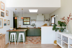
Green cupboard fronts in Melteca Spinifex laminate; Ivory Oak Shinnoki veneer: VidaSpace; benchtops in Airy Concrete: Caesarstone; SETA Ghiaccio moscaic splashback tiles in Matt White: Artedomus.
The Italian-made bricks, which have a soft, rustic aesthetic inspired by recycled brickwork, were a big-ticket item within the project, but one that both client and architect felt was worth splashing out on. “We all fell in love with these bricks and it was easy to justify the decision to include them as they were such an important feature and one that would last a lifetime,” says Beilby.
The Italian-made bricks, which have a soft, rustic aesthetic inspired by recycled brickwork, were a big-ticket item within the project, but one that both client and architect felt was worth splashing out on. “We all fell in love with these bricks and it was easy to justify the decision to include them as they were such an important feature and one that would last a lifetime,” says Beilby.
To visually connect the interior and exterior of the home, while creating the warm and inviting feel the couple was after, Beilby ran the outdoor brick right through to the kitchen, layered with timber veneer and lightly polished concrete flooring.
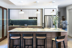
“Our client sought a modern, open-plan kitchen located to make the most of the morning sun,” she says of the cooking area in the main house. “They wanted the kitchen to be a social space, with a wine fridge and island seating.”
Curved upper cabinetry, which conceals the range hood and storage, adds softness to the main kitchen and echoes the curved shape of the planters at the front of the house.
Browse more images of kitchens featuring green
Browse more images of kitchens featuring green
Axle sofas: Kovacs.
“Designing a home for multiple generations of one family was a unique experience, but one that I think will become more common as Auckland densifies,” says Beilby.
“Designing a home for multiple generations of one family was a unique experience, but one that I think will become more common as Auckland densifies,” says Beilby.
Polished concrete floor finish: Mega Floors.
“The polished concrete floor has a special ‘Beach House’ finish, which is a very light grind that creates a softer and more subtle effect than traditional polished concrete,” she says.
To evoke the sense of volume that the client sought, Beilby designed a double-height ceiling between the entry and kitchen that soars 6.7 metres high, and a 2.9-metre-high ceiling throughout the rest of the lower level.
Noomi Spange handpainted Indigo Green wallpaper: Artisan; tap with gunmetal finish: ABI Interiors.
A sense of glamour was top of the client’s wish list for their powder room on the lower level in the main house. Tucked under the stairs, it has a concealed entrance, making the eye-catching wallpaper all the more impactful as you enter.
A sense of glamour was top of the client’s wish list for their powder room on the lower level in the main house. Tucked under the stairs, it has a concealed entrance, making the eye-catching wallpaper all the more impactful as you enter.
The client was open to creative suggestions throughout the design process, says Beilby. “Their one request was for a place to display their Lego – seen here,” she says.
Brera Grassloth Chinon wallpaper: Designers Guild; pendant lights: ECC.
Layers of rich navy in the textured wallpaper and bedding create a cosy and dramatic feel in the main bedroom. “The client wanted this spot to be soft, comfortable and relaxed – a true retreat,” says Beilby.
Layers of rich navy in the textured wallpaper and bedding create a cosy and dramatic feel in the main bedroom. “The client wanted this spot to be soft, comfortable and relaxed – a true retreat,” says Beilby.
European Oak flooring: VidaSpace.
The sunroom off the main bedroom was designed to feel like a balcony so the owners can enjoy the spectacular sunsets over the Waitakere Ranges to the west.
The sunroom off the main bedroom was designed to feel like a balcony so the owners can enjoy the spectacular sunsets over the Waitakere Ranges to the west.
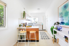
Pictured here, the 50-square-metre apartment for the client’s parents cleverly incorporates a bedroom, bathroom, living/dining space, an integrated laundry, plus an outdoor area and a private entrance.
Your turn
Are you as impressed with the architect’s space-saving solution as we are? Tell us in the Comments below. And don’t forget to save these images, like this story and join the conversation.
More
Seeking advice on designing a multi-generational home? Don’t miss this story – All in the Family: 4 Tips for a Thriving Multi-Generational Home

House at a Glance
Who lives here: A couple and their dog live in the main house, and one set of the couple’s parents live part of the year in the separate apartment connected to the main house
Location: Auckland, New Zealand
Number of bedrooms and bathrooms: Three bedrooms and two bathrooms in the main house; one bedroom and one bathroom in the apartment
House size: The main house measures 140 square metres and the apartment measures 50 square metres
Architect: Kate Beilby, architect and director at Milieu Architecture + Design
Interior designer: Mary-Ellen Hinton at Hello Saturday Design
Builder: Qualified Building Solutions
Kitchen cabinetry: Kitchen Link
“After reading client reviews on Houzz, our client initially approached us to do a renovation of their existing home. However, not long after this a section became available in their neighbourhood and we turned our attention to a new build,” says Beilby.