Grey Matters: 8 Monotone Marvels in the Kitchen
Look to subtle undertones and the right mix of cool and warm tones in your colour choices

Grey has been the ‘it’ colour in decorating for a few years now. But that doesn’t mean you can walk into a paint store and grab any can labelled ‘grey; and create a beautiful, inviting kitchen. You’ll want to pay attention to undertones and warm and cool tones to strike the right balance for your space and the surrounding materials. Here are a few examples of grey kitchens that get it right.
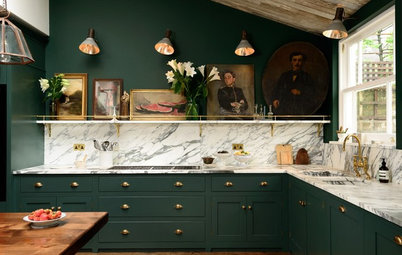
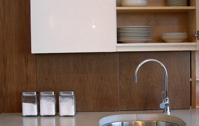
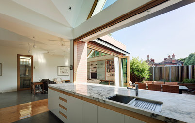
Adding a new splashback can have the greatest impact on the overall warmth of an existing kitchen. These warm blue-green glazed tiles bring life and balance to the grey-toned cabinets, which work here because of the warm light pink undertones. But the ‘Fantasy Brown’ quartzite benchtop and oak floorboards play a role as well in adding warmth. It’s worth noting that there is no sheen to these floorboards. When adding a soft grey stain, the designer used a Rubio monocoat to create the wonderfully dull finish.
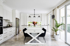
Here the designer also used warm grey-pink cabinets, but with a slightly deeper pink undertone than in the previous kitchen. She then warmed things up even more with warm-toned hardwood floors, decorative accessories and a fabulous vintage bench.
See more grey kitchens
See more grey kitchens
This kitchen strikes the right mix of warm and cool tones and architectural finishes. Notice that the cabinetry is still warm even though a matt grey stain has been applied to the straight-grained oak. The greys in this kitchen lean strongly toward the warm shades. The organic texture of the oak is permeating through the stain. The sandstone tile floor further adds texture to create a sense of warmth.
Here the sandy tones of the benchtops (Caesarstone’s ‘Lagos Blue’ in a honed finish) complement the grey wood paneling cabinetry. The deep red floorboards are actually an oak with a custom stain brimming with warmth.
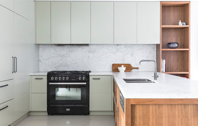
Here, the milk-coloured Caesarstone benches establish contrast greys in the cabinetry, which lean toward the blue-violet side – lighter for the island and darker for the wall cabinets. The far wall cabinetry, in the dark grey laminate, has both a high gloss and wood grain finish, and I find the contradiction of the two extremely interesting. A large expanse of warm wood on the floor provides the perfect balance of tones.
These cabinets offer slightly cooler, blue-violet undertones. The wonderfully veined and varied granite benches promote similar tones while the vintage refinished red oak floors bring the warmth, for the balance of warm and cool we crave. Meanwhile, a colourful vintage rug adds personality.
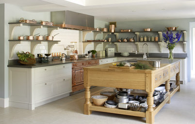
Rugs take the floor in kitchens
Rugs take the floor in kitchens
We designed this custom pocket kitchen within a three-square-metre footprint. We had to think of it in terms of a yacht or a Gulfstream galley for its overall design and efficiency. In order to meet the client’s requirements, we included a mini fridge and a 61-centimetre gas oven by Bertazzoni.
Our client requested a ‘quiet’ kitchen, especially since it would be seen through the custom French doors. We used a soft warm grey with pink undertones and a translucent stain applied to custom milled quarter-sawn white oak.
The star of this kitchen is the ‘Silver Stravos’ granite slab we used for both the benches and the splashback. The cuts were meticulously mapped out to incorporate the most active and deepest purple portions of the slab. We used a milky white 120 x 120 centimetre ceramic tile for the floor.
We painted the walls in the palest shade of lavender (Fine Paints of Europe’s ‘Delicious’). The ceiling is ‘Wet Porcelain’, also by Fine Paints of Europe.
The greys here are an interesting combination. The lighter cabinets lean toward green while the darker uprights venture into the blue-violet territory. Designing the cantilevered dining bench to drop from the dark cabinet is brilliant. The absence of sheen on all the architectural finishes is sublime.
The fine oak wood plank flooring oiled in grey is an ideal blend of warm and cool, while the touch of teal on the extruded metal exterior door frames are a welcome surprise.
By all means, embrace grey in your kitchen. But if you’re concerned about a too-cold, un-stimulating experience, be sure to consider several different options for bringing in warmth and balance.
Tell us
Have you fallen in love with the many shades of grey? Tell us how you’ve used them in your home in the Comments below.
More
Read more stories about colour

Sponsored