Houzz Tours

Houzz Tour: A House That Pops With Simple Forms and Crayon Colour
The design of this Adelaide house passes tests of comfort, style and sustainability with flying colours

Colours and shape are two of the most noticeable and recognisable attributes in the world, and are often how we organise the world around us. That’s certainly the case in Crayon House in Adelaide, South Australia, designed by architecture practice Grieve Gillett Andersen. Composed of a series of elemental shapes and saturated primary and secondary colours, Crayon House is all about smart simplicity. The build was driven by the client’s passion for sustainability, with an overarching idea that the simpler you make it, the more likely you are to use it.
“The brief was to create a modern home with simple, clean lines and compelling forms; to bring a sense of light and spaciousness with natural and colourful materials,” Andersen says. Though the build was driven in large part by the client’s passion for sustainability, she says there still had to be both communal and private spaces that would grow with the family.
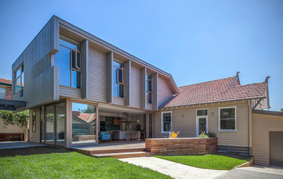
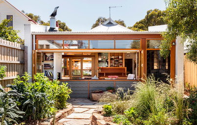
Crayon House is composed of two contrasting yet complementary forms that distinguish between private and public space. The timber structure at the front houses two bedrooms, two bathrooms, a study and a powder room. The metal structure at the rear accommodates an open-plan kitchen, dining and living area.
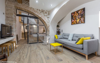
The entrance is via a timber-decked path down the side of the house, where the front door slots between the timber and metal structures. The door opens to a glass entry that blurs the lines between inside and outside.
The private spaces are configured within the timber structure, to the right of the glass entry. Two bedrooms, separated by a study, are organised along the north of the building where they take advantage of garden views and winter light. Both bathrooms and the utilities are arranged on the south side.
High-level windows along the corridor are openable, and an L-shaped, yellow-tinted window at the end of the structure creates interplays of light. “In the early morning light, a yellow shard through the front window saunters across the white walls along the corridor,” says Tim Fenton, senior architect.
High-level windows along the corridor are openable, and an L-shaped, yellow-tinted window at the end of the structure creates interplays of light. “In the early morning light, a yellow shard through the front window saunters across the white walls along the corridor,” says Tim Fenton, senior architect.
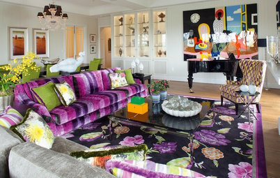
The client drove the vivid colour palette for the house right from the start of the project. Throughout the house, primary and secondary colours are bold and bright against white walls, and used to create vibrant, inviting spaces. “There is a playfulness between light and colour that leaps and dances on the walls, roofs and doors depending on the change of seasons,” Fenton says.
The bathrooms and utilities are configured on the south side of the timber structure, where they have reduced external windows to prevent heat loss, but added internal windows and open doorways to borrow light.
The bold colours continue throughout the bathrooms. One shower is tiled with vibrant red and white squares, which are reflected in the circular mirror, as is the canary-yellow window frame and sill.
The other bathroom also plays with colours and shapes. Royal blue joinery is set against the sunshine yellow doors and light effects, while square and rhombus-shaped tiles abut each other on the walls around the vanity.
Sleek Concrete 4003 bathroom benchtop: Caesarstone
Sleek Concrete 4003 bathroom benchtop: Caesarstone
The glass entry connects the front and rear of the house.
The metal building contains the public spaces: an open-plan kitchen, living and dining area with glass doors on the northern side that extend the living space outside. “The form flows outside onto multiple decks projecting out from the house, which are used for relaxing, swinging, bike riding, barbecues and beer-making experiments,” Andersen says.
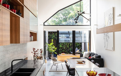
There’s certainly no shying away from colour here either. The kitchen has bright green benchtops and splashback that are softened by timber joinery and accented with dark green laminates.
Like the front structure, the rear building has a simple geometric form. “The solid and monochromatic main barn-shape forms were designed to balance the bright pops of colour placed intentionally throughout the interiors and exteriors,” Andersen says.
The buildings are composed of raw materials that change with age, such as timber, galvanised metal and copper. In contrast to the saturated primary and secondary colours inside, the exterior has a warm autumnal colour palette of yellow, orange and red. “It complements the natural materiality of the timber, especially as it turns silver and grey with age over time,” Andersen says.
Fielders Nailstrip cladding and roof in ‘Windspray’: Colorbond
The building structures surround a low-maintenance lawn and garden with herbs, vegies and plants that encourage birds. “The garden design [by WAX Design] circles the house creating lovely backdrops, vistas and functional zones,” Fenton says.
Retractable sails and shades installed along the northern side allow for maximum winter solar ingress to warm up the concrete slab.
Retractable Soltis shades: SunBlinds
Retractable sails and shades installed along the northern side allow for maximum winter solar ingress to warm up the concrete slab.
Retractable Soltis shades: SunBlinds
“Environmental considerations proved to be very important for the project, and the question the clients often asked was: would the sustainable elements make it less enjoyable as a family home,” Fenton says.
Wanting to achieve sustainability, comfort and functionality, the new house was sited north to provide as much light exposure as possible and to optimise winter solar gain. The eaves were reduced to maximise the winter sun; openable windows and walls provide cross ventilation and cooling; and the metal cladding on plywood reflects the summer sun.
Shiplapped Pacific Teak cladding with oiled finish: Woodform Architectural
Red horizontal and vertical outdoor shades provide sun protection over the large deck area in summer. In addition, a 42,000-litre tank hidden below the front yard supplies water for the house and garden, and automated irrigation reduces water use.
Crayon House demonstrates that simple can certainly be better. Going to back to basics, the family home is sustainable, comfortable, functional and – best of all – colourful.
Crayon House demonstrates that simple can certainly be better. Going to back to basics, the family home is sustainable, comfortable, functional and – best of all – colourful.

Who lives here: A family of three
Location: Goodwood, SA
Year built: 2016
Size: 200 square metres; 2 bedrooms, 2.5 bathrooms and brewing shed
Architect: Grieve Gillett Andersen
Project Team: Dimitty Andersen (director), Tim Fenton (senior architect), Samuel Jeyaseelan (graduate of architecture), Garth Davos (technician)
Awards: Shortlisted for the Australian Institute of Architects (SA Chapter) Architecture Awards – Residential Architecture – Houses (New)
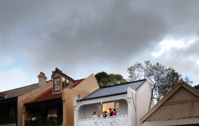
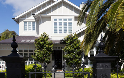
Crayon House sits on a quiet street in Goodwood, an inner-city suburb of Adelaide. The project involved demolishing an existing residence to build a new house, one that would fit in with the streetscape of varying heritage and character dwellings.
“With pitches and points, spaces and setbacks, and rhythms in harmony, the house has a lively conversation with its surrounding street companions, but has a language that’s warm and familiar,” says Dimitty Andersen, director at Grieve Gillett Andersen.