Houzz Tour: Parisian Apartment Inspired by an Almodóvar Film
Architects found on Houzz design a home for cinema lovers that pays subtle homage to the Spanish director

Home offers a kind of primordial comfort — especially for those who are often on the road. This is a sentiment shared by Charles Coutris, manager of L’Indochineur, a firm that commissions jewelry and tableware from artists in Vietnam. Coutris bought a 538-square-foot, two-room apartment with a dated interior in Paris not far from the Place Denfert-Rochereau, which tourists might recognize as the location of the Paris Catacombs.
The apartment hadn’t been renovated since the building was constructed in the ’70s, so Coutris asked the Lagom agency, led by Déborah Calfond Bettan and Avinoam Bettan, for a complete renovation after spotting their work online and in an article on Houzz. The Bettans had everything Coutris was looking for: a passion for contemporary and graphic spaces, a love of cinema and an understanding of the importance of good sleep.
The apartment hadn’t been renovated since the building was constructed in the ’70s, so Coutris asked the Lagom agency, led by Déborah Calfond Bettan and Avinoam Bettan, for a complete renovation after spotting their work online and in an article on Houzz. The Bettans had everything Coutris was looking for: a passion for contemporary and graphic spaces, a love of cinema and an understanding of the importance of good sleep.
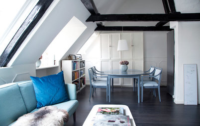
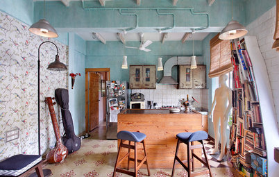
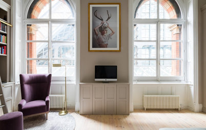
After: The apartment’s entrance had previously opened out into a straight and dark hallway, with the French doors of the living room directly opposite. Now it opens out onto a large, attention-grabbing open space running all the way to the picture window in the living room, which is partially separated into zones by the divider.
At the back, the entrance closet was replaced by a new storage unit in oak-veneered plywood that offers a drop zone in the entrance and hides the internet router from view. Two other storage units in white painted MDF store coats, among other things.
Shop for storage furniture on Houzz
At the back, the entrance closet was replaced by a new storage unit in oak-veneered plywood that offers a drop zone in the entrance and hides the internet router from view. Two other storage units in white painted MDF store coats, among other things.
Shop for storage furniture on Houzz
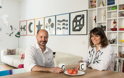
The architects replaced the hallway wall on the living room side with a very light divider that immediately conveys the project’s geometric feel. Designed by the Lagom architects, this bookshelf-divider artistically partitions the space without blocking the light. “It was absolutely necessary to frame this extraordinary view over all of Paris,” Déborah says.
The small, asymmetrical shelves suspended on thermo-lacquered aluminum tubes display beautiful objects that are valuable to the owner.
Those who have seen the film Pain and Glory will notice that the quirkier splashes of vibrant color from the main character’s apartment are missing here. No red kitchen with a blue backsplash, no living room with oversize paintings in exuberant colors. All that the architects took from these scenes is the graphic feel of Almodóvar’s beloved compositions and the deep green color of the main character’s velvet sofa. In fact, this is what gave them the idea for the pine green divider frame, which is softened by the light oak shelves and contrasts with the white of the walls.
New to home remodeling? Learn the basics
After: Only the typical 1960s-’70s checkerboard parquet floor was carefully preserved for its geometric look. The picture windows were replaced with sliding windows in frames that are white on the interior side and black on the exterior to respect the visual unity of the facade.
The architects dreamed up two linear storage units to install the home cinema system at the back of the room.
The architects dreamed up two linear storage units to install the home cinema system at the back of the room.
Avinoam is passionate about technology and took charge of installing the home cinema with a large immersive screen and surround sound. The top unit hides an HD projection screen, while a surround sound system is supported over Wi-Fi with an amp. Three speakers are embedded into the top and bottom cabinets. Two more speakers at the back return the sound, he says.
Manufactured by a carpenter from the firm Ergo-Logic like the rest of the custom furniture in the apartment, these linear oak-veneer cabinets end in a curved beveled edge that softens their outline.
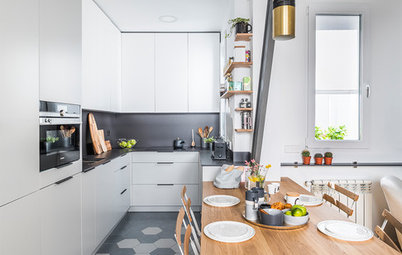
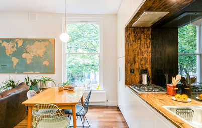
After: The cabinet bases were paired with doors in a pine green that echoes that at the entrance. In a nod to the sky-blue tile on the main character’s kitchen backsplash in Pain and Glory, Déborah proposed a 2-by-2-inch-square tile to underscore the graphic look of the place. The matte ceramic covers the backsplash and counter continuously. Note also the pretty detail of the edging.
The upper cabinets are about 16 inches deep. The white cabinets align over the green cabinets, giving the impression of a perfect fit. “The video projector is hidden among them,” Déborah says.
It is impossible to finish the description of this kitchen without touching on the lighting system. “We proposed it to keep with the graphic spirit, and Charles adored it. Moreover, he had spotted it in an article about one of our other projects. In the end the calculations were complicated, but it’s Avi who worked on them,” she says with a smile.
Using the customizable lighting system meant Avinoam had to calculate each linear yard of cabling that would be required, working from the plans the architects had drawn earlier. Equipped with a dimmer, this system can provide a bright or cozy light depending on the needs of the moment.
Opening up a kitchen is a classic move, but two challenges nonetheless required the architects’ attention.
First of all, the piping was difficult to move. “We decided from the beginning to take it on by looking for a full-height radiator that could subsume the piping while playing divider,” Déborah says. The radiator is installed on square plates, which pick up the pattern of the backsplash.
This challenge, which the architects spotted during the first visit, led to one of the leitmotifs of the decor. “These pipes were actually what guided us to the design of the suspended furniture,” she says.
The second problem had to do with the floor in the old kitchen. “We decided to extend the checkerboard parquet with a new parquet that’s as similar as possible, and then create a carpet of tile along the cupboards,” she says. “We created a broken-up transition by scattering tiles here and there in the parquet. Finding the right parquet and tiles of the same dimensions as the original pattern was not exactly easy.”
Coutris likes uncluttered settings with a few beautiful objects. He selected the dining furniture himself, finding a 1950s table in wood and formica, completed by design icons: the famous Y Chairs (Wishbone CH24) from Hans Wegner in rope and walnut.
They arranged the workspace he asked for to the right of the cabinet that conceals the combined fridge. It takes the form of an elegantly suspended piece of furniture.
The owner usually leaves his laptop here, but for the photo shoot he displayed tableware made by artisans in Hanoi.
After: Note the way contemporary touches have been integrated into the design: out with the big spotlights, in with LED strips placed under the kitchen cabinets. Instead of the stainless steel sink and its big draining board, a white ceramic sink has been installed directly into the tiled countertop.
Moving the bathroom walls cut the hallway down to 6 feet in length, lending more space to the entrance. The electric meter was hidden in the closet. A door makes it possible to isolate the private areas from the rest of the apartment.
After: The suspended toilet, mini sink in concrete and sliding door have propelled this little corner into modernity.
After: Focused on the magnificent view, the restrained bedroom design centers on light and pleasing shades, reflecting the owner’s minimalist philosophy. The thick wall-to-wall wool carpet is pleasant to the touch. The bed cover picks up the square motif of the backsplash. Two large rattan floor lamps complete this composition, which puts emphasis on the essential.
The architects installed a wireless Sonos Play 1 speaker in the bedroom. “Wherever Charles may be in the apartment, the music he’s listening to follows him,” Déborah says.
The architects installed a wireless Sonos Play 1 speaker in the bedroom. “Wherever Charles may be in the apartment, the music he’s listening to follows him,” Déborah says.
After: This bathroom was revamped from top to bottom. A shower took the place of the bathtub and a vanity replaced the pedestal sink. Extending the graphic harmony of the apartment, 2-by-2-inch white tiles were used on the floor and the countertop and 4-by-4-inch unglazed green ceramic tiles were used on the walls.
If the Almodóvar film was indeed the first inspiration, these tiles, with their graphic feel underscored by their contrasting grouting, remain the main leitmotif of the new decor of this apartment.
This material reminds Déborah of one of the discoveries that marked her double major in architecture and as a student at the school of art. “These white tiles with black joints always remind me of architect and contemporary visual artist Jean-Pierre Raynaud, who prepared his whole ‘home’ [referring to an installation by Raynaud entitled ‘The Home of the Celle-Saint-Cloud’] in them and said that ‘contrasting effects are stimulating.’ The essential tension between black and white is powerful.”
This material reminds Déborah of one of the discoveries that marked her double major in architecture and as a student at the school of art. “These white tiles with black joints always remind me of architect and contemporary visual artist Jean-Pierre Raynaud, who prepared his whole ‘home’ [referring to an installation by Raynaud entitled ‘The Home of the Celle-Saint-Cloud’] in them and said that ‘contrasting effects are stimulating.’ The essential tension between black and white is powerful.”
After: The new layout, left to right from top: terrace, bedroom, living room, kitchen, bathroom, hallway, entrance and washroom.
Carpentry: Ergo-Logic in Aulnay-sous-Bois
More on Houzz
Read more stories about homes around the world
Find design and remodeling professionals near you
Shop for home products
Carpentry: Ergo-Logic in Aulnay-sous-Bois
More on Houzz
Read more stories about homes around the world
Find design and remodeling professionals near you
Shop for home products
Apartment at a Glance
Who lives here: Charles Coutris, manager of L’Indochineur and its brand Studio Rivêt
Location: Seventh floor of a 1970s building in Paris
Size: 538 square feet (50 square meters)
Architects: Déborah Calfond Bettan and Avinoam Bettan of Lagom Architects
Since 2002, Charles Coutris has dedicated himself to his company. He deals with a lot of challenges in his work, so he wanted his new apartment to be a place of relaxation and well-being.
He fell in love with the apartment’s fantastic view of Paris, and the fact that its main rooms — living room, kitchen and bedroom — open out onto a terrace that overlooks a garden full of trees. All of the spaces in the apartment were served by a long corridor at the back.
An art lover who is passionate about cinema and music, the owner asked the architects to install a cinema space in the apartment, along with a sound system in every room. His other wishes were more classic, like creating a work area, opening the kitchen to the living room and replacing the bathtub with a shower.
As for style, Coutris trusted the architects based on their previous projects and gave them only one simple instruction, Déborah says: “A fan of the worlds created by Spanish director [Pedro] Almodóvar, he was in love with the interior owned by the main character of the film Pain and Glory— which was out at the time — in particular his graphic kitchen.”
As is their firm’s standard practice, the duo quickly came back to Coutris with two sketches. The owner selected a light and airy design underscored with notes of light wood and dark green.
Find an architect near you