
Decorating
Kiss and Make-Up: Interiors Influenced by Cosmetic Shades
Give your home a makeover to suit your personal style by decorating it with shades straight out of your make-up kit

When you’re stymied by coming up with your interior’s colour scheme, try searching your make-up bag for inspiration. A bold fuchsia lipstick, bashful peach blush or edgy metallic eyeshadow can lead you to shades that shimmer with radiance, complement your colouring and make you feel right at home.
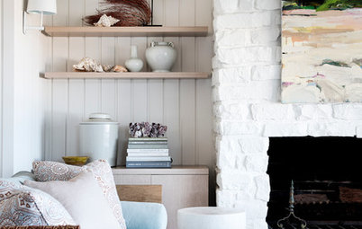
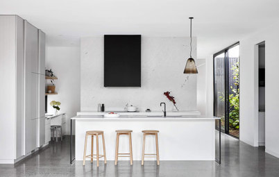
The make-up-inspired look can be duplicated in the kitchen just as easily as the bedroom. I see in this breakfast bar a fresh face beholding a palette of jars featuring subtle, greyed tints – like the eyeshadows that are a staple of the natural look. This kitchen needs no gimmicks, no ‘look at me’ embellishments: it is perfectly confident in its simple elegance.
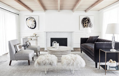
A nude palette fit for a drama queen has deep ebony accents and a few mysterious blue-grey throw pillows for intrigue.
Pretty in pink
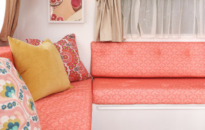
It is common knowledge that we tend to look our best in a pink room. Something about the way the colour reflects on skin softens hard edges and seems to add the flushed glow of health. It is the reason women wear blush, nude heels and pink lip lacquer, and it’s also a solid argument for decking your bedroom or bathroom out in barely-there pinks and corals.
See more ways to decorate with pink
The bookcases here are painted in the most breathtaking of refined pinks. Despite the trio of pink upholstered pieces, the room feels thoroughly adult and unexpectedly yet perfectly classic.
Who wouldn’t feel like a queen primping at leisure at this marvellous little vanity? Ladylike though it may be, let’s not forget that soft pink and peach make everyone look good, men as well as women.
Suggested paint colours to capture this look include Dulux’s ‘Cosmic Aura’ and Taubman’s ‘Fiesta Blush’.
Suggested paint colours to capture this look include Dulux’s ‘Cosmic Aura’ and Taubman’s ‘Fiesta Blush’.
Purple passion
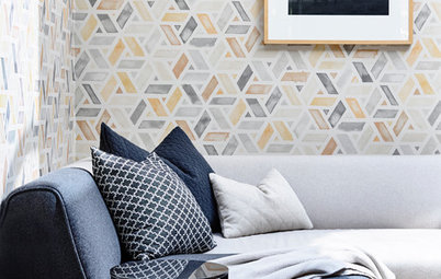
Purple is notoriously difficult to get right. Two tried-and-true tactics for using this colour to boost your home’s glamour are to select a greyed-out version, and pair it with metallics. Virtually any metallic will do since dusty lilacs are equally gorgeous with glinty steel and copper.
Purple is notoriously difficult to get right. Two tried-and-true tactics for using this colour to boost your home’s glamour are to select a greyed-out version, and pair it with metallics. Virtually any metallic will do since dusty lilacs are equally gorgeous with glinty steel and copper.
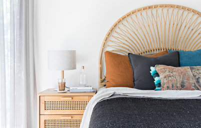
While purple can be gender-neutral, there’s no denying the girly glam at play in this room. Here we see how wood and metal bring this floaty aesthetic – with its gauzy sheers and fuzzy pillows – down to earth. The lilac and blush tones are sure to make you feel your best in this restful space.
Shimmering metallics
Natural stones like marble and granite often contain the hues found in today’s most popular make-up palettes. The copper and golden tones in these floor tiles mirror the specialty ceiling finish and gilded trim, and both the lighting and wall colour cast a regal aura over this stately Victorian powder room.
Add shimmer and sparkle with metallics
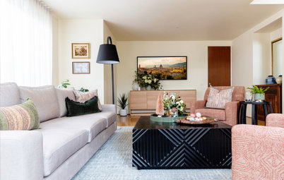
Here’s another exquisite example of using metal and wood tones as a neutral foil to the trickier pinks and peaches that most people are comfortable with only as accents. The grey tones down the sometimes oppressive cheeriness of pink, while the pink enlivens an otherwise neutral scheme. It’s rather like the way a bit of blush kicks our natural beauty up a notch.
With rose gold and copper being the current hot trends, gilding every surface with these ultrawarm metallics may be overkill. Still, it’s a haute look for today that is worth sprinkling in as pillows and objets d’art.
Pulling it all together
Thanks to Pantone’s designation of ‘Rose Quartz’ and ‘Serenity’ as its 2016 colours of the year, we’re finally opening our eyes to a grown-up way to combine pinks and purplish blues in the home. Saturated rather than pastel hues will keep the colour combo from feeling too saccharine, and combining deep magenta with periwinkle blue will feel fresh for a long time. These colours have long been popular in Indian textiles, and it’s nice to see rich raspberry and blue violet finally making a splash elsewhere.
Thanks to Pantone’s designation of ‘Rose Quartz’ and ‘Serenity’ as its 2016 colours of the year, we’re finally opening our eyes to a grown-up way to combine pinks and purplish blues in the home. Saturated rather than pastel hues will keep the colour combo from feeling too saccharine, and combining deep magenta with periwinkle blue will feel fresh for a long time. These colours have long been popular in Indian textiles, and it’s nice to see rich raspberry and blue violet finally making a splash elsewhere.
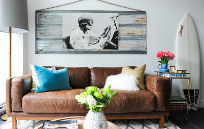
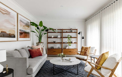
Zooming out on the space, we see more smoky tones blended with metallic and muted pink. We can imagine a confident uptown girl pausing at her favourite chair to step into her heels and glide on one last dash of pouty pink lip gloss on her way out the door.
If your regimen tends toward a tinted moisturiser, a quick swipe of mascara and an eye-popping fuchsia lipstick, you’d probably enjoy the understated romance of this sitting room, which exudes softness without feeling overtly gendered.
TELL US
What shades best suit your make-up preferences? Tell us or upload an interior to match in the Comments.
MORE
Get inspiration from more decorating ideas
TELL US
What shades best suit your make-up preferences? Tell us or upload an interior to match in the Comments.
MORE
Get inspiration from more decorating ideas
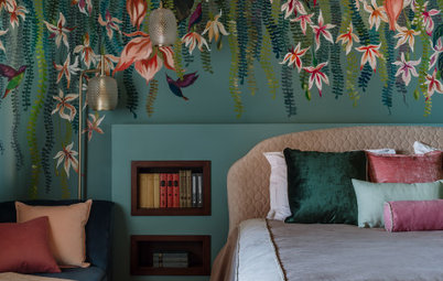
With make-up and interior design, a little goes a long way. Some say the key to applying make-up is making it look as if you’re not wearing any at all. The ‘naked look’ is all about subtlety, letting a woman’s natural beauty shine. We could say the same about this tightly controlled lavender colour scheme, in which every detail from the bedhead to the ceiling is mutually enhancing and sticks faithfully to the theme.