
Decorating
Mastering the Art of 'White Rooms'
Design writers Karen McCartney and David Harrison explore the beauty of decorating with white in their latest book, reviewed here

People have always been drawn to the purity and lightness of white, making it a star performer in decorating schemes, from Moroccan to minimalist, from romantic to rustic. But sadly for many of us, getting white right can be tricky. Crisp and clean can easily become clinical; and simple and serene often feels soulless. Best-selling author Karen McCartney and design writer David Harrison have collaborated with internationally renowned-photographer Robert Powers in a new book – White Rooms: Decorating With Style, Pattern and Colour – which aims to help readers with this challenge.
In the book, they showcase an array of inspiring interiors that burst with life, personality, character and flair. Drawing on creative techniques and imaginative inclusions, White Rooms showcases numerous shades, combinations and possibilities for white. We interview the author and dive deeper into the book to discover the key ways to gain confidence when decorating with white.
In the book, they showcase an array of inspiring interiors that burst with life, personality, character and flair. Drawing on creative techniques and imaginative inclusions, White Rooms showcases numerous shades, combinations and possibilities for white. We interview the author and dive deeper into the book to discover the key ways to gain confidence when decorating with white.
Embrace the possibilities
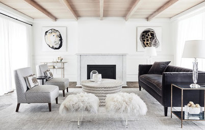
Not everyone is a fan of white. McCartney acknowledges that: “Some tend to see it in a negative light, as the opt-out choice. But white is not the issue. Interiors that work need to be cared about. Their success is not dependent on how much money is spent, but about collecting favourite pieces, displaying items beautifully and about how the elements come together and live in harmony.”
White is a powerful force when used in this context. Whether you are using it as a blank canvas or via carefully chosen accessories, if you’ve decided on all white, or want it mixed with pops of colour, white does not pigeonhole you to any one look. It simply provides a great shell, whatever your decorating preference.
McCartney stresses that white is decoratively diverse. “It depends on your combinations,” she says. “In a gallery style white is dynamic; but if it is calmness you crave, then soft forms of white promote tranquility. White unites spaces and can enhance rather than compete with an outside view.”
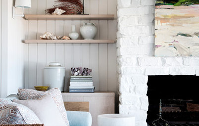
The pale tones of this relaxed indoor-outdoor interior are a calming foil to the dominant view of the outdoor greenery. Low-lying soft furnishings encourage rest and reflection.
Not everyone is a fan of white. McCartney acknowledges that: “Some tend to see it in a negative light, as the opt-out choice. But white is not the issue. Interiors that work need to be cared about. Their success is not dependent on how much money is spent, but about collecting favourite pieces, displaying items beautifully and about how the elements come together and live in harmony.”
White is a powerful force when used in this context. Whether you are using it as a blank canvas or via carefully chosen accessories, if you’ve decided on all white, or want it mixed with pops of colour, white does not pigeonhole you to any one look. It simply provides a great shell, whatever your decorating preference.
McCartney stresses that white is decoratively diverse. “It depends on your combinations,” she says. “In a gallery style white is dynamic; but if it is calmness you crave, then soft forms of white promote tranquility. White unites spaces and can enhance rather than compete with an outside view.”
The pale tones of this relaxed indoor-outdoor interior are a calming foil to the dominant view of the outdoor greenery. Low-lying soft furnishings encourage rest and reflection.
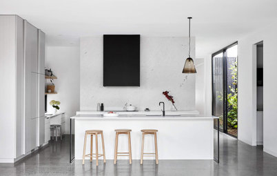
Create a clean look for kitchen and dining spaces
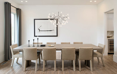
According to McCartney, using white in dining rooms and kitchens is a tried and tested formula, providing a bright and fresh space that is extremely easy to add to decoratively. By using white to unite the spaces, particularly in popular open-plan settings, you can avoid distracting colour changes and finishes. When the overall scheme is simplified, individual objects can gain attention without being drowned out.
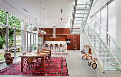
This huge converted warehouse has a small kitchen and an enormous living and dining area. Designer details such as the super-sized lighting fixtures add intimacy to the dining area and stand out against the clean white background.
According to McCartney, using white in dining rooms and kitchens is a tried and tested formula, providing a bright and fresh space that is extremely easy to add to decoratively. By using white to unite the spaces, particularly in popular open-plan settings, you can avoid distracting colour changes and finishes. When the overall scheme is simplified, individual objects can gain attention without being drowned out.
This huge converted warehouse has a small kitchen and an enormous living and dining area. Designer details such as the super-sized lighting fixtures add intimacy to the dining area and stand out against the clean white background.
Invest in sheer white fabrics
McCartney says that one of the most effective additions to a white space is sheer curtains, particularly in bedrooms and bathrooms. “The diffusion of light provided by the sheer fabric can create a quiet, magical glow and acts like a soft box in a photographer’s studio – reducing hard shadows and making everything appear warm, smooth and ethereal.”
This setting of all-white decorative elegance in this boudoir contrasts with a contemporary off-yellow bed by Turkish designers Autoban.
Pay attention to the shade … and the light
“The biggest mistake people can make when using white is in thinking that all whites are equal,” says McCartney. “Many cheap paints are tinged with blue and will leave your rooms looking and feeling cold. By researching the right product for your space, you will achieve a nuanced feel as opposed to something that is flat and boring.”
According to McCartney the orientation of a room and the amount of natural light it receives will play a major role in altering the perception of paint tone from room to room and even from wall to wall. “Reflected light may also carry a tint with it. A nearby brick wall or a bank of green plants will affect the perceived colour of pale walls around it.”
A good way of determining which shade of white works in a certain room is by painting a square metre of the shade on to your wall, to test it in different lights. McCartney emphasises the need to pay close attention during the decision-making process when designing any space, in order to gain a beautiful result.
Finally, and as the writers advise throughout the book, the best way to discover how white works in any room is through experimentation. “Nothing works in interiors in isolation”, says McCartney. “Gather your inspirations and favourite elements into an ideabook, then edit it back. Test how your colours work with the light. Look at floor coverings, key fabrics and furnishings to bring the palette together.”
White Rooms: Decorating With Style, Pattern and Colour, Penguin Books Australia, $59.99.
TELL US
Have you used white as a backdrop or main feature in your home and which do you prefer? Share your thoughts in the Comments.
MORE
It’s a Whiteout! Add Star Power to Your Interiors With White on White
10 Reasons to Love White Walls
Shady Business: How to Choose the Right White Paint
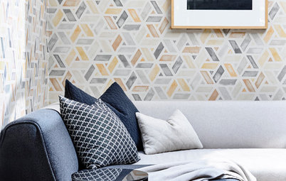
The book’s chapters take you through the main areas in the home, with sections titled ‘Kitchen and Dining’, ‘Living Rooms’, ‘Bedrooms’, ‘Bathrooms’, ‘Stairs and Halls’ and ‘Outdoor Spaces’, as well as another section focusing on ‘Decorative Details’. An additional ‘Working with White’ chapter also provides information on paint shades and techniques.
Faced with so many choices, many of us are rightly hesitant or downright intimidated when it comes to using white. Karen McCartney’s message to Houzz users is that having confidence is the key. So, with McCartney’s help, I have highlighted the key secrets to mastering the art of using white in your home.